For Zonin 1821’s holding we developed projects for: Casa vinicola Zonin e Principi di Butera.
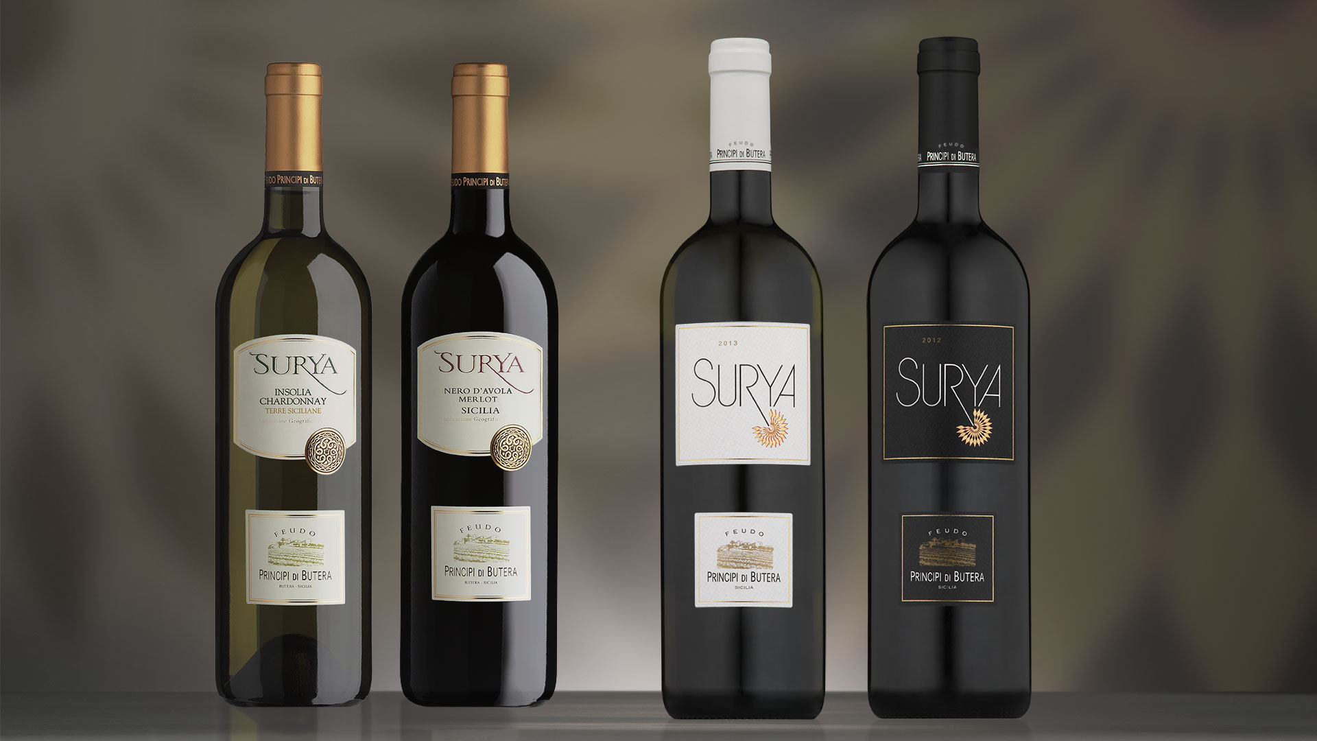
The Principi di Butera Surya restyling project involved, firstly, the redesign of the product name. To modernise the packaging and give it a stronger personality, the old characters were replaced with a more linear lettering, integrating the name of the wine with the new symbol and creating an authentic and original logo that reflects the Sicilian sun, a characteristic that greatly influences wine production in the region. In coherence with the stylistic features of the new logotype-product, the curved lines of the old tab were abandoned, with a return to an absolute rectangular shape. While maintaining the recognisability of the product, the new packaging appears more modern, incisive, and effective.
Activity: Packaging, Secondary Packaging
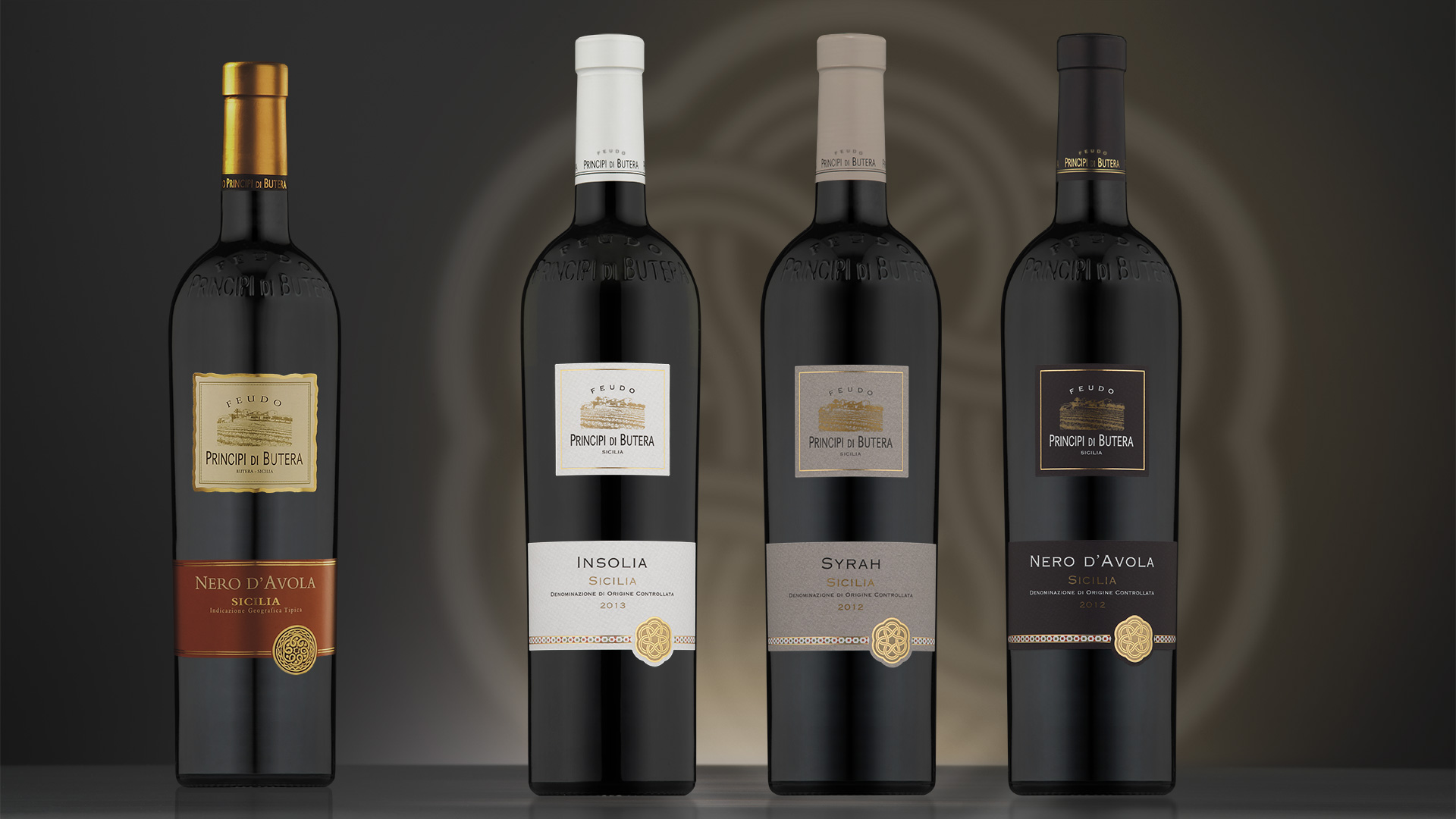
The ability to raise the aesthetic value of a packaging with a restyling project relies on the ability to recognise the potential that each element of the packaging contains. Every single detail must be carefully studied to identify the strong points and weaknesses of the packaging in order to make the appropriate changes. For these wines of the Principi di Butera winery, the symbol of the product line and the metallic threads were too generic, and have been replaced by a new symbol and a decorative frame that re-establishes a strong bond with the cultural elements belonging to the land where the wines are produced. The replacement of the font, the decision to use the same colour for the two fields of the packaging and the introduction of more elegant colours were all developments that contributed to raising the perceived value of the products.