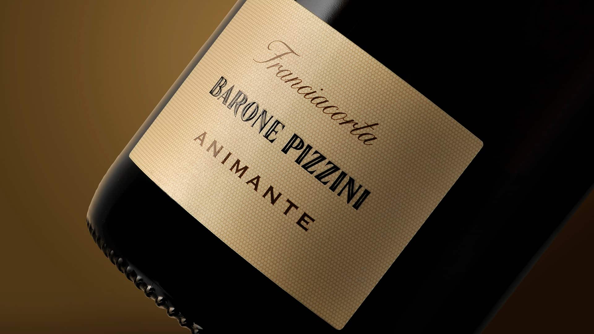
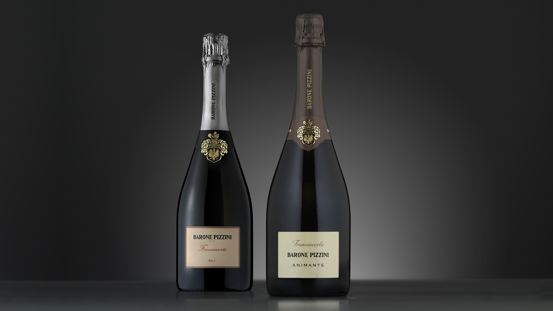
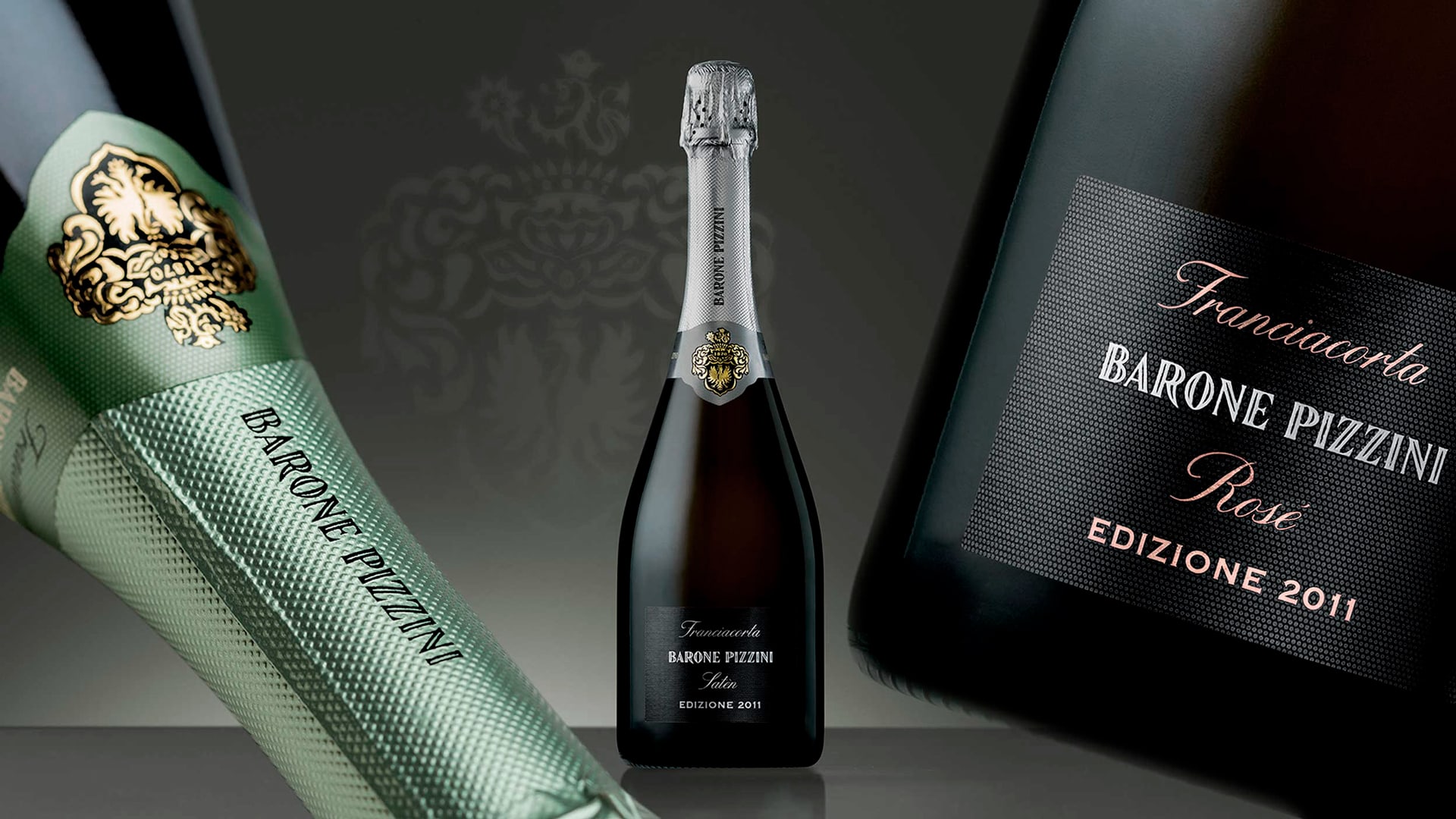
The re-launch of the Brut Barone Pizzini required us to communicate the evolutionary process that led the company to become a pioneer in biological viticulture in Franciacorta, through the label and packaging. In the honeycomb structure, as well as a formal reference to the perlage, we identify with the bee and how it works in perfect symbiosis with the environment, finding an image that perfectly reflects the company philosophy. We applied this structure to all elements of the packaging to enrich the surfaces and raise the perceived value, while introducing a greater level of stratification that reflects the complexity and character of the wine. The graphic structure of the label is extremely simple and essential, and the chromatic choices orientated towards warmer tones, help express the authenticity and naturalness of the product. The same graphic elements identified for Animante are also used for the vintages, only the label’s background colour becomes black, in line with the positioning of the “Edizioni” product.
Activity: Branding, Restyling, Secondary Packaging, Naming