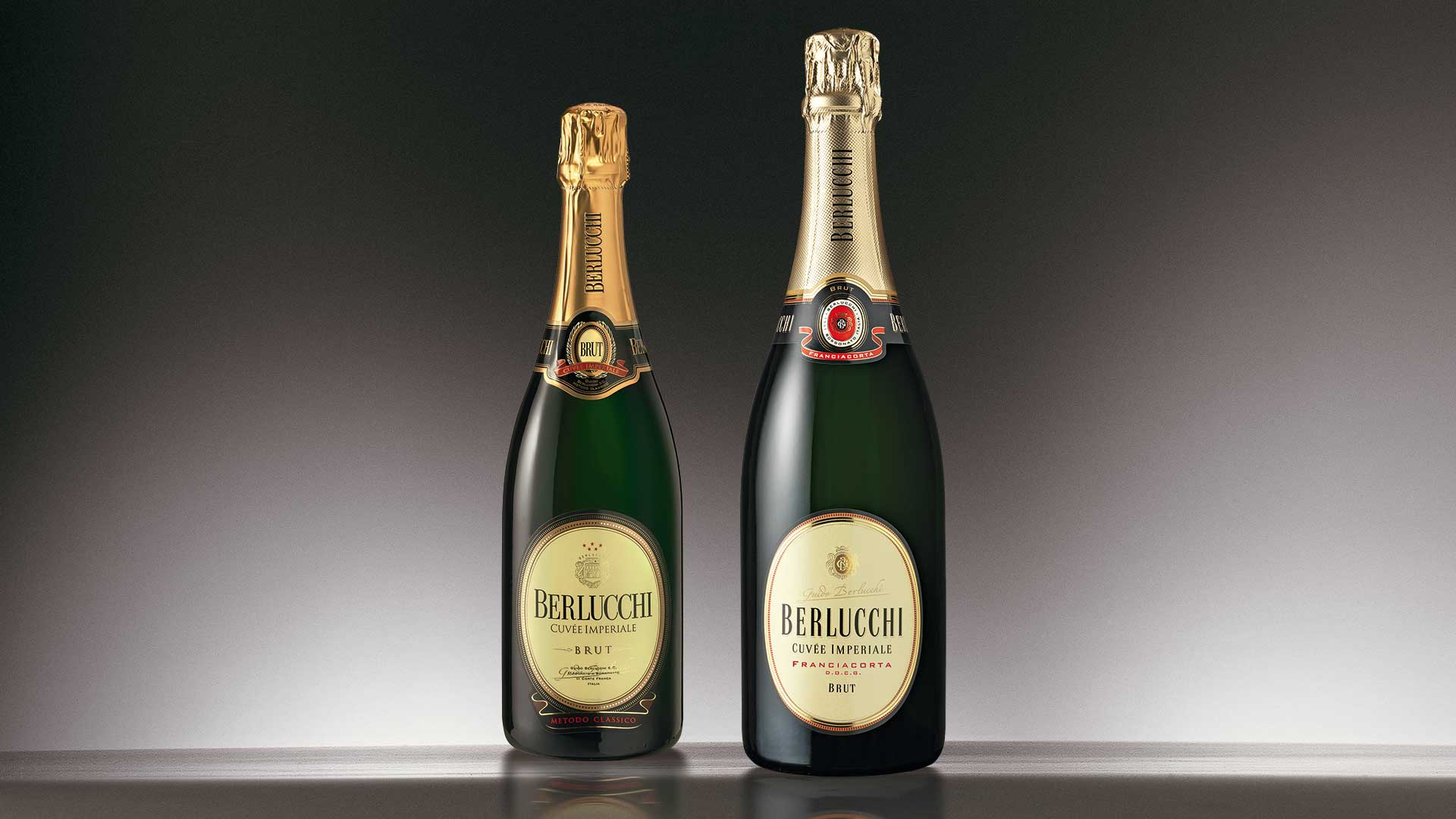
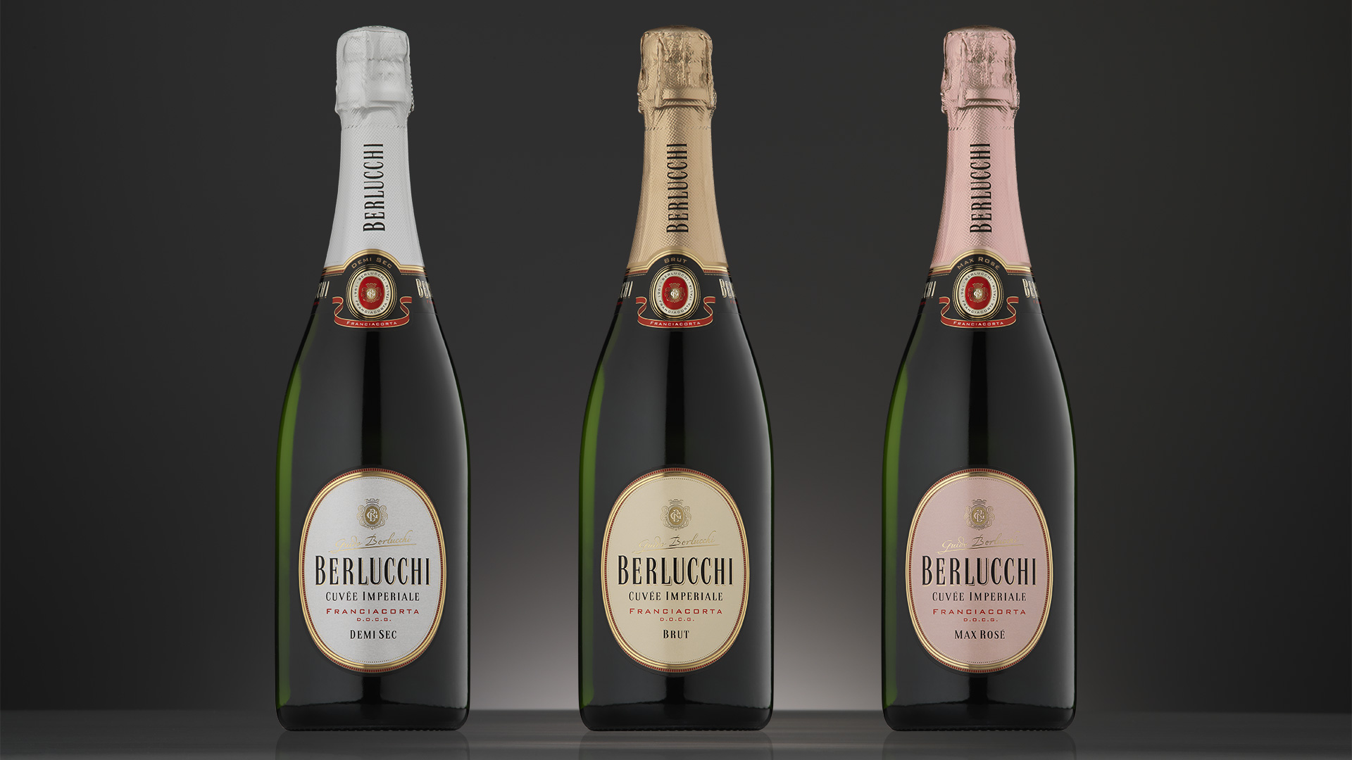
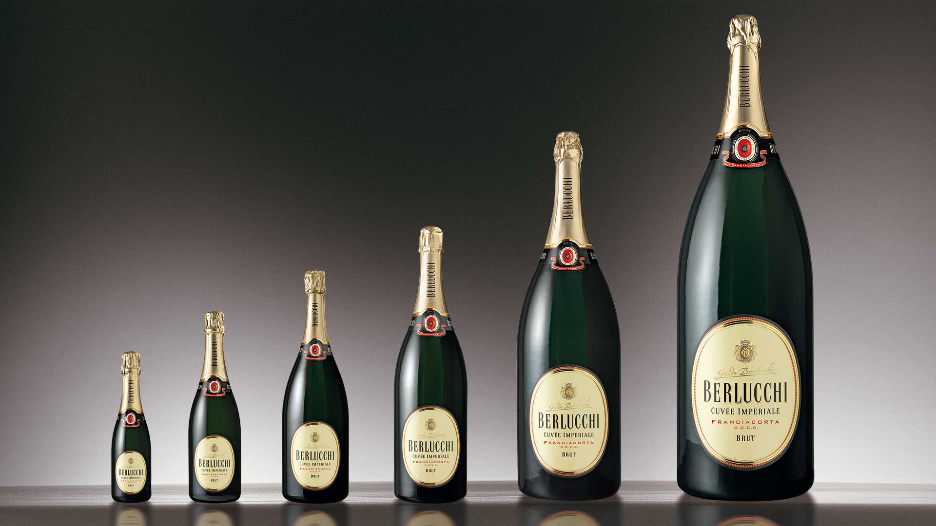
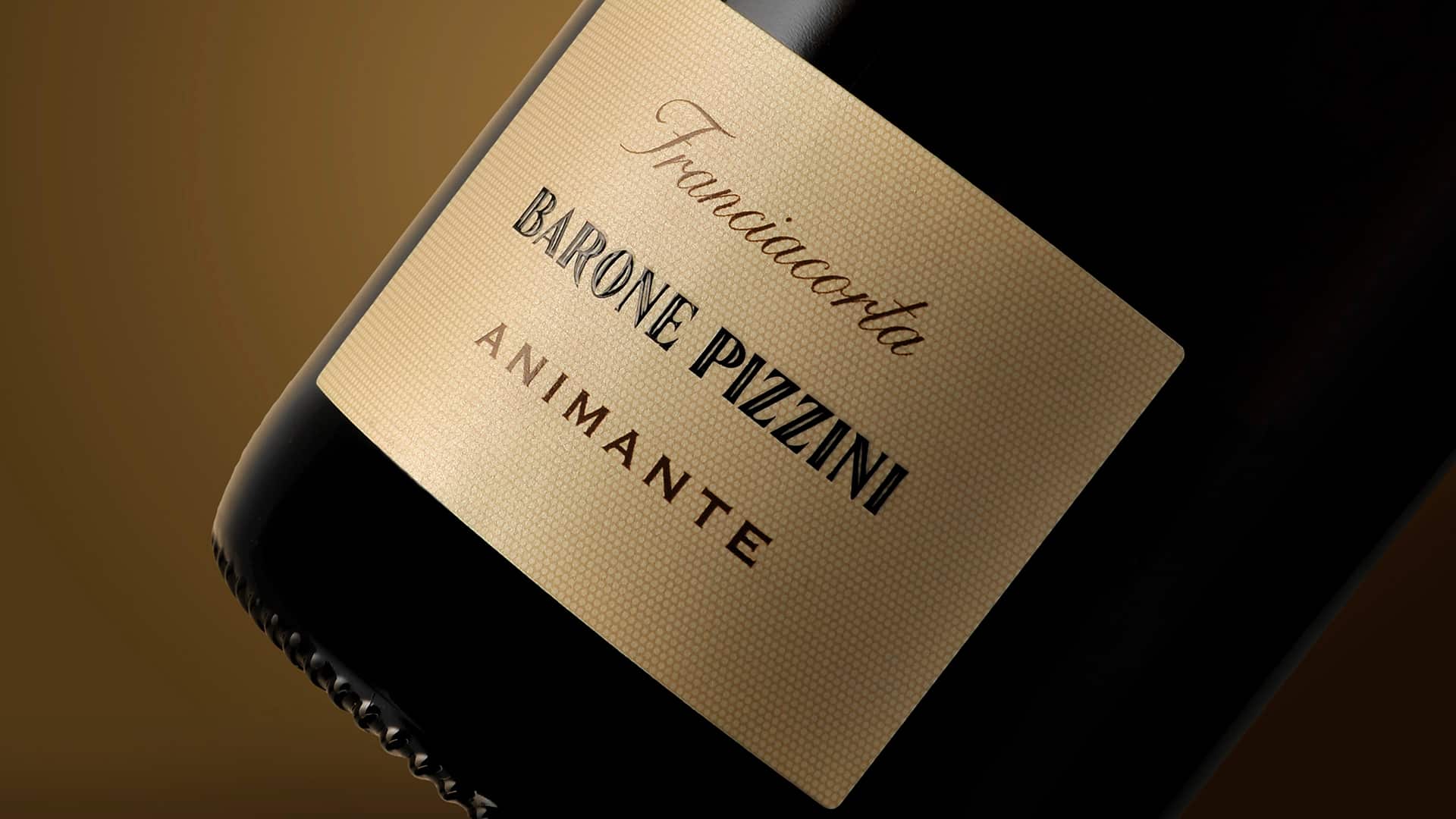
For the re-launch of the Berlucchi brand identity, which required us to redefine all product packaging, the restyling of the Cuvèe Imperiale represents an extremely delicate step as it constitutes the core business of this prestigious company. We needed to update the aesthetic codes of the packaging as the old designs were beginning to look tired, while the products also needed to appeal to a broader range of consumers.
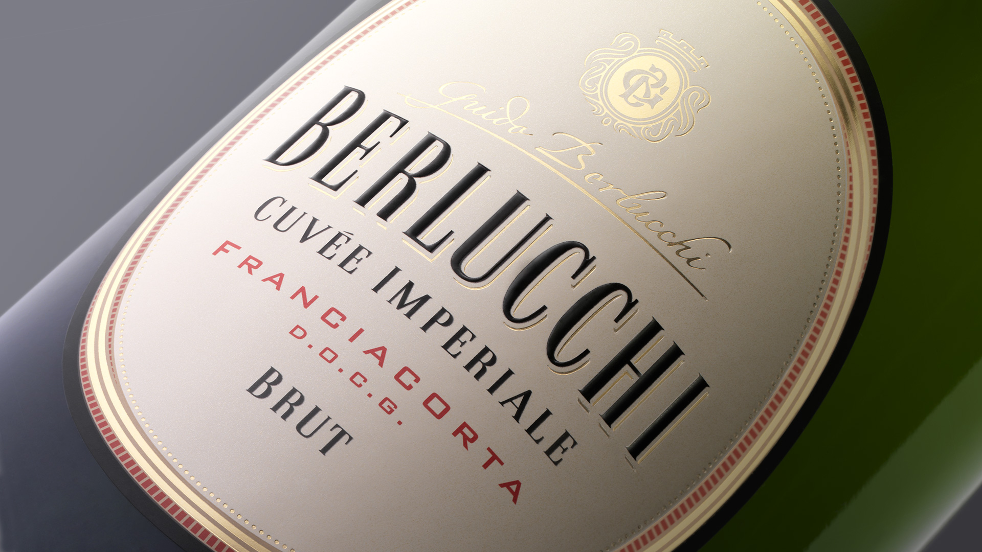
Every element of the old packaging was revisited with great attention to detail and with the specific objective of raising the perceived value of the product without compromising recognisability. The three-dimensionality of the frames, the bottle neck label that integrates with the body of the bottle and frees up the graphic elements creating space, and the introduction of the new brand are all elements that work together to increase the aesthetic quality of the packaging. Overall, the new packaging appears more minimalist and elegant, while it is also brighter, giving greater visibility to the product.
Activity: Branding, Packaging, Secondary Packaging, Restyling, Global Design