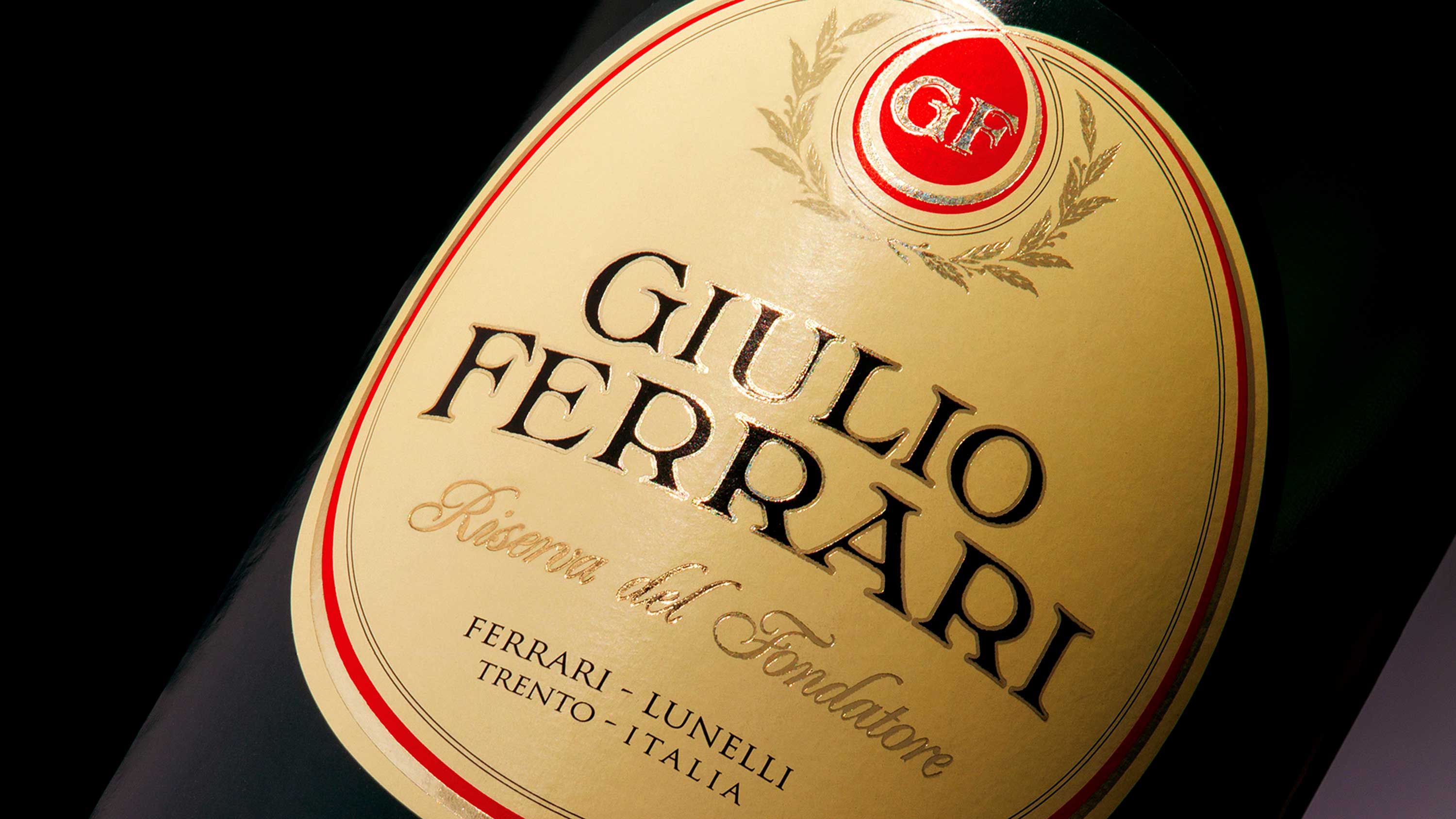
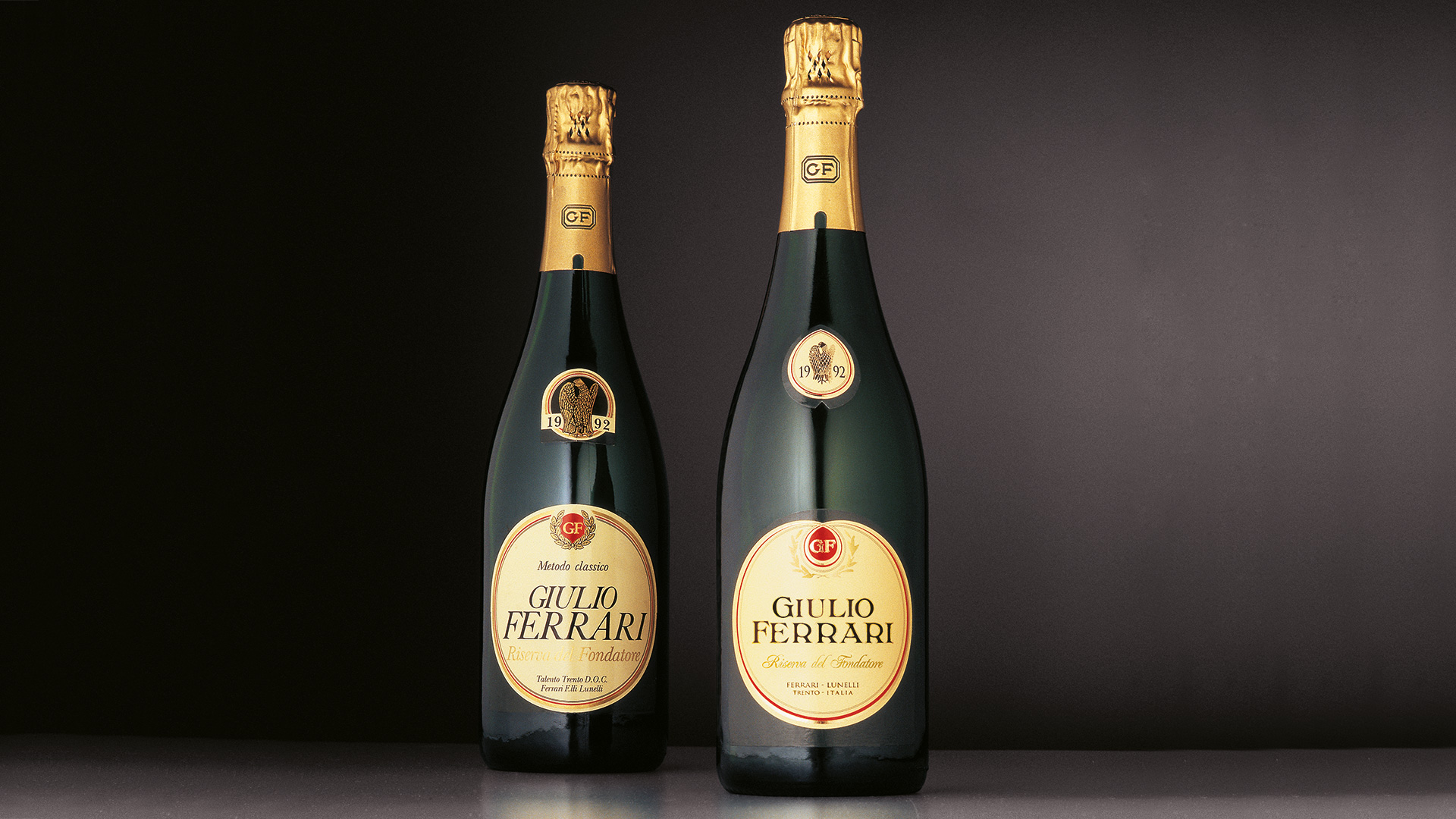
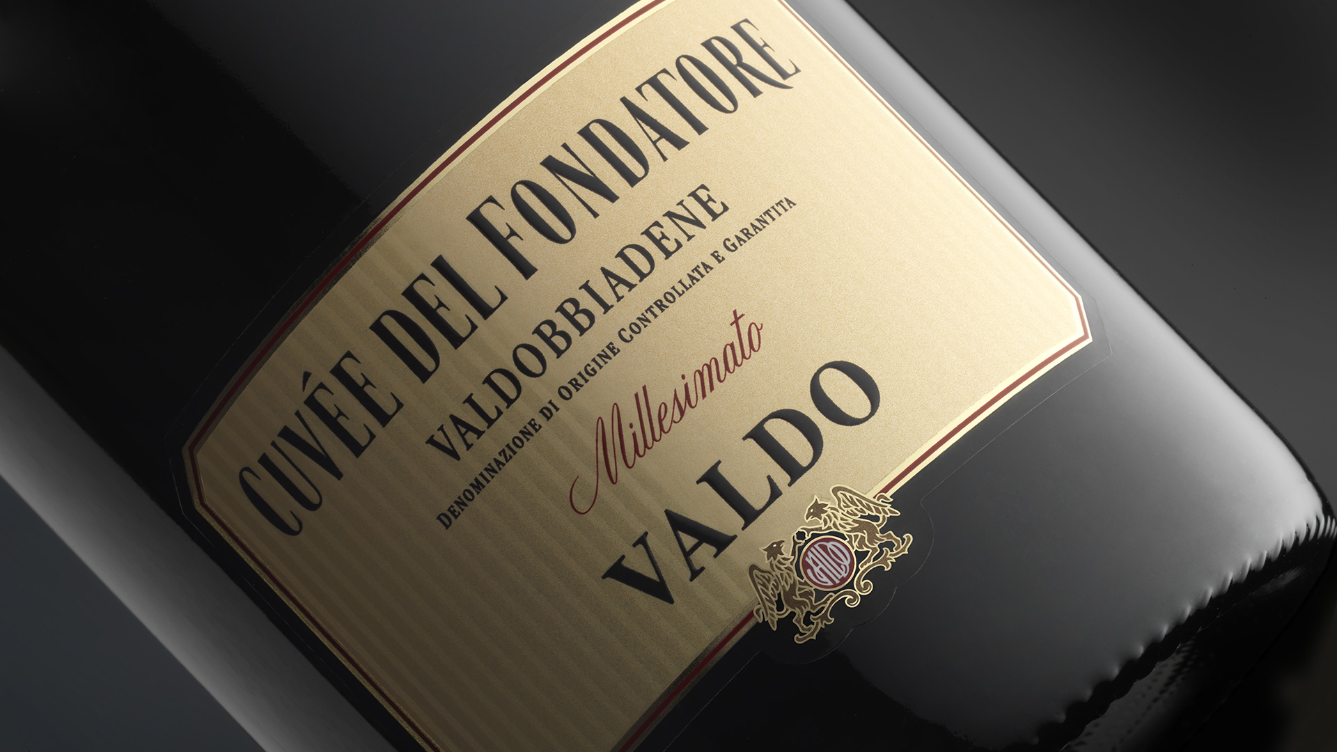
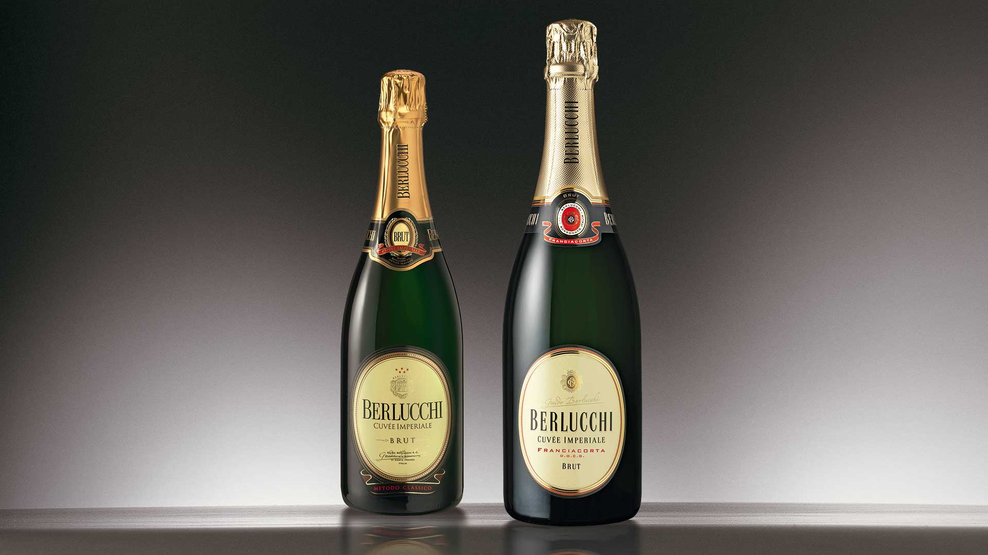
The fundamental contents and characteristics are renewed with equilibrium and clarity, to restore in every details the clear brand of nobility and the historic superiority of the most famous Italian Metodo Classico. The study undertaken for the evolution of the product packaging allowed us to reaffirm the historic value of the company. From the past, in the design of the new logotype, the liberty period character returns, taken from the founder’s old letter paper. The seal, the initials, and the profile of the label have been redesigned and made more memorable. The end result is greater graphic coherence, personality, and elegancy, without compromising the indispensable recognisability consolidated over decades on the market.
Activity: Restyling