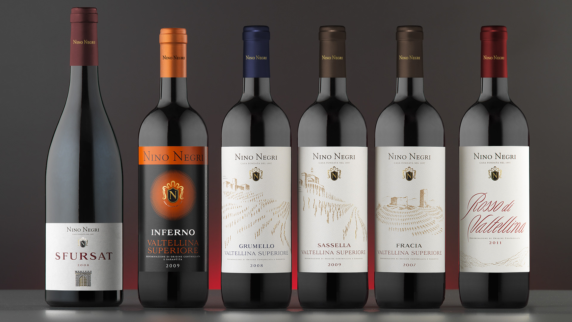
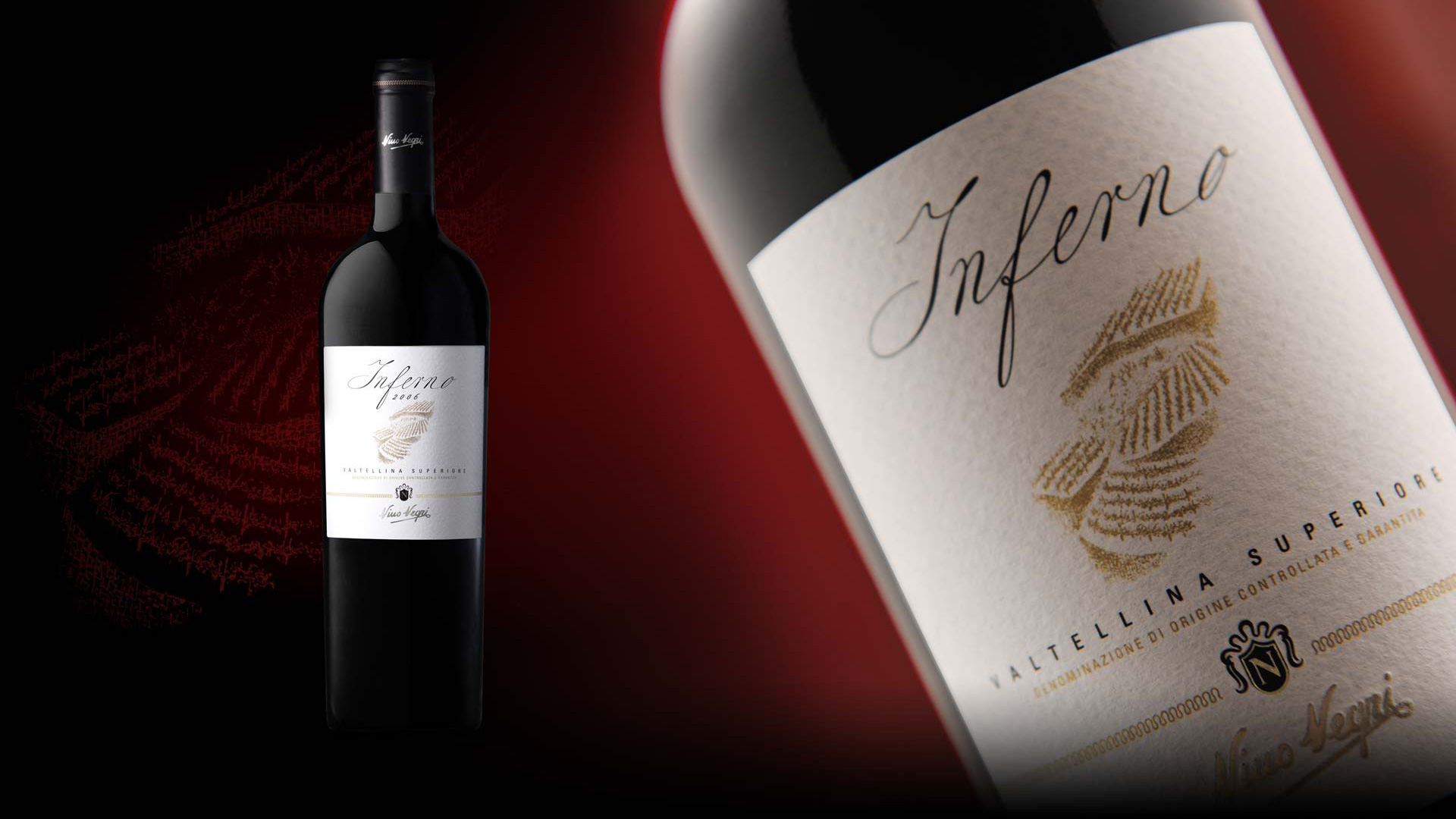
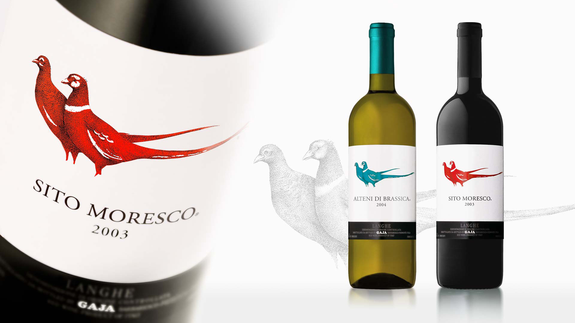
SGA has carried out a number of products for Nino Negri, both for products sold in supermarkets and those sold in hotels and restaurants. One of the most significant restyling projects was for Inferno, the flagship product of the winery. The project required us to evolve the packaging without compromising the historic value of the label. With this in mind, SGA maintained the central symbol, which represents a sun, embellishing it by replacing the graded shading with fine rays. From afar, the consumer still perceives the bright nimbus, while up close the visual experience is richer and more articulated. As the bottle is destined to be sold in supermarkets, it was essential that we gave the word ‘Inferno’ and the provenance of Valtellina Superiore a high impact lettering, which we designed especially for the occasion.
Activity: Restyling, Global Design
The Carlo Negri Inferno, on the other hand, is sold in hotels, bars and restaurants, and in order to convey this higher market positioning, the structure of the label features the name of the wine in a priority position, the protagonist of the packaging. The value is raised by a product logotype drawn in elegant calligraphy, which we created especially for this product. The illustration was also produced ad hoc and aims to exalt the peculiarity of the morphology of the territory, a unique detail as the wines are arranged on narrow terraces which do not allow access with machinery, meaning the harvest must be collected using the traditional wicker baskets, requiring great physical strength and effort.
To finish the packaging, the calligraphy of the brand is added, which assumes the value of a signature.