Gaja
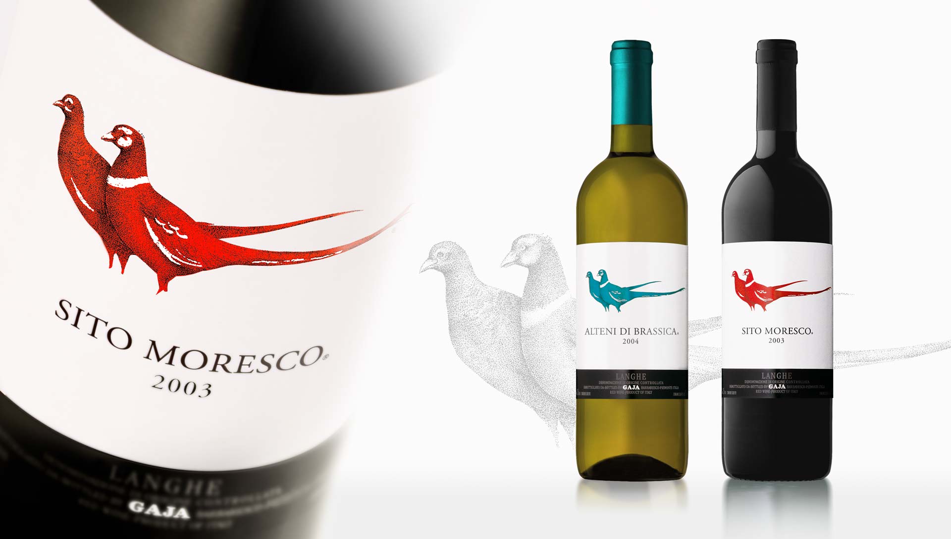
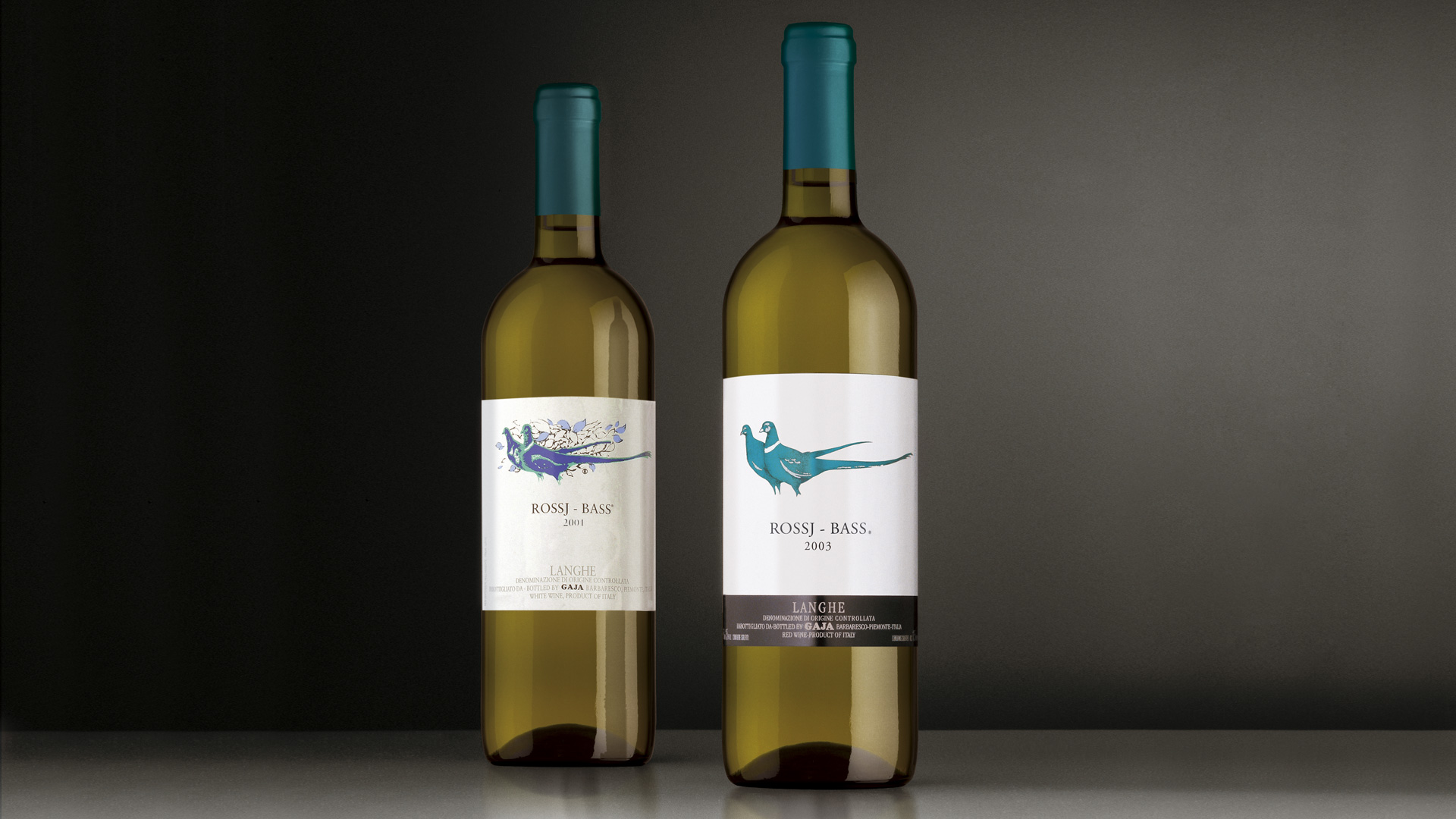
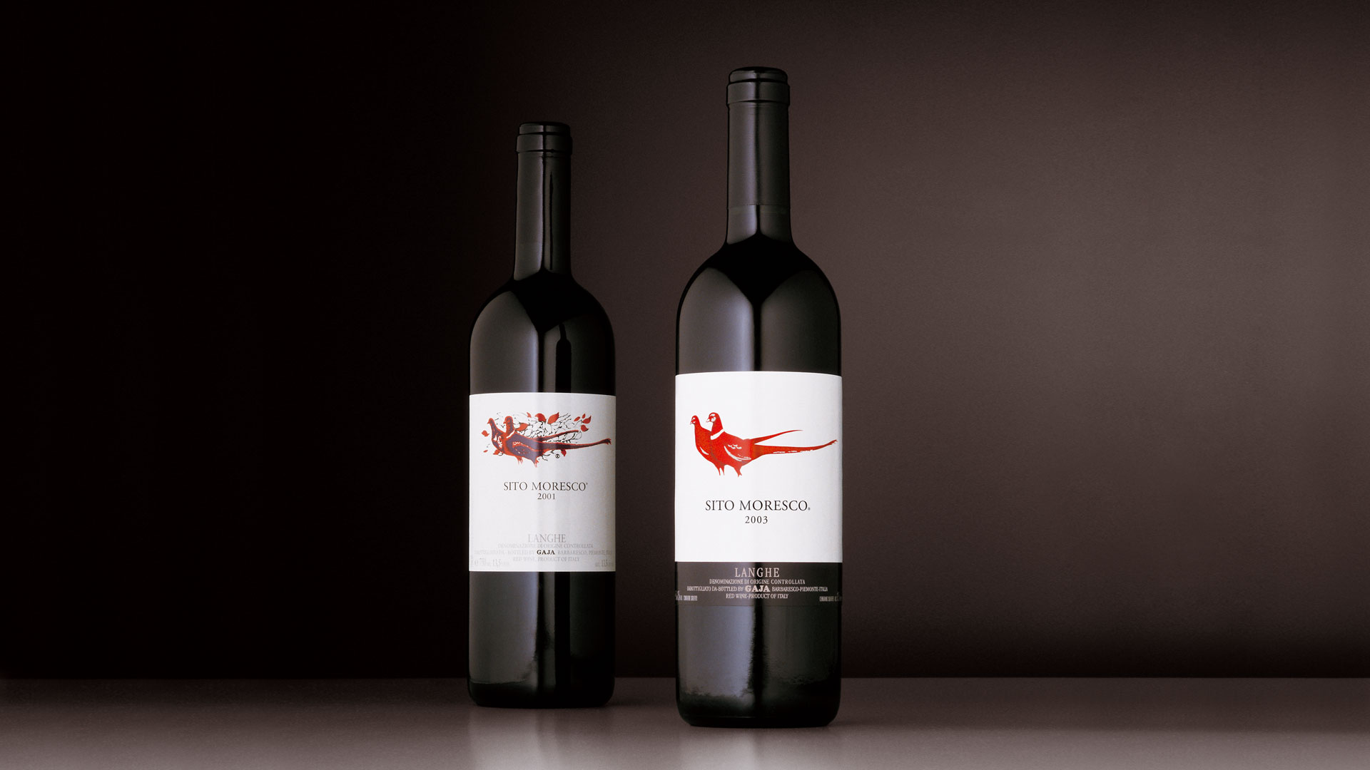
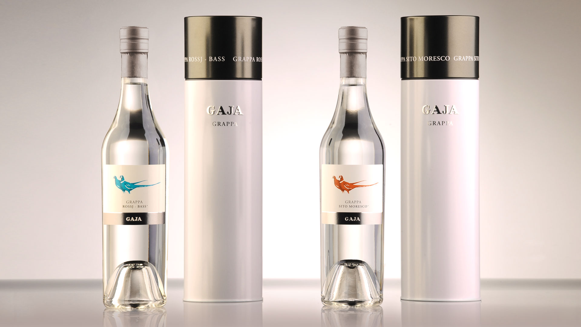
The attention is focused on the quality of the product in this comprehensive restyling project.
The characteristic visual element of the partridges has been interpreted with more finesse, using more traditional aesthetic elements. The project involved the redesign of the illustration that characterises the line and the definition of new colours, selected to provide coherence with previous labels and effectiveness of the symbolism. The effectiveness is in fact emphasised by the clarity of the image and the layout. With the introduction of the brand at the base of the label, the product intentionally gave more direct recognisability of the Gaja company.
Activity: Packaging, Secondary packaging, Restyling, Global Design
- L'architettura della cantina Identity, evoluzione dell'architettura
- Angelo Gaja, l'artigiano del vino Comunicare il vino secondo Angelo Gaja
- Oscar del Vino Winner 2006 Fagiani d'Oro