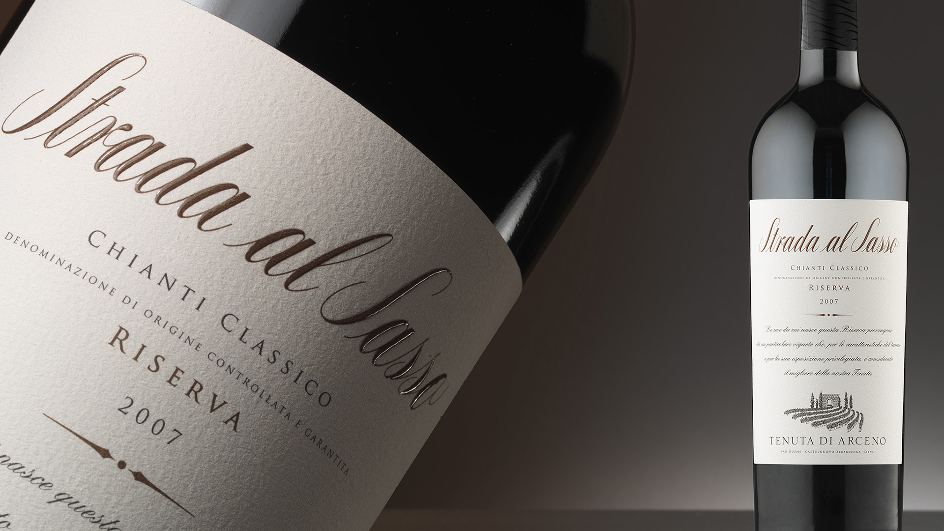
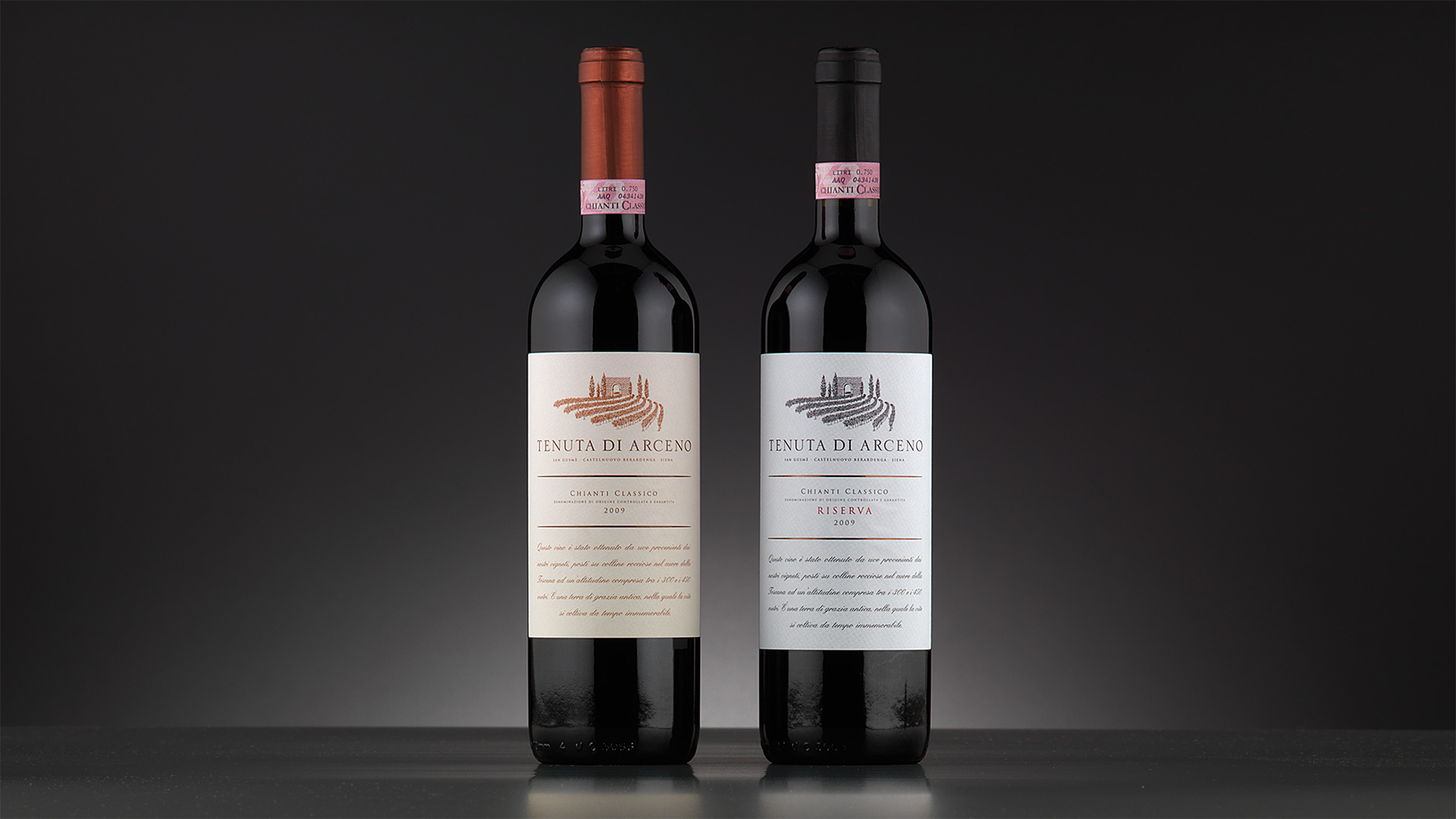
The three labels for the wines of Tenuta di Arceno were approached with the same methodology, but studied to express the personality of the individual wines and communicate their different placements on the market. The reference to the frontispieces of old books is reflected in the architecture of the new labels, the layout of the text, the free spaces, and the other elements. The choice of lettering and alternation of the characters used are reminiscent of the stylistic elements of the past and determine a design process carried out with the aim of authentically conveying the historicity of the estate.
To emphasise the prominence in and strong links with the territory, the designers chose to almost completely cover the Bordeaux bottle with a label format traditionally adopted by prestigious Tuscan wines. The chromatic choices determine its character. The brown of Strada del Sasso recounts the naturalness of the wine and refers to the link with the earth; the sanguine colour of the Chianti Classico, traditionally used by historic artists when painting from life, conveys warmth and passion. For the Chianti Riserva, the stark contrast between the intense black and natural white paper conveys authority.
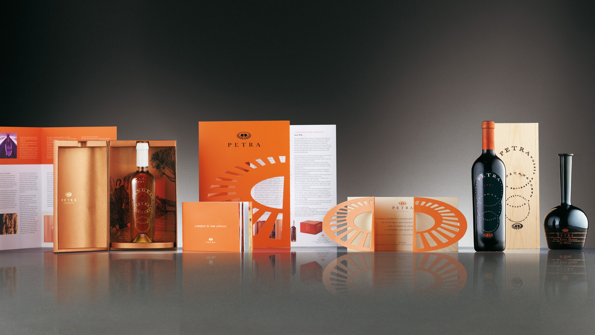
Activity: Packaging