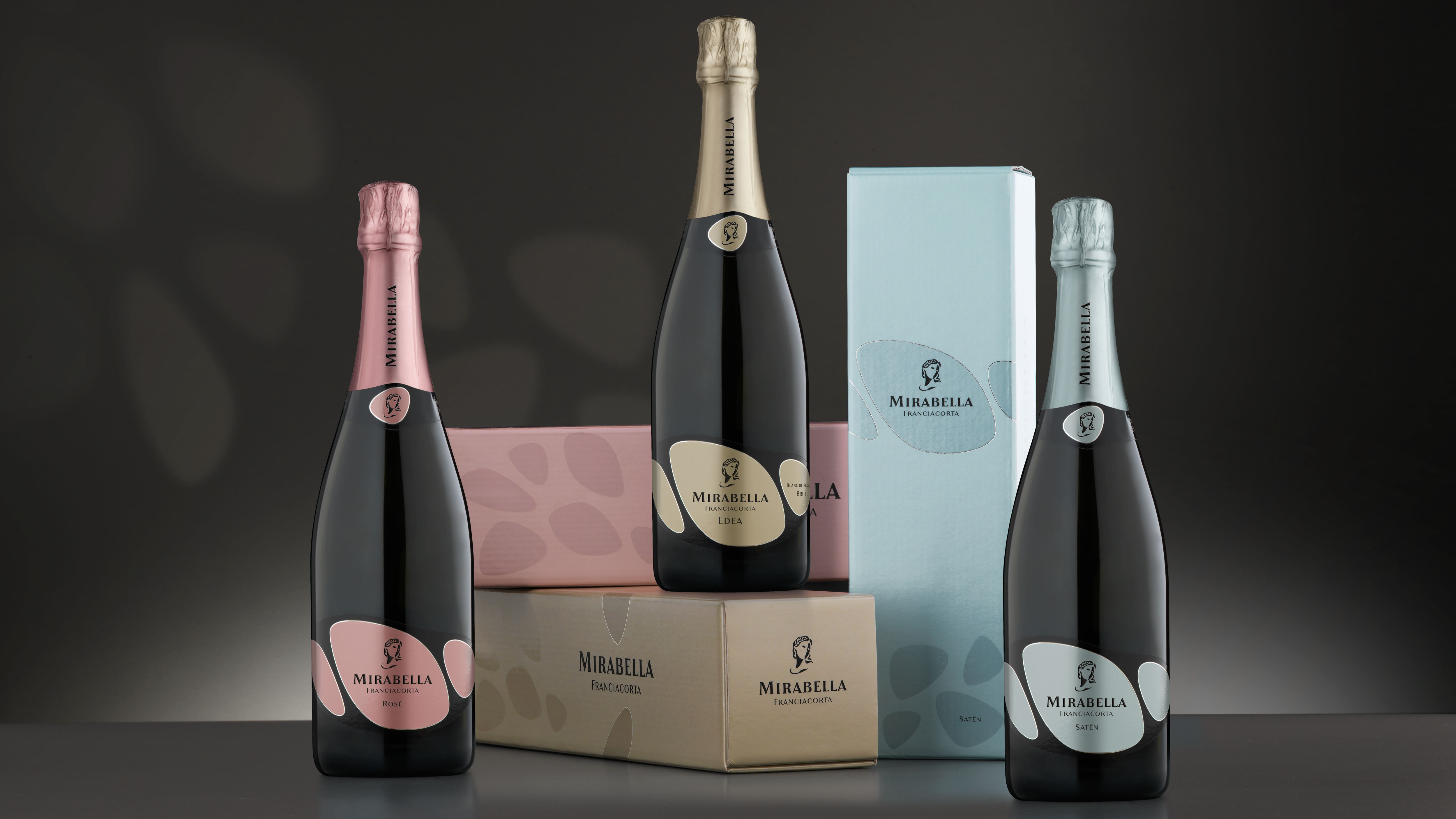
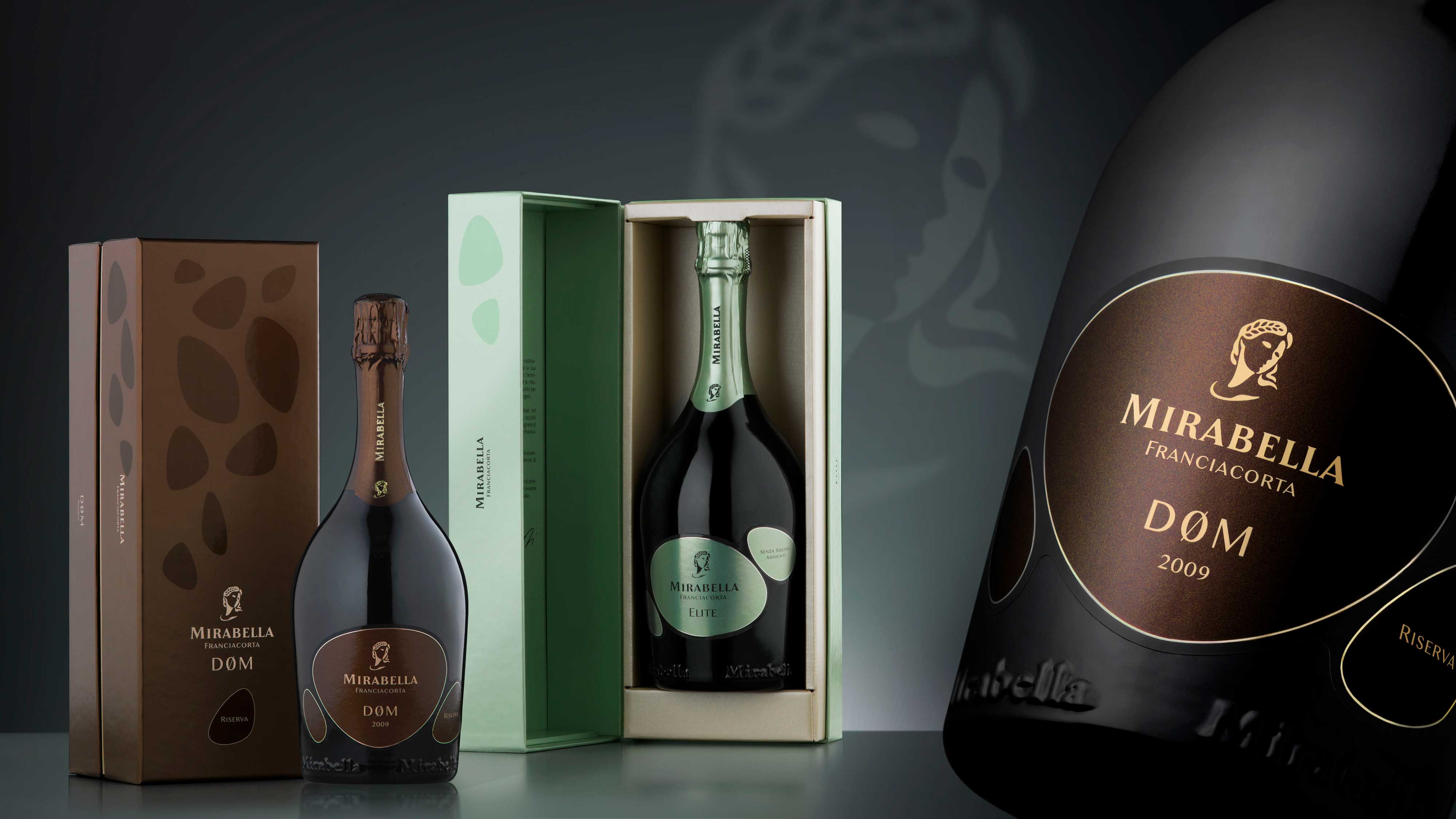
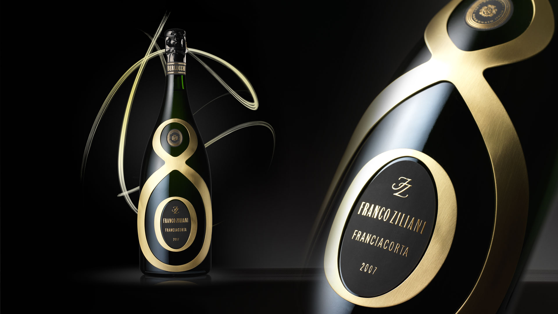
In relating to the new positioning of Mirabella, oriented towards innovation and to the main key target identified, the Millennials, the appearance of the products was designed with the precise aim of conveying the values associated with the brand, such as naturalness and innovative capacity. The three forms that make up the label are a precise reference to the stones in the territory of Franciacorta, the natural forms of rocks smoothed by water, an element of particular importance for this company, since the underground cellar is surrounded by groundwater that maintains its temperature and humidity always constant.
The three ‘stones’ which, by varying in composition and colour, characterise the various wines, can also refer to Teresio, Mirabella’s founder, and his two children, Alessandro and Alberto, respectively the company’s cellar master and marketing director. Three wine experts whose different skills and attitudes contribute to the creation of these Franciacorta with a unique personality. The simple graphical language and the strict minimalism convey the particular attention that the company pays to aspects regarding the naturalness of their wines, a firm commitment that led this cellar to produce the first Franciacorta free of sulphites.
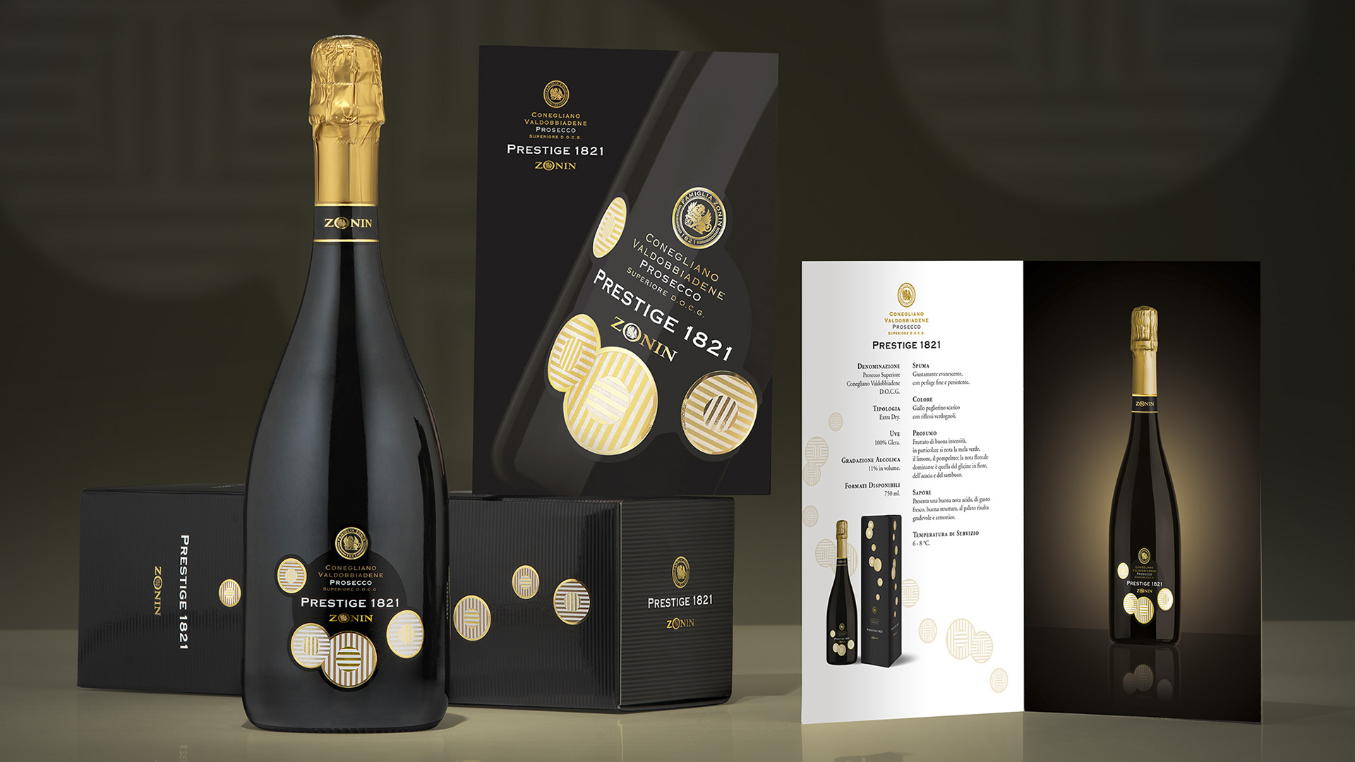
Activity: Packaging, Secondary Packaging
The enhancement of a sparkling product cannot neglect the development of a distinctive secondary packaging, consistent with the strategic direction and the image of the wines, as well as their respective positioning, while also carefully considering aspects such as functionality and costs.