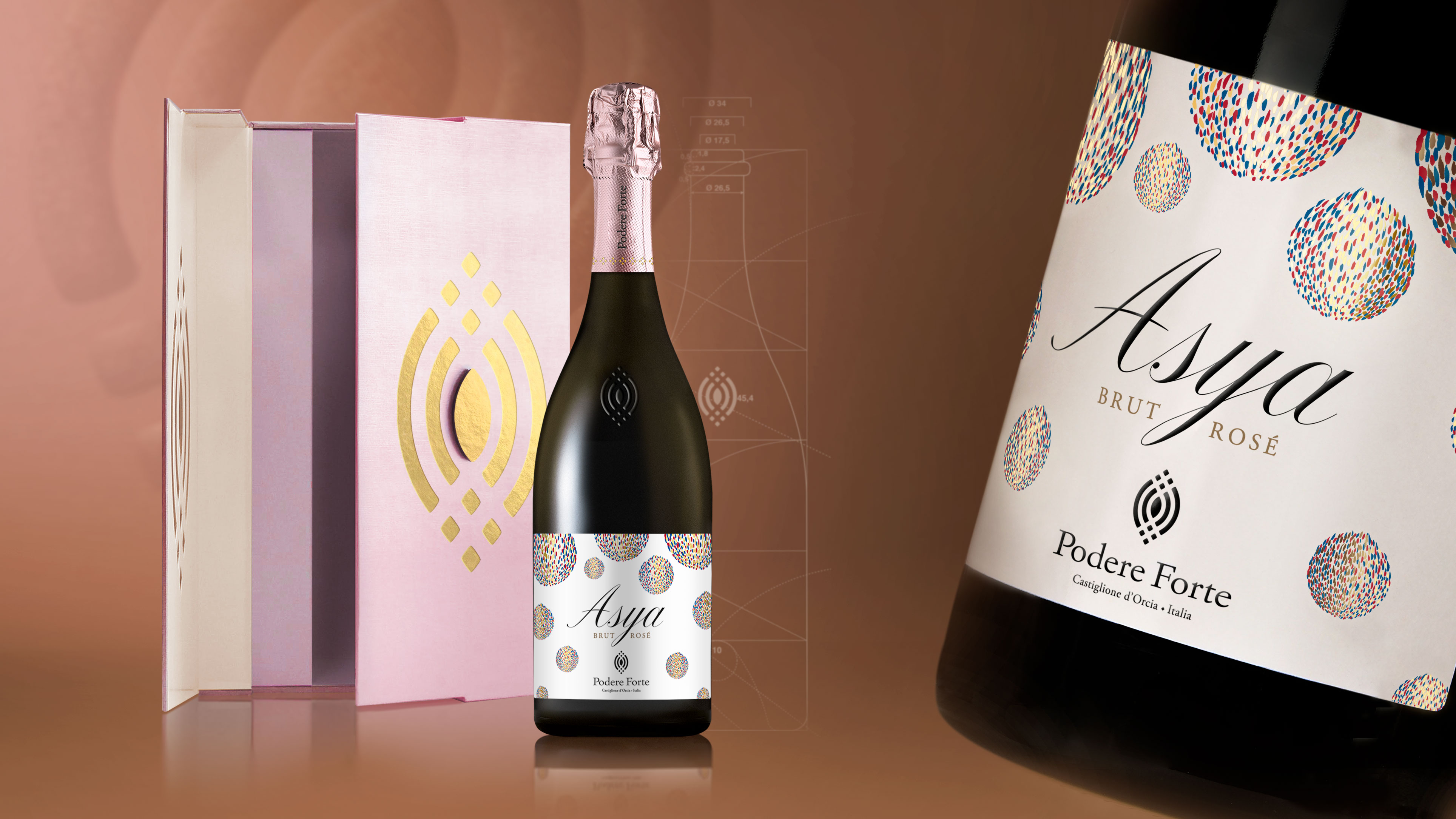
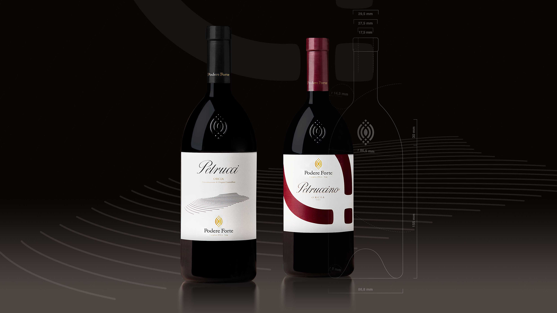
The packaging project for the products of Podere Forte is based on two primary elements: on one hand, a personal bottle designed from the study of proportions determined by the Golden ratio that guarantees an immediate family-feeling, on the other hand, the study of specific labels able to convey the personality of the individual wines.
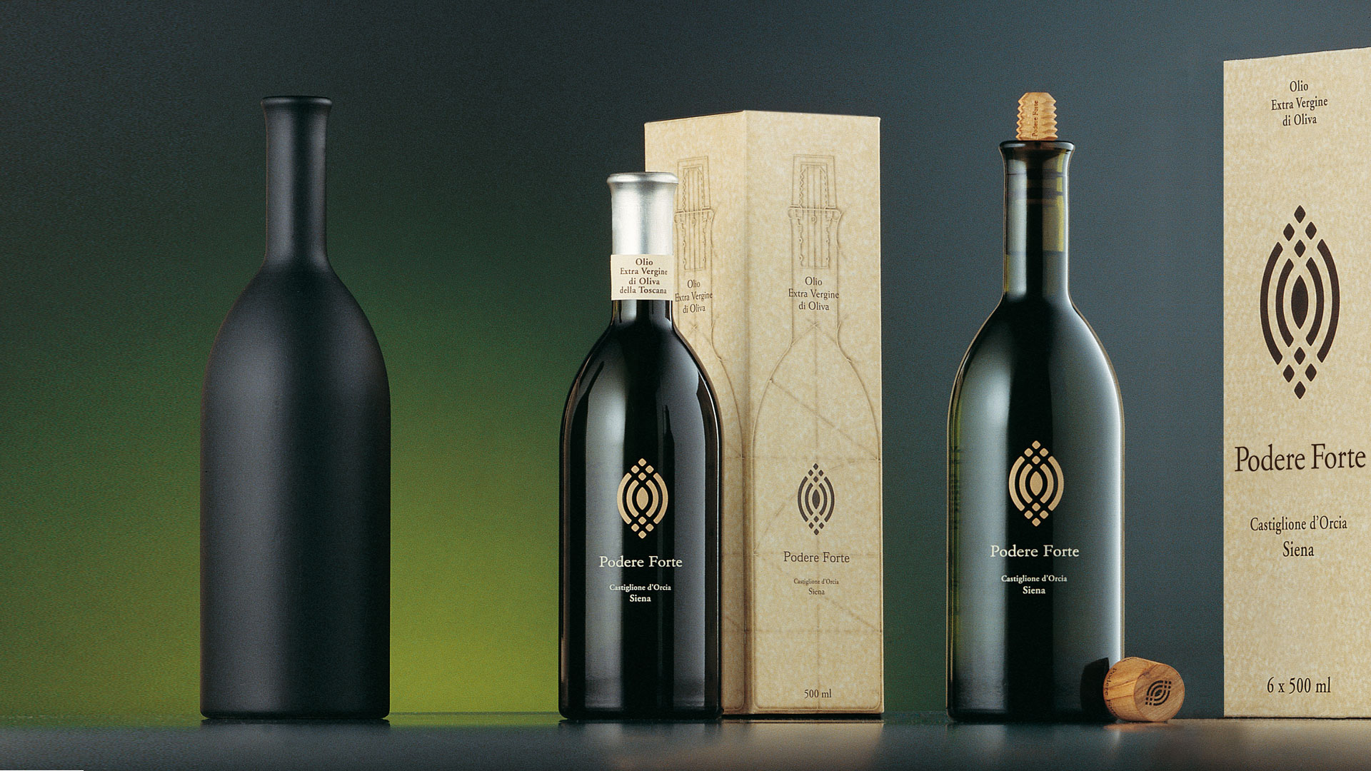
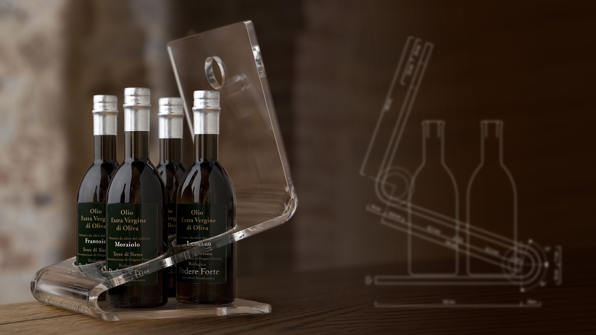
For the oil, in addition to the bottle, the project designed a pourer cap made of olive wood. As well as the functional aspects of its design, the cap helps communicate the naturalness of the product. The label has been replaced by the personalisation in serigraphy, the essentiality of the graphics contributes to raising the perceived value of the product.
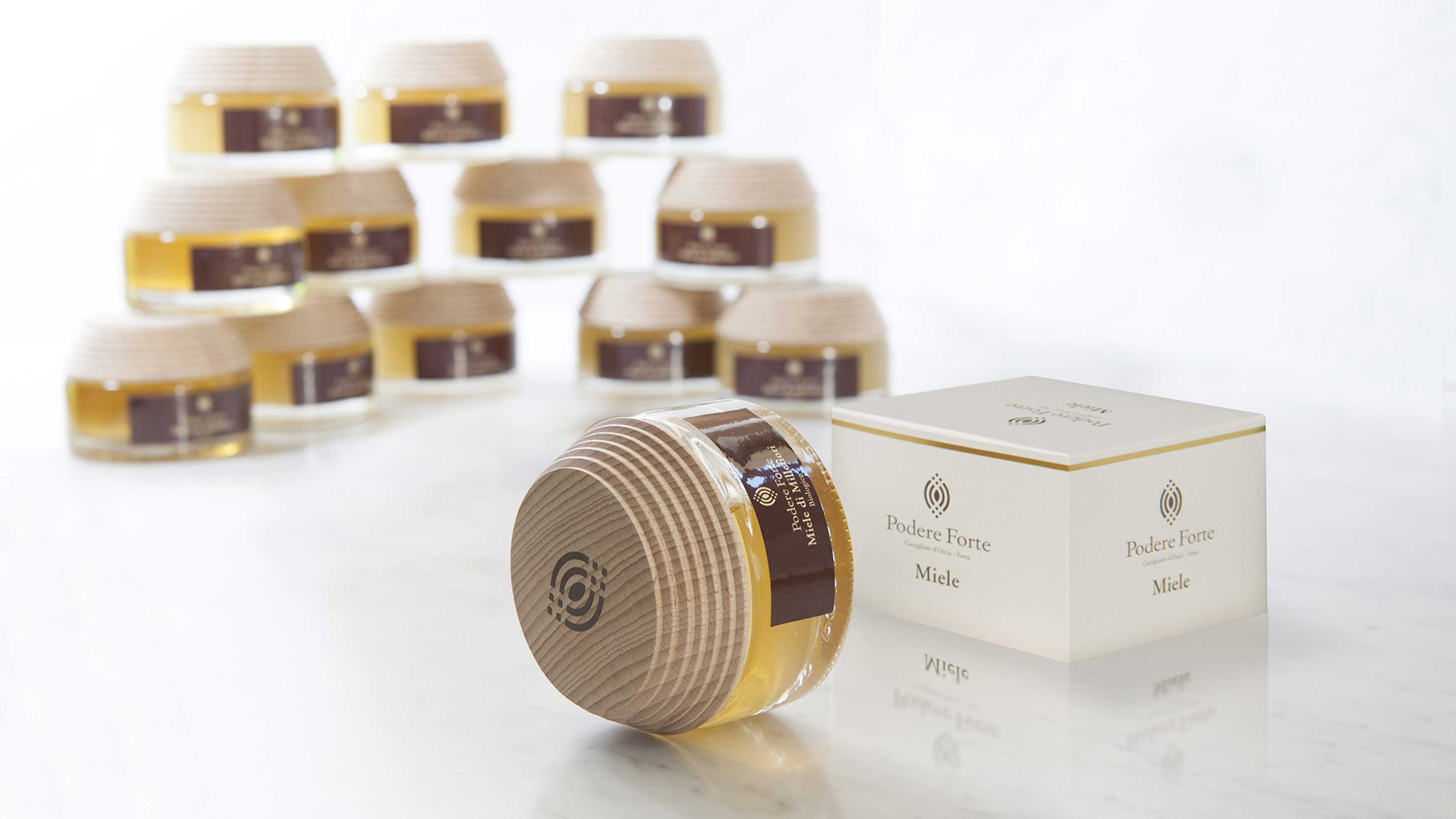
For honey too, the packaging comes from the design of a container with a cap that, in polished wood, combines the ergonomic aspect with aesthetic function. The minimalism of the label and extreme elegance of the box complete the packaging.
Activity: Brand, Packaging, Secondary packaging, Bottle design, Global design e Naming