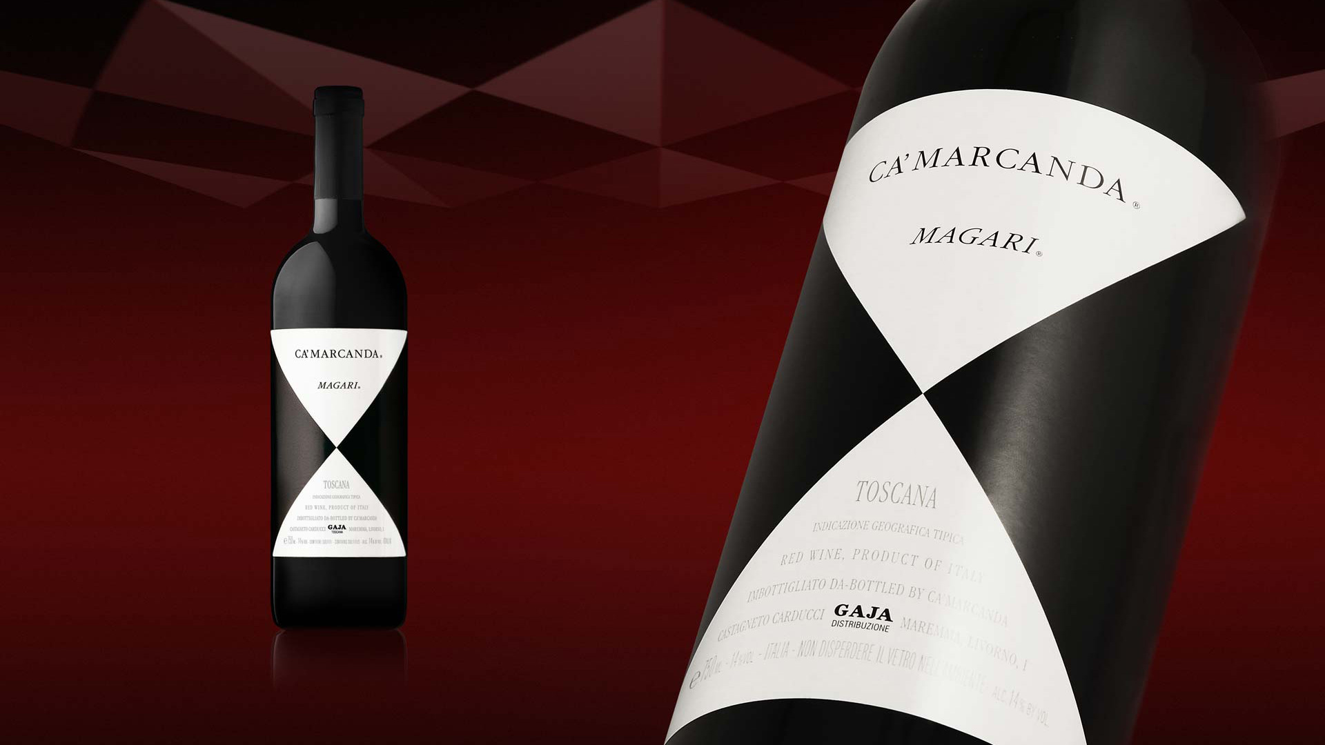
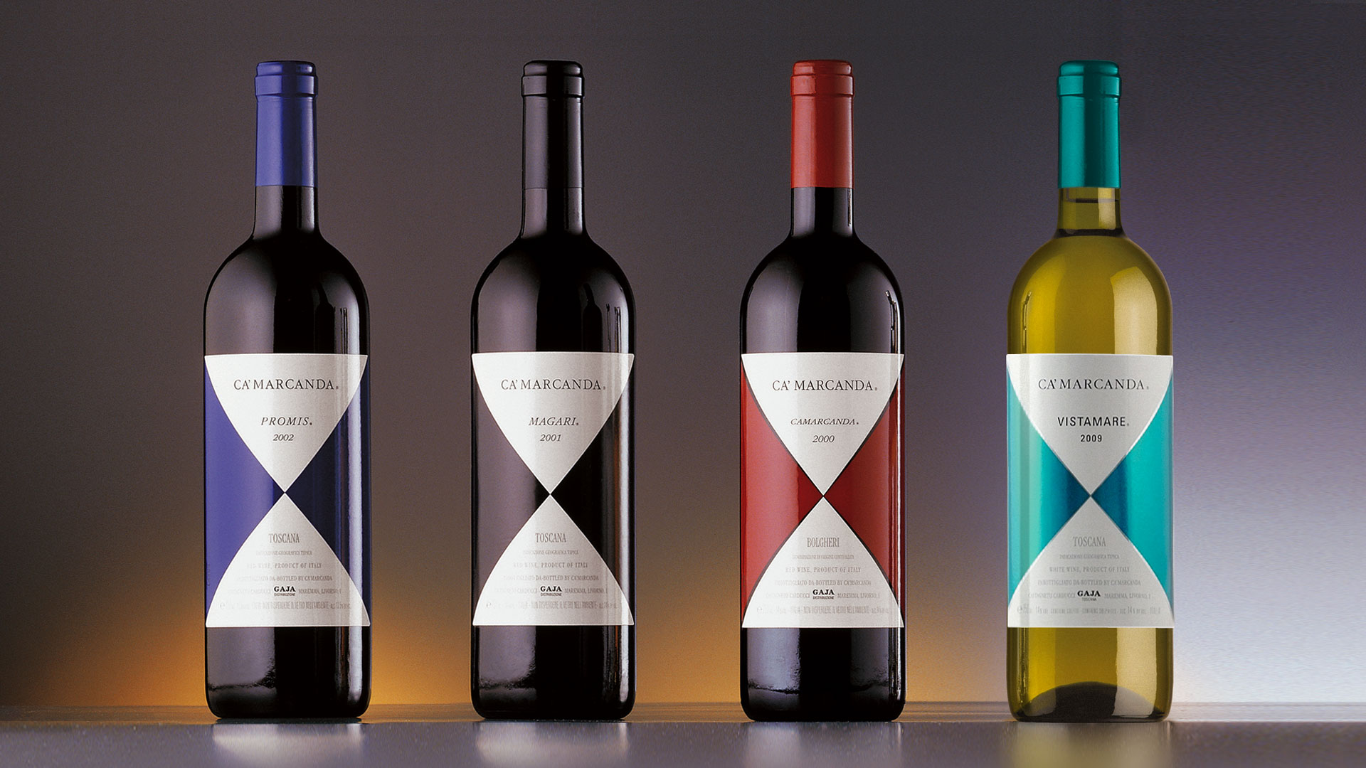
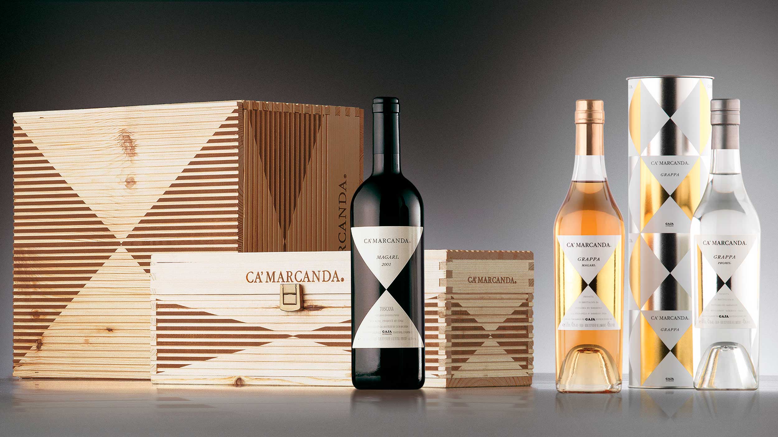
The minimalism that characterises the labels of the Piedmontese wines of Angelo Gaja is re-proposed in the labels of Ca’ Marcanda, determining a new graphic structure, the geometry of which picks up the pyramid shapes that characterise the design of the winery’s exterior. The label applied to the cylindrical surface of the bottle accentuates the value of three-dimensionality and underlines the synergetic relationship between the product’s packaging and the architectonic image. The result succeeds in expressing the identity of the winery, while maintaining the link with the Gaja family.
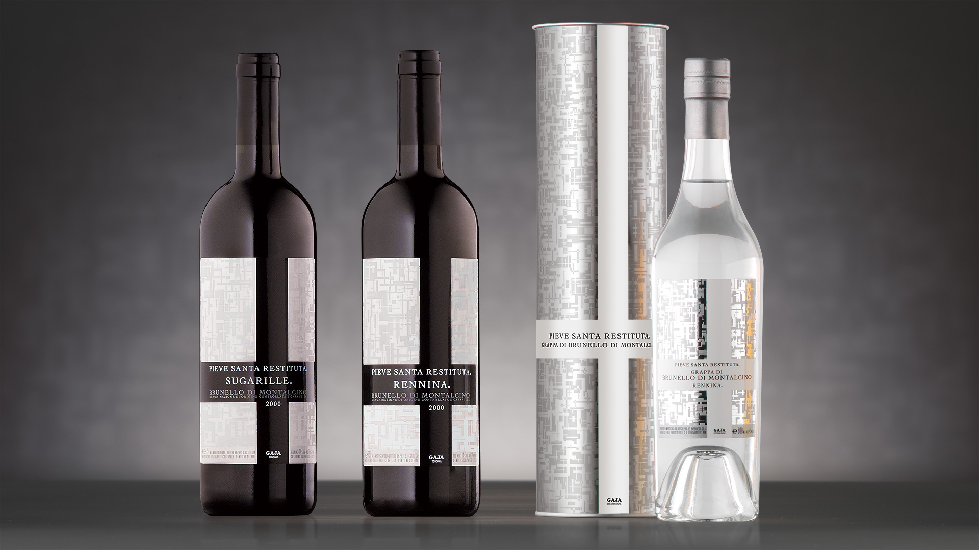
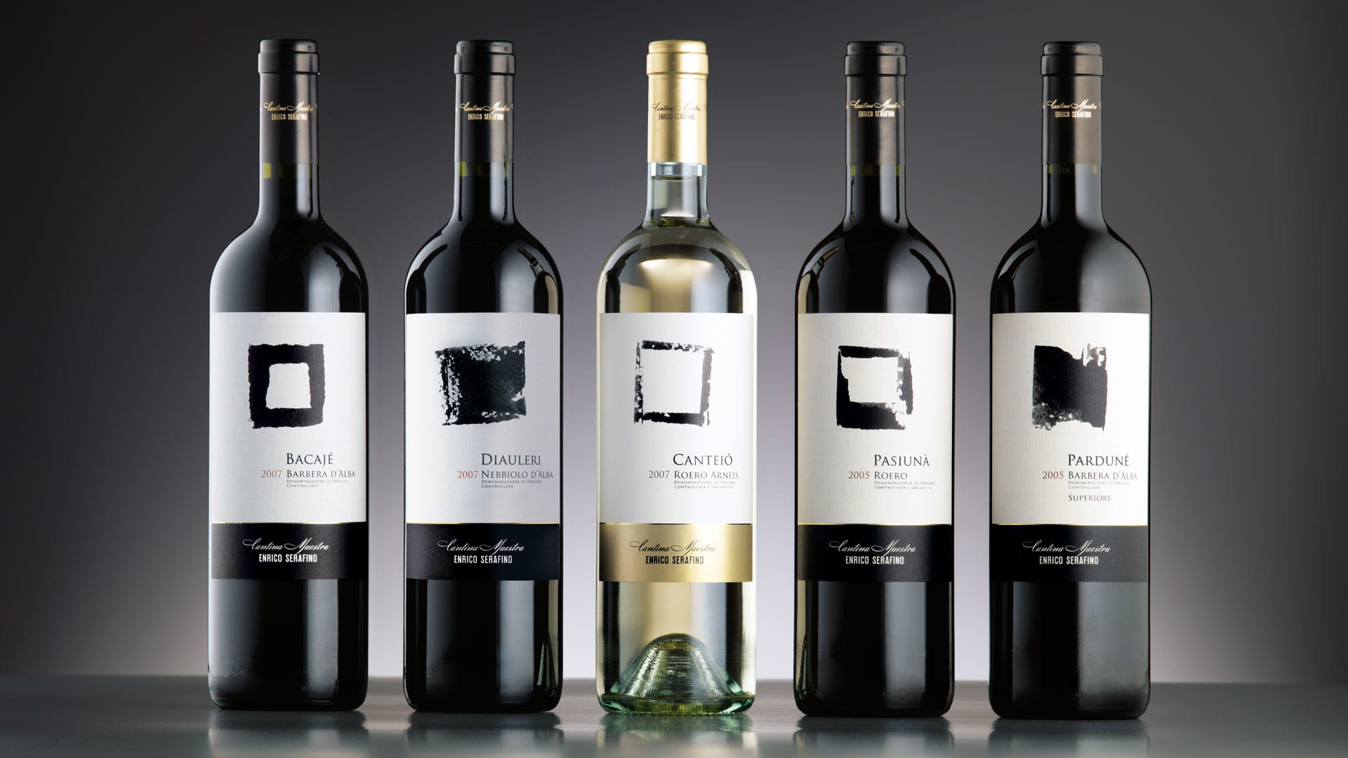
For the project of Pieve Santa Restituta too, the essentiality and incisiveness of the sign, black on white, helps to define an immediately recognisable identity and convey its belonging to the unmistakable style of the Gaja companies. The theme of the cross, which appears in numerous areas around the Montalcino estate, constitutes a highly distinctive element, while its extensive repetition produces a particularly refined texture, which reflects the richness and sumptuousness of these wines.
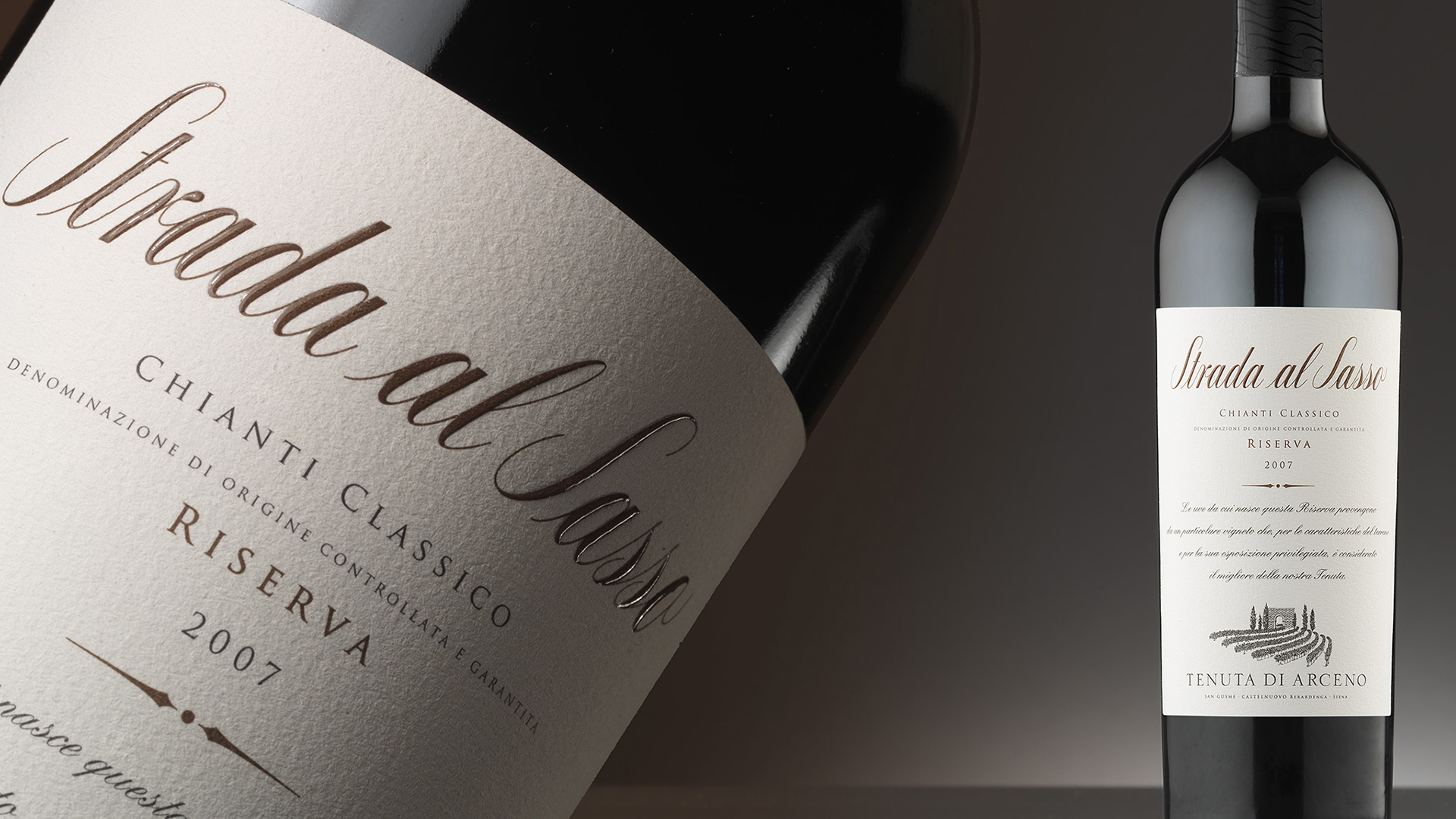
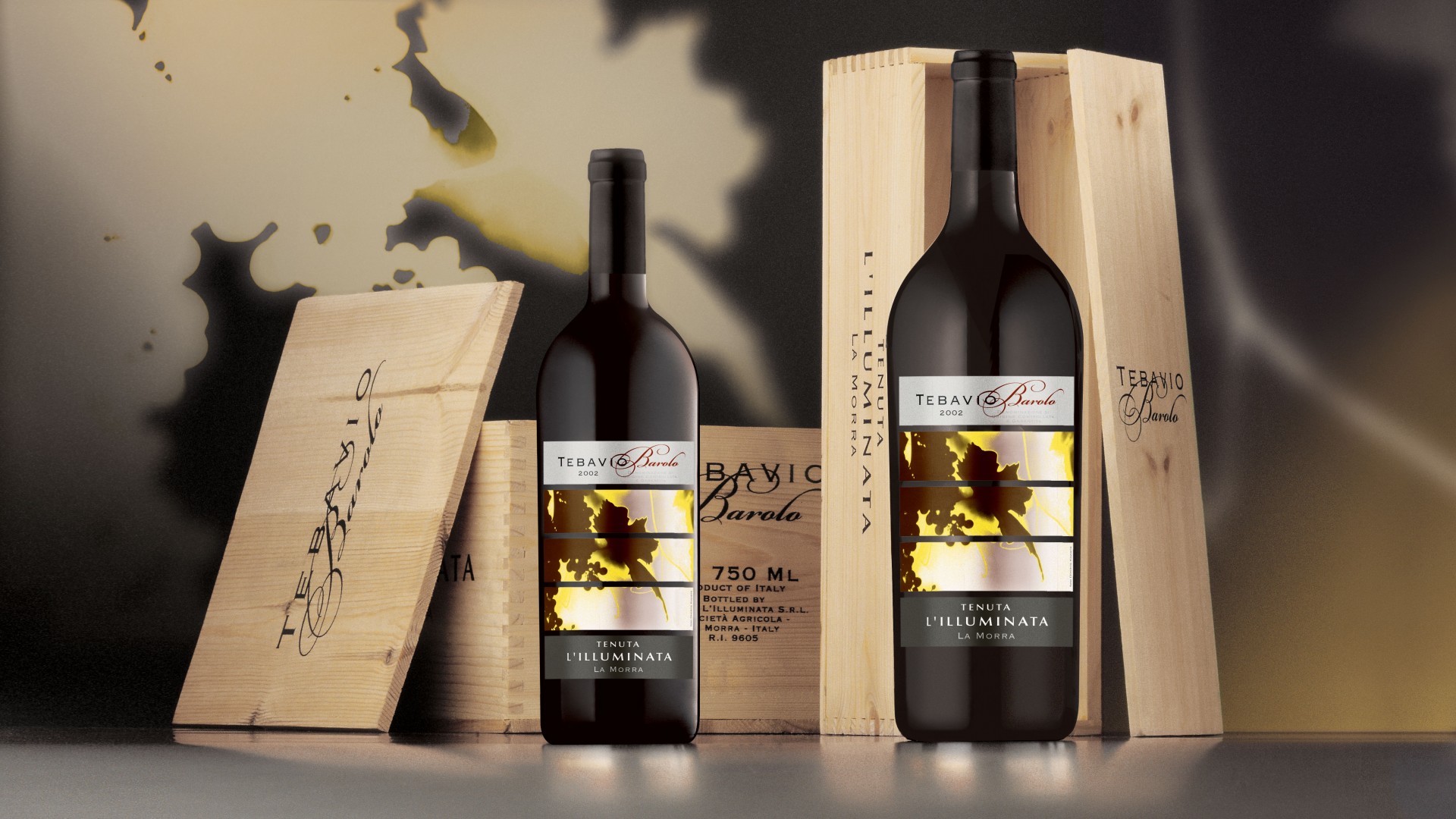
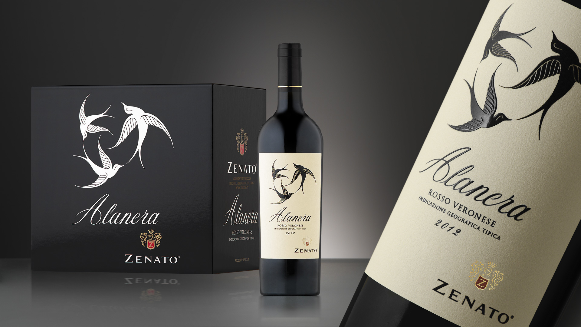
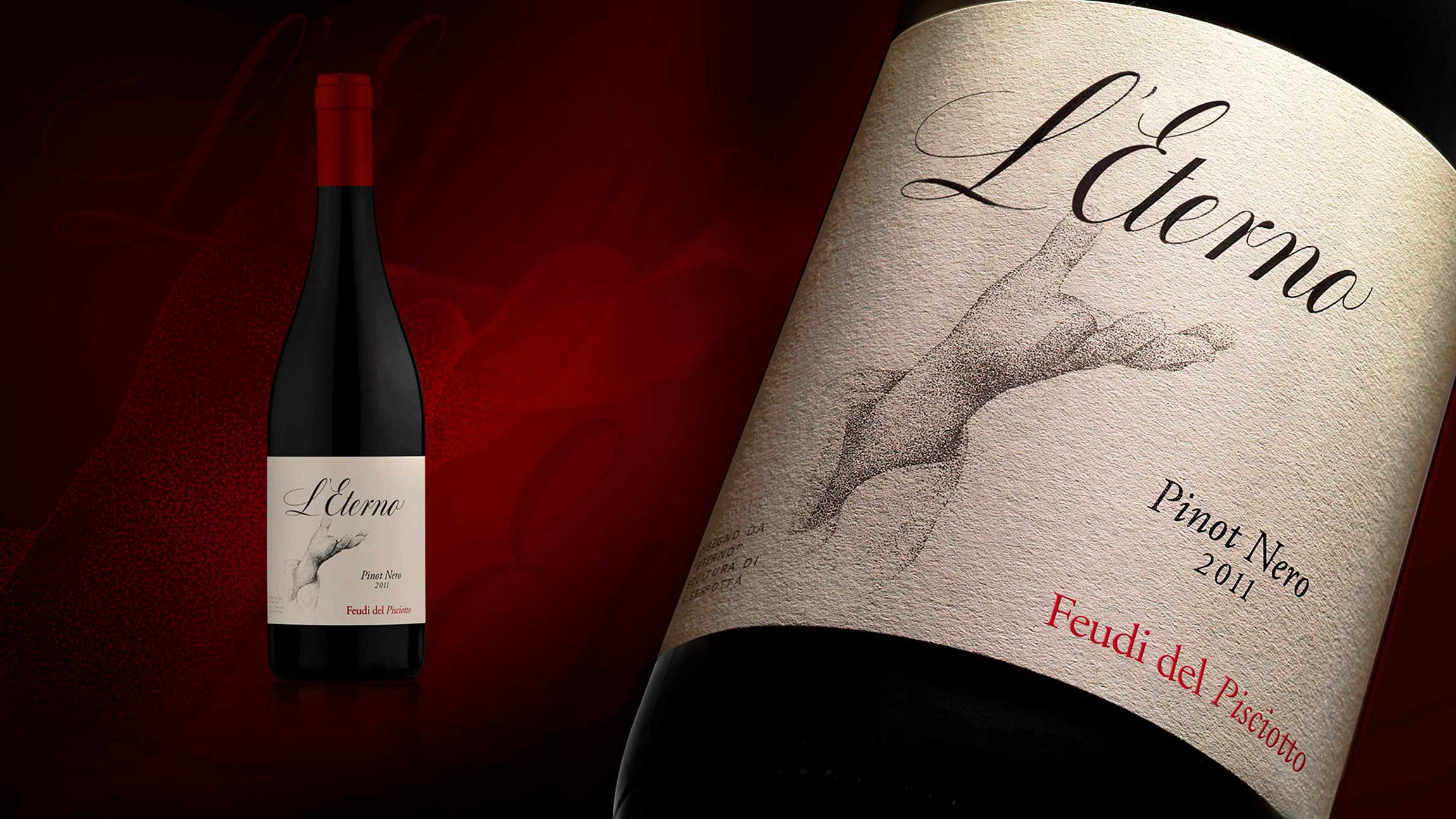
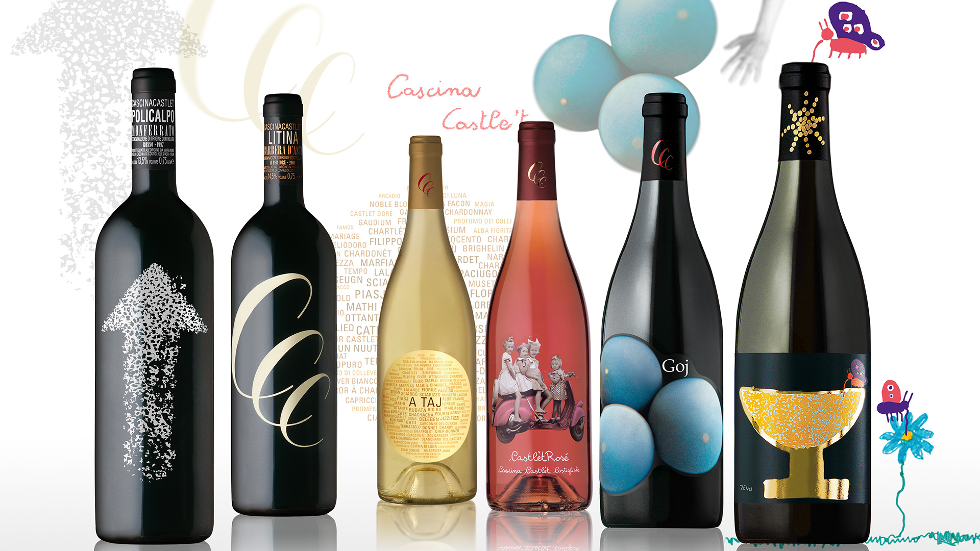
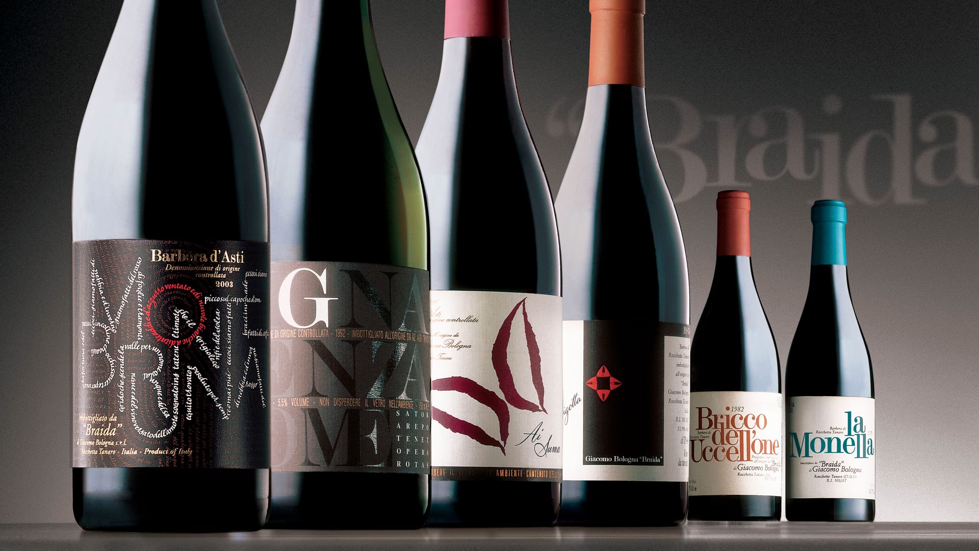
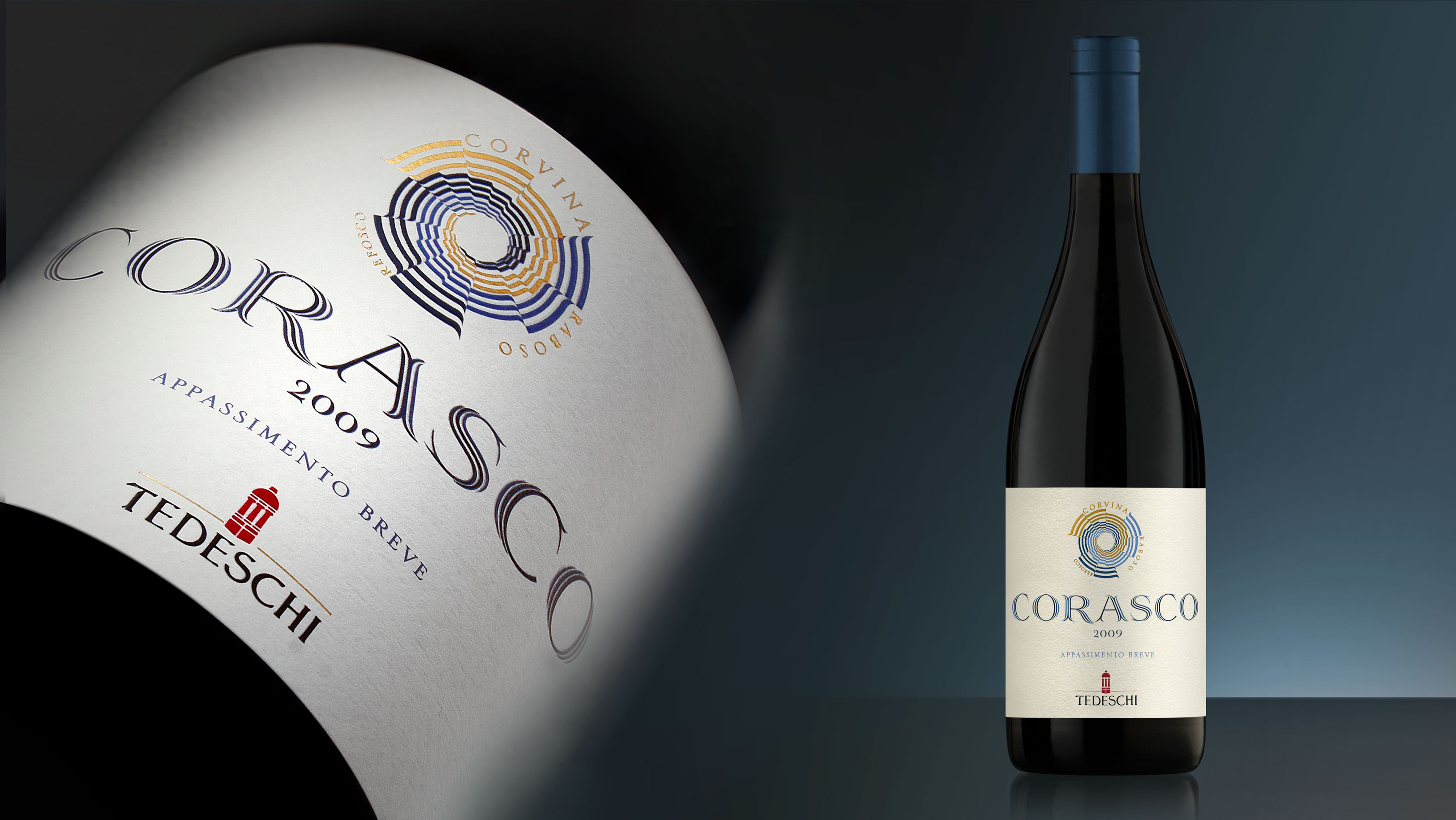
Activity: Packaging, Secondary Packaging, Restyling, Global Design
- L'architettura della cantina Identity, evoluzione dell'architettura
- Angelo Gaja, l'artigiano del vino Comunicare il vino secondo Angelo Gaja