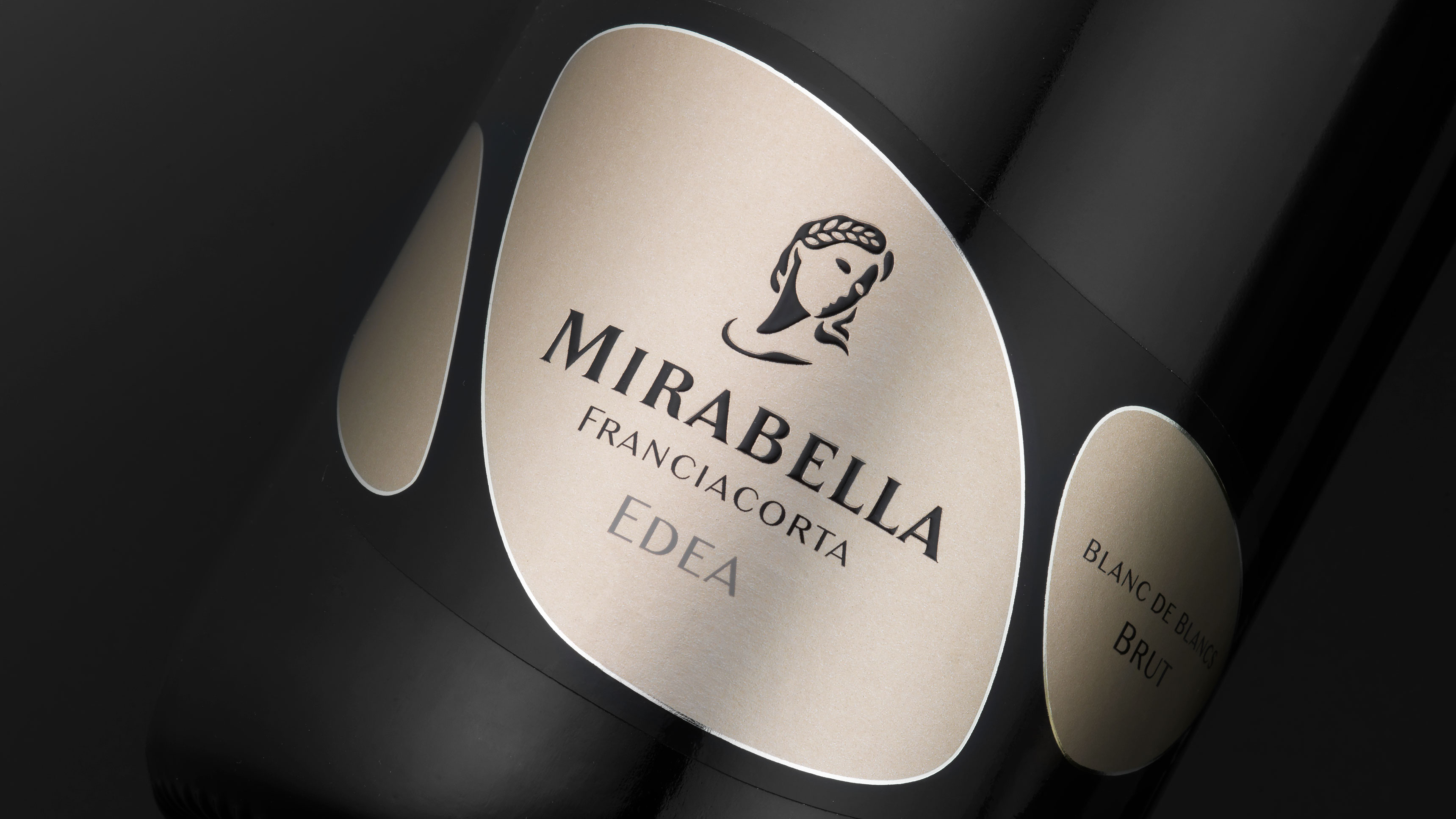
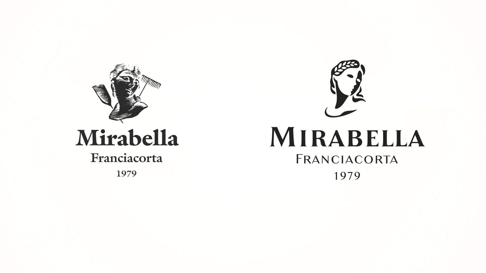
The project phase firstly led to the restyling of the Mirabella corporate symbol. The face of the goddess Demeter was redesigned, giving a more contemporary character to its reinterpretation. A new, more personal symbol whose three-dimensionality was determined by the positive-negative contrast of the two sides of the face, the graphical synthesis of which enabled the problems of reproducibility evident with the previous brand to be eliminated. The action on the brand also led to the redesign of the corporate name, stylistically harmonised with the figurative symbol with improved legibility.
Activity: Branding, Restyling
The new brand ensures attribution and continuity with the previous one and required the introduction of a radical change in the appearance of the products. The development of the brand was further broadened with the creation of an image handbook in which the codifying of the rules of application and the chromatic codes ensure its correct use over time. The creation of the corporate coordinates completed the definition phase of the primary instruments of corporate identity.