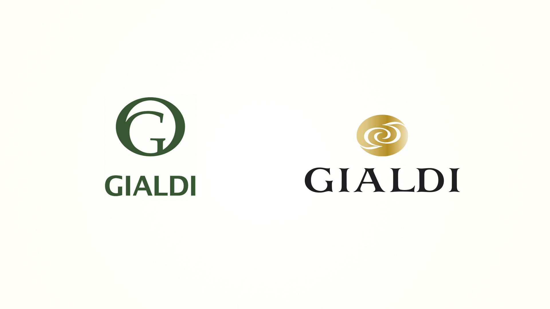
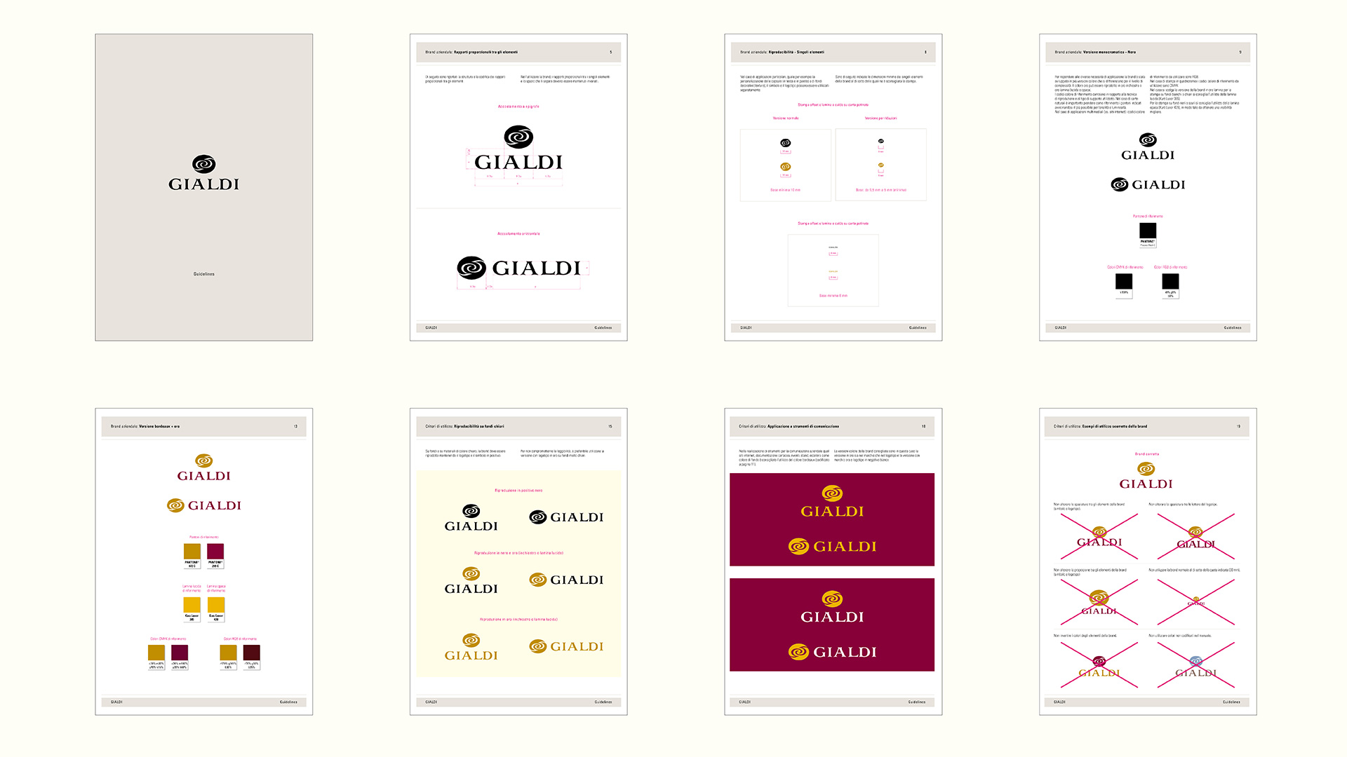
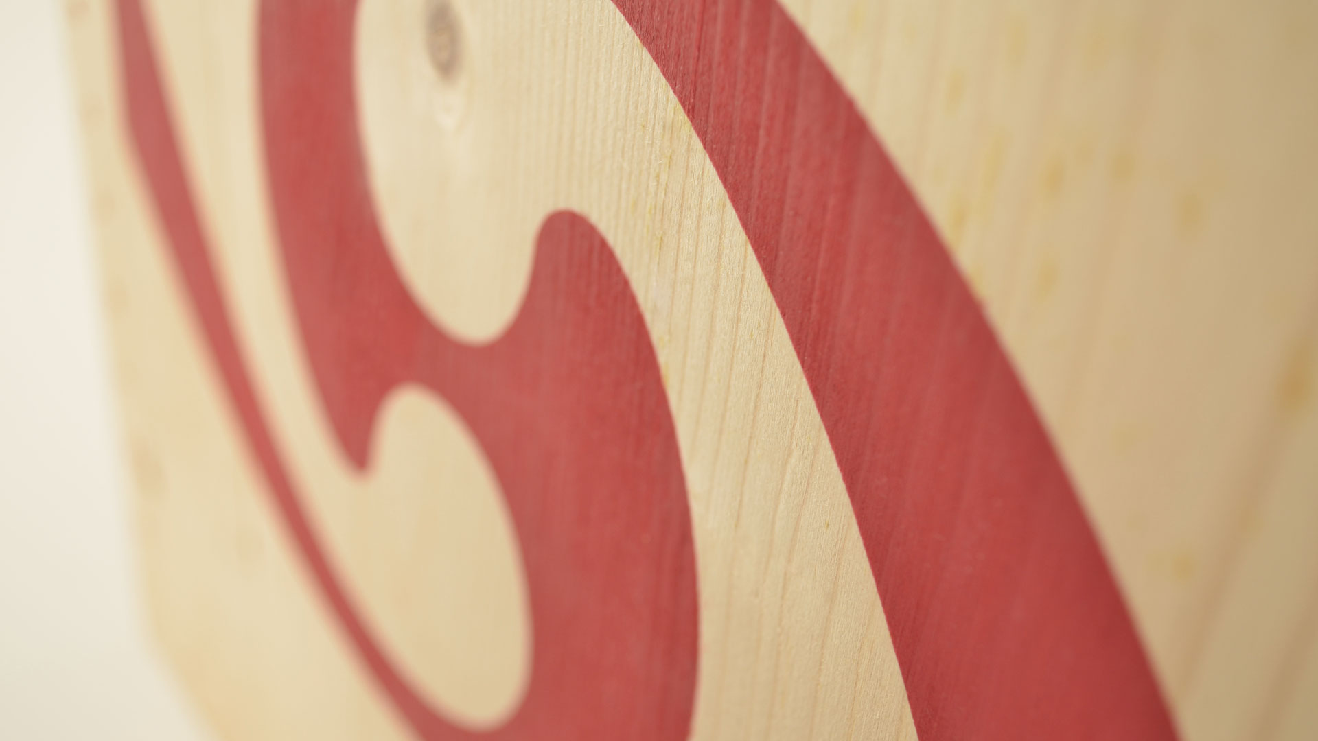
The process of renewing the Gialdi image involved restyling the brand that, given its plain personality, was no longer suitable for communicating the quality of the wines. The project introduced accurate guidelines for a more coherent use of the wine. The new symbol consists of a monogram developed around the initials of the founder Guglielmo Gialdi inserted in an elliptical form.
The spiral movement describes the evolution and the dynamicity of the company,which continually strives to reach new objectives. The mirror image of the initials represents the equilibrium of forces, synergic movement, and respect for the rhythms and laws of nature. The study of the logotype, the lettering of which was specially designed, helps to restore greater identity to the brand while improving the styling in relation to the compatibility between the symbol and the logotype.
Activity: Branding, Packaging, Secondary Packaging, Restyling, Global Design