For the buisness unit Campari Wines we developed projects for: Riccadonna, Sella&Mosca, Enrico Serafino, Cinzano, Teruzzi&Puthod.
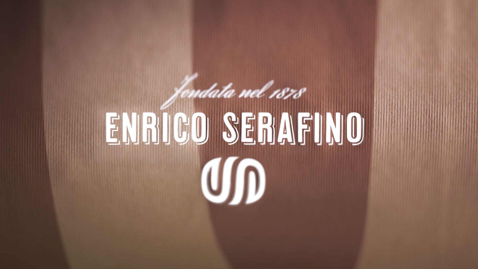
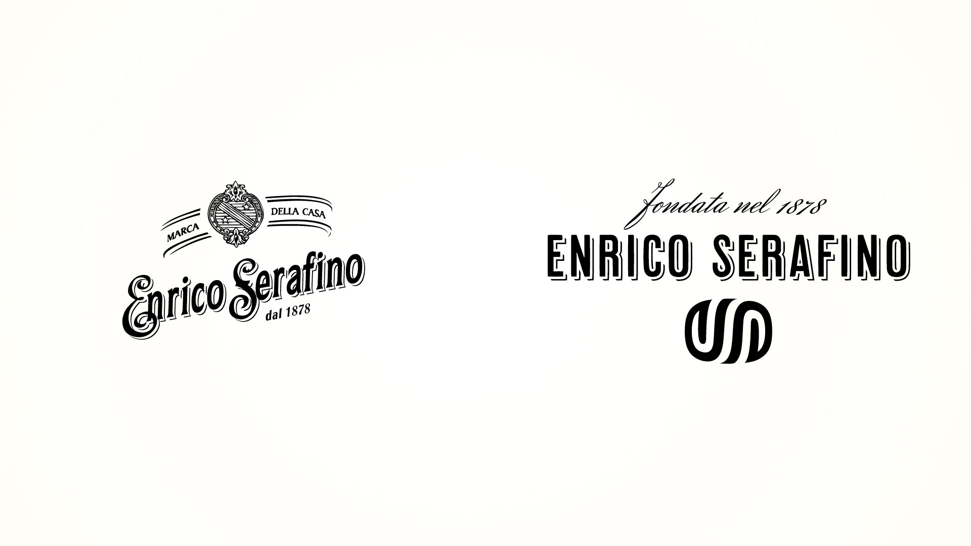
The project of requalifying the company image began with the precise objective of re-establishing the Enrico Serafino brand in a leading role in the territory.
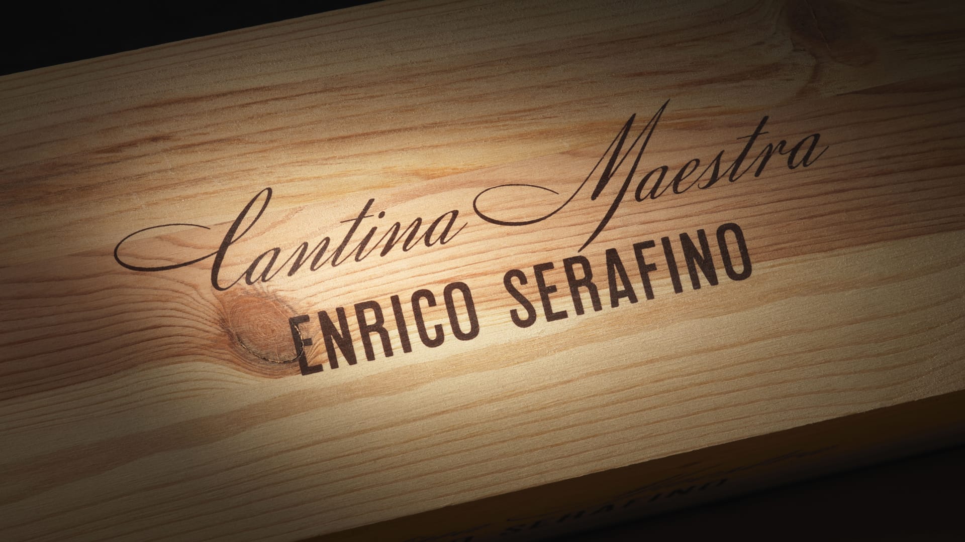
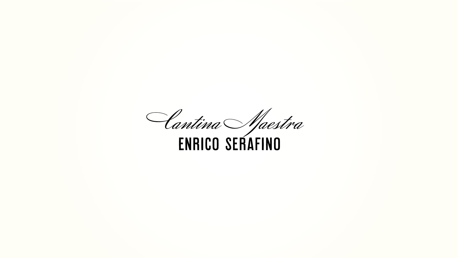
Alongside “Enrico Serafino”, the signature on the traditional products, a new brand has emerged, “Cantina Maestra Enrico Serafino”, with the aim of producing highly innovative wines.
Renewal of the brand began with the study of a new symbol that, while maintaining the links with tradition, imposes itself as a strong and memorable sign; a symbol whose form recalls the small oak barrels in which the wine is matured.
This reference gives the symbol the ability to suggest both the field in which the company operates (wine production), and the high quality of the brand. The characters chosen for the name and the subtitle have been retrieved from historic documents found in the archives of the company. The logotype was completed with the shadowing that gives the character elegance and three-dimensionality.
Activity: Branding, Packaging, Secondary Packaging, Restyling, Global Design e Naming