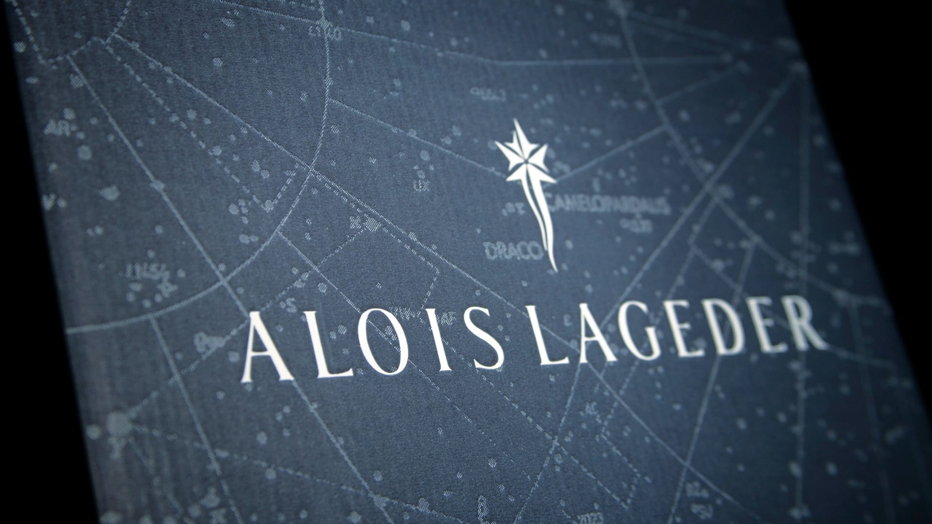
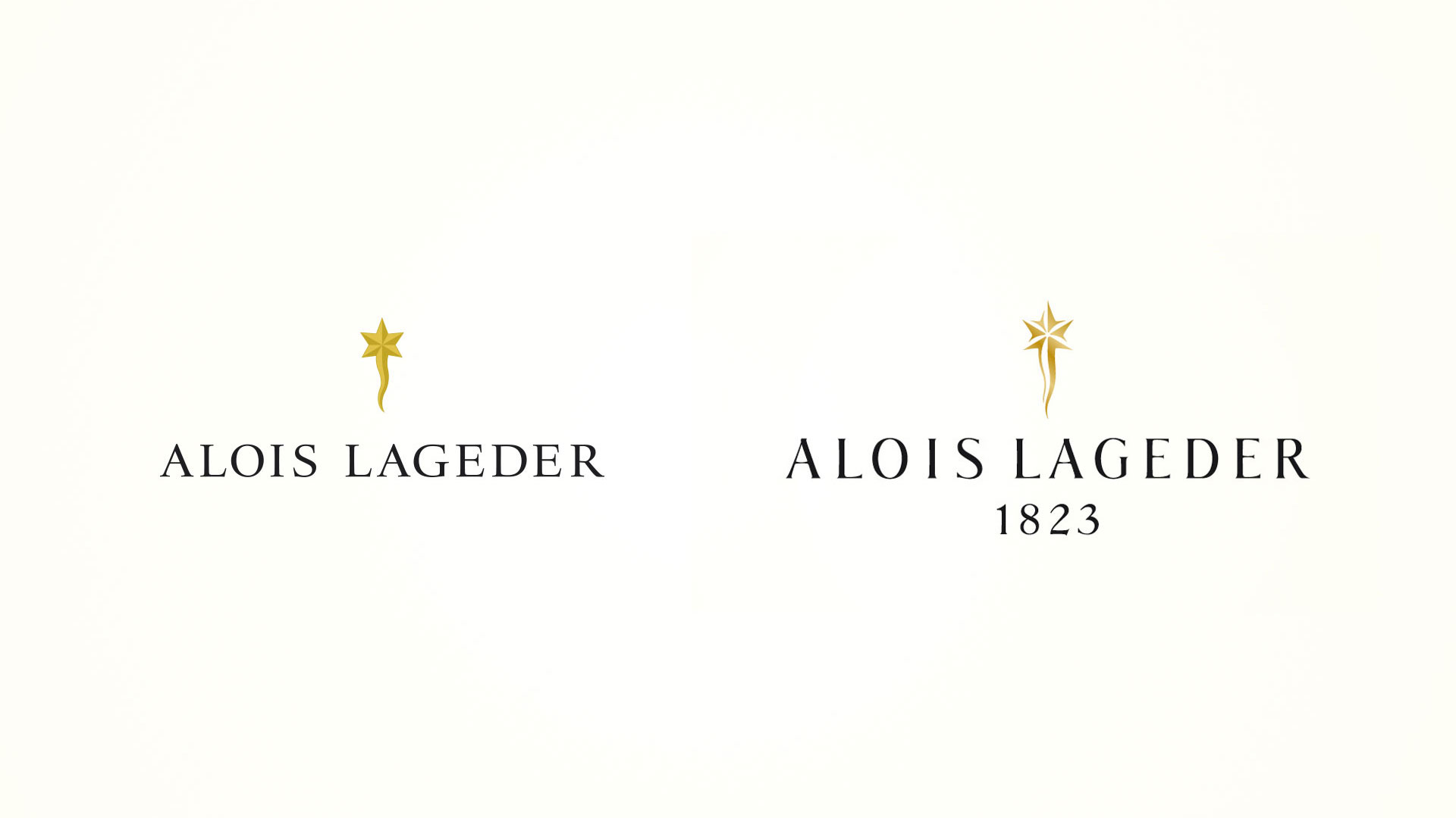
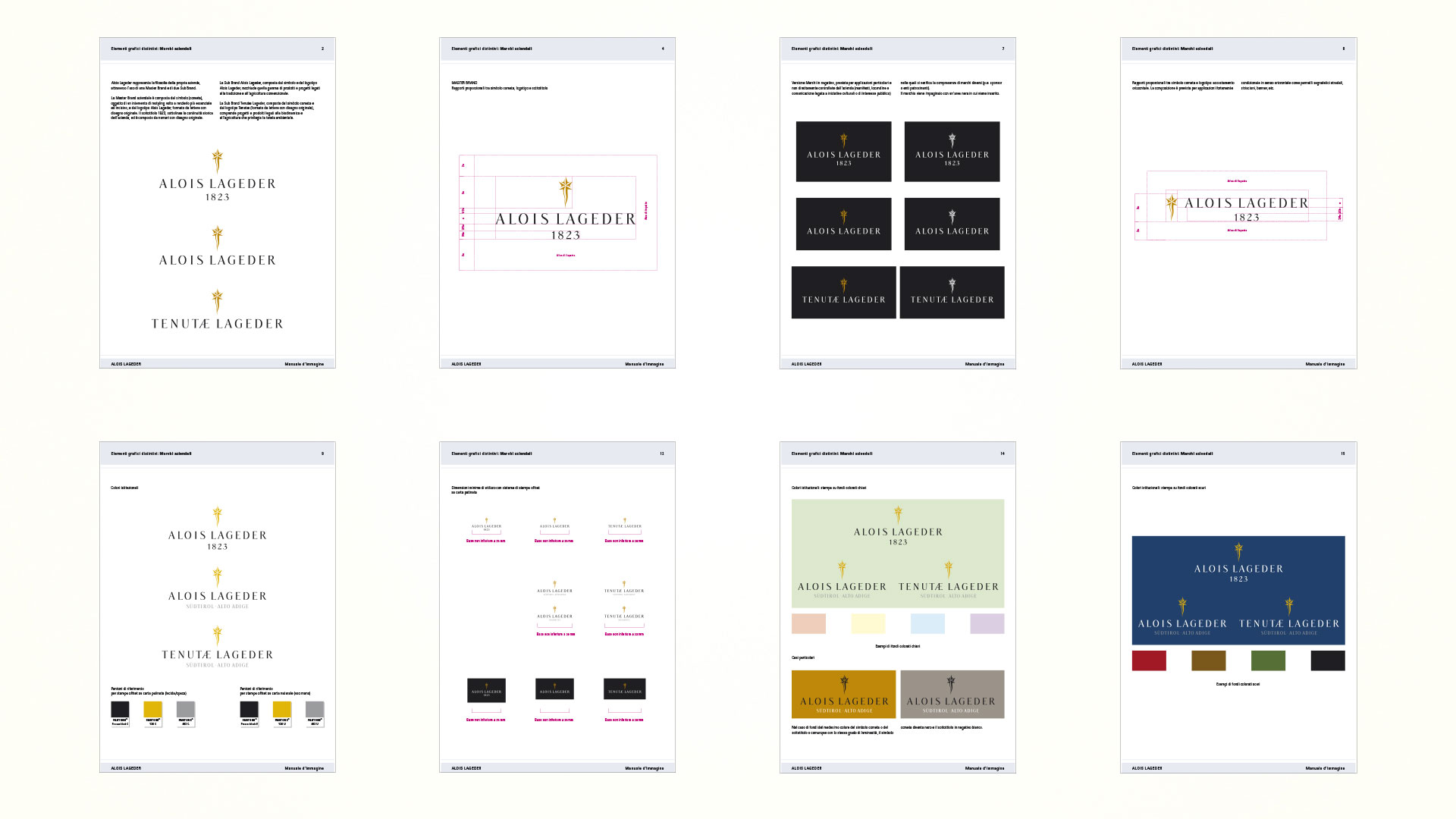
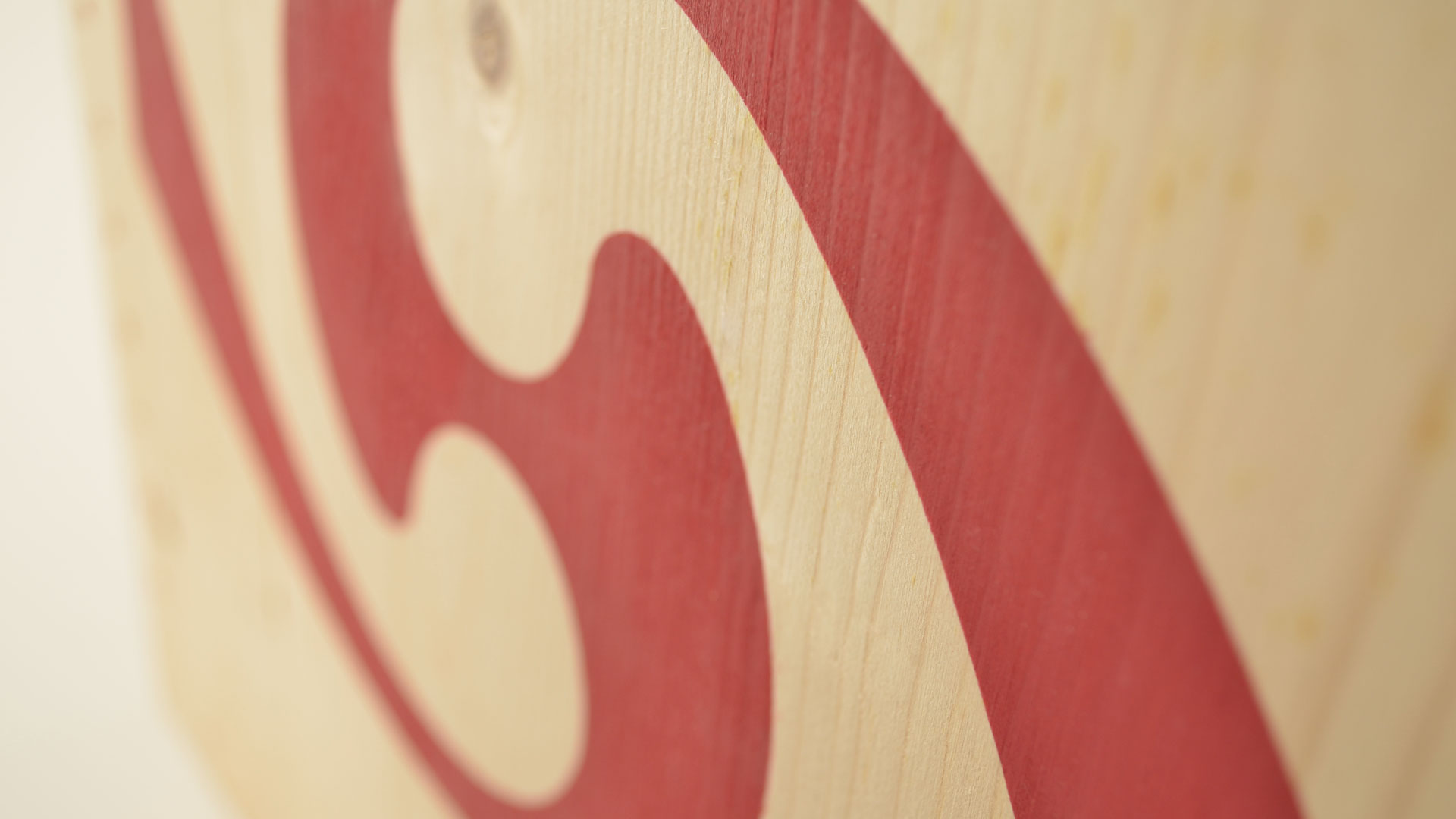
The shooting star, the historic brand image of this wine company, has been studied down to the minutest detail. The geometric character has been softened to make the expressiveness of the lines more organic and to make it immediately recognisable as part of the wine world. The definition of a font, Alois Lageder, integrates harmoniously with the intervention made on the brand and further accentuates the bond with the territory and the characteristics of austerity, simplicity, and purity of the products. The modular lines of both the lettering and the symbol give the overall brand added recognisability.
Activity: Branding, Packaging, Secondary Packaging, Restyling, Global Design


