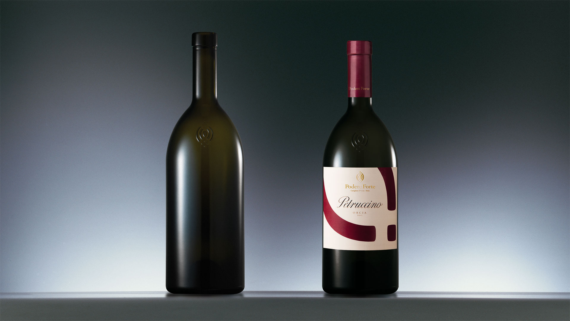
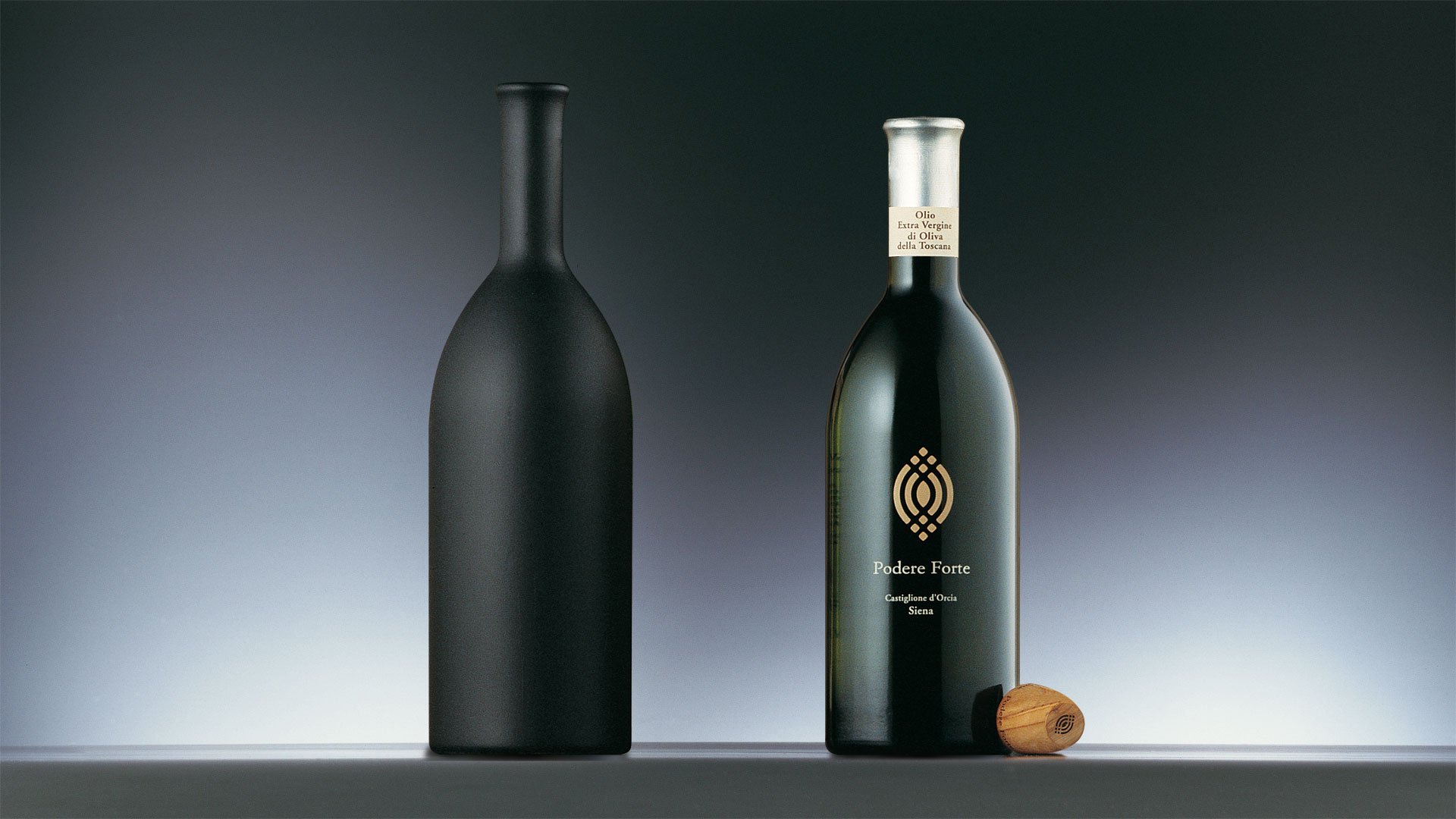
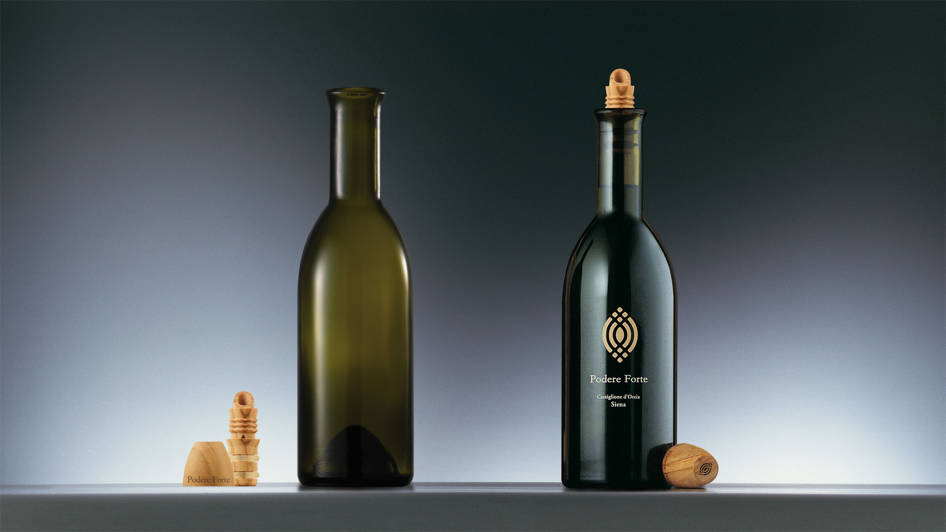
The project of the bottle for Podere Forte is based on the study of the Golden Section or section aurea, which in mathematics and figurative arts indicated the ratios on which the equilibrium in nature is based. From the geometric construction of these proportional rations comes the characteristic profile of the bottle, an element of strong recognisability able to produce an immediate sense that the various products come from a family-run business.
The project for the Podere Forte oil, in addition to the design of the bottle, involved the design of a pourer-cap made of olive wood, which conveys the naturalness and high quality of the product. The packaging of the honey products also featured a wooden cap, with a characteristic form that picks up the lines of the company symbol, and the proportions of the jar, lower than usual, underline the exclusiveness of the product.
Activity: Brand, Packaging, Secondary packaging, Bottle design, Global design e Naming