Print Buyer: communicating wine through design, culture and creativity.
The allure of a wine (also a champagne, a prosecco, or a whiskey) is not limited to the contents of the bottle, which, let’s be clear, is essential to the commercial success of the product, whether it be a low cost wine for the international market or a product with the prestigious family name of one of the great Italian wineries. Yet how it is presented is just as important as the contents: the bottle, the label, the cap and the packaging. Although producers are ever more concerned with pricing, whether for a bottle that costs 30 euros or one that costs 3, they know that they cannot neglect the corporate identity of the winery, the design and what is generally referred to as ‘communication’, which then merges with publicity.
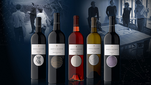
Original packaging for Alois Lageder
How has communication in the wine & spirits sector changed and how is it changing? What are the trends?
By now it is generally accepted that activities and messages must be coherent, just as the tools, whether traditional or innovative, must be interrelated and integrated”, says Giacomo Bersanetti, 57 years-old, leading the SGA Corporate & Packaging Design team in Bergamo. “History, territory, and productive methodology remain fundamental, but the way of expressing these values has become much more emotive and involving. We are seeing more and more opportunities to meet the producers who give us direct knowledge and experience.
How important is how one packages the product: from the bottle to the label?
Every wine has its own identity which translates into the value of uniqueness. The task of the packaging is to make this value visible and perceptible through a system of signs. It is the aesthetic value of the project that communicates the value and personality of the content.
Furthermore, in the wine sector, the packaging represents the main vehicle of the company image, and is therefore the most important element in the construction and transmission of the brand identity.
This goes for the bottle and the label, which often become the true symbol of a company.
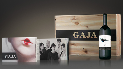
Packaging, secondary packaging and publishing for Gaja
What are the current trends regarding the shapes of bottles?
There are several trends developing simultaneously: bottles with generous proportions are drawing attention, contrary to in the past, and slender looking bottles are popular. For white and rosé wines, transparent bottles have seen a lot of success, and in general I see that producers are opting for clean shapes with minimalist geometric designs.
There are many bottle shapes to choose from, but room for experimentation is even greater. Generally, hollow industrial glass is used, while prestigious brand spirits opt for artisanal blown glass. Crystal is not used for bottles but it is used for accessories such as decanters and glasses.
What colours are most commonly chosen for bottles?
As I said, transparent bottles are popular at the moment, the classic dark green and oak colours are always in fashion, but many are choosing gold coloured glass now, which protects the wine from UV rays and also lets you ‘see’ it. Picking up a theme dear to those who bottle mineral water, blue is also becoming popular.
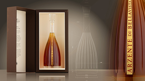
The original bottle for Arzente by Bellavista
And regarding labels, what choices are most requested by the market?
In this sector, creativity has really exploded. We use every possible new technique and for this reason we have a very close and precious relationship with the printing and embellishing companies with whom we work constantly, often inspired by their research into innovative solutions. For example, they have developed ways of printing the serigraphy of the labels directly onto the glass. In recent years, we have witnessed a move to self-adhesive labels, in place of the classic paper and glue. It doesn’t cost any less but it is more ductile in the phases of pre- and post-production. There’s also a trend in wines for exportation, from Italy to South Africa and Australia, to adapt wine and label towards a post-modern, informal and simple style. However this trend unfortunately is detrimental to the territorial recognisability of the product.
What kind of printing is preferred for labels?
Each printing technique has its own characteristics and produces a different result: bringing together serigraphy and flexo, offset and heat lamination, different materials for the support and different embellishing treatments, is a little bit like combining the voices and distinctive sounds of different musical instruments in a harmonic composition. The labels must respond to a sense of both freshness and vivacity, with research into new colours and surfaces thanks to the inks printed over the laminate or with embossing.
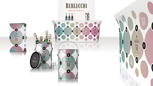
Packaging, secondary packaging and bar counter for Berlucchi ‘61
What are the vehicles that communicate the essence of the wine on the concept store and packaging levels?
The essence of the wine is a cultural and psychological factor, and for this reason we have always used elements that evoke and inspire sensations that resonate with our sensibilities. Think of the name “Saten” for example, which we conceived for the famous wine of Franciacorta, or of highly recognisable and memorable primary signs such as those of the labels of Ca’Marcanda or the bottle shape for Villa Sparina…
The study of the secondary packaging has become as important as the primary packaging project, and often constitutes an expansion of this; as has the branding of local events.
The packaging can be classic, with wooden crates, using, as we did for one large company, medium-density fibreboard, which reduces the costs, is distinctive, and kind to the environment: primary requisites for all modern companies. But, as well as metal, plastic materials are also used for the labels. I’m referring in particular to spumanti and champagne wines, which are served in ice buckets and therefore must be waterproof.
How important are references to environmental factors, from the wooden crate to the simplicity of the bottle and the role of recyclable glass?
It is ever more important; a number of recent projects have come out of the need to optimise the production of a container and ensure easier management of the materials during the various phases of production while, naturally, responding to the need to be distinctive, recognisable, and elegant.
How important is the printed material that accompanies wine products: brochures, catalogues, etc.?
This type of communication maintains a significant role, above all in relation to high level products (limited editions) and institutional communication, especially since it reaches those truly passionate about wine. Other than the content, these readers are struck and gratified by sensory elements, such as the colour and tactile characteristics of the paper or the richness of embellishment, and many other aesthetic solutions that cannot be perceived through a monitor or in online information.
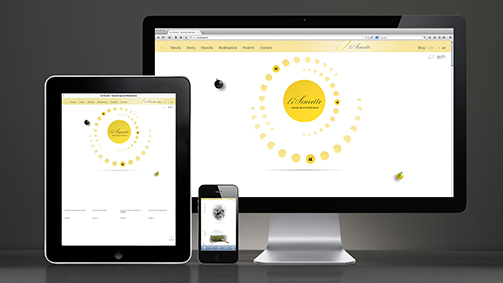
Web site for Le Sincette
The new digital communication tools, from social media to websites, are by now indispensable and have allowed us to expand our communicative scope and establish a direct dialogue with a greater number of people compared to printed communication. In both cases, the quality of the content remains decisive. It is not always possible to visit a company and get to know the products first-hand. Websites and social media adapt perfectly to allowing customers to get to know the products remotely, providing an increasingly complete experience.
