Gastronomy as culture: the debut of the first course of the Alta Scuola Veronelli.
A vision of oenology and gastronomy as cultural products; an approach to cuisine, to wine, to the vineyard and to tasting that favours methods of research, critical examination, the assignment of meaning and value: the inspiration given by Luigi Veronelli, an eminent personality who observed and supported Italian agri-food production and quality cuisine from the post-Second World War period until the early years of the new millennium, is more vibrant now than ever, and the Scuola dedicated to him intends to bring together and share his legacy through training.
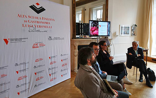
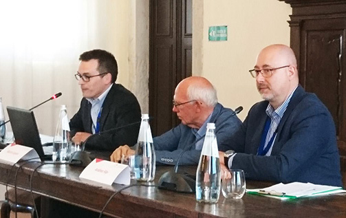
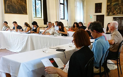
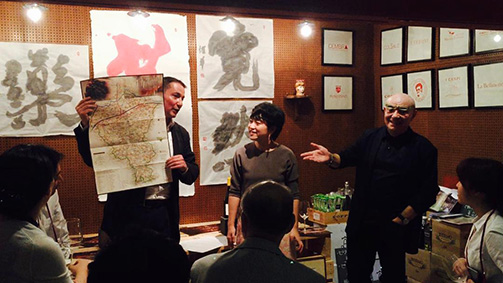
Today we are meeting Andrea Alpi, a member of the Scientific Committee and Educational Director of the Alta Scuola Italiana di Gastronomia Luigi Veronelli, gastronome, sommelier, Sensory Project Manager SISS (Italian Society of Sensorial Sciences); together with Andrea Bonini, director of the Seminario Permanente Luigi Veronelli and Coordinator of the Alta Scuola Veronelli. They will tell us about one of the latest initiatives promoted by the Seminario Veronelli, an association aimed at promoting the quality of Italian food products through the study and presentation of gastronomic culture. This is the first course launched by the Alta Scuola Veronelli, Walking through vineyards; places, people and culture of Italian wine, scheduled for the end of May at the Fondazione Giorgio Cini, on the island of San Giorgio Maggiore in Venice.
Taught over the period of one semester, until October 2019, it will examine Italian wine production, casting light both on the origin of a food system that includes cuisine and the gastronomic heritage, and the connections with the world of art and culture.
I asked Andrea Alpi, in detail, to whom the course is dedicated.
The Walking through vineyards course is dedicated to the owners and personnel of wine production companies, in particular those who work in marketing, communication and the sales sector; to operators in the quality food and wine trade; to the owners and staff of restaurants and wine bars; those involved in communications, such as journalists, bloggers and people employed in public relations; tourist guides and operators. Walking through vineyards is also aimed at university students on degree courses in wine production and oenology, food and catering sciences and technologies, tourism and cultural heritage sciences.
What are the prerequisites necessary to enrol on the course?
Applicants must have successfully completed an initial course in wine tasting, which is often provided by educational agencies such as the Associazione Italiana Sommelier and many others.
What skills will participants be able to acquire?
The skills that this course provides are linked to the six subject areas that make up the course: we cover highly operational skills, so specialisation with some of the major Italian tasters in the field of sensorial analysis, to skills of an economic order, since we will place specific focus on the wine markets. The wines of Italy and its territories will, of course, be at the centre: we will have a long exploration of the Italian wine districts. In addition, and this is one of the characterising elements, we have reserved as much as a third of the 180 hours of the course to matters or issues that would not be expected on a course dedicated to wine. Indeed, gastronomic culture will be a fundamental part of the course.
What subject areas will be explored during the traditional teacher-led lessons?
This is a course that has wine and the places of wine as the main focus. It will be more than an oenological journey through Italy; we will go walking though Italian vineyards virtually, but also physically, and so the oenological aspect will be the beating heart of the course. However, this will be accompanied by preparatory and in-depth aspects: tasting, knowing, which means also understanding what the territory is. Understanding the territory is a section that will be especially emphasised: from the location of the land to the composition of the soils but also the landscapes and everything that makes Italian wine a cultural aspect.
We have already talked about the areas understanding the territory and vineyards and wines of Italy; in addition to these, we will be covering the gastronomic culture, making use of the professionals and authorities on such matters within the Scientific Committee, starting, of course, with Alberto Capatti, who will also offer a digression on Italian cuisine, identifying the ten capitals that, due to their history and cultural and gastronomic importance, well represent the heritage of Italian cuisine. We will then place the focus on the communication of quality, that is, all those skills required to transfer the added value of these agri-food products to our interlocutors and a focus, already mentioned by Andrea, on the sensorial aspect and evaluation: we are not only talking about sensorial analysis, which will, of course, be an important factor of the training, but also all those skills that must be mastered in order to express a judgement in an accomplished way.
For completeness, I would like to ask Andrea Bonini to list in detail the subject areas that will be explored.
The first specialist course offered by the Alta Scuola Italiana di Gastronomia Luigi Veronelli has a study plan made up of the following subject areas: understanding the territory, vineyards and wines of Italy, gastronomic culture, Italian cuisine, communicating the quality, sensorial aspects and evaluation.
A teaching plan made up in this way fully reflects the multidisciplinary approach that the Alta Scuola wants to offer its students: indeed, we believe that the time of the hyper-specialists is over. Instead, it is necessary to succeed in coordinating different skills to restore the complexity and variety of the Italian wine production sector.
How much time will be given to tasting? Will there be experiential opportunities in the territory?
Tasting is a prerequisite but also a tool. It is a tool of exploration. In each of the 20 lessons that will be dedicated to the Italian wine-growing territories, an hour will be dedicated expressly to tasting, so on-the-spot tasting of wines selected on the basis of the territories explored but also based on the histories, the stories, the slant that the lecturers wish to give to their presentations.
Tasting will also be the subject of a specific course of sensorial analysis: the students’ senses will be developed and raised to a high level of awareness through on-the-spot tastings, not only of wine but also of essences, the actual aromas that can be the key to reading, for example, the main vines of Italy.
Is it possible to take the course without neglecting the professional activity or university studies?
The course has been put together precisely to meet the needs of people who study or work during the year. We have broken down the training into intensive weekends, around one a month during the semester; we then provide an opportunity of concentrated training in a single week in July, residential, as obviously the weekends will be, on the island of San Giorgio, at our base at the Fondazione Giorgio Cini. On that occasion, seven days of lessons will be offered, encounters with the wines, the producers, the experts and the lecturers.
We also have the option of combining the direct, traditional lessons with a part carried out as distance learning through the use of a dedicated platform specifically for this.
Who makes up the faculty?
For this first course, we have brought together a very large faculty, over 35 lecturers. More than the number, what is striking is the level of quality and the authoritativeness of those lecturers. We have oenologists and agronomists, university lecturers with a specific background in wine production and oenology; we also have figures from the world of culture in order to restore the multidisciplinary approach typical of the Alta Scuola Veronelli and this course.
What role does the Fondazione Giorgio Cini play in this project?
Fondazione Cini is the partner of Seminario Veronelli in this venture and its role is, of course, fundamental, especially for the marvellous location that it is making available, a former Benedictine convent on the island of San Giorgio Maggiore, overlooking the San Marco basin: it is a location that denotes our training activity in a significant way.
But it also has a fundamental role for the skills that it manages to mobilise. When we talk about cultural education, the Fondazione Cini is without doubt an authority and so will be fully involved in the promotion of the training actions.
Among other things, the personnel of the Fondazione Giorgio Cini will assist us and be part of the teaching body in the areas that concern, for example, wine, food and Italian art.
![]()
Is it still possible to register?
Registration is still open. On the website of Alta Scuola Veronelli, in the “training” section, it is possible to consult the details about the course, the methods of access, and express interest by compiling a brief written interview.
In what way is this course different from similar training activities?
The approach is what differentiates all the training services of the Alta Scuola Veronelli, the willingness to treat wine and agri-food products as part of a cultural heritage. We will make the maximum use of all the training stimuli available in order to train the students in an active way and involve them to the full.
We will cover the sensorial aspect, we will have on-the-spot examples, we will have a body of lecturers who will bring particular points of view: each one will discuss and describe the territories, the people and the wines with a personal, unique and unrepeatable slant, enriching the course with great fascination and great culture.
The authoritativeness of the lecturers is a distinctive factor of our training course compared to other possible services.
How would you summarise the philosophy that underpins the formulation of this training course?
A difficult question to which I immediately answer with a slogan: gastronomy as culture. Gastronomy cannot be separated from culture; culture enriches this vision, especially for those who want to fully learn it, communicate it and master it.
A prerequisite of the Alta Scuola is that of creating an alternative to gastronomy as entertainment, which seems to be the only dimension linked to food and wine in our historical period. We believe that the operators above all must acknowledge their role as active subjects from the cultural point of view and become promoters of a heritage that is immense and that we believe to be still undervalued.
Among the images: logo and coordinated image, invitations, brochures and site created by SGA.
Tag Cultural products, Gastronomy, Global design, Interview, Oenology
The new wine markets through the eyes of Luca Mazzoleni.
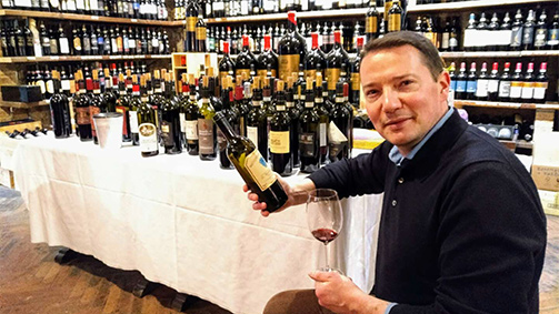
How can foreign consumers be won over more effectively? What are the most acknowledged virtues of Italian wines abroad? What communication approach should be adopted to respond appropriately to the evolution of the market? We put these and other crucial questions for those who operate (or intend to operate) on international markets to one of the leading experts in the sector in Italy, Luca Mazzoleni, selection consultant and salesman in the USA for many years and founder of UnoVino Wine Trading, a firm specialising in the brokerage of wine and food products to the main export destinations.
Born in Bergamo in 1975 and having gained familiarity with the world of wine through Luigi Veronelli Permanent Seminar courses, Luca Mazzoleni, after graduating with top marks in Modern History at Milan University, moved to New York for work and remained there from 2002 to 2008. During his six years in the USA with the importer Selected Estates of Europe Ltd, he worked first as procurements manager/selection consultant, and then as area manager and sales force trainer. At the end of 2008, his second USA work permit having expired, he returned to Italy and founded UnoVino Wine Trading, a sole proprietorship engaged in the brokerage of wine and food products to the main export markets. Today, he works with more than thirty companies in Italy and Burgundy, helping them export to North America, North Europe and Asia. In addition to the brokerage activity through his own firm, he previously occupied the position of sales director at two prestigious Italian wine production companies, the Gulfi company in Sicily and the Mazzolino Estate in Lombardy.
Based on your experience, what are the most acknowledged virtues of Italian wines among foreign consumers?
Firstly, the great heritage of native vines possessed by our country, from the north to the south, able to generate an eclectic, all-round wine production, which meets all market segments and tastes. Italian vines offer individual and unmistakable aromas and tastes, and generate a variety of types of wine, region by region, which is equal (if not superior) to the French. Our heritage of expertise in the study and classification of cultivated grape varieties is the main alternative to the organic system of French vines, which have gradually become established in the world to the point of becoming known as “international vines”. A reaction to the standardisation of international vines was already developing at the end of the nineteen nineties in the United States, summarised by the acronym ABC (anything but Chardonnay). Think of fragrant vines, for example, where Italy leads the world for quantity and quality of production: the family of Moscati, that of Malvasie, Brachetto, Traminer, Aleatico, Ruché, Lacrima di Morro d’Alba…these are wines with strong sensorial impact which are currently attracting new consumers in the Asian markets, for example. I remember one episode.. in 2012, I held a tasting of Italian wines at a major food import company in Hangzhou in China. At one point, a young taster among the public said: «I don’t drink wine but I like Moscato d’Asti, it tastes like grape juice».
Secondly, Italian wines are considered to be “wines for dining”, that is, wines particularly suitable for gastronomic combinations, including with exotic cuisines far from that of the Mediterranean. This is due to a very diversified range of aromas and tastes between one vine and another. Added to that, a medium level of acidity, fruity freshness and rather marked sapidity, able to counter the strong tastes of spicy or sweet-and-sour cuisine.
Finally, I think that the evocative power of the “Italy” brand in the imagination of non-European consumers should not be undervalued. Our country is one of the leading destinations for international tourism and nearly every great Italian DOC and DOCG carries with it the memory and image of a prestigious tourist destination, from the Florence of Chianti to the Venice of Prosecco.
Italian wines are appreciated abroad for their many qualities but they have to deal with strong competition. What would enable them to more effectively attract foreign consumers, for example, from overseas?
If, by overseas, we mean the North American market (United States and Canada) or Japan, that is the “mature” markets “worked” for years by our consortia and export managers, then it can be said that the procurement managers of the key accounts in the Ho.Re.Ca sector of the major cities currently possess good or excellent knowledge of our Italian DOC and DOCG wines. Some types of top-of-the-range, high price Italian wine, from Barolo to Pinot Grigio, are today mainstays in any good restaurant or wine store in the United States, Canada and Japan. This result was achieved through the combined work over decades of the consortia, Vinitaly/VeronaFiere, the ICE, the Wine Guides, the export managers of Italian wine companies and their importers and sales managers.
If I think of the early years of the millennium when I was living and working in New York, there were only two major events dedicated to Italian wine in the city, able to attract the cream of the professional operators and American journalists: the Tre Bicchieri Tasting organised by the Gambero Rosso in the old Puck Building in midtown Manhattan, and the Benvenuto Brunello Tasting, the annual presentation of the new vintages of Rosso and Brunello di Montalcino sponsored by the Consortium. Nowadays, there are very many tasting events dedicated to Italian wines in the United States and Canada, sometimes “touring” and held annually, sponsored by the consortia (at least the larger ones with the greatest financial resources) or by other subjects (think of the multi-city Slowfood roadshow and, again, Gambero Rosso).
On the other hand, the major Italian wine consortia organise incoming programmes in Italy reserved to the press and foreign operators, with a well-established schedule of stopovers across the peninsula: I am thinking of Grandi Langhe and Nebbiolo Prima, the Amarone Preview, the Tuscan Previews of Chianti Classico, Vino Nobile di Montepulciano and Brunello di Montalcino etc.
Finally, Italian (and even Italian-sounding) catering is widespread in the United States, Canada and Japan and inevitably carries out an action of promotion and popularisation of Italian wines.
If, by overseas, we mean China and South-East Asia, India, South America and the frontier markets of Africa, the Middle East and Central Asia… the situation is very different. Italian catering is not yet widespread and the combined work of communication and promotion of our wines conducted by the consortia or other subjects still has a long way to go.
If denominations or vines are proposed that are little known abroad, how should the communication be approached? In your opinion, is it a good strategy to emphasise their peculiarity or is relying above all on the wine-growing and territorial references a risky stance?
This question is vital and I have a rather firm position in this regard. I am convinced that the communication strategy for our native grapes should be based on their sensorial peculiarities and on the competitive and evocative factors of the territory of origin. I find it anachronistic today to try to make wines of an “international” nature with our regional vines, misrepresenting them and diluting their varietal identity.
Curiosity and open-mindedness are absolutely not lacking in the buyers of quality, both in the “mature” and in the “frontier” markets. In my career as a selection consultant and salesman in New York, I moved pallets and pallets of Grignolino, Freisa, Pelaverga, Uva di Troia, Susumaniello, Carricante, Perricone, Timorasso, Rossese, Moscato di Scanzo etc. and I still sell them today with great satisfaction ... both economic and professional! Note that I do not wish to argue that any Italian wine produced from native vines is, of itself, competitive and commercially viable: rustic wines, inconsistent over the years or without a marked character are always difficult on export markets, be they produced with Montepulciano or with Cabernet. But, for the type of clients that I work with, the values of the preservation of the native, the site-specificity of a vine linked to a unique and characterising terroir, the traditional processes in the cellar and, of course, the environmental sustainability of agricultural practices are crucial values.
We are no longer in the nineteen nineties of oenological “turbo modernism” and the deregulation of wine production, when the imperative was to make a “muscular” wine to earn a good rating from the usual four well-known journalists. It is as if a century had passed: the Internet, blogs and the natural wines movement have radically altered the expectations and the scale of values of all the high-end buyers, from Tokyo to San Francisco. None of the importers with whom I deal would ever buy an Etna Rosso or a Verdicchio di Matelica because I tell them that they have been awarded Tre Bicchieri or 94 points from Parker… only the sad monopolies of Canada still use awards and scores for the rankings of their tenders. When I receive press releases from advertising agencies that work with certain companies and I read about their new wines, I sometimes have the impression that our wine consultants have been left behind by the market. The confusion is understandable, there’s so much wine, perhaps too much wine on the market, in the last twenty years new companies and bottlers have sprung up like mushrooms. I remember my first Vinitaly in 1993 … there were maybe half the exhibitors compared to now.
That said, I must however add that the private initiative of a selection consultant or an importer is not enough to create market recognition for a native vine or a minor denomination. Communicating the typicality of a vine or a denomination can no longer be left to a single company because it would simply be lost in the ether. Effective communication should be done at the producer group level, whether dealing with a consortium (where one exists, is united and works well) or free associations of winemaker friends who share a project, a style and a vision of typicality. And this is a sore point for our winemaking sector, we know it, we are a country of individualists who find teamwork difficult, the splits in so many consortia and the short life of so many export associations bear witness to that.
Finally, the communication strategy for a native vine and its territory should be conceived and personalised depending on the foreign market which it is intended to break into and open up. Not all foreign markets are equally receptive for the Malvasia di Casorzo or for Frascati – let’s say. The first step is to investigate the tastes, cuisine, eating habits and wine consumption in the various foreign markets to which it is intended to export, in order to understand their minimum and maximum potential. And, to do this, what’s required is curiosity, the willingness to travel and perhaps the humility to listen to local professionals able to act as cultural and commercial mediators.
Originality and innovation in the packaging: in markets that often do not have our cultural paradigms, can breaking the rules and proposing unusual labels and formats be a winning formula or can it be counterproductive?
A very stimulating question! The ability to innovate in the graphics and advertising of the wine, even in a debunking and “pop” way, is a feature of the wines of the New World, which had to invent their own new and alternative market space with regard to the wines of the Old World, that is, France, Italy, Spain, Portugal, Germany etc. Many cellars in California, Chile, Australia, New Zealand and South Africa have rightly focused on the conceptual, the viral logo, the colour, imaginative names and sometimes on outright provocation, not having a tradition and an image established over centuries on which to rely. But the buyers in their twenties or thirties of New York, Shanghai and Singapore with whom I work, who live in ultramodern and multi-ethnic megalopolises and belong to the social network generation, when they think of the Old World they imagine ancient cellars immersed for centuries in a verdant and sleepy countryside, with vines cultivated by generations of the same family, loyal to their own traditions, in an agricultural world on a human scale where time passes more slowly. This may raise a smile but we are exotic for a Chinese person just as China seems exotic to our eyes. I mention China because respect for tradition and the devotion to their founding ancestors are two pillars of Confucianism, which is a kind of state religion for them. This also explains the pre-eminence of Bordeaux wines in China, thanks to the conservative policy of their advertising (have you ever seen a Bordeaux wine in a Burgundy-style bottle?) and labels, all similar and eternally constant: the little drawing of the old Chateau, the avenue through the vineyards, the low wall, the old coat-of-arms of the nobility. Our clients around the world do not see our labels as we see them.
Returning to the discussion about alternative forms of packaging, I always take my cue from my experience in China, which is a really fluid and unconventional market – one might think – that is, not hemmed in by our old world mindset and “Eurocentric” paradigms. It is a market that I know well and I have visited three/four times a year since 2010. If, by “unusual packaging”, we mean a container other than a glass bottle, then I would not be able to point to a success story or a “marketing case history” of any kind. The glass bottle reigns supreme, perhaps with flamboyant innovations like sleeves or unusual shapes, with cloth or shiny inserts, added gadgets or eccentric tops, but always the glass bottle. I have not seen alternative containers such as tins, plastic or tetrabricks, other than on airlines and trains, but that is very much a segment apart. On the other hand, there is the bag-in-box market, which is growing, as in North America and North Europe, and about which a separate discussion can be had.
As a touch of colour … I did once export prestigious old Marsala in ceramic bottles (very popular in China because Chinese rice wine is nearly always bottled in ceramic flasks), but that was an isolated case and a very particular product. So, in my personal experience, including in frontier markets far from the wine culture of the old world, the glass bottle still remains, in 2019, the widely dominant container for quality wines and also for those intended for the mass market.
While the classic 0.75 glass bottles continue to hold the greatest market share by value (72.5%), a recent Nielsen analysis found that, between 2016 and 2017 in the USA, in the major retail chains, the most significant growth value has been that of wine in cans (+59.5%). What do you think about these data? In your experience, can the adoption of an alternative wine package design be a key driver in purchases?
It is significant that the Nielsen survey you mention refers to the major retail chains. In the major retail chains, different rules apply compared to Ho.Re.Ca. segment and the behaviour of consumers is more uninhibited and impulsive, moreover wine is an article on sale among many others and appears less “solemn”, less framed in a traditional wine store image. I have dealt with the American major retail chains like Trader Joe’s or WholeFoods but always and only for wines in bottles.
The main alternative to glass is the bag-in-box, with constant growth also due to the motivation from a certain “ecological” image associated with this format (there is less waste of glass, stoppers, labels, caps), especially in Scandinavia and the rest of North Europe. In this regard, the most interesting phenomenon is that of the bag-in-box for medium range or premium wines and I could cite the case of a famous Langa company whose turnover is mostly based on the sales of good quality Barbera, Dolcetto, Nebbiolo etc. in bag-in-box, for the Norwegian market.
In the USA market, this trend is not yet fully accepted, bag-in-box wines are wines of daily consumption or house wines in restaurants and steakhouses. A typically American phenomenon is that of wines in large 1.5 litre bottles, known also as jug wines (demijohn wines): a diminishing phenomenon in Italy, also in the major retail chains I think, but one that continues in the States and is linked to the nature of the American territory, where the shopping is done in a four-wheel drive and the pick-up is loaded at the back of the wine stores. In my limited experience, I would say that bag-in-box is the main alternative format to glass, much more so than tins or tetrabricks.
How are Italian producers responding to the evolution of the market? Are they tending to stay loyal to glass or trying out new packaging formats in order to compete at the international level?
Trying out new formats and new packaging materials requires capital. If I look at the range of Italian companies with which I work today, only the cooperative cellars or large-scale private bottlers are equipped to handle a bag-in-box line or a Stelvin/Screwcap top. I can understand this, if the demand isn‘t there, if there isn‘t the critical mass to implement alternative packaging, it simply is not done. Producing wine is, of itself, already an activity that requires high liquidity and capital outlay, with medium-long or long-term returns on the initial investment… and most producers are always focused on the investments required in the vineyard and cellar, above all. I understand this, it’s natural.
On the other hand, excellent wines with excellent market potential can be penalised by labels that are inadequate to communicate the message that the wine contained inside brings with it (obvious to the producer but unknown to the operator and the consumer). It is true that the label offers a graphic representation but the specification and core values, the key values that the label must express can only come from the producer. While it is true that Michelangelo painted the Sistine chapel, it was Pope Julius II with his advisors who detailed the “specifications” for the fresco, what to depict and which saints, which prophets and which demons to insert in the various points of the ceiling…
Can an innovative, outside-the-box label influence the perception of a company’s value and reputation and, if so, how?
During my latest work trip to China, a couple of months ago, I saw Terminal 1 of the Pudong International Airport of Shanghai completely plastered with enormous advertising banners of the well-known brand of Champagne, Moët & Chandon, which was promoting, with an ultra-aggressive and “techno pop” graphic, their first Champagne for drinking with ice cubes in it… in white plastic beakers with the Moët & Chandon logo. Just look on Google for “Moët Ice Impérial”; it is both a Demi-Sec and Demi-Sec Rosé, offered in simple bottles with multicolour sleeves. Well …. If a luxury multinational like LVMH today can develop an advertising campaign of this type for one of the French brands with the longest history and greatest prestige, in spite of such a glorious attestation of quality as Champagne, in the premium bubbly section… everything is possible! What would we have said in Italy if one of our major sparkling wine companies had come out with a marketing campaign of this type? Yet none of our bloggers or journalists cried scandal when it came to a name like Moët & Chandon. This is an extreme case and maybe only Moët & Chandon can indulge in this type of shock marketing. I am sorry to sound a little conservative and old-fashioned, but frankly I have become resigned to observing many times that the good old labels of the sixties, seventies or eighties were much more iconic and recognisable than the later ones with sad, minimal and lightweight “conceptual” restyling.
From this point of view, our beloved-hated French cousins are showing that they have known how to do this much longer than us, and to be more aware of the competitive advantages: the tradition, the authenticity, the immutability of a family history. I cannot bring to mind any cases of top companies in Burgundy, Bordeaux, Alsace, the Rhône or Champagne that have radically changed their brand and labels from one day to the next. I would like to see a comparison between the average cost for graphic design and brand development of the average wine production company in France vs Italy... I know, Italy is the home of industrial design, we are all designers, passionate about art and individualistic in taste and style … but I worry every time that a producer tells me: “You know, I’m redoing the labels, they need to be freshened up, I will send them to you soon.” Boom! Firstly, on many markets, labels must be approved and a new label means a new approval: it is extra work for me and my importer. Secondly, I also make clear that, if one day I go to a supermarket to buy Barilla pasta and I no longer see the compact blue mark on the shelf that has always indicated the Barilla packages… it’s easier for me to buy another brand. Packaging that is consistent over time evokes in the consumer that family feeling or familiarity with the brand that the theoreticians of cognitive marketing indicate as a strategic objective to be attained. A lot of consumers are lazy and act with inertia, repetitively… Sometimes, it seems to me that certain producers feel the need to change the labels of their wines out of boredom or to be fashionable, like changing an old car for the latest model or one’s entire wardrobe based on the colour in vogue that autumn. The worst case is when the new graphic livery of the bottle, perhaps developed from a single graphic on which the producer has placed all the responsibility for “renewing the corporate image”, is absolutely anonymous, generically “contemporary” without being able to evoke the territory of origin. Or worse, it can happen that a new label is in clear contrast with the nature and sensorial profile of the wine it represents, and also with the core values embodied by the company. It can happen. Of course, these considerations are valid for denominations and companies with a long tradition behind them, and there are many in Italy. They do not apply to young companies and denominations of origin without an established image.
The best educated, most cultured and brilliant journalist in Italy talks about himself. Interview with Cesare Pillon.
In the preface to the “Manuale di Conversazione Vinicola” (Wine Conversation Manual), the editor-in-chief of the Corriere della Sera, Luciano Ferraro, described him as follows: “Pillon has been writing about wine since the 1970s and is the best educated, most cultured and brilliant journalist in Italy by far.” We interviewed him: he told us about his passion for gourmet food and wine, the origins of his career, the state of specialised journalism today.
Born in Turin in 1931 of parents from the Veneto, Cesare Pillon became a journalist at the age of 21: he began his career at the newspaper L’Unità, collaborating over the years with prestigious titles like the Corriere della Sera and Il Mondo. He covered crime, politics, economics, lifestyle and movie criticism. He has written many published works on the history of the Workers’ Movement.
From 1979 onwards, he focused on gourmet food and wine, penning numerous publications, and is the author of the historical-cultural entries in the Encyclopaedia of Wine published by Boroli; he took part in the Commission that made it possible for Christie’s to organise the first auction of Italian wines. He continues to write about wine and analyse the market in the daily Milano Finanza.
Cesare, you have stated: “I came into the world in 1931, one of the greatest vintages of the last century, especially for the reds. Clearly, wine was part of my genetic heritage, it was written in my stars.” After covering so many subjects for major newspapers, why did you decide to devote yourself to the world of wine?
Because I discovered that whoever makes a great wine, to whatever social class they belong, whatever their level of culture, they are never boring. You can make beautiful cars, for example, without having much of a personality but, to make a great wine, you have to be a great character. This is what fascinated me and made me decide that, as soon as possible, I would only concern myself with wine and gastronomy.
In your early career, up until the age of 48, you covered other subjects. Did this help you when it came to dealing with wine?
Absolutely, yes. Everything I covered, economics, health services failures… it all helped. There is no experience in my life that has not helped me, at the right moment, to better understand wine. My passion for chemistry as a youngster, my interest in history. The history of wine is one of the elements that attracted me the most. It’s part of the human story. You can’t understand human evolution without knowing how wine developed and the relationship between mankind and wine.
What was the work of a journalist like in the years you made your debut in the world of gourmet food and wine?
Newspapers were still composed with lead characters, they weren’t produced digitally. There was no Internet; the news did not come by teleprinters but still by fax. Interviews were done in person, not on the telephone or by sending questions and receiving answers by email. In short, the work was done in a much more direct way. More difficult, more complicated, longer, more effort. But certainly healthier.
What encounters were fundamental for your professional training?
A really important meeting was with Luigi Veronelli. I wrote about is some years ago, telling how it came about and why it changed my life.
I got to know him because I had to ask him to do an article on wine for Il Mondo; he couldn’t because he had an exclusive contract with Mondadori but he gave me all the help he could. Once published, he encouraged me, my publisher, Paolo Panerai, and all the winemakers he knew to help me continue on the path of gourmet food and wine.
When I met Gino, it was as if I had known him for years: I had always read everything he had written. I never managed to compile a proper archive of my publications, but I did with what he wrote. All his columns in Panorama, glued on strips of cardboard and properly listed. Seeing him in person seemed to me simply to be deepening an old acquaintance.
What did the opportunity to take part in creating the Encyclopaedia of Wine mean to you?
After 25, perhaps 30 years from my debut in the field of wine, it was an opportunity to take stock of all this experience. I realised at that moment that, by a stroke of luck, I had witnessed the renaissance of Italian wine because I had begun in the years when it had reached rock bottom. From that point, the only way was up. So it was, and here I am.
Is there some episode in your career that holds a special memory?
I remember very clearly one episode right at the start of my career in gourmet food and wine. I was making a survey of Montalcino when I met Count Costanti: he had all the traits that some years earlier I would have detested. He was a nobleman, an aristocrat, he had been a local party chief during the fascist period… And yet we got on so well I finally realised: labels are worthless, men must be judged as individuals. From that moment, I began to fight against intolerance. I had never been intolerant, but from then on I was certain that intolerance is truly the worst feeling that a man can have.
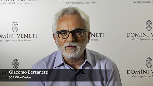
Cesare Pillon with Giacomo Bersanetti
You have written for many newspapers and publishing houses. How do you think the relationship between the press and journalism and the world of wine has changed and at what point do you think it is today?
I am very worried because there are symptoms of an attitude that is no longer healthy, no longer right, no longer tolerable. The truth is that there has been a democratisation, if you like, of the world of wine. The Internet now makes it possible for small companies to communicate directly with journalists; generally, they do it through public relations companies, which have multiplied out of all proportion.
Once, press releases were issued for really important event; they were sent by teleprinter or by post to specialist journalists, imposing an embargo in order not to disadvantage the last person to receive it. It was a complicated, long and costly business.
The Internet has made everything easy, and now I receive everything, including press releases asking for the publication of insignificant news in a questionable, if not offensive way. I find this deterioration very unpleasant.
At the end of the 1970s, when you began to cover gastronomy and oenology, these subjects were not “mainstream” as they are today. Do you think their wider dissemination is an advantage for the sector or do you think it is a case of overexposure? What does all this mean?
It is very true that there is overexposure. I had the good fortune to collaborate with newspapers edited by Panerai who was very sensitive to this issue and encouraged the publication of articles on wine at a time when this was very unusual.
But now, it’s all become too much. Everything comes down to the tasting: in 80 per cent of cases, communication focuses only on that.
I have always tried to tell the stories of the men of wine, the men who make the wine. I am convinced that the fundamental factor for great wines is the Cru, the selected vineyard, but the man who cultivates it is crucial. In my work as a journalist, and not only in the field of wine and food, I have always been convinced no one gets enthusiastic only about ideas. What interests them are stories about men. It is through the stories of men that ideas catch on. This is well understood by today’s populists, who deliberately use fear to get support for their ambitions.
How has the link between the world of wine and the world of finance changed since you wrote the first edition of the wine guide for executives in 1979?
We had drawn up this publication for a section of the economic weekly Il Mondo entitled “Personal Affairs” because it was intended for those managers, business people and readers who were personally interested in the subject.
Now everything has changed: there have been cases of wines sold en primeur, there are wine investment funds and, above all, there is interest now in investing in wine and therefore in auctions. I must say, however, that so far I am still the only Italian journalist who continuously reports on the auctions in Milano Finanza.
You have been a member of the Journalists’ Association for more than 50 years. Over this period of time, the profession of journalism has changed radically. What challenges do journalists in the sector face today?
Today’s journalists face major problems posed by the Internet, which is taking all the advertising. The successful outlets are the ones provided free to users via the Internet, but they are the slaves of advertising. This is not healthy.
The challenge that today’s journalists must overcome (and I don’t envy them) is not simple because, in reality, the phenomenon, like all human phenomena, has two sides: one is very positive, the democratisation of communication, the fact that everyone can take part. But there’s a negative side. And I must say that journalists are perhaps those with most to fear. The fact that copyright is not recognised (the attempt to ensure payment has already provoked a reaction from Trump, who argues that it is an attack on the very foundations of the United States) is really worrying.
Has the language of gourmet food and wine criticism in Italy changed over the years? In what way?
Yes, it has changed: the fact that everyone can take part has certainly lowered the level. We are a long way from the days when Gino Veronelli was involved, a man of boundless culture, or Mario Soldati, characters who wrote the most important literary works on wine. Currently, it has certainly all been dumbed down. But I think this is a transitory phenomenon. Any form of democratisation begins with a lowering of the general level before rising again.
Every year, you compare the scores of the main Italian guides, yet you say you “have never given ‘votes’ to wines”, and in the past you have expressed your agreement with Gualtiero Marchesi, when he disputed the “claim of giving an objective opinion expressed on the basis of personal taste”. What is your position on the scores given by the gourmet food and wine guides?
The gastronomic guides are not currently thriving, they are definitely in decline. They are no longer the consumer’s Bible and this, I must say, is a positive aspect of the advent of the Internet.
With regard to the question of the scores: I have tried to humanise them, comparing the scores of all the guides in order to obtain a collective consensus on one wine rather than another. But I have always considered giving scores to a wine a little arbitrary. A wine is appreciated for the emotions it can convey. And the emotions vary depending on the time, depending on who is tasting it, depending on what they are used to. It is too personal, in short. Certainly, there are great wines of indisputable importance for everyone, for whoever loves wine, and wines that are less important. But it is a long stretch to say that this one is worth 99 and this one is worth 97.5.
Carla & Cesare Pillon.
When you approach a wine, what are you looking for, what do you hope to find?
New emotions and unusual personalities are what strike me. The world of wine is very rich in this regard: truly extraordinary people, friendships that spring up around a bottle. It is difficult to establish such an intense relationship with a teetotaller.
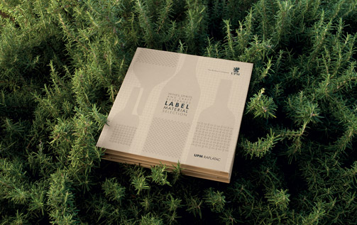
Design of new catalogue for UPM Raflatac’s self-adhesive labels
UPM Raflatac is one of the world leaders among self-adhesive label manufacturers. It supplies high-quality paper and film both for consumer and industrial products through a global organisation made up of factories, distribution terminals and a widespread network of sales offices employing around 3,000 people.
The production of a new catalogue for self-adhesive labels used for beverages - considered a crucial segment for the company’s growth targets - led UPM Raflatac to strictly focus on certain objectives:
- to raise and consolidate the perception of the company’s reputation to bring it into line with the objective quality in terms of aesthetics and technology represented by the materials in the portfolio;
- to demonstrate, especially in the target format of drinks’ producers, designers and printers, that UPM Raflatac is completely aware of and able to respond to all their needs and expectations;
- to convey its identity and its values, based on the utmost concern for the environment, production sustainability and a high level of technical expertise.
These are well-defined, complex objectives that needed to be conveyed through authentic, innovative content; creative solutions were required both to excite and stimulate the curiosity and imagination of the interlocutors and to demonstrate the potential of each label selected, for the purpose of reinforcing the perception of reliability and versatility through high-profile performance.
All the decisions connected to the design of the new catalogue, both the part dedicated to the assortment and the visual book, had to be in line with the corporate philosophy, its values and production methods and so our responses were drawn from observations of the extraordinary, boundless beauty of Nature.
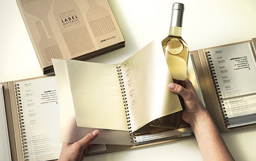
The new UPM Raflatac catalogue was designed to be very practical and easy to consult; when looking for a label, the whole range must be available at the same time and “on first sight”. Just this simple aspect can enable the catalogue of one label stock manufacturer to stand out compared to another.
The samples as ‘listed’ in two directions: horizontal (for instant identification) and vertical (to enable selection by touch and sight).
The labels were carefully selected to meet current and future trends in the beverage sector in the various forms, ranging from artisan drinks to spirits (cognac, vodka, whisky) through to soft drinks, beers, wines (whites and reds) and, of course, sparkling wines. Alongside the assortment, only the essential information was included to enable the features of each label to be recognised instantly.
The catalogue’s structure was devised to optimise the use of material and display the company’s great concern for the environment; unlike most catalogues of the sector – and others – plastic was not used but, instead, a material that conveys a sense of naturalness and warmth right from the first contact and, at the same time, possesses resistance, in view of the frequent use by the operators.
The self-adhesive labels offered in the catalogue’s four sections are the real protagonists of this new work instrument and that’s why we avoided needless enhancements.
The real ‘meeting’ between a group of 18 different labels – selected depending on the corresponding beverage type – and design creativity comes in the visual book, the catalogue’s fifth section.
The design of this section started with an examination of the performance of each label, arising from the close dialogue with UPM’s technicians and experts. In the second phase, 18 samples were chosen, for which an intervention was needed to enable the intrinsic features of each material to be highlighted.
This had to be done in a way consistent with the codes and languages of each market segment and in an especially distinctive way: specific concepts were identified for each project – all inspired by Nature – that were pertinent and innovative, creative and incisive, surprising and memorable at the same time.
Content and a harmonious and linear direction of reading were required, which could be defined as holistic: from the type of drink to the label identified as most suitable, from the name assigned to the product to the creative visual which, for each label, is never generic but always significant.
In all phases, from design to actual production, the dialogue with UPM’s managers (Italian and international) was constant, as it was with the company (MCC Lucca and Prato) that printed and produced the catalogue; only the close, continuous exchange and discussion of every detail enabled its optimal production.
The new positioning of Mirabella through a global design strategy project
Strategy /Brand value building
In an increasingly competitive context like the world of wine production, the strategic management of the brand is seen by some producers as a primary requirement. The identification of the positioning, therefore the value-bearing system, the mission, the key target and the content of the storytelling are fundamental and determinant steps in defining a consistent and effective strategy for obtaining positive, long-lasting results. For the Mirabella project, the analysis phase was crucial: with Claudio Castellaro (Creative Business), it was possible to explore, based on a methodological approach perfected through numerous shared projects, the various aspects that contribute to determining the personality of this specific corporate organisation; in particular, its potential in terms of brand value building through marketing guidelines aimed at the consistent development of all the communication instruments required for its relaunch.
Currently, priority actions have been carried out but the strategic guidelines prefigure a more extended and complex course that will be carried out in the medium period.
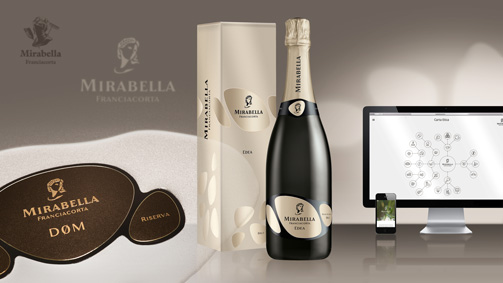
Branding
The project phase firstly led to the restyling of the Mirabella corporate symbol. The face of the goddess Demeter was redesigned, giving a more contemporary character to its reinterpretation. A new, more personal symbol whose three-dimensionality was determined by the positive-negative contrast of the two sides of the face, the graphical synthesis of which enabled the problems of reproducibility evident with the previous brand to be eliminated. The action on the brand also led to the redesign of the corporate name, stylistically harmonised with the figurative symbol with improved legibility.
The new brand ensures attribution and continuity with the previous one and required the introduction of a radical change in the appearance of the products.
The development of the brand was further broadened with the creation of an image handbook in which the codifying of the rules of application and the chromatic codes ensure its correct use over time. The creation of the corporate coordinates completed the definition phase of the primary instruments of corporate identity.
Naming
An important element that determines the identity of a product, especially a wine, is its name. But creating a new name, consistent with the image of a cellar that is not already in use is today truly one of the hardest tasks. “Edea” was created with the intention of affirming, in a simple and easily memorised way, the character of this Franciacorta, the wine that constitutes the core business of the cellar and that distinguishes it, since the fining on the lees lasts for more than 30 months, while 18 would be sufficient under the regulations for making a Franciacorta.
Packaging
In relating to the new positioning of Mirabella, oriented towards innovation and to the main key target identified, the Millennials, the appearance of the products was designed with the precise aim of conveying the values associated with the brand, such as naturalness and innovative capacity.
The three forms that make up the label are a precise reference to the stones in the territory of Franciacorta, the natural forms of rocks smoothed by water, an element of particular importance for this company, since the underground cellar is surrounded by groundwater that maintains its temperature and humidity always constant.
The three ‘stones’ which, by varying in composition and colour, characterise the various wines, can also refer to Teresio, Mirabella’s founder, and his two children, Alessandro and Alberto, respectively the company’s cellar master and marketing director. Three wine experts whose different skills and attitudes contribute to the creation of these Franciacorta with a unique personality. The simple graphical language and the strict minimalism convey the particular attention that the company pays to aspects regarding the naturalness of their wines, a firm commitment that led this cellar to produce the first Franciacorta free of sulphites.
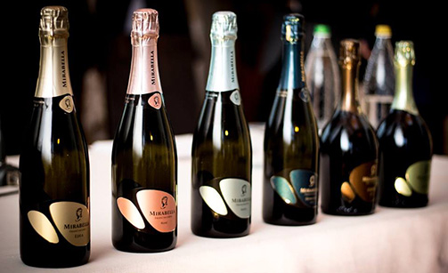
Secondary packaging
The enhancement of a sparkling product cannot neglect the development of a distinctive secondary packaging, consistent with the strategic direction and the image of the wines, as well as their respective positioning, while also carefully considering aspects such as functionality and costs.
Catalogo
The renewal of the image of a cellar must pay particular attention to the images that document its life, the place and the people at the times that mark the different activities and production phases. We therefore planned the involvement of photographers and video operators who put together – under our artistic direction – an accurate record that, as it is enriched over time, will make up a complete archive of the life of the cellar. The images and video shots communicate authenticity and naturalness, without force or artifice. The material gathered was selected with this same objective, avoiding any retouches or alterations to the result obtained. From this material, we were able to create the Mirabella catalogue project which, in relation to the new orientation, portrays the character of the cellar with freshness and dynamism.
Web Site
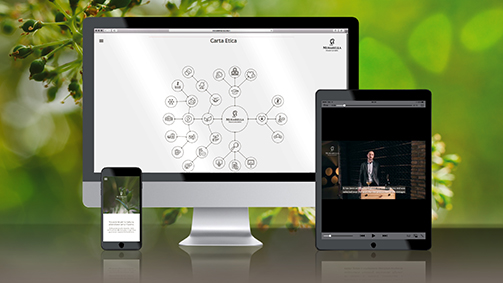
Special attention was given to the new Mirabella website, created in collaboration with NokNok, which was conceived as the primary vehicle for the contents of value that characterise this cellar. Video tutorials and a detailed information system seek to express the particular attention paid by the cellar to the passionate and expert consumer but also to all those who seek to broaden their level of knowledge. Thanks to the experiential communication and the dialogue with its interlocutor, aspects that characterise the company, such as protecting the environment and nutritional health, are thereby made transparent and accessible. Indeed, it is Teresio and his two children, Alessandro and Alberto, who tell us, in a personal and direct way, about the cellar, their experiences, their expectations and their wines. The Charter of Ethics completes this information, represented through a dynamic infographic – inspired by the process of growth of the plants – that encapsulates in a single image the constant effort poured into the various areas through the actions undertaken by the company. Special attention was also paid to the choice of the content, the terminology and the technical choices in order to achieve the best optimisation for the research engines.
Tag Brand, Global design, Packaging, Website
"Comete" Alois Lageder - Organic wine project
With the new “Comete” line, the winery Alois Lageder introduces a group of wines obtained through a series of innovative research and experimentation projects. The aim is to raise awareness of the enormous potential waiting to be expressed in the wine-growing heritage and the versatility of the land, but also to face the inevitable change in climatic conditions, by testing unconventional grape varieties suited to warmer climates and exploring pioneering winemaking techniques.
All the while, the research never deviates from the holistic philosophy that the winery has applied since it introduced organic-dynamic agriculture – one of the first to do so in Italy.
The packaging had to convey a series of concepts: from the highly innovative content, to the experimental character and the unrepeatable nature of each of the wines, the constant dedication to quality, respect for the environment and for the vineyard, which is treated as a living entity and not simply a means of production; and finally the care for the people, whether they be the partners that have provided grapes for generations or the passionate consumers for whom these wines are produced.
The name ‘Comete’, as well as being an explicit reference to the company symbol, clearly communicates the purpose and meaning of these wines, produced only in highly limited quantities. The comet indicates a direction: it can have a brief or an extremely long duration, but it leaves a trace, an indication of a path along which to proceed.
The graphic identity of the line couldn’t simply be coherent with the company identity: it had to express the evolution in progress and it had to do it in an immediate and unconventional way.
The adoption of a single wraparound label simplifies manual application: the blue background – Lageder’s institutional colour – is evocative of cosmic space and accommodates the gesture (a reference to its handcrafted quality) that distributes the pigment and traces the comet. All aspects of production were analysed with care, including the sequence: a single type of paper for the white and red wines, which ensures stability even when in contact with water and ice, that is natural and expresses preciousness, and that above all offers a surface to which the colour adheres permanently.
The pigments used (red and white) are made of natural ingredients, are quick drying and offer high stability, making them perfectly suited to the manual operations of the packaging.
Every bottle, then, is characterised by a comet, each different to the next, and at the end of the packaging process, is numbered to underline its uniqueness.
Tag Organic wines, Packaging
Gruppo Italiano Vini – Italian Organic Project
The new Italian Organic Project of the GIV, Gruppo Italiano Vini, aims to optimise communication of the organic wines of these selected wineries. For Bigi, Castello Moncaci, Melini and Rapitalà, we designed new packaging that guarantee each label a precise identity, personality and recognisability as a product of their respective wineries.
The aim was also to create an identity for the line through their shared aesthetic criteria and by introducing a symbol to mark the organic products offered by the group.
For each label, spontaneous and light illustrations were used, characterised by fresh colours that express vitality and authenticity.
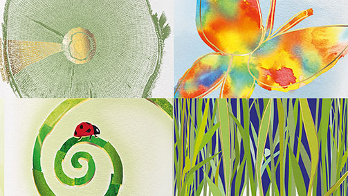
For Rapitalà, a brightly coloured butterfly symbolises the health of the habitat; for Castello Monaci, blades of grass represent the technique of allowing plants to grow between the vines then turning over the soil to naturally reintroduce the nutrients. For Melini, a ladybird, symbol of agriculture in which chemical pesticides are not used; and finally, for Bigi, a cross section of a vine illuminated by a ray of light evokes the influence of the celestial bodies on planting times and the life cycles.
Tag Organic wines, Packaging
L’Arena: Amarone on the trail of Ulysses, 700 step up to the challenge.
Excerpt from the article by Camilla Madinelli: “L’Amarone sulla rotta di Ulisse, alla prova si cimentano in 500”, published in L’Arena, July 2017
The myth of Ulysses, from his adventurous journey over seas and far off lands to his multiform intellect, even after thousands of years, still enchants and teaches designers, winemakers, and sailors of the new millennium take on new challenges: the challenges of the future, but with a regard for the past. The Homeric hero was adopted as the leading theme at Cantina Valpolicella Negrar’s award ceremony for the Limited Edition label «Wine Mythology Label» for the Amarone Vigneti di Jago 2012 Domìni Veneti. The winning label, from the Slum Design Studio in Florence, came out of the international ideas competition «Wine Mythology Label» promoted by Code “COmpetitions for DEsigners) in collaboration with Cantina Valpolicella Negrar and with the technical partnership of UPM Raflatac and Grafical. The competition, coordinated by the winery’s public relations manager, Marina Valenti, saw 700 submissions from designers and artists from 40 different countries. The union of wine and design, therefore, seems to be more popular than ever. Especially if we then add a mythological element. And even more so if Ulysses is involved. «Designing a label and creating a wine have much in common with the figure of Ulysses», explains the wine designer, Giacomo Bersanetti. «it takes subtlety in invention, the courage to shift one’s point of view, curiosity and the ability to convey authentic contents of value. The winning design, with the talent of extreme synthesis, uses colour as light: it is highly evocative and invites a lover of Amarone to establish a more intimate experience with the wine».
To put oneself to the test, for many, is an adventure too good to turn down. There is the risk of shipwreck, just like Ulysses. It happened to Matteo Miceli, entrepreneur, boat maker and sailing enthusiast, on his way back from his third solo regata in 2015. The wreck cost him the keel of his Eco40, his hi-tech boat equipped with solar panels, and water and wind turbines that allows him to travel in an eco-friendly way. A Verona-based carpentry specialist, Dmz of Villa Bartolomea, managed to repair the damage and restore the vessel. And so Miceli, as he revealed at the winery, is ready for his latest adventure: Ocean World 2019, a round the world trip while being self-sufficient for food and energy (complete with on board vegetable garden and chickens), in a regata with other solo sailors like himself. Ulysses’ mythical journey is still so enchanting that the scholar Giorgio Conti, cofounder of the Sustainability Archives at the University Ca’ Foscari in Venice, confessed to having retraced the journey when he was younger. Remaining with his feet on the ground and in the terroir, finally, is the enologist and general manager of the Cantina Valpolicella Negrar, Daniele Accordini, judge of the competition: “The intelligence of Ulysses”, he concludes, “is an intuition that lets him read reality in an adaptable way and to find new solutions to any problems: in winemaking, it is the intelligence to find the weak points in the production system and change them, adapting tradition.”
Tag Press
Label Art: the laws of organization of visual information - Part 2
In the second part of Label Art, organised by the association “Gli Ergonauti” and Maria Teresa Tonutti, Paolo Bernardis, researcher in the field of visual perception and cognitive neuroscience at the University of Trieste, and Giacomo Bersanetti, designer and founder of SGA Wine Design, talk about the principles on which our perceptive system works before complex visual information.
When we recognise an object in a visual scene and give it a name, our brain has carried out a series of processes that allow it to establish that certain parts of the scene belong to the object while others belong to the background or other objects.
For example, in the famous image of the Dalmatian by the photographer R.C. James, it isn’t easy to distinguish which black marks are the dog and which are the background; and yet once the silhouette has been recognised it is impossible not to see it again.

Or in the image of the panda, the famous symbol of the WWF, where does the white of the head end and the white of the background begin?

And in Rubin’s paradigmatic vase, what object is depicted? The vase/candelabra or two heads facing each other?

Our perceptive system uses principles or rules (also known as laws of segregation/unification) to decide which parts of an image are part of the object and which are part of the background. These principles, described for the first time by the Gestalt school psychologist Max Wertheimer (1880-1943), can be summed up as follows: (a) principle of proximity, objects close together tend to be grouped into units; (b) principle of similarity, elements that look similar tend to be grouped into units; (c) principle of common fate, elements that move in unison tend to be grouped into units; (d) principle of objective set, united elements tend to maintain unity; (e) principle of good continuation, elements tend to be organised in groups that require the least variation in the perceived contours; (f) principle of closure, information is organised into elements that generate the perception of closed edges; (g) principle of past experience, the observer favours organisation of information influenced by previous knowledge.
These principles involve a ‘ceteris paribus’ (all other things being equal) clause; in other words, the factor in question will affect grouping between the elements only when other factors are equated between elements.
The validity of Wertheimer’s observations is confirmed by a great many subsequent observations, using probabilistic models (Kubovy, 1994). Most perception researchers today agree that Wertheimer’s laws work because they correspond to statistical regularities of the environment and the objects that populate it.
The relationships between art and science are well known and have can be traced back many centuries. We only need think of Leonardo da Vinci for example, and of his painting influenced by his study of anatomy and physiology. To cite an example from our times, a scientist particularly dear to me and who also painted, is Gaetano Kanizsa. Kanizsa was an internationally famous academic, founder of the Triestine school, and made fundamental contributions to the study of perception and the psychology of cognitive processes in general. “Kanizsa’s triangle”, invented in 1954, has become a universally recognised symbol of research into visual perception.
But Gaetano Kanizsa was also a surprising painter, and into his painting, not without irony, he poured his interest for the “creation” of images, as he had the chance to write when he participated at the 10th Biennial of San Martino di Lupari, 1990*. An app* dedicated to Kanizsa can be downloaded at the following link: https://itunes.apple.com/it/app/kanizsapp/id1038839202?l=en&mt=8
PAOLO BERNARDIS
Below are a selected examples of design projects inspired by Wertheimer’s laws of perceptual organisation.
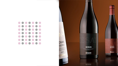
Cesari - 2004

Michele Chiarlo - 2014

Cascina Castlet - 2008

Cesari - 2010
From the catalogue “Moltitudine di impronte” 2002, published by his daughter Silvia Kanizsa.
App created by Paolo Bernardis, Walter Gerbino, Carlo Fantoni, Studio trart and Provincia di Trieste
Label Art: a coming together of research, design and production - Part 1
Label Art, an event organised by the association “Gli Ergonauti” and Maria Teresa Tonutti, brought together Paolo Bernardis, a researcher and expert in visual perception and cognitive neuroscience at the University of Trieste, and Giacomo Bersanetti, designer and founder of SGA Wine Design, to discuss and explore the relationships between research, design and production.
This encounter was conceived in the spirit of reducing the distance that has always existed between the worlds of business, university and society. The aim was to stimulate a dialogue between who conducts research to produce knowledge, specifically regarding our minds and on the brain, and who uses this knowledge to produce a product, the label of a wine bottle, that communicates with the consumer as effectively as possible.
The visible information that reaches our eyes is processed and transformed to create representations of the outside world in our minds. These internal representations (or perceptions) are formed according to functional principles or models of cognitive processes. The models of perception are not limited to explaining how the mind functions, but seek also to explain how they can be implemented in the neural mechanisms of our brains, or rather, functional models of the groups of nerve cells that form the brain.
The perception of the outer world
The study of perceptions poses us some preliminary questions that can help us understand the very nature of the study of perception. Kurt Koffka (1886-1941), one of the founders of the school of Gestalt Psychology, in The Principles of Gestalt Psychology (1935), asks: “Why do things look as they do?”.
The question might seem strange. The simplest answer is that the world and its objects are here present and appear this way (red, soft, big, hot,…) because in reality they are that way. This type of approach is called naive realism, and if adopted, does not get us very far towards discovering how our perceptive mechanisms work. Another approach is critical realism, which argues that things look as they do because the organisation of information imposed by the mind/brain system is what it is. In other words, it is the organisation intended as the laws and functioning principles of the mind/brain system that make us experience things as red, hot and soft. There are many examples that demonstrate how naive realism is wrong.
In the example of “Kanizsa’s triangle”, we see a central white triangle with one of the angles pointing directly upwards, the white of which is lighter than the white of the background.

Kanizsa’s Triangle – MODAL COMPLETION
In reality, no such white triangle physically exists, only three black circles with “slices” missing. This example shows us how we “see” the white triangle not because “it is here present”, but because our mind/brain system works in such a way that makes us “see” the white triangle. Several years after this illustration was proposed by Gaetano Kanizsa (1913-1993), two researchers (Grossberg & Raizada, 2000) proposed a functional model of the nerve cells of our brain that explains why, thanks to a sophisticated systems of excitatory and inhibitory connections, in the illusion of Kanizsa’s triangle we see the white central triangle, even though it doesn’t exist.
PAOLO BERNARDIS
Below is a selection of projects inspired by the perceptive phenomenon of “modal completion”.

Fontanafredda - 2006

Gialdi - 2012

Winzenberg - 2016
The label as the primary vehicle of storytelling
If we look up the meaning of “history”, we find it defined in terms of “research, investigation, and cognition”, that is well defined activities and concepts that naturally evolve into “knowledge” and “vision”, underlining how “knowledge” and “observation” are closely correlated.
If we look up “story”, on the other hand, it is interesting to read that it is a “composition… generally dedicated to a single event and intended to be read uninterrupted, distinct from a fairy tale as it tends to represent facts as they actually occurred.”
A fitting description, then, of the core activities and characteristics of storytelling, a term that has become popular today and is now essential to all businesses that are mindful of their own unique values, roles and objectives. The importance now attributed to communicating content in order to initiate, nurture and consolidate a dialogue with one’s customers – both existing and prospective – stems from the realisation that the messages and the unidirectional way of communicating that businesses used in the past were schematic and superficial. In a word, communication was ineffective and, above all, failed to take into account the fact that people want to be an active part of the business-customer relationship.

Naming e packaging
There is no product or industry that is unsuited to storytelling, however the wine industry is certainly among the most privileged sectors for its historic and profound affinity with the creative and intuitive faculties of the mind and, consequently, with culture. As Luigi Veronelli once put it so beautifully: “Wine is consumed for this miracle. It drives intelligence to greater things.” And in the story of wine, in the recounting of its personality and its values, the label on the bottle continues to be the protagonist and does most of the work in what can be a series of coherent communication activities and languages. To contextualise these concepts, we’ve selected our recent project with the Produttori Associati Moscato d’Asti, intentionally avoiding experiences with private producers with which, by the way, we have been applying the same methodological approach for around 35 years. The project began with an in-depth analysis and research that would allow us to identify the contents and values on which to construct the new identity. A strategic analysis allows us to define the design direction and positioning, but also other aspects such as pricing and distribution strategies, and the content and tone of the communication.

Mario Berchio, enologo Natincò
The name of the wine had to express the collective character of the initiative and its ambitious purpose: a large association of grape growers and winemakers who decided to create a wine that would become a landmark producer for its type through the perfection of a well-defined productive method. In logical relation with the name chosen, Natincò, the image represents a group of people singing in a choir creating harmony and at the same time, expressing the particular production method used for this Moscato, which involves the selection of grapes from the high, medium and low altitude hills, assembled during vinification to obtain the best possible quality.
The label shows an elegant, refined choir, in accordance with the characteristics of the wine, and at the same time evokes Italian musical tradition that, most universally recognised and with its highest expression in opera. An additional and highly characteristic aspect is the colour, adopted for its distinctiveness, memorability, and immediate evocation of the fresh and floral perfumes of the wine. All of these elements of content contribute to creating and expressing a sense of uniqueness and originality through a sensory structure that each observer interprets individually, from different perspectives, influenced by their own cultural traits, their personal sensibilities. In order for storytelling to be effective, it is essential that the emotive content and authenticity are tangible and easily perceptible, this is one of the reasons why we used the real produces as models. The winemakers of Moscato participated with enthusiasm, openness and humility to create their own communication tools.
All consequent communication, in its various forms that range from the website to a series of viral videos, from advertising to the classic trade folder, stand and digital presentation, responds to a principle of coherence that guides and accompanies the design of every tool so that they all work together. As Jung so astutely describes: “the observed moment is the sum of all ingredients”.

Comunicazione integrata e immagine coordinata
Tag Global design, Packaging
Wine Tourism and Hospitality: An analysis by Carlo Pietrasanta - Part two
The mission of the Italian Wine Tourism Movement is to promote the culture of wine through wine tourism and develop synergy between the different players. What stage is wine tourism at in Italy? What works and what doesn’t? Why is it worth it? All the answers to these questions on wine tourism and much more in the second part of the interview with Carlo Pietrasanta, President of the Italian Wine Tourism Movement (part one HERE).
Intervista a Carlo Pietrasanta, Presidente Movimento turismo Vino: Un’analisi su Enoturismo e Marketing dell’Accoglienza - Seconda Parte from SGA Wine design on Vimeo.
How would you define, or describe, wine tourism?
Wine tourism is the greatest opportunity the world of wine has seen in the last 25 years. It has self-generated with the epochal change in mentality: a quarter of a century ago, talk of wine tourism and winery visits was almost heresy; today there’s hardly a winery in Italy that doesn’t offer tourist services.
What it’s history in Italy?
Wine tourism in our country developed after a 1992 study by the University Bocconi that highlighted how, despite a high demand to visit them, Italian wineries were mainly closed to the public. Since then, a group of winemakers, captained by Donatella Cinelli Colombini, a producer of Montalcino, came together and began planning activities linked to wine tourism. The first activity we invented was “Cantine Aperte”, that is Open Wineries, with the first edition held in 1993.
To what extent can wine tourism function as a direct sales channel? Do you have any data on direct sales that result from wine tourism?
We have wineries with up to 50% of their revenue accounted for by direct sales through wine tourism. Direct sales at the winery have always been a part of distribution, and in the 1970s a lot of unbottled wine was sold. Nowadays, another type of direct sale prevails, bottled wine, with a greater profit margin.
When selling wine directly from the winery, what’s the average amount people spend? How many wines to they take away?
The average oscillates between 3 and 6 bottles, depending on the area and the value of the wine. If the bottles are prestigious the average is around 3 bottles; for mid-prices wines (around 8 euros), they often take away 6 – 12 bottles.
What proportion of the total revenue does this represent?
From a minimum of 20% to a maximum of 60%, depending on the type of winery. Percentages are more significant for smaller wineries. For those that produce more than 100,000 bottles a year and have at least some commercial organisation, the percentages are lower, but they are becoming ever more important.
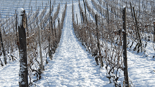
Photo by Franco Bello
How much does being a renowned brand make a difference?
It has a particular influence on foreign clients: being a known brand or representing a famous region attracts people more easily and increases sales.
What problems do you believe tourists from far off countries encounter when trying to send wines home? What do you believe might be the solutions?
The problems are enormous: after September 11th 2001, for security reasons, you can’t take bottles on board in your hand luggage any more. As a result, sales at the winery to tourists travelling by air fell sharply. Due to EU levies and regulations, it is complicated for a winery to send wine to a private client in the EU: they have to follow similar procedures to those for importation. Therefore, as a Movement, we are creating a platform that will allow you to send wine to private foreign clients using a self-shipping model: the foreign client will order and pay for the wine and shipping directly at the winery (therefore it’s not us sending the wine as a business but the visitor, the wine tourist who is sending his wine home. This expedient, permitted in all 28 countries of the EU, allows customers to ship up to 90 litres a day, paying low shipping costs because there will be a discount on a national level.
How necessary do you believe digital channels (apps, internet and social media) are for this type of offer?
They are fundamental, but you need to know how to use and handle them to avoid them backfiring: it’s better not to have them than use them poorly. One of our missions is to raise awareness among wineries and other operators in a territory (offering hospitality, dining, typical products) so that they can manage these new tools together, thus reducing the costs. While a small company often can’t spare a person to dedicate entirely to this activity, 5, 6 or 7 companies banded together (of which perhaps only 2 or 3 operate in the same sector: wine, restaurants, hotels, typical products) can create a synergy. Together they can put together the right communication to prevent the apps, platforms and everything else turning into a double-edged sword: failing to respond promptly to a tourist or to those who leave criticism can sometimes be a problem.
How important is it to know how to integrate these channels with traditional communication?
It’s essential: with traditional communication you can grab the attention more or less of the over 40’s target, which is already a consolidated group of clients. But with new communication methods it is possible to connect with, cultivate and gain the loyalty of the Millennials, the generation now in their twenties and thirties. But it doesn’t stop there, it lets you connect with a person who’s 80 if they’re passionate about wine. Digital communication today has a wider spectrum because there are ever increasing numbers of people, including those of a certain age, who are able to access it.
In which countries do you think they are doing well in promoting and spreading the word of wine tourism? Can you give some examples?
The most striking example is our French cousins. We can only learn from them, even if we Italians are more capable and more exciting. A couple of recent examples: the day before the opening of the BIT travel exhibition in Milan, the French presented the new portal Visitfrenchwine.com, created by the state and companies, small and large. On the website they all have the same visibility, the great regions like Champagne appear with the same prominence and importance as a smaller zone like Jura. Within each zone the giant brands and small producers again appear with the same visibility and prominence. It is logical, the giants that can receive 10 bus tours a day will attract more visitors than the small family businesses, but in the end the results are useful for both.
The other example is the inauguration in great style in Bordeaux, twenty days ago, of the Cité du Vin, the international museum of wine; between public and private contributions, 80 million euros have been invested in the construction of a decanter shaped building for the museum, an operation that has brought together all the political colours of the central state, working together so that as of next year, this place can welcome between 4 and 5 million visitors. We had a marvellous situation in Italy: the Oil and Wine Museum in Torgiano owned by the Lungarotti family, but it’s private, and the Enoteca Italiana in Siena, a wonderful place that, for political reasons, was closed down.
Is there a regulation for this sector? Do you think it’s necessary? Does it facilitate or hinder the development of wine tourism?
There’s’ the law on the Strade del Vino (Wine Routes) passed in 1999, but it would be better if it didn’t exist. It consists of 4 articles, and since 1999 no implementary regulations have been made. Over the years, with the passage of some responsibilities to the regional councils, a lot of confusion has been created. These institutions created the Strade del Vino e dei Sapori, mixing wine with other products. As soon as the public money ran out, some of the routes were abandoned and only exist today in the form of weathered road signs.
There have been some exceptions that managed to remain faithful to the initial project of Strada del Vino: this doesn’t mean that dining, accommodation, or typical products are not involved in the project, quite the opposite. But there must be only one at the helm, it must be the wine that dictates the guidelines. Then, given that visitors to the wineries have to eat, have to sleep somewhere, love to buy typical products and arts and crafts, the influx of visitors is to everyone’s benefit.
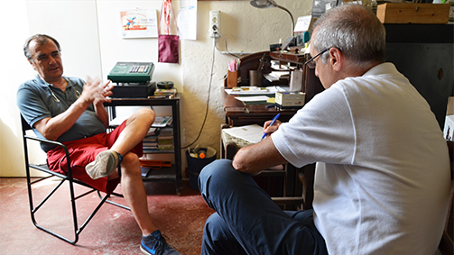
Carlo Pietrasanta with Claudio Castellaro
So do you think it’s necessary for the operators to network with each other, tourists, wineries and others)? Do you have an example?
Networking is fundamental: an example in this sense is the Strada del Vino in Franciacorta. The Strada was created independently by the Consortium: the producers of Franciacorta wine, members of the Consortium, pay a single, all-inclusive quota. The Consortium gives the Strada what it needs for it’s activities. This is a system that works and produces results. It doesn’t mean that there aren’t any hotels or restaurants in the Strada Franciacorta, but I repeat, there must be one sector in command. In an area where there is no wine but a lot of apple cultivation, such as in Val di Non, you could create the Strada delle Mele: but it would be a meaningless operation around the world, whereas the so-called wine routes have spread, and are now so popular that they’re being ‘invented’ even where they don’t really exist because wine, with its label, is the image of a territory.
This is an Italian example. What about abroad?
The Californian Wine Routes attract numbers that we in Italy can only dream about. It’s a different concept, the wineries in California aren’t lucky enough to have the historic architecture that ours have, but theirs is a touristic product and are organised as such. Even non-drinkers visit their wineries: as a winemaker friend of mine in Franciacorta says, the important thing is that he has some credit on his card so we can sell him everything, from wine that he might take as gifts for friends, to corkscrews, aprons. All these things we can’t sell in Italy. Here, all we wine makers can sell is wine.
What type of tourist comes to visit? In your opinion, what are the prevalent socio-cultural classes and where do they come from?
In the last two years there’s been an increase in foreign tourists, even in less well-known areas. I have to say that the effects of the Expo are being felt today, a year after it ended, because it has brought in tourists from all over the world and of all types to re-experience and re-appreciate Italy. Here in Italy, the average wine tourist is someone who has a fair amount of disposable income and is aged between 30 and 60.
Do you think there are new trends in this sense?
They can be created. Today the winery is seen not only as a place where you can buy wine but also as a place where you can relax. A growing trend is that of winery visits during the harvest: you can offer recreational-educational activities, collect the grapes (perhaps not for too long as it’s hard work), even help squeeze them under foot. Of course, the producer must be prepared to sacrifice those grapes, you can’t use those methods today. But people are willing to pay for the experience, with formulas of around 27-30 euros per person, and then they buy the wine, because they’ve been satisfied.
Tag Interview, Wine Tourism
Wine Tourism and Hospitality: An analysis by Carlo Pietrasanta, President of Movimento Turismo Vino
The Class of 1962, Carlo Giovanni Pietrasanta is among the founding partners of the Wine Tourism Movement Italy (Movimento Turismo del Vino Italia), an association dedicated to the development of wine tourism and hospitality. He has been president of the movement since 2015.
The association’s goal, as the president explains, is to promote the culture of wine through visits to the wineries. In this sense, the discipline hospitality marketing is just being introduced to the world of wine, a modern way of reviving and valuing a practise that used to be a natural part of operating a winery.
Intervista a Carlo Pietrasanta, Presidente Movimento turismo Vino: Un’analisi su Enoturismo e Marketing dell’Accoglienza - Prima Parte from SGA Wine design on Vimeo.
How well do you think the wineries, businesses and people who offer tourist services are actually prepared for it?
There are those who are well prepared, but it’s patchy. We have some excellent examples, there is a core of operators that have learned through experience: they started their own wine tourism 25 years ago and have learned how to host visitors and promote their wineries. Today we need to create new incentives because the world has changed in the last 25 years. Today, with online communication, you need to be ready to greet the new wave of wine tourists who come from all over the world, treating the Japanese tourist in one way and the American tourist in a completely different way. The Movement’s goal is to educate and prepare its wineries for these influxes of tourists.
The importance of the culture of marketing applied to hospitality is evident, but how many wineries are aware of this?
Very few: often we producers rightly dedicate a lot of our time and effort to the vineyard and the cellar, but due to our lack of education in the subject, we forget about the marketing and communication side of things. This is especially true at small wineries, with few members of staff where the producer has to do a bit of everything.
And how much do the consumers know about it?
In Italy there’s a huge difference between the passionate Wine Lovers and the general public, who visit the winery to learn about winemaking. The general public is uninformed but can have a very satisfying experience that can turn the product, if it goes down well, into one of their “everyday wines”. Also, a more evolved public is arriving from abroad, in search of something special. I’m referring above all to countries that are already in their second and third generations of wine drinkers: the United States, Japan, Anglo-Saxon countries. In these countries, consumers have evolved and now seek out grape varieties and wines that are less well known. And then there are the emerging markets, like Russia, the Chinese market, the Far East, with a public who are less informed but nevertheless curious and interested.
What role does this component have in the marketing mix of companies?
In my opinion it should have an important role since without marketing and without communication you can’t get very far today, especially if you’re based in an area that’s not well known. By applying the right marketing and communication tools, even in a region that is not one of Italy’s most famous, a producer can achieve excellent results.
Is it possible to categorise clients in order to differentiate the offer?
It’s essential: especially for large-scale events like “Cantine Aperte”. These have to be different environments to accommodate both the wine lover, who should be pampered, and the general public, who just want to try a couple of wines and take away a couple of bottles as souvenirs.
What can the WTM do to spread this kind of sensibility? Today the WTM promotes this service, but can it also spread the culture of marketing to individual wineries?
It must do because it is key to the continuing success of wine tourism: it must help its associated wineries to be prepared on this front. The message is: not just making excellent wines but also knowing how to communicate and present them.
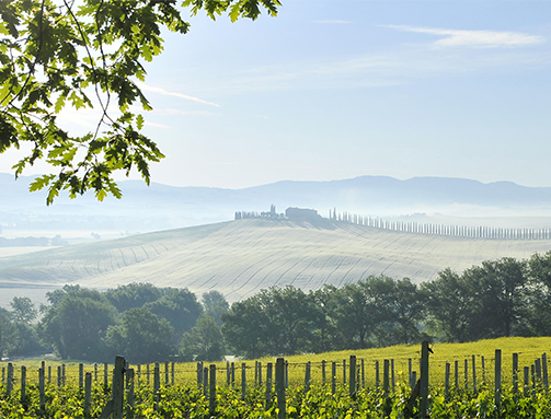
Ph: Francesco Radino
What are, in fact, the main functions of the WTM?
The main function of the Wine Tourism Movement is to unite wineries that believe in wine tourism hospitality, taking advantage of the five national events that have been created and by now consolidated, such as “Cantine Aperte” and “Calici di Stelle”, that have been running for more than 20 years and are the supporting pillars of communal activity (for Cantine Aperte, all the wineries open their doors on the same day). The Movement is committed to assisting the wineries to be better prepared in other areas: a winery is born to cultivate the vineyards and produce wine, but today they also need all the rest.
How then, is the Wine Tourism Movement structured?
The Wine Tourism Movement, on a national level, is a second-level organisation, consisting of 20 regional associations: the wineries are partners on a regional level. There are regions that have secretaries who organise the constant activities that involve the member wineries throughout the year. On a national level, we are moving forward with strategic agreements in a variety of areas, from finance to car hire, to offer more services to visitors.
What are the main objectives of its mandate?
To help the wineries of the Wine Tourism Movement sell more visits, more bottles of wine.
The aim of the mandate is to transform the Movement from a voluntary association into an association that can make it on its own with constant organisation, even if the presidents change. Furthermore, I’m trying to start working with tour operators and other subjects to bring in some limited royalties to the national association, so that we can weigh less and less on the wineries. This does not mean devaluing the association, but it means that the wineries will get much more for the same amount they are paying now.
What are the advantages for the wineries, what incentivises them to sign up to the Movement?
The advantage is that they join a network that moves a lot of people: during the national events, like Cantine Aperte, at least 60-70% of those participating don’t just visit one winery, they move around and see several. Being part of this circuit means finding new customers and meeting new people. Where consumers used to find a winery they liked and bought all their wine from there, today’s consumer buys one wine from me, another from someone else, and they build their personalised collection.
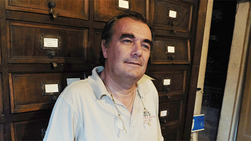
As a movement, have you formed any particular relationships with tour operators? How common are relationships with tour operators? Is the movement known to just a few specialised tour operators is it common in wine tourism?
There are tour operators (especially American and English), that are very active in wine tourism and there are wineries, both associates of the movement and not, that have close relationships with these tour operators. We as a movement are a little behind in this. We’re trying to catch up and soon we’ll finalise agreements that have already been set in motion for platforms linked to a virtual tour operator that will exclusively sell the destination Italy.
Why and when is it convenient for a winery to use Faberest (platform for booking visits to wineries)?
Faberest is a new platform created by some guys I met four years ago just after they’d graduated. It develops an idea that we put out there four years ago: to sell recreational-educational activities at wineries, and more (you can go and see how cheese is made, and so on). It is one of the many platforms that can help us to intercept wine lovers and curious customers that want to come to see our wineries. Thanks to the benefits afforded the movement, wineries associated with the WTM can access this platform without initial costs and with lower percentages of the revenue than wineries not in the WTM.
What is Faberest like compared to a dedicated section of a winery’s website, or with other sites that sell tours and packages?
There are companies that have websites where customers can book and pay for a visit, there are other sites that offer other opportunities… a few days ago the “Tripadvisor of wine” was presented. I think that every portal of this kind has its own characteristics; in my opinion, even if we’re talking about digital tools, the people behind it make the difference.
How much do the wineries that offer this kind of service interact with their customers on their preferred platforms?
Not very much as yet. One of the aims of the Wine Tourism Movement is to increase this interaction; we’re creating a synergy with some platforms that will allow wine lovers to discover new opportunities, new visits and new producers. Furthermore, as in all fields, we aim to profile the consumer in order to involve them with targeted offers.
How much do wineries respond to guest reviews left for example on Tripadvisor or other platforms (like Booking.com, Trivago, Expedia…)?
We have to respond because it’s our reputation. Not all wineries manage to stay on top of it and therefore it’s important to join forces and, as we are currently proposing, assign someone to take care of this aspect for a larger number of subjects.
Tag Interview, Wine Tourism
On the Moscato trail with Antonella Bocchino, the lady of grappa
Having left the family business, a milestone in the history of distillation, since 2014 Antonella Bocchino has been dedicated to the AB Selezione Italian Spirits project. Her mission is to collect the best Italian spirits produced from the finest grapes and pomace from around the country.
The most prestigious grappas of Moscato produced with pomace from different regions around Italy, are distilled in Piedmont and aged in oak barriques (toasted to varying degrees), as well as other great Italian spirits: three vintage grappas, two single variety cru grappas, Moscato d’Asti and Nebbiolo da Barolo, and two liqueurs recovered from the ancient tradition of Piedmont.
An interview with Antonella Bocchino: on the Moscato trail with the lady of grappa from SGA Wine design on Vimeo.
Antonella, what intuition led you to begin this new project?
AB Selezione is the result of the desire to select the best of what craft distillation can offer in this country, treasures hidden in the cellars of small artisanal distilleries that often go unappreciated. The project is a search for grappas, mainly, but also Italian spirits in general, which can be found in abundance throughout the country and are almost always the quintessential expression of a territory, a region, or a microclimate. During my search, I have been able to collect samples of these drinks, and I have discovered that they contain some spectacularly pure and unique aromas and perfumes.
Hence “Italian Spirits”: in the plural, because from the Alps to the islands of the Mediterranean, different spirits, grappas and liqueurs represent the immense and diverse beauty of Italy. My wish is to reveal the splendour of our country through the beauty of artisanal distilling.
Brand Design
Does promoting the grapes of Moscato represent an opportunity to safeguard biodiversity as well as development for the region?
The heart of the AB Selezione project is the exploration of the Moscato grape variety. I was born in Canelli, the homeland of Moscato d’Asti, and so the starting point had to be there, where my roots are, where my memory recalls the intense perfumes and aromas of this variety. Nevertheless, almost every region in Italy cultivates a Moscato: and this was the most fascinating part of this journey, finding out whether this grape, with its intrinsic biodiversity that produces incredibly diverse wines, could also produce diverse grappas.
As Gino Veronelli first showed me, the Moscato di Chambave, a Moscato from which very few bottles are produced in Val d’Aosta, just below the snow line, is certainly different to a Moscato di Pantelleria, cultivated in the heart of the Mediterranean island, where the sea air wafts through the from every direction, in an igneous terrain rich in minerals, which inevitably enhance the final product. Researching the diversity of this grape variety, in its unique incarnations in every region in Italy, was the challenge I took on: and it is a wonderful and compelling adventure. The appreciation of these diversities has taught me to recognise a unique characterisation, a fil rouge that links all these grappas: it’s the most intriguing thing about Moscato, the aromas, a softness present in all five (soon to be six) grappas of the Moscato AB Selezione. It is a connection that unites these spirits: whose strong personalities and individualism are owed to the biodiversity of this grape variety.
A trip like this, on the trail of a wonderful and ancient vine variety, I think is only possible with Moscato. There are no other grape varieties in Italy with such a diverse range of examples.
Now, talking about how these grapes help the development of a territory, we have before us two very significant episodes: one is the declaration of the Langhe, Roero and Monferrato as UNESCO World Heritage Sites, which the Moscato di Canelli is a part of; the other, UNESCO declared the ‘alberello’ method of cultivating Moscato di Pantelleria as World Heritage. For the first time, UNESCO recognised an agricultural practise, giving important recognition to the biodiversity and uniqueness of the territory, an appreciation that will also surely have a significant impact on tourism and wine tourism in particular.
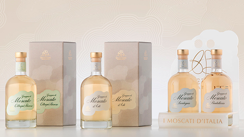
Packaging, confezioni ed espositore della linea Moscato
You have travelled the length of Italy tracking down the best Moscato grapes, produced in diverse Italian regions. What are the differences and what are the constants you found on this journey?
As I said, a constant of the Moscato is its beauty: this perfumed, fragrant grape variety has a unique capacity to release aromas that are always different, but intense, in each one of the regional grappas. It is something I rarely find in other grape varieties.
The diversity of the different Moscato grapes is truly fascinating. When I began to taste the various Moscato grappas blind, fresh from the alembic, I realised as I closed my eyes that it was like travelling through Italy. I began my journey at my roots, from the perfumes of wisteria, acacia flowers, the white flowers of our Moscato d’Asti, which my grandfather showed me when I was in pre-school, when they were given to children with ‘meliga’ biscuits or with a slice of panettone at Christmas. A moment later and I was breathing the perfume of the Moscato from Sardinia, with its enthralling history: the Moscato grapes were taken to the island under the rule of the House of Savoy with the aim of increasing production, but there they produced a wine and a grappa that were completely unique, and very different to what they knew of Moscato in Piedmont. The Sardinian grappa, at the end of tasting, has hints of the sea air, of salt from the sea surrounding the vineyards; some have compared it to a highland whisky, with which it does have many things in common.
My journey continued with the rich aromas and compelling history of the Moscato of Pantelleria: zabib (Zibibbo), a grape variety brought by the Arabs, means a sun-dried fruit, and I find in fact that the Moscato grappa from Pantelleria fills the glass with fruity scents: grapes from Cyprus, aromas of dried figs. This Moscato too is unique, with its own distinctive and recognisable personality. Then the other Moscatos, each with a different character and personality: from the Moscato of Oltrepò Pavese to the Rosé Moscato of Trentino Alto Adige, cultivated on the slopes of the Dolomites in a rocky terrain, with its surprising fragrances of peach and rose, extraordinary sensations with the eyes closed. Finally will come the grappa of Moscato of Trani, from the Apulia in the beautiful south. It will have another unique aroma and taste. But it has just been distilled and is aging in barriques, t o be ready next season.
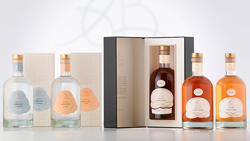
Packaging e confezioni della linea Millesimi e Cru
The AB Selezione Italian Spirits project includes three prestigious vintage grappas and two single variety cru grappas. Can you tell us about these?
The vintages are the last Moscato grappas produced in a small distillery that closed its doors a couple of years ago. Among the barriques, now transferred into tanks, were a few jewels: grappas that have been ageing for twenty years, and that are 100% of the year stated on the labels (therefore 2000, ’97 and ’94). I am convinced that these grappas can match anything the international market has to offer, alongside the greatest Bas Armagnacs, Cognacs, Whiskies or Calvados, because they have, each in their own way, a profound narrative, an aroma and flavours with a longevity and intensity that can compete with the finest spirits in the world. Lovers of these great vintages often accompany them with great Cuban cigars, Montecristo, Cohiba…
The two single-variety grappas are the flagships of Piedmont; they couldn’t be excluded from a line of clear “Piedmonticity”, at the heart of which is the Moscato di Canelli. The grappa of Moscato d’Asti is fresh, young, and contains all the fragrances of a harvest just completed. It is dedicated to the lovers of grappas tout court, those who don’t want it contaminated by the wood of the barriques and prefer to enjoy its purity, fresh from the alembic. The grappa of Nebbiolo da Barolo is the other side of the aromas of Moscato: it is very dry and austere, produced from pomace from one of the eleven small towns that produce Barolo: Serralunga d’Alba, within the UNESCO World Heritage territory.
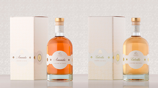
Packaging e confezioni della linea Liquori
Where did the idea come from to revive Ananda and Calvilla from ancient tradition, the liqueurs of cocoa and apple?
We worked on two fronts, if I hadn’t been accompanied by two extraordinary partners in this operation, Ananda and Calvilla wouldn’t have been possible. Ananda is the fruit of a collaboration with Guido Gobino, a great master chocolatier of Turin, who provided me with the finest of his cocoa selection. We infused the cocoa beans from the plantations of Ecuador, a cocoa “cru” called Arriba Superipor Selecto, with alcohol for six months. The result was a harmonious marriage between the alcohol and the cocoa: the latter relinquishing its aromas and the mahogany red colour typical of the Criollo. Ananda means blessedness in ancient Sanskrit: the liqueur is a synthesis of pleasure and purity, the quintessence of cocoa in a drop of alcohol.
Calvilla was the product of my collaboration with Slow Food, which safeguards a historic variety of Piedmontese apples called Calvilla, originally imported from France, from a small town on the borders between Flanders and the Alsace: Calville, the town that produces most of the apples used for Calvados. For the production of this liqueur, we use the same apples, although in this case they are not distilled, but sliced and left to interact with a brandy for a year. This produces another liqueur with a low alcohol content (both are 28%), which are very easy-drinking at the end of a meal and a perfect accompaniment to desserts or pastries. It’s also loved by the younger generation of mixologists, bartenders who want to make their mark with sought-after ingredients and niche products to allow them to propose extraordinary cocktails. I tried a spectacular Martini with a Calvilla base, and a fantastic cocktail called “Poetry” made with Ananda, drops of Angostura and Barolo Chinato.
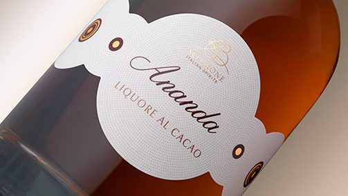
Packaging Ananda, liquore al cacao
Just over a year since the launch, it is possible to reflect on the recent past and the future of the project?
The recent past has been exciting, fascinating, a wonderful year full of new experiences, searching, discoveries and rediscoveries: rediscoveries of old friends, restaurant owners, wine store owners, who have all contributed to this adventure with enthusiasm. The present heralds many new developments for the coming months and years.
This year, AB Selezione has introduced itself to the world at several events: Salone del Gusto in Golosaria, Banca del Vino at the University of Pollenzo, Eataly. We also attended several fairs abroad: the fair in Dusseldorf was particularly interesting because AB Selezione was the only table of Italian grappas in the midst of the world’s finest spirits. It is called Acquavite, and there were whiskies, rums, gins, tequilas: AB Selezione made a great impression and we are very happy and satisfied. Challenges of course are endless: 2016 will be a year of expansion, we hope, especially abroad because grappa, in my opinion, even though it has been gaining recognition in recent years, still has to make its mark, and we are here to greet it when it does.
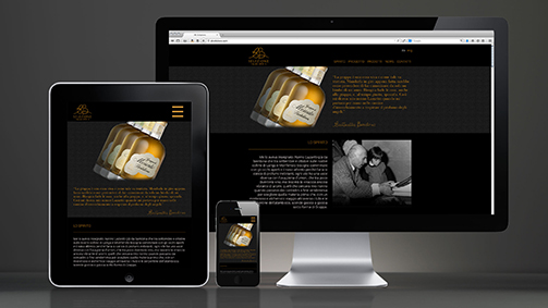
Sito internet e comunicazione digitale
Tag Global design, Interview, Packaging
Sartorial restyling for the Valdo Prestigio line.
The restyling project of the Prestigio line, produced by Valdo for the Ho.re.ca channel, is now complete. It involved:
- Cuvée di Boj
- Cuvée Viviana
- Cuvée del Fondatore
- Cuvée 1926
The development of the project was carefully configured and inspired by a well-defined company strategy, based on the absolute awareness of their own characteristic values, identity and potential, and organised into clear and common objectives.
We look back at how the project unfolded with the global marketing manager of Valdo Spumanti, Mauro Bonetti. With a career in marketing in the wine and spirits sector that began in 2008 with Pernod Ricard Italia, Bonetti graduated from Milan’s Bocconi University and matured experience at companies like La Rinascente SpA, before moving to Valdo Spumanti in March 2014.
“The restyling project of the Prestigio line all began with the Cuvée di Boj, its genesis being the input from the market itself that began to reach us in 2013: it came from the consumers and a portfolio of around 4500 ho.re.ca clients that, in Italy, interact with us through a strong distribution network consisting of more than 100 agents”, Bonetti explains. “They asked us to ‘give it a bit of a dust off’, to make it younger to appeal to the contemporary consumer. Today the Prosecco embodies the spirit of the time: drinkability and lightness combined with a sophisticated taste. The old packaging didn’t communicate these concepts to the new target consumers to full effect. And so we set ourselves the goal of evolving our look, without revolutionising it”.
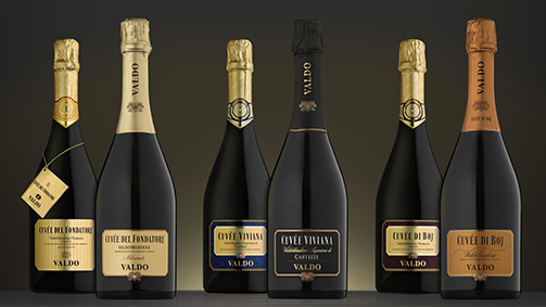
With the aim of elevating the perceived value, the old packaging of the Cuvée di Boj was brought up to date with minimalism and geometric precision. An accentuation of the modern line accompanies the preservation of the family feeling and identity. The old bordeaux was abandoned in favour of a deep and dense golden tone, an expression of a persuasive product with a complex personality. The colour gives the product character and makes it distinctive: the metallic tone, warm, almost like copper, expresses richness and prestige.
For the label, an aluminium support was used, reflecting the light to confer vitality and brightness. The material used for the label allows all the most important information to be printed with a pronounced relief. The shape of the rectangular label with its softened corners and condensed characters was maintained, a solution that helps improve the legibility. “The new packaging of the Cuvée di Boj is a perfect example of the elegance of days gone by reinterpreted in a modern key: a classic of today”, sums up Bonetti.
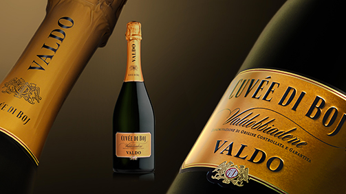
Last year, the restyled Cuvée del Fondatore and Cuvée Viviana entered distribution: the latter is produced from the grapes of the hill of Cartizze, the most famous in the Prosecco region. The prestigiousness of this product is emphasised by the total black - both for the label and the cap - as well of the use of embossing, reminiscent of the softness of fabric. “The restyling of the bottle offers a multisensory approach, which conveys the modernity of this product without distorting its identity and classic shell”, Bonetti comments.
The updating of the previous version of the Cuvée del Fondatore was more limited: like the other projects, more prominence was given to the name, the Cuvée and the legibility of the key information - a result achieved thanks to a brighter support -, but the alternating shiny and matt lines on the golden surface was maintained as it remains a distinctive and highly recognisable aspect of this particular packaging.
“For us it’s essential that the area of origin is instantly visible and clear. With this, emphasis is drawn to all our core values: the bond with the territory, the passion and obsessive attention to detail and quality, the history and the sense of tradition”, adds Mauro Bonetti. He is echoed by Giuseppe Sala, manager of the traditional distribution channel: “coherently, for the whole range, the name ‘Prosecco’ has been moved to the back of the label, giving greater importance to the name, Valdobbiadene: this is what distinguishes us and this is our extra value. Not all Prosecco is the same.”
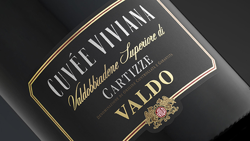
For all products of the Valdo Prestigio line, with the aim of giving the bottle a sleeker look, the cap has been elongated and has lost the band around the neck, making the overall look more contemporary. “A sustainable choice, from both environmental and financial perspectives: despite the greater investment in terms of paper quality, we have in fact optimised the economic balance of the products”, Bonetti explains.
It is a choice confirmed also in the restyling of the Cuvée 1926, the Valdo product that proudly asserts the year in which the producer was established. Here the intervention focused on reinforcing the family feeling. For this reason, the Valdo brand is completed by the symbol of the griffins, which evokes tradition and prestige, and the format recalls the characteristic polygonal profile with softened corners. The legibility of the name, and above all the brand, has been greatly improved, the elements being particularly evocative and recognisable.
Since its establishment, Valdo has always pursued the objective of creating a strong identity, sustained by the elegance and high quality of its products.
To achieve such an important objective, no aspect can be overlooked; with this in mind, the project needed to communicate the real value of the sparkling wines through a series of elements that, in addition to the primary packaging, extend to the secondary packaging and utility and service tools, such as the new ice bucket and bowl.
In creating the secondary packaging, metal containers were chosen that are very sophisticated in terms of production that are of high visual impact and value. “The secondary packaging is essential if one is to distinguish oneself from the masses on the shelves, particularly during the festive period”, explains Sala. “Customers look for something new, even in the tiny details: always having something new to present, something to talk about… that’s the real trump card.”
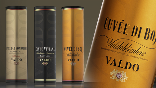
The outline of the new Valdo ice bucket is inspired by the sleek lines of a classic flute glass; thanks to this choice, the bucket is strongly evocative and communicative. The base is characterised by a pronounced re-entrance (picure) that allows the bottle to remain raised, and therefore emerge and stand out from the objects that crowd a table.
The proportions of the ice bucket are well-calibrated in width to ensure it is practical to use and contains the weight, and is developed vertically for better recognisability, making the object both distinctive and functional.
The extension of the project to the ice bowl came naturally and coherently. The final shape, obtained by merging the volume of five ice buckets on a pentagonal base, constitutes an indication of the law of the golden portion.
This allowed us to create a container with a strong visual impact, that can hold and chill six Valdo bottles.
The metal cylinder, ice bucket and ice bowl are made of completely recyclable materials.
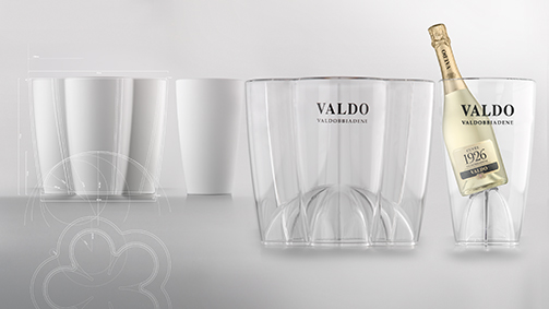
The ice bucket and bowl are like suits made to measure for the bottles. These objects are greatly appreciated by our customers, both for the visibility allowed by the transparency and the sinuosity, as well as the effectiveness at maintaining the right temperature for the wines. The picure creates a dynamic and solid base for the bottles, providing adequate exposition”.
“In this market, of which we hold an important share, you have to be innovative and ingenious. Over the course of 2016, when we mark our 90th year, we will produce a celebrative logo and special editions, supported by ad hoc activities,” concludes Bonetti.
SGA and Brevetti Waf: design and technology for wine.
Brevetti Waf, a company that has produced and exported technology and design products for the beverage industry for more than forty years, launches an all new, modern, and immediate website.
Special attention is draw to the design project for the ice buckets and bowls of the Valdo company realised by SGA.
The shape of the new Valdo ice bucket, made of transparent methacrylate, draws its inspiration from the particularly sleek silhouette of a champagne flute; this choice led to the evocative design of the ice bucket, an amplification of the classic sparkling wine glass.
The floor of the bucket is characterised by an especially pronounced ‘picure’, the proportions of which mean the bottle remains raised, allowing it to protrude and stand out of the crowded ‘landscape’ of the table.
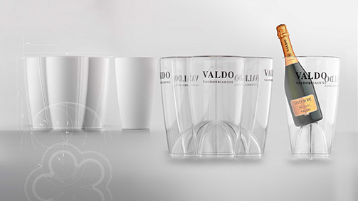
The shape of the ice bowl is an elegant expansion of the ice bucket; the final product was designed by fusing the capacity of 5 ice buckets on a pentagonal platform; it uses the golden section, the natural ratio of proportion that dictates the growth of every animal, vegetable and mineral being, evident also in the leaf of the grape vine.
This approach has produced an ice bowl with a compelling visual impact and the capacity to chill 6 bottles of Valdo sparkling wine: one in the centre and five in the surrounding niches. The bottom of the bowl also raises and affords prominence to the bottles.
Tag Global design, Web site
The wine label, yesterday, today and tomorrow. An interview with Manlio Tonutti.
The wine label, yesterday, today and tomorrow. An interview with Manlio Tonutti from SGA Wine design on Vimeo.
An interview with Manlio Tonutti, head of Tonutti Techniche Grafiche of Fagagna (Udine) alongside his daughter Maria Teresa and son Marco. 400 million labels printed each month, 130 employees, 70 years of history, the company is known as the “Cartier of labels” for its dedication to the finest quality printing. An international point of reference in the labelling sector, this Italian company has expanded into a range of sectors, moving from wines to the wider field of beverages in general, and then on to food and cosmetics. Tonutti, a name synonymous with labels, won “La Vedovella 2014” prize, known also as the “Oscar of printing”, in the category of Best Label Printer.
Tonutti Tecniche Grafiche is an outstanding Italian company that was established around 70 years ago by your father, Mario. Can you tell us briefly how he got started in typography and give us a brief history of the company?
It’s quite an interesting story. My father was a tailor, an excellent one at that. He had 20 employees and produced 20 quality suites a week. He also sold the fabrics he got from England, Scotland, or in Italy. But it appears that he was also a born entrepreneur: his ambitions went beyond his tailoring business. He always had his eyes peeled for business opportunities.
He knew someone at a lithographic printer in Udine. In 1944, towards the end of the war, the studio was destroyed in a bombing raid and the two-story building reduced to rubble. The owner, speaking with my father, said: “it’s all been destroyed, but there’s iron in the rubble, cast iron, big machines, it might be worth digging it out to see what can be salvaged”. My father realised that there could be something valuable to sell, and so he bought everything as it was from this printmaker, with the gates closed, saying “I’ll take what there is, then I’ll sort things out myself”. The remains of the print shop were dug out, a beam had fallen across a the most important printing machine in the factory. It was damaged, but mostly at the base, not in the rotating mechanisms. My father didn’t want to sell it and took it to the courtyard of this tailor’s shop, while he sold the rest for scrap. He told the former employees of the printmaker, who were now out of work: “try and fix it up”. They worked on it for a year or two and eventually got it working: it printed. Looking around, my father realised that there was a shortage of notebooks and the schools were reopening. So he started printing notebooks, while he continued with his tailoring business. It was 1945.
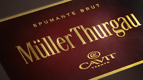
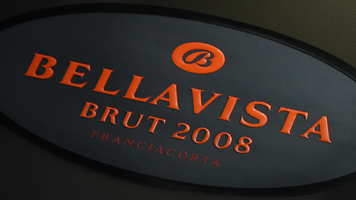
Restyling of Müller Thurgau Cavit and Linea Franciacorta Bellavista
In 1946, something strange happened. My father said: “I didn’t do market research, it just came to me”. In the town of Fagagna, in our town, there was real hardship in those years after the war. The people had next to nothing, struggled to buy food, there was no work. But one day, strangely, a horse and cart arrived from the direction of Collio. On the cart was a barrel of wine that was to be offloaded at one of the taverns in the town. Word spread and as the barrel arrived, half the town came out to greet it. Practically even man in the town. They couldn’t get the barrel into the tavern: the innkeeper tapped the barrel there in the street and as the people came forward he poured the wine. They emptied the barrel. My father, who assisted in this great feat, came to a conclusion: the people were desperate, they didn’t have money for food, and yet there was always enough money for a glass of wine. He said to himself: “if people drink when they are desperate, and yet they drink when they are happy… I must in some way become part of this industry”.
The business began to evolve: from printing notebooks he began to print labels for local businesses. But for which sector? At that time wine was rarely bottled, especially in our region, and was instead sold in large carboys. So: grappa? He began printing labels for grappas and other spirits and liquors. But it wasn’t enough to use the machine to its full potential. And so he added another type of printing, other types of labels to make use of the rest of the equipment for die cutting, veneering, etc. In those years, brooms were selling in incredible numbers. The traditional brooms had a wooden handle to which each manufacturer applied their own paper label. The brooms had famous names, like the Scopa Pippo, millions of which were produced.
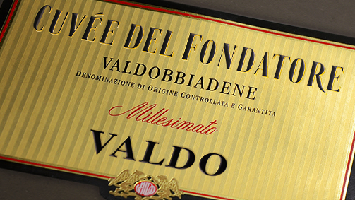
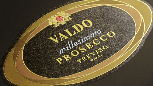
Restyling of Cuvée del Fondatore and original packaging of Prosecco Millesimato Valdo
So the business was printing labels for grappa, liquors, and brooms. From there, the customer service side developed, which required flyers, catalogues or boxes to be printed. The company gradually evolved from the flat bed printing machines and lithography. The first rotary machines arrived, the first Roland machines, from lithography to offset printing. As the equipment evolved my father began printing a bit of everything.
I entered the family business in the 1960s. I took a break from my studies, from university (I had graduated in accounting), and began working with my father. He involved me in the printing company and I made the decision to print just labels. My father agreed with the idea, and I became a partner with a 50% share of the business. When we were just the family together, I often thanked him for the opportunity he had given me, and he always replied: “yes, you are lucky, but I’m lucky too because I’ve given you 50% of my debt”.
And so you decided to specialise in one area?
Yes, in the 1970s we decided not to print any more flyers or boxes, but to focus exclusively on labels. Our core business has always been labels for wine, but back then we printed all sorts, from labels for soft drinks to the food sector.
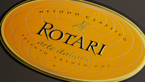
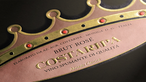
Original packaging of Rotari Arte Italiana and Costaripa Brut Rosé
As you have mentioned, one of your strengths is keeping pace with technological changes, and in fact, often being one step ahead. What are the latest innovations that you have adopted and what do you expect to develop in the future?
Over time we have adopted a range of innovations in order to meet the demands of our customers, realising what more we could offer with the rotary printer that was inconceivable with the flat bed machine. We tried to overcome the limits of paper and glue labels, where first we had to print then veneer, then add the bronze or gold touches… The process was too long, and the number of different stages made quality control quite difficult. A self-adhesive machine on the other hand could do it all.
Of course, we also needed to convince the suppliers. Our efforts (perhaps not only ours but of all those working with self-adhesive labels) went into constructing machines that offered greater possibilities and with which we could use offset printing, which was the primary technique used for labels, or rotogravure, while at the same time gold foil printing and varnish coating printing, making reliefs, embossing, and cutting. We began to make these demands of our suppliers, and we worked together to construct specific arrangements of machines, complete with offset, flexo, the option of gold foil printing, and also a rotogravure line. And in the end, and this was the greatest result for me, we were able to combine these operations with serigraphy.
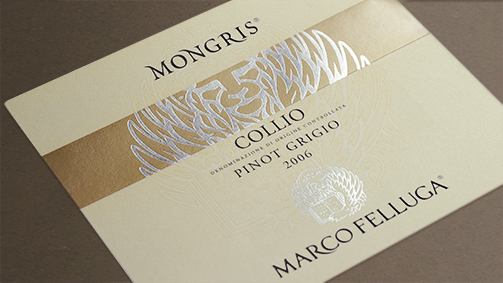
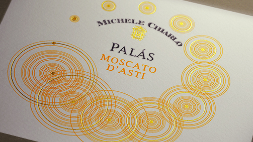
Original packaging of Marco Felluga and Michele Chiarlo
We here at Tonutti installed one of the first flatbed serigraphy machines. It was so slow; several people said we were crazy. I too was convinced that with such a slow printing rate, our clients would never have opted for serigraphic printing. But it turned out that the labels produced by the flatbed, although they were expensive, were of such great quality that they had an immediate boom and demand soon surpassed the production capabilities of the machine. So we acquired faster machines, still with a frame. And we were the first to have a mixed machine, in other words a machine with offset groups and a serigraphy group. The rotary serigraphy machines also evolved: today we can print with rotary serigraphy at a high rate for this type of production. We have machines that print offset for CMYK, flexo for veneer and full backgrounds, and in serigraphy producing great opacity and brightness of colours.
In what ways have you seen the client’s requests change over the years?
Over the years, our clients in all sectors, but especially in the wine sector, have begun to export more produce. With exportation, they demand more from the label, which has to be produced with paper that will stand up to the wear and tear of transportation and shipping to far-off places such as the United States. With wine bottles being shipped in holds where humidity exceeds 90%, our most frequent requests have been for labels that had suitable paper and glue and that didn’t allow mould to form. Demands also increased for ice buckets for white, sparkling, and spumante wines. It is important to be able to export products with the guarantee that the labels will arrive on the market in tact without the need to invest in expensive containers: for this reason labels with a scratch-resistant veneer are also highly requested, which can stand up to the stresses of transportation and changes in temperature. On our part, in collaboration with the raw material suppliers, we conducted significant research in this field, based on the requests of the clients.
Clients have also matured in relation to the quality of the labels they want and on this front we worked with the companies. It has become more and more important to have labels with brand, important labels, labels that stand out. We noticed that we were often being asked for labels that would appeal to all types of buyers, with different mentalities, because what might do down well on one market in theory might not work on another. This, in my opinion, is true to a certain point. Today, graphically, labels have a global appeal and at times reflect the characteristic of a place. The client wants it to be remembered, and wants the label to reflect the characteristics of their company. They want something extra and I would say that the graphic designers have given them just that. Today there are some beautiful labels on the market, and it is the market itself that demanded them.
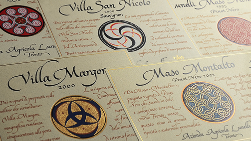
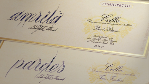
Original packaging of Azienda Agricola Lunelli and Schiopetto
What are the characteristics of a quality label today?
A quality label today cannot overlook certain necessities: above all it must have a glue that guarantees resistance to changing temperatures. Of course, the label for a red wine, if we’re talking about wine labels, does not need to be fridge-resistant. So we can use different paper for wines that need to be stored in a fridge or served in an ice bucket, but usually nowadays we opt for a glue that provides the essential qualities for all the labels and a front that is durable and scratch- and water-resistant.
Once the physical qualities have been decided, the label must be aesthetically pleasing. Therefore, the printing technology we have mentioned must be applicable to the graphics, adapting to the requirements of the designer. Today there are no limits to the realisation of a beautiful label, we can print offset if we have CMYK or hexachrome, we can add one or more golds to the same label, or a gold and a silver, with different tones of gold foil printing. We can use flexo printing for sections or fills. I believe that, now and in the future, a fine label needs one or more steps of serigraphy printing, even if only for the finer details, tones or touches. Finally, a label without embossing, without relief, to me seems like it is lacking something. But this is just me, as I try to get everything I can from a label.
We label printers have to be able to offer everything that the graphic studio asks of us. A label may be very simple, for example in just one colour, but the material on which it is printed and the technology used to print it makes all the difference.
Original packaging of Cascina Castlet
Ok, the last question: can you outline any trends you expect to see in the future regarding the evolution of this market?
It is difficult, but I believe that in certain sectors we will see labels of 100 square centimetres or even more. Today sleeves are on their way in, other labelling systems are developing, which in certain areas can give the designer the possibility of conveying multiple messages. We will almost certainly go in the direction of the sleeve, labels that cover the bottle completely. This trend, by now consolidated in other food and drink sectors, will also involve wine, clearly only certain types, certain products and certain quantities of wines. This trend is destined to expand, in my view, just like the trend to apply messages to the label: we are currently working a lot on augmented reality. We will see more and more labels with a small logo that one can scan with a smartphone to retrieve a lot of information about the wine, the product, the producer. We are already producing some great back labels: in the future they must be ever more intelligent, provide everything a consumer wants to know about the producer, that type of product, how it was made, and its year. In this way, we will have given the consumers what they want. The new world takes us in a direction where information, everything that is in the bottle, can be contained in a tiny label.
We believe that we are among the leaders in this area too, and every day we are trying to involve the suppliers of plastic materials to follow us, because plastic is not just an ugly, cheap or shiny material. We have started to re-evaluate plastic, achieving opaque or mixed results, i.e. shiny or matt (and nobody realises the label is made of plastic); we can also make reliefs on the label. In this way we also provide the durability and resistance to wear and tear that the producers request. I feel that in the not too distant future, relatively few labels for white, sparkling, and spumante wines will be made of paper. We will have more and more materials that will help us in our pursuit of the perfect label. Without naming names, the best labels of the producers of quality champenoise wines in France and in Italy now print on plastic materials. I think that, unfortunately, in the future there will be much less paper used in label printing. I was born with paper, I love it, I love the smell of it, but we will print less and less on paper. In recompense, we will give great satisfaction to our clients: certain problems will be a thing of the past and it is our duty to offer them this opportunity.
Projects that turn back the clock: Prunotto.
Barolo Riserva Bussia ‘Vigna Colonnello’.
The new label for the wine obtained from the small prestigious cru Vigna Colonnello, on the hill of Bussia, represents the latest evolution in a process of design archaeology that began in 1988 with the updating of a business card that had been used since the 1930’s.
A continuation of that memory, the packaging designed in the late 80’s for the Prunotto wines drew from those business cards produced with lithographic printing (a traditional technique used to print on stone), which the company’s salesmen used to hand out to potential buyers. Retrieved and redesigned in the form of an SGA label, while maintaining the original fonts, the type of paper, the colour and the format, they gave life to a classic, elegant, rarefied and authentic image.
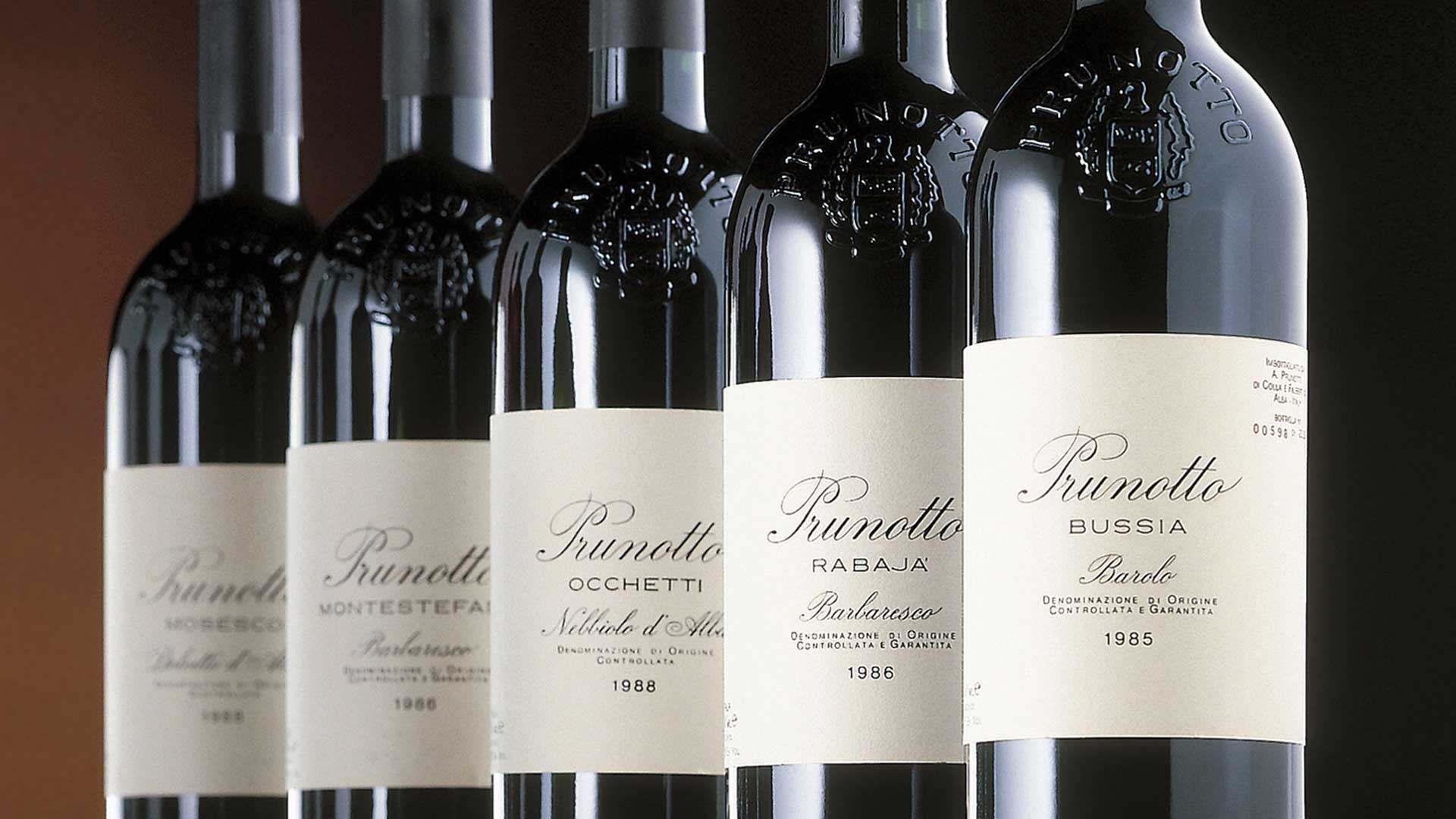
The labels designed by SGA in 1988
The simplicity and the rigour, which at the time were conveyed by black typeface on ivory paper, were updated by the new label that inverted the colour of the text on a black background. While entirely preserving the original layout, with a composition that places the epigraph at the centre, the new label has been cleared of any interference, placing any information about the wine on the back label.
The proprietary element, after the Prunotto signature, is the name of the vineyard, among the most prestigious in Barolo, to which the maximum emphasis is afforded at the conclusion of the epigraph.
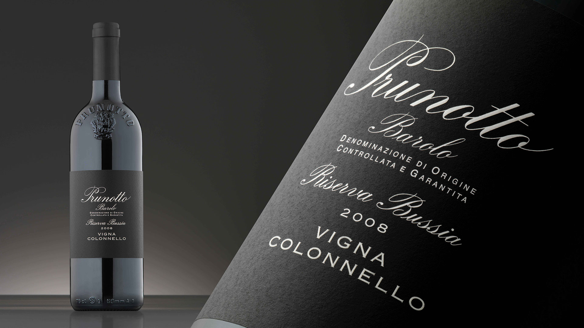
Barolo Reserve Bussia ‘Vigna Colonnello’
The label blends with the body of the bottle; it lets the text emerge from the black background, to step up to centre stage and to harmonise with the glinting reflections of the brand in relief on the glass.
The highest positioning of this Reserve is conceded to the more subtle yet most significant aspects, such as the preciousness of paper and the tactile quality of the relief applied to the brand and the name of the wine.
Despite the fact that almost three decades have passed and Prunotto has been bought by a new owner, the original project has proved to be extraordinarily current and effective.
The new project for Vigna Colonnello, in strict coherence with its historical counterparts, shows that it is still possible today to adhere to the same values and criteria, producing a result of indisputable impact.
Tag Packaging
Bottles and battles. The story of Guido Berlucchi told by the mind behind the success.
Franco Ziliani tells us about his professional experience in the world of wine, about the obstacles he has had to overcome along the way, and regales us with a few memorable anecdotes.
The company that he co-founded, Guido Berlucchi & C S.p.A., is market leader on the Italian market in the classic method sector, producing 4 million bottles a year and with around 10 thousand clients in Italy and in 33 countries around the world. The company currently has around 500 hectares of vineyards in Franciacorta and 90 collaborators working at the headquarters, in the cellars and on the vineyards. Since the harvest of 2014, the vineyards of the company now managed by Franco Ziliani’s children Cristina, Arturo and Paolo, are being converted to an organic regime.
Franco Ziliani with his children Cristina, Arturo and Paolo.
What intuition back in the 1950’s led you to create this company?
My career in wine officially started in the 1950’s, I was lucky enough to try Champagne. In those days we usually accompanied out panettone with Asti Spumante at Christmas, but my father worked in the wine sector (like his father before him), and one year he brought two bottles of Champagne home for the holidays. At that time I was studying enology in Alba, and I knew Champagne thanks to the great lessons of Professor Dell’Olio, who had a passion for the famous French wine. When I tried it, I decided that I would reproduce it in Italy. Naturally, first I would have to find a wine that could be suitable for refermentation in bottle, base of the classic method (at the time called méthode champenoise) which used to be taught by a very skilled technician. Often, to demonstrate the process, he would take us to the winery he directed, Calissano winery, in the centre of Alba. In Piedmont, like Cinzano and his “cellar of a million” (rumoured to contain a million bottles) they applied this method to Asti, at least until they moved on to charmat method, in other words on to fermentation in autoclaves..
In 1954, after resitting some exams, I got my diploma: I wasn’t a good student. I left Alba to return to the province of Brescia and soon after that my father passed away, so I closed his small company that sold wines popular at the time, and I started to cooperate as technical consultant for wineries, especially in the area of Lake Garda. One day Alessandro Borghese, a wine dealer, told me: “Mr. Berlucchi is looking for a technician: he wants to try to bottle the batch of Pinot Bianco he has at the castle.”
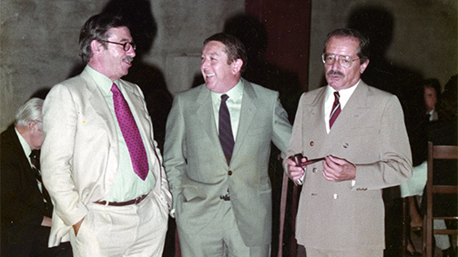
Giorgio Lanciani, Franco Ziliani and Guido Berlucchi.
So in 1955 I went to Palazzo Lana Berlucchi to meet the descendant of the counts Lana de’ Terzi. The house was incredible, and I was also impressed by the old cellar and the narrow alleyway that led to it: from a beautiful stairway you entered a vault, beneath which were some small cement bowls. It was in that cellar that, limited as we were by the strict laws, we began to experiment, bottling this wine, that Guido Berlucchi sold under the name of “Pinot del Castello di Borgonato”. He had designed the label himself and it depicted the lodge building in the passage of the 16th century residence; the wine was sold in Bordeaux-style bottles. Berlucchi loved Bordeaux.
On that day I put it to Berlucchi: “why don’t we do something a little more unusual? Let’s try to transform this Pinot Bianco with the champenoise method”. Guido Berlucchi was perplexed, but in the end he accepted. We created a company (at the time only verbally). Our goal was not easy to achieve: we didn’t have the right materials, we had no experience. The champenoise method was virtually unknown in our area, I had to make do. I often went to the enology school, but even my technician friends could only offer vague suggestions.
Three or four years went by, and in the meantime the wine in the bottles had started to ferment again, I never knew why. At a certain point, with the production of 1961, three thousand bottles came out well. I got some white wine to leave as brut and the following year some rosé too (that Guido named Max Rosé and which was the first rosé produced using the classic method in Italy, dedicated to his friend Max Imbert). The Pinot of Franciacorta was born. We put the bottles we had on sale: the new wine, after the initial scepticism, went down extremely well.
The Sixties: Franco Ziliani in the cellar and with the British Consul William Sharpe.
The next year we increased production, and still further in the years that followed. Demand started to increase, and to think that I started by dragging everyone I knew to the cellar to try it, friends, family. They loved it and bought crates of six bottles, then they would telephone and say they wanted another two, another five… Moral of the story: we started to sell out with ease. We went on for two or three years, continually increasing production. We were soon producing twenty thousand bottles a year. I remember when we stacked them in the cellar; myself, a butler of the Berlucchi household, Mr Guido’s personal butler (called Beppe), and the cellar manager. Laying down the last two bottles, poor Beppe exclaimed “well we’re ok for the next twenty years”, thinking of how long it had taken to stack away the first bottles: more than two years!
And how were those first bottles?
The first bottles came from the glassworks of Asti, they were beautiful, dark, with a pronounced, thin neck. The corks, which I bought from some producers in Piedmont, were cut from a single piece of wood. The cork was always a problem because occasionally, as you removed the wire cage, it would pop; other times it wouldn’t come out or broke, it was a hassle. Then there was another problem, we didn’t have a proper wine fridge, only a normal one, so freezing the liquid that was to be expelled took hours.
In the winter of ’62 I visited Champagne for the first time: it was the precise period when they were putting the crown corks in. I immediately adopted this technique too, but faced serious problems with the seal. The cork was a real obstacle.
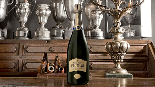
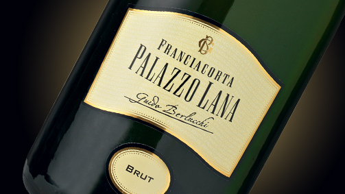
Original packaging of Palazzo Lana.
At the beginning of the 1960’s I had abandoned my father’s company and opened a technical assistance office in Brescia, but I stopped by at Borgonato di Corte Franca in the morning and on my way back. One evening, in an office on the lower floors, I found some beautiful corks. They turned out to be some samples that a French visitor had brought from Spain. Without wasting a moment I had Mr Berlucchi lend me a car, an old Morris. I set off at once for this cork factory with a colleague who still remembers this trip. We set off at 6 in the evening and arrived at 11 the following morning. After a short stop at a motel, we loaded the car – inside and on the roof – with paper bags full of corks. I couldn’t wait to get back to use the new corks and replace the old ones, they were such a disaster. On the way down from Épernay in Borgogne, before turning off towards Mont Blanc, we hit a sudden storm. Back then it wasn’t motorway all the way. At a junction I had to brake hard: the corks on the roof were thrown all over the road.
We stopped the traffic, we threw the corks in the back of the car loose as the bags had fallen to pieces… when we set off again the car stank of cork, it was intolerable. We had to do the rest of the journey with the windows down. We got to the border at the foot of Mont Blanc at 5 in the morning: it was too early and the border wasn’t open yet. When they finally arrived and checked our documents they said: “here it says 24-25 parcels… all you have is corks!” The border officers thought it was a trick and started cutting the corks open to see if they contained something illegal. Only after I told them the whole story of the storm they let us go. By 4 in the afternoon we were back in the courtyard of the Palazzo. I said to the cellar manager “Battista, take the corks and put them in the boxes, I’m going to Brescia to sort things out with customs. When I got to Brescia I still couldn’t get the all clear. I tried to protest to an official, who replied “you tell me: you set off with 24 parcels, now you have 28, how come?”
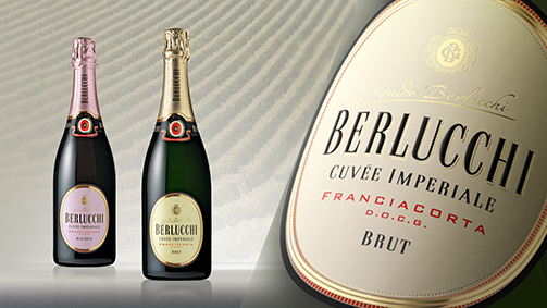
Restyling of Cuvée Imperiale.
Can you describe the first packaging the bottles had?
The first packaging of our bottles was done in Brescia at Apollonio. It was conceived by the third partner, Giorgio Lanciani, who was passionate about art. The first label was beautiful but very expensive. It was oval shaped, with the name in relief. The shape made it stand out from the other wines. We wanted to be innovative, like producing sparkling wine in Brescia was. The year was shown in the centre of the label, which was also new, as at that time the year wasn’t normally shown on the bottle. But we had learnt a few things in France…
I’m sometimes accused by my colleagues of being a Francophile; actually I owe everything to France and its wine producers, like Moët et Chandon, who have hosted me dozens of times. I was always welcomed at Avenue de Champagne, in Épernay, by their PR person. It was the Countess de Maigret who, what a coincidence, had gone to college in Bologna with two sisters from Brescia. It was they who wrote us a presentation card the first time we went to Champagne. I’m not ashamed to say it, I copied everything I did from the French. From the crown cork to the first gyropalette, to the first dosing machines… We only needed the land. But I was determined to make a wine like Champagne. Because I asked myself: “is the quality of this wine simply down to nature or is a large part of it determined by the human factor?” I convinced myself that the human factor was the key, but in truth man can only preserve what nature provides.
Did the grapes you used to begin production come from the territory?
Our grapes came from Franciacorta. To begin with we used ours, also we bought them locally, sticking with Pinot Bianco. Pinot Nero didn’t exist. I planted our first Pinot Nero vines myself: it produced such small grapes, production was so low that cultivation of this variety only developed much later.
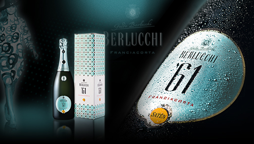
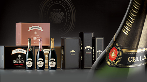
Original packaging of ‘61 Franciacorta and Cellarius.
Have you faced many difficulties in your career?
Particularly limiting laws and legislations have often posed obstacles that were difficult to overcome. For example, the chaptalization of wine that will be made spumante that is below the sugar level limit and therefore the alcohol limit. In France there is more freedom, and here it’s a problem. They were clever, they didn’t call it “sugaring” like in Italy, they named it after Chaptal who invented the practise.
Burocracy: a nightmare. I remember when to send wine to America I needed the INE stamp. I sent the documents, and in Rome they authorised shipping of the Pinot di Franciacorta, the Brut but not the Rosé. Why? Because the regulation stated that the wine must be “yellow with green reflections”. But if you let me use the Pinot Nero, why can’t I also make rosé? I had to fight to make it.
And that’s not all. We were the only producers in Italy that had to pay VAT raised to 38% for sparkling wines that had to be produced with fermentation in the bottle (méthode champenoise). The law had been introduced to target Champagne, but it also hit us as we used the same method. I went in person to Rome to knock on the door of the Ministry of Agriculture, and I didn’t let up until they changed the article of law.
I also remember falling out with the director of the consortium of typical local wines in our region, when I tried to encourage the producers, as few as they were, to plant Pinot Bianco and Chardonnay. One day he invited us all to a conference in which he argued that the wine of the Italians is quintessentially red. “No!” I exclaimed. Out of around a hundred people present, perhaps 98 of them sided with him. And so he stood up, raised a glass, of red wine, and proposed a toast: “I drink to the death of the sparkling wine of Franciacorta!” What doesn’t kill you makes you stronger…
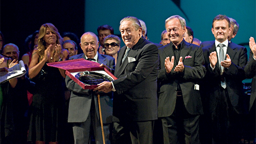
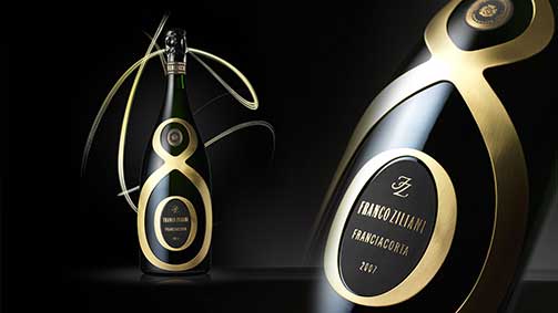
2011, Brescia Teatro Grande: Franco Ziliani celebrated by the producers for his 80th birthday and the 50 years of Franciacorta.
Below: the limited edition dedicated to him.
Wine2wine: how to improve the image and consolidate the brand in the world of wine.
Investing in an image in the wine sector (what does it mean and why is it important?)
It means the investor understands that they need to be recognisable and memorable - it seems a given but it’s not the case. Producers invest in the vineyard, in the cellar, in the production, but they don’t always put the same effort into the presentation of products on the market, failing to realise that even the best quality products will suffer as a result.
Renewing the image: why should I do it?
It only makes sense to renew an image if it is inadequate.
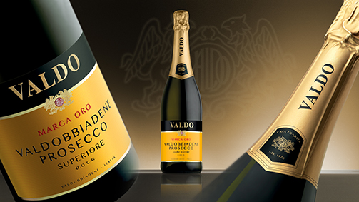
Packaging restyling of Marca Oro Valdo
How do I know when it’s time to change?
By cultivating a dialogue with the operators of the market, a company can collect feedback, ideas and suggestions: observing competitors, without imitating them, is also just as useful.
I’m concerned that my clients no longer recognise me: am I wrong?
I would say so; any disaffection of loyal clients does not depend on the aesthetics. Nonetheless, it is true that ignoring unequivocal signals inevitably has negative effects.
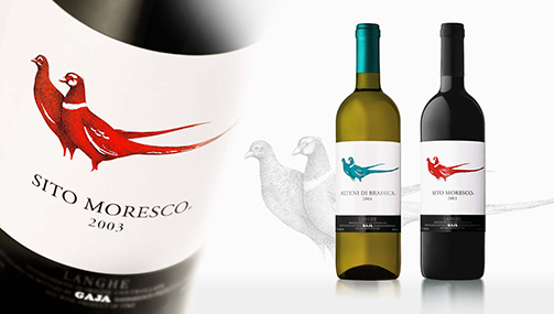
Packaging restyling of Gaja
What risks do I take if I decide to change my image? And if I don’t?
You can’t really answer this question in general terms, there are too many variables. We can say that a change of image – which is certainly a delicate process – should be approached as an opportunity, not a threat.
In this sense, failing to act translates into a wasted opportunity.
What must the image restyling involve? (e.g. logo, label, packaging, etc).
Not only must every element of the packaging be rethought, but almost always, the restyling process goes well beyond the packaging and develops the identity and communication of the company.
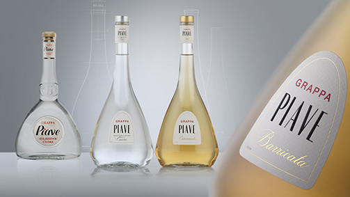
Packaging restyling of Grappa Piave
Of the elements involved in the restyling, are some more important than others, or it is best to work on everything equally?
Elements involved in a restyling project have varying degrees of importance; however, it is fundamental to work on all elements, even those that are relatively less important.
The future of the wine sector (new trends and best practise from Italy and around the world).
Many different trends coexist and creativity has really exploded: the greatest risk lies in a trend that has seen many producers adopt a generically defined international look. As a consequence, the packaging fails to convey the cultural and territorial connections of the product.
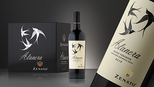
Original packaging of Alanera Zenato
Tips (what are the do’s and don’ts).
Among the do’s I’d place our extraordinary capacity to create wines of great personality; care for the environmental (and thus for people) is improving our level of civility and wellbeing.
Things to avoid are any kind of imitation, in tastes and styles; don’t repeat tired communication strategies. As I mentioned before: don’t leave out the values that characterise the production and the culture behind it.
Communicating wine: the global vision of Giovanni Minetti.
Intervista a Giovanni Minetti: comunicare il vino from SGA Wine design on Vimeo.
An interview with Giovanni Minetti, professor of agronomy specialised in viticulture and enology at the Agricultural Faculty of the University of Turin, who began his career as a an agricultural engineer at the Alta Langa mountain community. In 1979 he began working as a an executive and then director for Regione Piemonte, at the Agriculture and Forestry department; between 1992 and 1996, still with the Regione Piemonte, he assumed the role of director of the viticultural department. Between 1982 and 1996 he was also the director of the Enoteca Regionale del Barolo. For 17 years he was then the managing director of the historic Fontanafredda estate in Serralunga d’Alba. Minetti was named president of the Consorzio di Tutela del Barolo, Barbaresco, Alba, Langhe e Roero on 15 January 2001, and held the position for six years. After the creation and launch of the internationalisation project “Nuovimondi” for the producers’ association Vignaioli Piemontesi, since September 2014 he has been the managing director of Terre Miroglio, an organisation that unites the historic Tenuta Carretta, an estate in the production area of Roero; the Malgrà company, in Mombaruzzo, a producer faithful to the traditions of the classic wines of Monferrato, and the Edoardo Miroglio Wine-cellar, a producer with over 150 hectares of vineyards in Tracia, an ancient territory with more than 5000 vineyards.
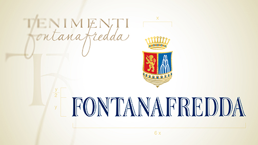
Brand design
What where the key stages of your professional development?
After getting my high school diploma, a degree in Agricultural Sciences and my specialisation in Viticulture and enology, the first fundamental step in my career was winning a selection and entering Regione Piemonte, initially as an expert and then as the Assessor of Agriculture. My first position was in Cuneo, and after a few months I was transferred to Alba, in the trenches, getting to know the wine producers first hand: this experience gave me a significant insight into the world of vines and wines in Piedmont. A few years later, as an expert with Regione Piemonte, I was asked to assume responsibility for the Enoteca Regionale of Barolo, based in Castello di Barolo: both a cultural and technical experience that taught me how the world of Barolo is structured in terms of its operations and producers. This knowledge grew further when in 1996 I was called to take on the role of Managing Director of a company like Fontanafredda, which had constructed and represented the history of Barolo over the last 150 years. These key stages of my career were interspersed with other experiences as a journalist and meeting Gino Veronelli, who made me realise the importance of critics in the world of wine and the importance of the image of the company perceived by the market. These milestones mark out what has been an interesting career path, and I’m not at the end yet. During this time I have matured a complete picture of the world of wine from a technical and legislative perspective, and in terms of production, the market, marketing and commerce.
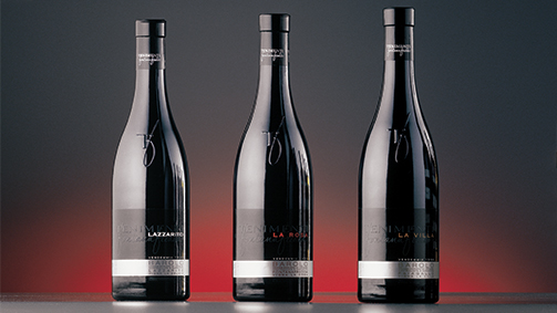
Original packaging of Le Vigne
What are the differences between the promotion and communication of wine at the start of your career and how it is done today?
Until the 1980s it was difficult to find great quality wine. Only a few producers focused on the quality of the product, and even fewer concerned themselves with how it was presented. Today the situation is completely different, quality has become a prerequisite, and other values now make the difference: the way the wine is presented, the packaging, the choice of bottle, the cork, all of which contributes to the product’s image. This is the most important change I have witnessed in the last twenty years. In the same time, I have seen a shift in the channels of communication, the relationship with the press, with the clients, and with the intermediaries (agents, wholesalers, restaurant owners), who was perhaps a stronger figure in the 80s. Today the consumer, with the help of media and the internet, wants to by-pass this channel and purchase directly from the producer. It is clear that this more direct approach opens questions on the function of the trade: I am convinced that it must evolve towards better customer service. This is where the smart money is today.
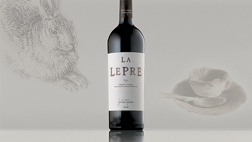
Original packaging of La Lepre
Regarding this new way of communicating with the public, are there still differences between the approaches of the institutional sector and those of the private sector?
As I see it, the job of the institution must be to act as the catalyst between the production and the market. Their role must be that of facilitator: the institution should bring together the companies and bring them closer to the market, creating at the same time situations that encourage the market to come to meet the companies.
Restyling of Papagena
Barolo: what are the objectives and contents that will be outlined in the future for this wine and this territory?
Barolo is a flagship wine, an undisputed symbol that has spearheaded the growth of the territory. The question of the evolution of the name remains open, even if all things considered, we have already reached an important milestone from this perspective: after decades of discussions we have managed to delineate and identify additional geographical areas. We managed to map out the Barolo territory, giving a name to every micro-area (the so-called “cru”, or sub-zones) and putting a definitive end to litigations over labels, where some claims were legitimate, others probably false. It is a clear sign for both the market and the production: today everyone can work towards raising the value of well-defined denominations within the world of Barolo. Now the challenge passes to the market, which will be a fair judge as always: of 172 additional geographical denominations, only around forty will be recognised, while the others will be forgotten. But the important thing is that they are clearly defined and the boundaries distinct, so that from now on the situation of Barolo wines is clear and not subject to change, as it is in Barbaresco.
Original packaging of Barolo Riserva
There is talk of a new project that involves the creation and launch of a new label and the fine tuning of commercial strategies that are waning on the foreign markets, and that will concern some of the most dynamic producers in Piedmont. Can you tell us more?
It’s an ambitious project that mainly involves an area of Piedmont (not just Barolo) and aims to unite the production of several cooperative wineries agricultural companies under a single label. The idea is to begin from the vineyard, imparting particular protocols of vinification, to achieve a dual result: first of all a production of higher quality, and then a concrete support of the world of the cooperation. These protocols, which we’re now in the process of elaborating , will initially be applied to produce a limited number of bottles, but we think and believe that they will be implemented on a more general scale, so that all the producers make them their own.
There are already protocols in place at the vineyards, which in recent years have spread significantly: there’s still much room for improvement at the wineries, but there are already products of extremely high quality that are relatively unknown to consumers. One of the objectives of this label is to raise its profile and seek out a market that recognises its quality and therefore is willing to pay for it.
Original packaging of Moncucco
Which markets are most interesting and for which wines?
The market that is showing the most promise at the moment is the Chinese market: the prospects for growth over the next 10 years are enormous. It is quite a surprising market since substantially the Chinese are not huge wine consumers: it is still unknown and chosen for special occasions. As far as the wines of Piedmont are concerned, China is interested in at least 3: Barolo, renowned for its quality, Barbera (both d’Alba and d’Asti), and the sweet wines (Moscato d’Asti and Brachetto d’Acqui), which go perfectly with the cuisine of the east coast. Barbera, Nebbiolo and Barolo are more popular in the central regions, as they better accompany the stronger flavours of the cuisine inland. There’s another particular aspect that makes the Chinese market interesting, which is tannins: the tannins of Barolo, Nebbiolo, and Dolcetto are very similar to the tannins in tea. This cultural affinity is creating some unexpected situations, and we’re realising that the Chinese feel ‘at home’ drinking wine, much more than we could have imagined. The extraordinary potential of China must not lead us to forget about other countries, the traditional markets for our products. We need to pay particular attrition to northern Europe, which is open to everything Piedmont has to offer: from the most expensive wines to the cheapest, reds, whites, sweet and sparkling. On a more sorry note regarding the success of our wine on the world stage, we have not yet managed to get an Italian standard of our dry sparkling wine to take off, and this continues to create numerous obstacles to the market of the Metodo Classico, it is very difficult.
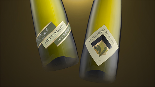
Packaging originale Moscato d’Asti e Le Fronde
In relation to these markets and their diversity, does the communication change? And if so, in what way?
China has very clear preferences: some colours are accepted and others not. They like bottles that recall Italian style and elegance, but at the same time they like gold decorations and red embellishments, as wine is above all a gift in China, the more lavish looking the bottle, the greater the perceived value. When designing a label for the Chinese market one faces a specific challenge, to unite seemingly contrasting elements.
In other parts of the world, everything is more subtle: normally on the American, Scandinavian, German, or English markets, the image and packaging used for the Italian market are equally effective.
South America on the other hand is a rather closed market, with the exception of a few footholds in Brazil: our wines are seen as too expensive, and suffer the competition of Argentinian, Chilean and Brazilian wines, available at much lower prices. It is true that Italian wine has its own image: nowadays wine is sold as an expression of culture and territory, therefore as something that characterises a way of life. And this is what makes us competitive, despite the fact that our prices are not; on one hand, if we accepted price war and competed in this respect, we would always come off worse, as the production costs in South America are ten times less than they are here. On the other hand, we are entering and consolidating foreign markets due to the very fact that we are Italian, that we are from Piedmont, the Langhe, and therefore we are able to create an air of the territory and cultural context in which the wines are produced.
I believe strongly in the ‘incoming’, I believe in the growth of wine tourism. The consumer no longer trusts what he reads, or what he sees in the media: he wants confirmation himself, he wants to meet the producer, talk to him and see how he lives, works, understand the product and have it explained. This aspect is fundamental. On a personal level, it has convinced me to invest in a print and online magazine called Wine Pass, which aims to act as a go-between to bring the producer closer to the tourist and consumer.
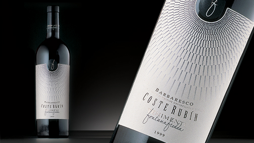
Original packaging of Coste Rubín
The future belongs to those who believe in the beauty of their dreams. (Eleanor Roosevelt).
Brand design, product packaging and the planning and coordination of all elements of company communication in the wine sector are now backed up by experience in the food sector, expertise in publicity and the use of new media and event planning.
They form a team of professionals that share not only a new headquarters, but also a modus operandi and a clear philosophy: according to Heidegger, the meaning of existence lies in openness to the future, while Flaubert argued that the purpose of art is above all the search of beauty. These are the values we constantly refer to in our approach to design.
The list of services reflect this common vision and approach:
· BRANDING
Strategic analysis · Brand architecture · Brand study · Brand manual · Coordinated image · Naming · Type design
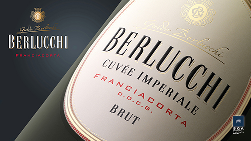
· PACKAGING
Analysis, definition, and positioning of the product · Study of the packaging and secondary packaging
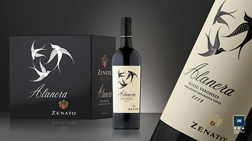
· DESIGN
Bottle design · Special editions · Food containers · POS material
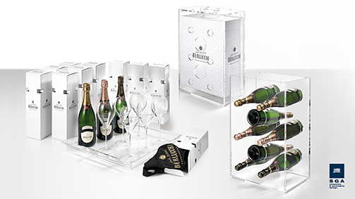
· RESTYLING
Brand restyling · Product restyling
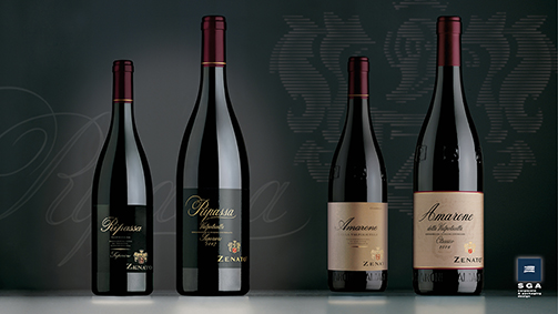
· COMMUNICATION
Advertising · Publication · Promotional materials · Ambient, guerrilla and viral marketing · Digital marketing · Institutional press office for products and events
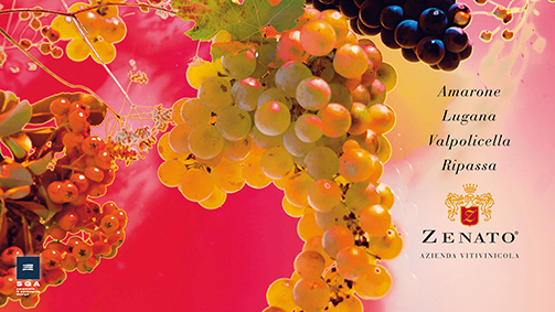
· WEB AND APP
Siti web · E-commerce · Interactive company literature · Apps for IOS, Android, Cross platform HTML 5/CSS3 · Apps for Facebook
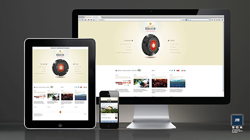
· EVENTS
Institutional · Motivational · Format · Road show · Enogastronomic reviews
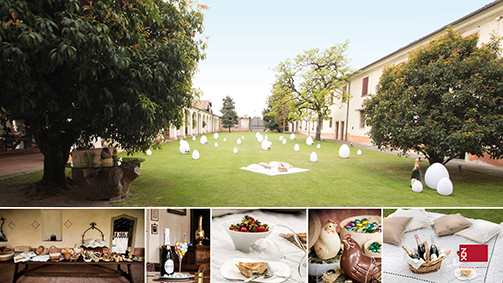
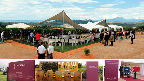
· SOCIAL MEDIA MARKETING
Creativity applied to the Social Networks · Creation of editorial plans · Community operations management · Monitoring, analysis of online word-of-mouth and results achieved · Digital PR activity · Personalised training
· STAND AND STORE
Temporary stands and outfitting · Concept Store · Showroom · Corner
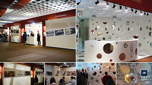
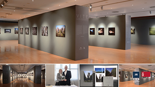
www.sgawinedesign.it/synergies
Tag Global design, Packaging
Restyling for René Briand: valorize the authenticity.
The product name was given priority with a more current font, which was researched and plays on the movement created by the descending strokes of the two ‘R’s that accentuate the product’s personality.
The idea of dividing the label in two was inspire firstly by the desire to make some of the information regarding the product more visible, especially its Italian provenance, and secondly by the fact that it would allow the colour of the brandy itself to become an integral part of the packaging. SGA first worked on the tear-off tab, giving a perception of prestige even before the graphics of the packaging are introduced: we created an equilibrium between the shape of the container and the shape of the label. Brandy René Briand, in its new packaging, is more recognisable, authentic, contemporary, and attractive.
Print Buyer: communicating wine through design, culture and creativity.
The allure of a wine (also a champagne, a prosecco, or a whiskey) is not limited to the contents of the bottle, which, let’s be clear, is essential to the commercial success of the product, whether it be a low cost wine for the international market or a product with the prestigious family name of one of the great Italian wineries. Yet how it is presented is just as important as the contents: the bottle, the label, the cap and the packaging. Although producers are ever more concerned with pricing, whether for a bottle that costs 30 euros or one that costs 3, they know that they cannot neglect the corporate identity of the winery, the design and what is generally referred to as ‘communication’, which then merges with publicity.
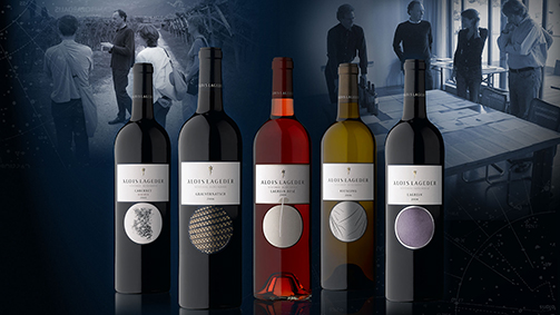
Original packaging for Alois Lageder
How has communication in the wine & spirits sector changed and how is it changing? What are the trends?
By now it is generally accepted that activities and messages must be coherent, just as the tools, whether traditional or innovative, must be interrelated and integrated”, says Giacomo Bersanetti, 57 years-old, leading the SGA Corporate & Packaging Design team in Bergamo. “History, territory, and productive methodology remain fundamental, but the way of expressing these values has become much more emotive and involving. We are seeing more and more opportunities to meet the producers who give us direct knowledge and experience.
How important is how one packages the product: from the bottle to the label?
Every wine has its own identity which translates into the value of uniqueness. The task of the packaging is to make this value visible and perceptible through a system of signs. It is the aesthetic value of the project that communicates the value and personality of the content.
Furthermore, in the wine sector, the packaging represents the main vehicle of the company image, and is therefore the most important element in the construction and transmission of the brand identity.
This goes for the bottle and the label, which often become the true symbol of a company.
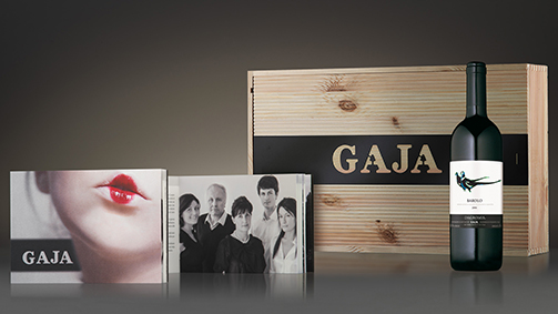
Packaging, secondary packaging and publishing for Gaja
What are the current trends regarding the shapes of bottles?
There are several trends developing simultaneously: bottles with generous proportions are drawing attention, contrary to in the past, and slender looking bottles are popular. For white and rosé wines, transparent bottles have seen a lot of success, and in general I see that producers are opting for clean shapes with minimalist geometric designs.
There are many bottle shapes to choose from, but room for experimentation is even greater. Generally, hollow industrial glass is used, while prestigious brand spirits opt for artisanal blown glass. Crystal is not used for bottles but it is used for accessories such as decanters and glasses.
What colours are most commonly chosen for bottles?
As I said, transparent bottles are popular at the moment, the classic dark green and oak colours are always in fashion, but many are choosing gold coloured glass now, which protects the wine from UV rays and also lets you ‘see’ it. Picking up a theme dear to those who bottle mineral water, blue is also becoming popular.
The original bottle for Arzente by Bellavista
And regarding labels, what choices are most requested by the market?
In this sector, creativity has really exploded. We use every possible new technique and for this reason we have a very close and precious relationship with the printing and embellishing companies with whom we work constantly, often inspired by their research into innovative solutions. For example, they have developed ways of printing the serigraphy of the labels directly onto the glass. In recent years, we have witnessed a move to self-adhesive labels, in place of the classic paper and glue. It doesn’t cost any less but it is more ductile in the phases of pre- and post-production. There’s also a trend in wines for exportation, from Italy to South Africa and Australia, to adapt wine and label towards a post-modern, informal and simple style. However this trend unfortunately is detrimental to the territorial recognisability of the product.
What kind of printing is preferred for labels?
Each printing technique has its own characteristics and produces a different result: bringing together serigraphy and flexo, offset and heat lamination, different materials for the support and different embellishing treatments, is a little bit like combining the voices and distinctive sounds of different musical instruments in a harmonic composition. The labels must respond to a sense of both freshness and vivacity, with research into new colours and surfaces thanks to the inks printed over the laminate or with embossing.
Packaging, secondary packaging and bar counter for Berlucchi ‘61
What are the vehicles that communicate the essence of the wine on the concept store and packaging levels?
The essence of the wine is a cultural and psychological factor, and for this reason we have always used elements that evoke and inspire sensations that resonate with our sensibilities. Think of the name “Saten” for example, which we conceived for the famous wine of Franciacorta, or of highly recognisable and memorable primary signs such as those of the labels of Ca’Marcanda or the bottle shape for Villa Sparina…
The study of the secondary packaging has become as important as the primary packaging project, and often constitutes an expansion of this; as has the branding of local events.
The packaging can be classic, with wooden crates, using, as we did for one large company, medium-density fibreboard, which reduces the costs, is distinctive, and kind to the environment: primary requisites for all modern companies. But, as well as metal, plastic materials are also used for the labels. I’m referring in particular to spumanti and champagne wines, which are served in ice buckets and therefore must be waterproof.
How important are references to environmental factors, from the wooden crate to the simplicity of the bottle and the role of recyclable glass?
It is ever more important; a number of recent projects have come out of the need to optimise the production of a container and ensure easier management of the materials during the various phases of production while, naturally, responding to the need to be distinctive, recognisable, and elegant.
How important is the printed material that accompanies wine products: brochures, catalogues, etc.?
This type of communication maintains a significant role, above all in relation to high level products (limited editions) and institutional communication, especially since it reaches those truly passionate about wine. Other than the content, these readers are struck and gratified by sensory elements, such as the colour and tactile characteristics of the paper or the richness of embellishment, and many other aesthetic solutions that cannot be perceived through a monitor or in online information.
Web site for Le Sincette
The new digital communication tools, from social media to websites, are by now indispensable and have allowed us to expand our communicative scope and establish a direct dialogue with a greater number of people compared to printed communication. In both cases, the quality of the content remains decisive. It is not always possible to visit a company and get to know the products first-hand. Websites and social media adapt perfectly to allowing customers to get to know the products remotely, providing an increasingly complete experience.
Emilio Pedron: faithful to ourselves, without stereotypes.
Intervista a Emilio Pedron: fedeli a noi stessi, senza stereotipi from SGA Wine design on Vimeo.
Managing director of Bertani Domains, Emilio Pedron, was born in Cles in Val di Non in 1945. After completing his studies in oenology at the Agricultural College of S. Michele all’Adige, he moved from Trentino to Valtellina to take up the position of director at the Nino Negri winery. During the 1980’s, his career took him to the Lamberti winery in Veneto, after which he became the managing director of the Gruppo Italiano Vini in 1996, where he remained until 2010. From 2003 to 2009, Pedron was the president of a consortium for safeguarding the wines of Valpolicella, where he actively worked to obtain the DOCG quality assurance denomination for Amarone.
Special edition
Mr Pedron, how did your career in the world of wine get started?
I’ve been living in this world practically my whole life: my father had a small vineyard in Trentino, so I’ve been around grapes and wine since I was born. My professional career, which has taken me all around Italy, has also allowed me to learn and improve: starting from a small winery I’ve gone on to direct an important group, perhaps the most important group of Italian wineries.
Based on your experience, how has the consumers’ perception of the wines produced by the Bertani company changed over time, and how has the way they communicate with the consumers evolved?
I believe that Bertani is a really exceptional and atypical case: it is a brand that was created in pursuit of quality, with a particular and recognisable style that it has managed to maintain over the years. Not only has the company been able to preserve it, but we have consumers that recognise and seek out this style. This is our great strength and, if you like, also our handicap: we are characterised so strongly by our admirers that we find it hard to find new ones among younger consumers. The loyalty and attachment of our consumers remains nevertheless one of our biggest advantages: God help us if this changes.
Special edition
In a recent interview, you criticised the excessive importance that producers give to using the price tag as a leverage tool in marketing. Do you think that the packaging and the marketing of a wine are fundamental characteristics in promoting the values and implicit meanings of a product? Can the ‘wrapping’ of a wine influence the perception of its quality?
I think that Italian wine has a relatively brief history on the global market, having only recently been introduced to foreign consumers compared to French wine that was exported centuries ago. We therefore have to rely on a tradition, a history, and an ability to appeal to less sophisticated markets. For this reason, many producers only know how to use the price as an element of competition. But using price as leverage is very difficult and very risky, since it tends to create a pricing war. The average price of Italian wine sold abroad is half that of French wine, and this says it all. We need to learn to distinguish our products and compete with added value that goes beyond the natural quality of the wine, and to do this one certainly needs to know how to communicate in a modern and articulate way.
Packaging design
What are Bertani’s ambitions in reaching more interesting markets, and for which wines?
Due to the characteristics of the entire range of products of the company, the most interesting markets are the more mature ones: Italy, the United States, Canada, the U.K., Germany. And then a lot of more recent markets such as Japan, Russia, and ex-soviet countries. In any case, anywhere we sell in the world, we appeal to the more expert consumer who recognises our style and can appreciate our quality. Therefore we have to work hard to maintain our image and not to let down our current consumers.
Considering the important work you did for the Consorzio Valpolicella, what tools can a territory use to promote itself and how can the various companies organise themselves to compete on international markets?
That’s an interesting question. “Valpolicella” is a collective brand, a brand that belongs to a great many people and a vast territory. In general, the difficulty in managing collective brands lies in having to take into account the behaviour of a lot of individuals and a lot of companies. I believe there are two elements that are key to raising the value of collective brands, and therefore also of Valpolicella: one is to preserve the natural beauty of the territory, protect its historic value and traditions, and translate the quality of the region as a whole, not only in relation to wine productions, but with regards also to agricultural production, tourism, and hospitality. The other key element is the behaviour of the producers and all parties involved in the production of, in this case, Valpolicella. This behaviour should be as cohesive as possible and aim for common objectives. This is the most difficult thing, since producers are all very different: small, big, historic or fledgling companies. Each producer sees things in their own way and acts differently. This is one thing that distinguishes the Italian territory from the French: unlike the Italians, who are much more individualistic, the French are used to pursuing the same qualities, the same objectives.
The territory of Valpolicella and of Amarone have been great examples of success over the past twenty years, and thus today they are perhaps more at risk than others, since from success comes even more autonomy and individualism in the way producers operate.
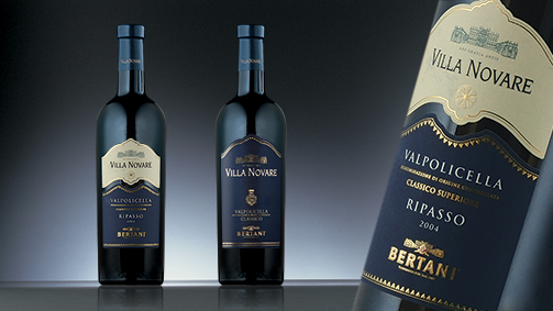
Packaging design
In your opinion, how should the marketing of a wine change in relation to markets, considering their profound differences?
I believe that if you want to keep up today, you have to develop your own know-how on two main fronts. One is the product, which must be innovative and at the same time be able to faithfully represent the territory. The other is to know the markets. Often wine producers focus on just one of the two, whereas bringing these two elements together, in my opinion, is the real key to success.
We have to innovate with our products, while still adhering to the characteristics of the territory from which they come and making most of the value of these roots, which are often ancient. On the other hand, we have to know the markets we are catering to: first of all the distribution, but also the attitudes towards consumption. Finally, many people mistakenly believe that we must produce for the market. This is wrong, since in our case we would have to adapt our typical wine to the market we a catering to, and in doing this we would lose our distinctiveness, the traits that characterise quality Italian products on the whole. Nevertheless, it would be just as foolish to produce our wine, from Valpolicella to Amarone, without knowing the consumers or the markets we are targeting. By combining these two aspects, we can develop all elements of the marketing in a way that suits the product and the market: the pricing, the packaging and presentation of the product, and the communication.
We mustn’t forget that today, from the marketing point of view, the behaviour of the producer is key. With the arrival of the internet and new technologies, the new generation of consumers often learn about the history of the wines online, instead of tasting them. The producer’s ability to present itself, to tell its story and to be credible, becomes as important as having a quality product to let new consumers taste.
You have always had a very broad vision of the world of Italian wine, first with the Gruppo Italiano Vini and now with Bertani Domaines. What do you believe are the best tools for approaching the current situation and scenarios that may arise in the future?
Today we have to be able to innovate and reinvent ourselves within our historic traditions. We must never betray our traditions, betray the territory: we must remain faithful to ourselves. However, within our tradition, our history, and our wine producing culture, we must also say and do new things. I believe that the world of quality wine has matured in the way it presents itself and tells its story and needs something new.
High quality wine, in Italy, was born twenty, thirty years ago. Since then, our history of the vineyard and the winery has become almost a common stereotype, we all tell the same story. We can go on about having more vines per hectare, low production per plant, soft pressing… this is old news by now. We need innovation, and above all we need to address the new consumer in a different language, with different adjectives, to tell the stories and convey the quality of our wine. We need to understand that we are talking to new and younger consumers, who therefore have a different perception of the value that consumers had in the past.
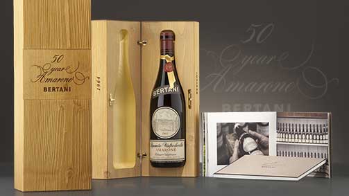
Special edition
Design Tribune Magazine: Packaging is a supermedia.
Wine is a product inevitably linked to time. How much and in what way does this characteristic impact branding and image strategies?
It’s true, time has an enormous impact. “How much and in what way” depends on several factors that concern both culture and production: for example the clarity,completeness, and the profundity of the company vision, but also technical aspects like how the wine is matured, can condition the evolution and launch of a new project. Time is determining during the design phase for the dynamics and because we like our projects to have longevity, which is indispensable for the development and consolidation of a company or product identity.
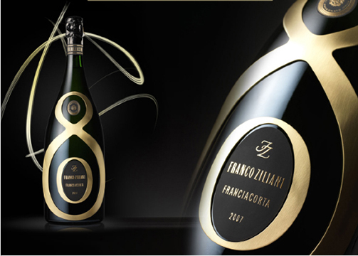
Riserva Franco Ziliani Berlucchi, Special Edition
Can you tell us about your most recent projects?
The project for the Alanera wine of the Zenato company, designed for distribution on the US market, was developed in a limited period of time thanks to a concise dialogue with the representatives. The objectives included the development of a packaging that was attractive on the shelf and prestigious for the hotel and restaurant channels; that could convey the values in which the company recognises itself and create a dialogue with a highly diverse consumer base. We began the project by identifying an incisive and memorable name, which contained a reference to the type of grape and was evocative of the territory while also conveying the product’s strong personality and elegance. The packaging, from the selection of the bottle to the label design, is distinctive and striking while meeting the same universal objectives for the project.
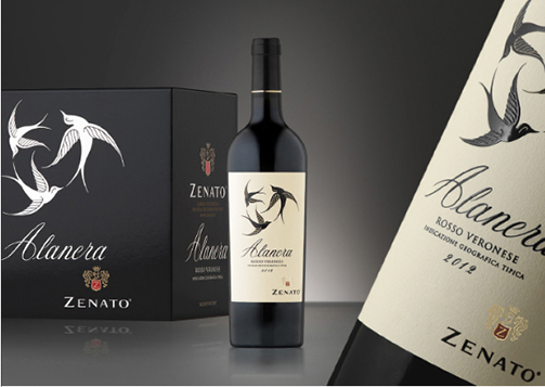
Zenato Alanera project
Your studio largely deals with branding, but also packaging for wine, everything from the bottle to accessories, containers, and packaging materials. What do you feel has been your most complete project to date?
In many of our projects we have worked through the different spheres of communication: one of the most complete projects has to be that for Guido Berlucchi; since 2006 we have developed projects for stands and traditional marketing campaigns (publishing and advertising), brand restyling and architecture, website and events, packaging, bottle design, secondary packaging and limited editions. To remain in theme, we studied the various elements required for the packaging and décor of the temporary corner for indoor and outdoor branding activities.
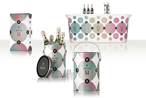
Berlucchi ‘61 project (brand, packaging, secondary packaging, ice bucket design and bar counter graphic design)
Sustainability and transience are two values that often contrast each other. How do you deal with this problem in your project?
We tend to propose the use of materials that respect the latest criteria for safeguarding the environment. Secondly, it is essential that we optimise the use of these materials to avoid waste. We do not promote the assembly of components or materials that would then form an object that cannot be recycled. The reduction of the weight of the bottle and reducing the duration of the packaging phases always moves in the direction of sustainability.
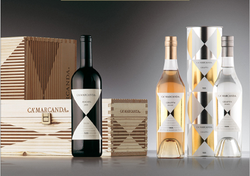
Gaja Ca’ Marcanda project
And how is the wine this year?
It’s difficult to say in general terms.The harvest has suffered this year, but I’m sure the producers have not simply submitted to the adverse weather conditions and have interpreted the particularity of this harvest with the aim of producing high quality wines. Faced with a lower quantity, I think we will see some very interesting wines, even if they are different to recent years. I think they will be surprising.
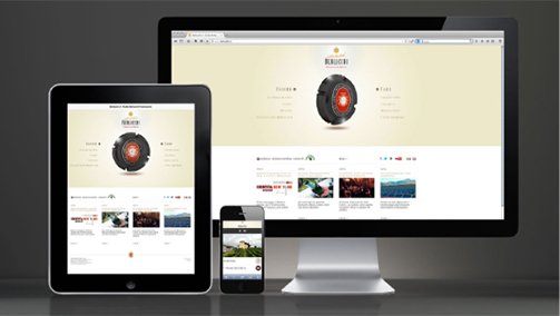
Berlucchi website
Tag Global design, Interview, Packaging, Press
Alois Lageder: the art of wine
Interview with Alois Lageder: the art of wine from SGA Wine design on Vimeo.
Alois Lageder took over the company, which dates back to 1823, in the mid-60’s. With the help of his sister Wendelgard and brother-in-law Luis con Dellemann, he immediately moved to give a new face to the historic company and secure a new position in the market. Convinced that his land had potential that was as yet largely unappreciated, he opted for the route of quality, purchasing new plots and focusing on innovative methods both out on the vineyard and in the cellars. This lead to the birth of products like the uvaggio rosso Cor Römigberg or the Löwengang Chardonnay, which signified a real change of style in the company’s panorama.
Alois Lageder purchased the Hirschprunn estate in 1991, (30 hectares of vineyards surrounding the renaissance building), which was added to the Löwengang estate in Magrè, in the southernmost part of the province. It is an estate with excellent vines in the perfect position to produce great full-bodied red and white wines like Cabernet and Merlot. In 1995 in Magrè, Alois Lageder constructed a new cellar, a shining example of modernity with its sustainable and ecological architecture. Since the early nineties, the company has been pursuing an innovative project, gradually converting its vineyards to dynamic-biological cultivation.
Faithful to the holistic approach that characterises his business philosophy, with the help of his wife Veronika Riz, theatrical dance choreographer, and their three children, Alois Lageder promotes initiatives connected to contemporary art and music within the company.
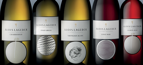
Original packaging of Classici product line
150 years deeply rooted in its territory, Alois Lageder is a company that unites tradition and innovation. Use of the most advanced technology and respect for sustainability; production and preservation of the environment: what’s the secret to addressing such radically different demands?
Perhaps at first glance they appear very different aspects, but that’s not the case. My experience has taught me that the more we have evolved, the more we’ve been moving in the wrong directions. Therefore, today, innovating often means returning to the past.
For 10,000 years man has cultivated the land using methods in tune with nature; in the last 150 years, on the other hand, with industrialisation and rationalisation of work, in my opinion we have taken a wrong turn. Biodynamics teaches us to go back to the roots, to find a bond with nature and follow in the footsteps of our ancestors, even if it is with a different and more efficient approach. In our case, we have tried to respect our traditions, but without remaining in the past. We take the past as a starting point we can evolve from.
In fact the Alois Lageder brand is now synonymous with biodynamic wine production and the holistic and sustainable approach: how are these values communicated to the consumer?
In recent years we have tried to communicate our experience in the world of biodynamics through on-site activities and via the packaging of our bottles. We decided to associate ourselves with one of the institutions that follow biodynamics, Demeter, which has been operating since 1928, that is just four years after Rudolf Steiner’s lessons on biodynamic agriculture. Due to the importance we attribute to transparency, we decided to show this brand clearly on the label: since “bio” became fashionable (and many producers began claiming to be bio that aren’t), I’m convinced that we need to give the consumer a guarantee, informing them of the work and serious control processed behind this certification. Sustainability is just as complex but it’s more difficult to communicate: for this reason we have always tried to bring potential customers to our vineyard, so they can experience our production process first hand.
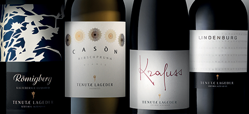
Masi product line
Bioarchitecture: the cellar within the historic Löwengang estate also encompasses the dual philosophy of environmental protection and efficient production. What principals inspire its design?
The first design of the cellar, which dates back to ’92, didn’t focus much on sustainability, as more than twenty years ago it wasn’t such an issue. However, at that time, for other reasons, I met the founder of the Eco institute of Alto Adige, whom I spoke with about the idea of constructing a new cellar: it was he who encouraged me to integrate features to make it sustainable. So that’s why I put aside the first project and started a second from scratch: the basic idea was that our company had the responsibility and obligation to leave a world for future generations that we have preserved with our own resources. The project was built around three conceptual pillars, first of all it had to use a minimal amount of energy. Instead of using fossil fuels to produce heat we designed it to be powered by renewable sources (water, sun and biothermal). The second objective was to create an attractive and healthy environment for everybody working in the cellar, but also for the wine, which is extremely sensitive to external factors. We therefore eliminated possible sources of electro-smog, opting for sustainable architecture and the use of natural convection to air the environments. The third ambition of the project, and perhaps the most important, was to ensure the grapes are processed gently and smoothly. With this in mind, we constructed a round vinification tower, 17 meters deep, into which the grapes are loaded at the highest point; as they drop down they travel through the various processing phases without any mechanical movements. This is how we maintain all the quality of the vine. In a cellar, one can’t create quality from nothing: all we can do it treat the grapes delicately and refine the wine to preserve the quality. With this same idea in mind we introduced the concept of the circle: the wine vases are positioned in a circle around the point the grapes drop, to minimise the distance they are transported and to avoid using pumps or machinery to move it around.
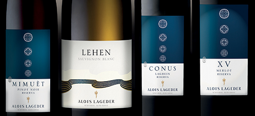
Original packaging of Terroir line
In line with the holistic approach that permeates the company philosophy, a lot of space is dedicated to contemporary art and music at the vineyard. How important is artistic research and cultural promotion in constructing and promoting a company identity?
Bringing art into the environments where we live and work was first and foremost a personal choice, as it pleases me and my wife, but it is also a way of identifying the company and the people that work here. In particular my own personality: my holistic approach, my ideas of sustainability, my love for art, they are themes that echo through the company and messages that are conveyed outwards.
In the 1980’s, with a few others here in Alto Adige, we opted for the direction of quality, reducing output and increasing the value of the product. This helped us create a strong image, marking us really stand out from the other producers in the area. Then, in the 90’s, others began to catch on to the idea of quality, and the perception of our profile became a little diluted by the crowds. So I asked myself how we could distinguish ourselves from the competition, given that quality was no longer the only factor that made the difference: that was the moment I had the idea of giving the company a clear and distinguished identity through art.
Wine tasting and concerts at Vineria Paradeis and Cason Hirschprunn: guided tours of the vinification cellar and vineyards. How important is it today to welcome the customer in?
Our objective is to bring as many people as possible here to Magrè, giving them the opportunity to experience and get to know our vineyard first hand. The Vineria Paradeis is where we greet customers and guests from all over the world and is a vital tool that I dedicate time to every day. In recent years we have been trying to improve what we offer in terms of hospitality, offering not just the opportunity to visit the cellars, but also the vineyards where we can actually show guests the concepts of biodynamics, and the park, which is an integral part of the holistic vision of the company.
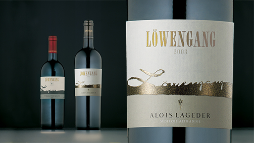
Restyling of Lowengang for Tenutae Lageder
A cornerstone of the company philosophy is that a wine is an ambassador of its place of origin, and that every single vineyard has its own unique characteristics. Is it possible to communicate the differences of the various terroirs via a bottle?
It isn’t easy, but communicating our individuality through the bottle and its packaging is a crucial point and something I’ve always personally overseen. And in our partner, we have found an extremely attentive and intuitive interlocutor, who first of all set out to understand what we wanted. Due to the great diversity of pedoclimatic conditions we have in the various regions of Alto Adige, we have a vast assortment of varieties, and therefore it is complicated to try to communicate all their idiosyncrasies in the right way. Today I’m very happy with the presentation of the company, precisely because with our partners he have managed to create very distinct labels, each very different to the others; we also greatly an enjoyed initiative we undertook ten years ago now, in which we worked with artists who created the labels of the Monovitigni line for us. Therefore I believe that through these labels, if a consumer takes the bottle in their hand, he can see much and understand our philosophy, the way we work.
Wooden box Rarum
And we’ve come to the last question: as we’ve said, your production is particularly rich and diverse in typology and positioning. How did you resolve this complex issue?
In these very days we’re yet again discussing how to divide our vast assortment clearly to distinguish the different types and qualities we have.
At the top of the pyramid are the Masi wines from the Löwengang estate , Hirschprunn estate, Maso Römigberg, etc., which have been cultivated in a biodynamic way for years, based on the idea of the living organism, a theme central to the philosophy of Rudolf Steiner. To each of these wines, the most important from a qualitative perspective, we have tried to a great sense of individuality through the bottle and label, because the wine of each farm is an entity, it has its own characteristics affected by the soil, the position, the environment, the presence of animals and other plants. Then we have an intermediate level – gathered in the Terroir category – which include wines from areas with limited space, Masi, smaller regions or towns that are the maximum expression of their wine variety. Finally we have the classics, the characteristic wines of the territory, of good quality but prices to suit day to day consumption.
Again, with the help and guidance of our partners in Bergamo, we have succeeded in giving each wine and line its own theme, and I think this is very important. It’s important because the consumer has to understand what product they have picked up, not just by looking at the price. They need to perceive the quality we give to every single wine.
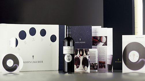
Brochure and corporate image for Alois Lageder
Tag Biodynamic, Brand, Global design, Interview, Packaging, Video
Renewal is a natural process
There are moments that mark the defining stages of one’s evolutionary process; important steps that signify growth and express the will to broaden horizons.
Photo by Francesco Radino
With thirty years of experience in company image and product design, principally for the wine & spirits sector, SGA has expanded its studio, moving to their new offices in the heart of Bergamo. A prestigious place with wide open spaces and easier to reach, the new studio also renews how our studio communicated with clients.
In collaboration with the web agency Ocho Durando, we have launched the new blog www.sgawinedesign.it/blog, rich with interesting information and content, and our new website www.sgawinedesign.it, a more functional and accessible platform that exhibits our projects through striking images.
The new domain sgawinedesign, already used for the twitter and facebook profiles, was adopted with the specific intention of creating a dialogue with an international audience.
Tag Web site
Wine and design: Interview with Aldo Colonetti
Intervista a Aldo Colonetti: l’equilibrio sensoriale tra vino e design from SGA Wine design on Vimeo.
Aldo Colonetti, philosopher, historian and theoretician in art, design and architecture.
Scientific Director of the IED Group (Milan, Turin, Rome, Venice, Madrid, Barcelona, San Paolo) since 1998, and Vice-President of the Francesco Morelli Foundation and the European Institute of Design. Since 1991 he has been the Director of the contemporary architecture and design magazine Ottagono, and Chief Editor of Editrice Compositori.
Essayist, curator and promoter of cultural initiatives, in Italy and abroad, he is the consultant for design and architecture of the cultural direction of the Ministry of Foreign Affairs. In 2001, he was awarded the title of Member of the British Empire by Queen Elizabeth II for his achievements in cultural development. Since 2009 he has been a member of the National Council of Design, under the aegis of the Ministry of Cultural Heritage, the Ministry of Foreign Affairs and the Ministry of Economic Development. In the same year he also become a member of the Administrating Council of the Centro Legno e Arredo of Cantù.
Italian design has always had a certain international appeal, why is this? Why should a foreign company entrust a project to an Italian design studio?
Italian design is a complex cultural system, which is the cornerstone of specialist companies in this field. It’s not just the passport that defines what Italian design is: in many cases a design project can be considered ‘Italian’ even if it is developed abroad or created by foreign designers that work in our country.
Our specificity and our international appeal are closely linked to the quality of the cultural system that Italian design transfers to the product, even when expressed through a foreign project.
Every day we are surrounded by objects, but when do they become “designer”? What does it mean?
When applied to any object, design becomes a determining factor not so much for the aesthetic or symbolic value it conveys. First of all, design must take into consideration the essential purpose of the object, and in meeting this end function, it must be able to make an impression on the world in the long term.
Think, for example, of the Castiglioni brothers’ Arco lamp, designed in the early 60’s: it’s an extraordinary product, which accounts for a large part of Flos’ revenue to this day.
A bottle, an alcoholic drinks container, or even oil bottles, liquors, sparkling wines, when do these become objects of design?
When design is related to food and drink, it must respect one golden rule, which happens to be the theme of a book that I’ve been working on recently with gastronomy expert Alberto Capatti of Slow Food (Design in cucina. Oggetti, riti, luoghi – Giunti Editore). When applied to food, design must be able to express a particular synesthetic characteristic, enabling the product to attract attention and evoke a sensory reaction. Yet, when design meets the theme of food there must also be a perfect balance: the product must not be extolled beyond its actual value and content, or excessively sensationalised. In the food sector, creativity can be much more difficult than in other sectors, since it is related to a living product, which is continually evolving.
Our packaging for La Lepre of Fontanafredda
Design is a phenomenon that has transformed the value of everyday objects, both from an aesthetic perspective and in the symbolic values they convey; this aspect also applies to the packaging of products. In what ways does design influence how we choose a product?
In any sector of Italian and international manufacturing a product is successful if, building upon a foundation of basic quality, it undergoes its creative development coherently, in a way which complements it with the right values.
It can happen that excellent products remain in the dark due to a lack of or incoherent development in this aspect; but it is also common for the opposite to happen, with products that come out of the wings or are of mediocre quality to have extraordinary success simply due to the communicative capacity and effectiveness of the marketing. Talking about packaging inevitably means dealing with the important theme of marketing: in the food sector, like in many others, packaging plays a central role, making it an integral part of the product’s development system.
Since the 80’s, Italian wine has undergone an incredible evolution, which has led to a need for an aesthetic transformation. What are the implications?
Compared to how it was in the 80’s, today Italian wine enjoys an extraordinary authority, which has matured in response to the economic crisis which forced the industry to re-establish itself by transforming along with the culture of the territory. When we design the appearance then, it is important to take into consideration the concept of territoriality, giving it value from a visual point of view, but most of all on a “multi-sensory” level. A bottle or a label, through graphics and design, should represent the stories of people, places and things, and be in tune with the entire production process.
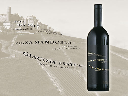
Packaging for Vigna Mandorlo of Fratelli Giacosa
Choosing a wine implies some degree of knowledge. But this is not always the case. How much does the labelling of a wine influence the perception of quality?
Wine is a product that relies upon a bottle, a label and a carefully studied system of distribution and marketing. Yet we should remember that the packaging of these products is also crucial to its success. The most distinguished wines often have quite ‘low profile’ packaging. That doesn’t mean they lack creativity, but perhaps it is concentrated in some aspects of the language used: lettering with historical or cultural significance or in a name. I’m not sure whether it’s a real rule of thumb, but I’ve noticed that it is often effective.
Since the 90’s, some wineries have commissioned internationally acclaimed architects to design their cellars, creating a phenomenon that involves the entire world, in manufacturing in particular. How should an architect or designer approach a project in the wine industry?
There are some very interesting examples of this phenomenon in Italy and Spain. I love architecture that, without holding back the expressivity of the architect, can integrate with the territory, working with the environment rather than imposing itself upon it. In a place of production where nature is the determining factor, a pure expression of the will and power of the architect can have negative effects. In a cellar or winery, I also appreciate the insertion of elements that symbolically represent the historical relationship between the wine and the territory. When this is respected, a prestigious winery becomes a place people want to visit, as well as a place of marketing and publicity.
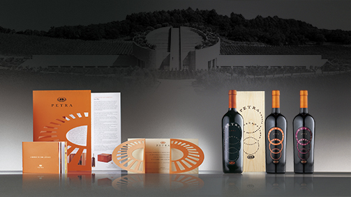
Corporate image for Petra winery of Terra Moretti
Building a team spirit to achieve new markets: interview with Gianni Legnani
Building a team spirit to achieve new markets: interview with Gianni Legnani from SGA Wine design on Vimeo.
Gianni Legnani (Milan, 1936) began his career at Nestlé (Milan) and went on to work at their head offices in Vevey (Switzerland); he later worked with Locatelli, Gillette Italia and then acquired a partnership in Design Group Italia.
General Manager and then Managing Director of Hill & Knowlton Italia, the P.R. Agency of J. Walter Thompson he later became International Vice-President of Burson-Marsteller Italia, the prominent Communications and Public Relations Company of Young & Rubicam.
Legnani founded the Champagne Information Centre in Italy and has been directing it for 16 years on behalf of the Comité Interprofessionnel du Vin de Champagne (CIVC). Under his direction, the Centre has managed to settle very sensitive issues such as the “Wine war” between France and Italy, which ended in the “peace of Florence”, and the discrimination against Champagne, charged with a VAT of 38% while for Italian sparkling wines VAT was of only 18% This inequity was corrected so that the same rate of 18% was applied to both, thanks to a verdict issued by the European Court of Justice.
After having headed the Cognac Information Centre in Italy for 12 years on behalf of the Bureau National Interprofessionnel du Cognac (BNIC), he became the communication consultant for the Consorzio Tutela Vini dell’Oltrepo Pavese and subsequently he has been in charge of communication and image of Guido Berlucchi.
Gianni Legnani teaches lessons on sparkling wine production, on distillation and on special wines in the A.I.S. (Italian Association of Sommeliers) first level courses for sommeliers and for other organisations in the wine world. He contributed to The World of the Sommelier manual, “Il mondo del Sommelier”, the official course book used by the A.I.S., and regularly collaborates with trade wine and gastronomy publications.
He currently teaches a course on Oenology (grapes, wine making and distillation) at the Università per Tutte le Età, fostered by the Lions Club of Brugherio, within the range of their social and cultural activities.
Based on your experience, how would you say communication has evolved in the wine sector?
Over the past 20 years, the average quality of Italian wines has improved, and considering the progresses we are still making in oenology, I’m sure that in another 20 years our wines will be even better than they are today. On the other hand, wine consumption is constantly decreasing. When people tell me “we drink less but we drink better”, I’d actually like to hear “we drink better and we drink more”. The negative trend is in part due to Italian wine producers’ communication and marketing strategy over the past years: we’ve never been able act as a team. Wine marketing has always been bound to individual producers, each one with its own message, and this scattered approach has prevented the creation of a critical mass that could give the boost that Italian wine needs on the global market. The real improvement in the quality of Italian product has not been properly communicated to the consumer in terms of image, and today we’re paying the price for this lack of communication.
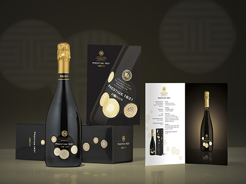
Packaging Prestige designed for Casa Vinicola Zonin, distributed in many countries.
Wine is distinguishing itself more and more from the other goods categories: we see this in the supermarkets, where more attention is given to the information provided about the product and special departments have been dedicated to wines alone. In relation to the specific properties that distinguish wines, what criteria should the marketing be based on?
In the past, wine was consumed in almost every household. Children were given a “positive introduction to wine” within the family, as parents added a drop of wine to their water which changed colour and taste: so they were feeling “grown-up”! We’re losing this early introduction: today young people aren’t really shown that wine consumption is part of our heritage, and, left alone, discover alcohol in their teens, often binge drinking without any basic culture.
After my experience abroad, I can safely say that wine culture in countries like France, Switzerland and England is superior to that in Italy. In particular, wine experts tend to focus more on quality, while in our country we see more of a sporadic interest in the matter. If I invite Italian friends over, even if they’re highly educated or wealthy managers, I never hear them say “Let’s open a bottle of Château Lafitte”. Instead they ask “look I’ve found this homemade wine, I paid one euro a litre for it, you’re a wine expert, what do you think of it?”
In our industry, the marketing should overcome these cultural and social barriers, communicating the positive aspects of quality wine, which is the coveted result of the ability and expertise of oenologists and producers. Wine is not simply a drink; it has symbolic connotations, emotional aspects, specific tastes and scents. Everything good about a wine, all the aspects of life it contains, should be conveyed by the marketing, which shouldn’t just talk about production and variety.
I find that we Italians have played an important role in the history of wine. We should be able to capitalise on our traditions, to stand out not only in Italy, but also abroad. The French have done this better: they have managed to sell their wines around the world, making Bordeaux, for example, an archetype. Then if we think of Champagne; a third of production is exported. If a third of Italian production was exported, our entire industry would be completely revolutionised. But to achieve this we need to reach that critical mass that allows for real communication.
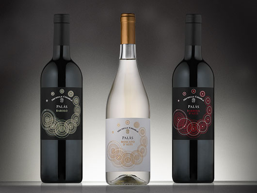
Michele Chiarlo: new packaging Palas’ line dedicated to foreign markets
Over the last few years in Italy we have seen a decrease in wine consumption. Yet this phenomenon corresponds to an increase in the attention we pay to the quality; how has the consumers’ perception changed?
In the past, wine was considered a staple part of a standard diet and was drunk in larger quantities as a source of energy. Today we ask something of wines we didn’t ask in the past: the pleasure of tasting it.
Organisations like the A.I.S. and Onav regularly offer courses to promote wine culture. Some courses I teach have been attended by up to 100 people, willing to invest time and money to eagerly follow the presentation of wine tasting.
Presenting the DOCG wines of Piedmont and the wines of Lombardy to an audience of Chinese wine dealers at the Interwine event in Canton in June 2013, I noticed the same interest. And everybody, at the end of the tasting sessions, tells me: “we now drink differently”. I realise that the spreading of wine culture is a long and expensive process, but it is essential for the expectations of today’s consumers, who want to know what they’re drinking and take pleasure in tasting and sharing great wines, rather than be happy with saving a few euros.
Let’s talk about sparkling wines: the Classic Method produces a category of wines that are unique by their particularity: what elements and differences characterize the marketing of these products in relation to other wines?
Sparkling wine, in Italy, is essentially perceived as a wine for special occasions. On one hand, this is positive, as it endorses the emotional aspects of the wines, yet on the other hand it detracts from the value of the wine for what it is. This doesn’t happen in France with Champagne, which is both consumed during special occasions or to match good food.
The typically Italian behaviour of associating sparkling wine with festivities, celebrations, toasts, tends to penalize the possibilities of what in my opinion remains one of the gems of Italian oenology. Wine produced by the Classic Method, while safeguarding its celebratory vocation, should be perceived as ideal choice on all occasions for the pleasure of sharing. It’s nice to dine with bubbles!
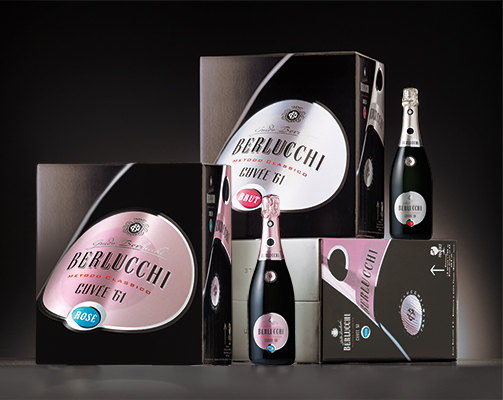
Guido Berlucchi, ‘61 line: packaging and outercases developed for U.S. market
In relation to the recent expansion of the areas of production all over the world, which means Italian wines now compete with products from the so-called “new world” (Chile, Australia, South Africa and more recently China), what strategies should be adopted to maintain and increase our market share?
First of all by putting internal competition aside: I believe that producers have a common goal. It is useless to fight for a small cake, the slices become smaller and smaller as the number of contenders increases. They should all work together to make the cake bigger, so that the size of the slice is bigger for everybody.
It’s not about outdoing other producers. If suitably educated, the consumer won’t simply slurp down the first wine they find, but will look for the best quality and organoleptic characteristics based on their own expectations and tastes: and this is how we’ll increase consumption, by concentrating on quality.
Of course, emerging regions like those in Chile, Argentina, California or Australia now offer very interesting wines. But it’s also true that markets in which wine is not part of the traditional culture, such as the Far East, are about to enter the market. If we can manage to help those vast markets to learn about quality wine, our tiny cake will suddenly become huge, and everybody will get a larger slice.
Together producers have a common goal: foster a more regular and suitable per person consumption around the world. We Italians are certainly capable of this, we are capable of producing excellent quality products, but with our individualistic mentality we don’t always manage to communicate it with the same effectiveness. Following the example of the great Châteaux of Bordeaux, ambassadors in the world of French wine, and Champagne, ambassador of sparkling wine, instead of fighting our own individual battle, we should fight for “Italian wine” without getting distracted by too many alternatives and possibilities, but focusing on strong varieties that can compete on the world’s market. We favour native vine varieties instead of international varieties, and our traditions: we should privilege our wines, the ones we know how to produce, and we must present them in ways to make them recognisable. And so, led by the great names, which beyond their commercial targets, carry the flags of ambassadors of Italian wines in the world, we will have the strength and ability to compete on the global market.
Tag Press
Tag Global design, Packaging, Press
Tag Interview
2014 - Ottagono: to protect and display
How did your collaboration begin?
Giacomo Bersanetti. Angelo had been ‘monitoring’ our designing for years: I offered my services and he wrote me a letter explaining why our relationship would not be starting straightaway.
Angelo Gaja. lt was important to get in tune with each other, to create a harmony that had to be built on a knowledge of the company history and how it behaves on the market, of its aims in communication. This takes time and matures slowly.
What has struck you most about Angelo/Giacomo?
G.B. His extraordinary intuitive capacity, clarity and intellectual rigour.
A.G. The intellectual dimension, taste, vivacity and instinct.
Brief definition of packaging.
G.B. The meeting point of person and object, between consumer and product. Forms speak to our eyes, our memories, our emotions; design creates universal keys of communication.
A.G. Identity that the company conveys through the graphics.
How does it change to fit the product?
G.B. It changes with the company, territory, typology,
sector, period, positioning, target ...and the product.
A.G. There isn’t enough space to reply!
The detail you pay most attention to.
G.B. Coherence with the producer/company philosophy.
A.G. Sobriety, cleanliness, elegance.
The most difficult part of the job.
G.B. Managing to do it!
A.G. Not squandering, representing the soul of the company with continuity.
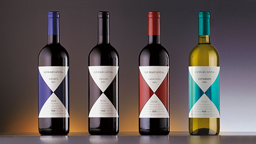
The next project.
G.B. A publishing project.
A.G. I have many in mind but I want to think carefully and avoid being driven by haste.
Angelo/Giacomo in one word.
G.B. Total. As gifted and restless an artist as Michelangelo.
A.G. I call him my private Einstein.
Your bond in a word.
G.B. Authenticity.
A.G. One word isn’t enough. The awareness of having built a relationship that Is based on esteem, community of thought and mutual respect.
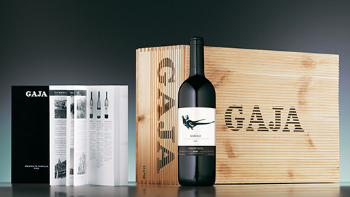
2013 - Artlab: Labels and colour
Although a particularly intense use of colour on spirit bottle labels is a recent phenomenon, its roots go deep: Johnnie Walker has been using red as an element in its whisky’s identity since the beginning of the last century.
Wineries also have a long and well-established tradition of using colour to improve their brands’ recognisability: Veuve Clicquot’s deep yellow and Mumm’s red sash are integral parts of their brands’ recognisability. But the colours chosen also have to be in tune with the wine’s personality, ensuring that the colours relate to and express the taste experiences they suggest.
One example of this is the silver-platinum tone paired with satin in the case of a Franciacorta wine. In the approach adopted by Francesco Voltolina of the Bergamo-based studio SGA, colour has become a focal element for brand identities and product positioning.
One example is the Cà Marcanda line by Gaja, which has gone for a minimalist graphic design, where colour is the signage value that distinguishes one product type from another. A contribution to the spreading use of colour in wine labels comes from the evolution in papers, in print systems and in inks. Pearly colours, the matt finish of screen-printed tones and the range of metallic colours help refine the message being conveyed, giving even the most traditional of labels a touch of personality.
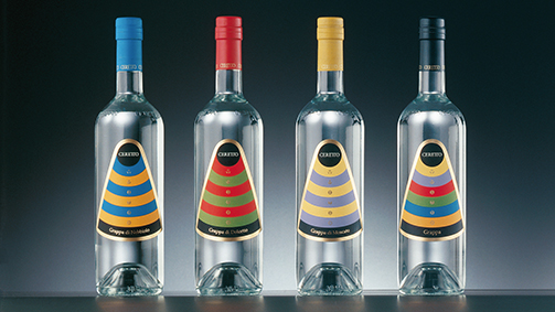
All the same, it is indicative that, unlike what happens in Italy, which is still faithful to a certain type of classical tradition that influences the language of graphic design and communications, the labels of foreign wines, especially from Australia, South Africa and California, privilege full colours applied to ample surfaces, stylised images, elaborate illustrations and hyper-decorative patterns. On these bottles, the culture of graphic design plays a stronger role than that of winemaking. As for the result, the jury is still out…
The future of communication in the world of wine production
Intervista al Dott. Paolo Panerai from SGA Wine design on Vimeo.
The name Paolo Panerai stands for great success in various information sectors, but also in fields of excellence like wine production. Where does your passion for wine come from?
Passion for wine is something genuine and authentic that started when I was a child. I had always lived in the country with all my family in my grandfather’s great house in Florence. When we had the chance, we decided to return to Tuscany to a place we really liked, in the Chianti area, and we started looking for a company. We were lucky: after a day’s searching, we found it and it was like falling in love for the first time. The friendship and professional relationship with Luigi Veronelli was of equal importance. We met at the Panorama magazine and, when we founded the publishing house (Class Editori), he began to write for our magazines, called “L’Etichetta”. So I had the good fortune to be able to explore this passion for wine and knowledge about wine in the company of the greatest writer and philosopher of wine. A connoisseur, who never agreed to blindfolded wine tastings because, for him, it is the totality of the wine that produces that sense of quality or pleasure, or otherwise, through the bottle, the label, knowing the wine’s origin. It’s the expression, the synthesis of many factors, including the territory.
Thank you. You’ve already partly answered my next question: are there other people, other figures who influenced you in addition to Luigi Veronelli?
Certainly, there’s the example of some great producers of Tuscan wine, but not only that… Antinori, Frescobaldi… Reflecting on the fact that these families have been producing wine for centuries and on the continuity in the life of their families that comes from running a wine business. Yet, at the same time, it is also a “new world”. It was with Luigi Veronelli that we made an important tour of America in the seventies when the whole world was discovering California, and the Napa Valley in particular. Meetings with characters like Robert Mondaci, his wine expert son, Tim, or Michael, in charge of distribution, were very stimulating. But the person who influenced me most of all was Edmond de Rothschild, with whom we became partners in a company specialising in importation and the technology of French wine. Edmond had always been part of a separate branch from the French bank, his father had founded a bank in Switzerland, but nevertheless was always the biggest shareholder (now it’s his son, Benjamin) in Chateau Lafite, although not directly involved. Then he got it into his head that he was going to create the Chateau Lafite of the new millennium. He bought a company called Chateau Clarke but died before he could achieve his objective. However, in an act of friendship, he invited us to visit, along with Luigi Veronelli and Maurizio Castelli, who was then our wine expert in the company in Chianti (Castellare) and there we had the good fortune to be able to speak for two entire days with the greatest wine expert of the last hundred years, Emile Peynaud, a professor at Bordeaux University, who helped me understand that it was a good idea – something Veronelli had already concluded – to favour native vines and so, in the specific case of Tuscany, that meant the Sangiovese rather than the Super-Tuscans, produced by mixing international vines.
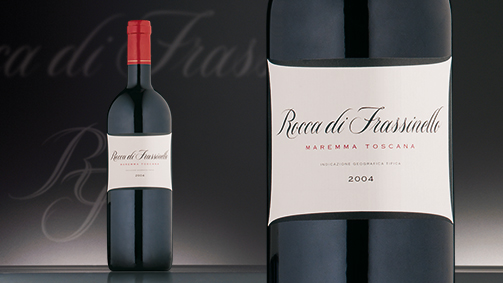
Wine is a product that is increasingly undergoing evolution and stands apart from other categories. How was it advertised in the past? How is it advertised today? And, above all, how will it be advertised in the future, in your opinion?
Originally, it was hunger, because it was a nutritional product that provided calories as part of a diet that was then very poor. Wine was important because it was the stomach that dictated how knowledge of a wine was spread. Gradually, the living standards of Italians improved and, what’s more, calorie was to be found elsewhere. It was gradually realised that, beyond a certain limit, wine is no longer a pleasure, a beneficial product, but can become a problem and so awareness of quality, rather than quantity, became more important. This was a revolution for oenology and viticulture based on quantity, as it had been the case in Italy for a long time. Less so in France, where selection had been practised since 1855, due to the classification imposed by Napoleon III: the vineyards to be uprooted, the ideas to be spread etc. Now a wine’s reputation is based essentially on two values: quality and authenticity, and authenticity soon leads to the consideration of production that is almost 100% organic. Unfortunately, very often vines, like so many other plants, are affected by diseases so, if the destruction of the vineyards is to be avoided, sometimes interventions have to be carried out. I was convinced by this precept from the start and that’s why we’ve always put John Gould’s bird drawings on the labels of the Castellare wines, seeking out the rarest - because for a long time synthetic chemicals were used in the vineyard - when in fact it is possible to achieve balance by using more natural products like green copper etc, thereby preserving the quality. These are the two main threads and, of course, all the rest follows. It isn’t possible to sell just a bottle of wine, the territory itself must be sold using the values of the land, all the more so since, in the meantime, many other countries that were not wine producers have now begun production and, because it is not a very difficult technology to acquire, they can also produce good wines. What makes the difference for Italian wines, therefore, is the overall description of the wine along with the land of its origin, and what that land has to offer, the welcome, the tastings and everything that follows.
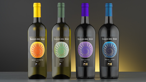
The architectural design of the cellar has become an element that helps establish the reputation of the brand. How important is this aspect, in your opinion?
There are two advantages, like the two sides of a coin. The architectural harmony of the cellar can help to enhance the wine, but if the architectural value of the cellar, as a consequence, exceeds the value of the wine and people become more interested in the cellar than the wine, this strategy loses its effectiveness. In our case, with a very great architect, my great friend of many years, Renzo Piano, we made a cellar with “its feet on the ground” so to speak, recognising the fact that a cellar is a production site. Therefore, starting with the choice of materials, such as the exposed concrete, and the architectural lines, we agreed from the outset that it had to be a functional work place, with the architectural value that an extraordinary artist like Renzo Piano can provide. This practice has become widespread and there are cellars by architects everywhere. In many cases, let’s say, they’ve strayed from the essential value of the wine.
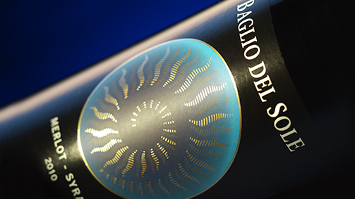
In the history of your wines, there’s the prestigious joint venture with Domaines Barons de Rothschild when, within two years, the great wine, Rocca di Frassinello 2004, was awarded two Gambero Rosso wine glasses, followed by three for the 2006 vintage and three Veronelli stars. A continuous search for excellence. What does excellence mean to you?
Actually, it was my old friendship with Edmond de Rothschild that provided the link with the cousins, who run Chateau Lafite and, especially, with Eric. This relationship was cemented by the fact that, as bankers, they had been our advisers on the stock market listing of the publishing house. A real bridge was formed between publishing, finance and wine. Eric is a very curious person. One day, we were in Maremma having lunch at the Gambero Rosso – Fulvio Pierangelini is no longer there now – and I told him I had bought a holding not far from there, since it was very difficult to find land in Chianti and there were also many constraints. As a result, there had been this shift towards Maremma where more land was available. We went to the place and, seeing there was a small patch of vines, he was curious: “Where is the wine?” he asked. I answered: “I don’t know where the wine is because the farmer takes care of it. I don’t even know what kind of vines there are.”
But he wanted to taste it and, with his characteristic understatement, he said: “Ah, this wine is good”.. and so on, and he asked: “How many hectares are there?” And I told him: “There are 50 hectares.” “You can’t do anything with 50 hectares because as the French say: ‘C’est une affaire foncière.’ You need many more hectares. If you can get 500 hectares, we can start a company.” So the company was founded and it was the first joint venture between Italy and France, the two major wine producing countries of the world, both in terms of quantity and quality. The search for excellence was implicit. At the beginning, two wine experts were working together: Lafite’s wine expert and ours, Alessandro Cellai, now a major figure in this world. The wines took off much earlier than anyone imagined and, in this case, let’s say, precisely because it was a joint venture between the two countries, bringing native vines together, so Sangiovese with international, French vines. But the research never ends…
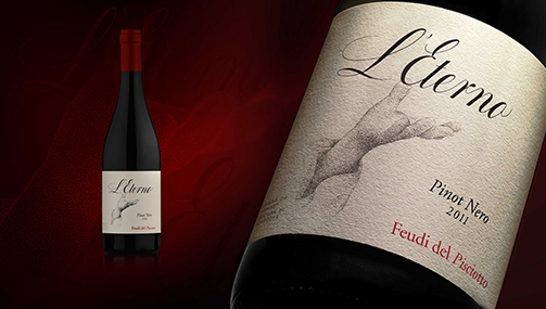
How important is the outer appearance of a wine in determining its success?
I would say, as far as we are concerned, it has been vitally important and, I believe, this is true for everyone. When we left – now there’s been some misuse, some copying of our initial Castellare label – the idea of using Gould’s beautiful drawings, someone who had been a great ornithologist, and linking him to this idea of protecting the land and the fauna by taking care of the vineyard. Not using any chemical products, which are what destroy the fauna and aren’t good for the person who drinks the wine, was typical of this approach. For a long time now, we’ve heard people say: “Ah, this is the wine with the labels depicting birds.” It is vital to trust the professionals. For me, that first label was a lot of work, alongside an intelligent graphic artist that I had when I was editor of “Mondo”, but then, in order to always proceed at the highest level, what was needed was a quality graphic that expressed the value of the wine in the way you want it to. So if the philosophy a wine is elegance, the labels must be extremely elegant and stay in the mind. It’s as if you place a sort of photograph in the mind of the consumer that enables the wine to be immediately recognised by its label.
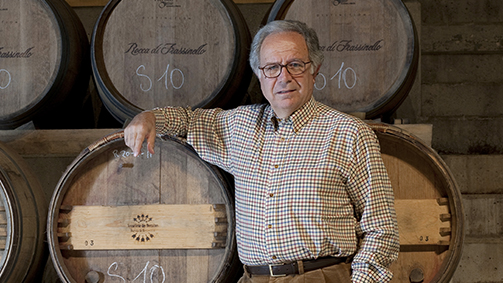
A final question: in what way did your vast experience in the publishing and economic-financial fields contribute to the creation of your wine production business?
The publishing experience has only been useful in terms of knowing how to communicate. As a deliberate choice, I’ve never mixed publishing with oenology in the sense that publishing involves a company listed on the stock market while wine is something personal. All the events we stage leave people asking: “Is this wine yours?” “No”, I say, “it’s not mine!” because we never do that. The only exception we made was some time ago in Shanghai where we presented two initiatives for China: an issue of ‘Gentleman’ in Chinese and the information system for Chinese tourists, who will be a fundamental factor for Italy, but also for the wine, which is called Excellence of Italy, made with Xinhua, New China Agency. In those circumstances, we had to use our own wines because in the restaurant of the hotel where we were staying, the Ritz-Carlton, they were the ones available. But we never try to mix the two things. Obviously, there is a transfer of experience from publishing, as regards communication, which is an advantage for the wine. And from the world that wine represents, the philosophy it implicitly contains, come values that can also be applied in the publishing sector.
Future scenarios for wine
LE VOCI DEL VINO. Protagonisti del mondo enologico - Intervista a: MARILENA COLUSSI from SGA Wine design on Vimeo.
What were the research criteria?
The quantitative type of research involved widespread sampling of the Italian population, representative of the web population and interviewed via the internet: a sample of 500 cases from 18 to 64 years, Web People Doxa, and an even more extensive sample of more than 2,000 cases, interviewed through the HQ24 panel. Then, during Vinitaly, through the websites of the titles of the 24 Ore Group (Bargiornale, Gdoweek, MARK UP, Ristoranti, VigneVini), we conducted a quantitative survey of a group of 300 operators in the wine supply chain: restaurateurs, chefs, sommeliers, producers, distributors.
How has wine consumption changed in Italy, and in what way is the role of wine in our society evolving?
Wine consumption in Italy has changed a lot in the last 30 years, quantitatively and qualitatively. Wine consumption as traditional nourishment, made by the family or in the local area, has been replaced by a more discriminatory consumption, although in lesser quantities: indeed, currently consumption is below 40 litres per capita a year, practically half compared to 30 years ago.
Nevertheless, the appreciation of quality and the willingness to spend on wine has increased. Wine consumption is now less of a simply repetitive habit and more a pleasure, a choice.
Consumption has changed, it’s even become more feminine: more and more women are taking up wine, including as experts and connoisseurs or simply as enthusiasts and fans. Let’s explode a myth: young people like wine too, they don’t just drink beer or other fizzy beverages. When it is presented, explained and made accessible to their taste, their needs and their expectations, they also appreciate wine. Beer lovers and wine lovers are increasingly coming together and creating hybrid drinkers.
The relationship between Italians and wines has changed and continues to evolve. While the percentage remains constant of the so-called teetotallers, that is, Italians who say they do not drink wine (around 6%), 42% of drinkers say their consumption is moderate and balanced. Occasional consumers make up 28% and drink when the right occasion comes up, and 21% say they drink regularly. Only 3% say they drink in a sustained way.
As a whole, the consumers of wine that emerge from the survey are extremely multifaceted. It is therefore necessary to know how to position wines in different ways, depending on the target consumers.
What changes have emerged from the research in how and where wine is consumed?
In some regions, the culture of the aperitif, or wine with a snack has been around for a while but, historically, in Italy wine has always been linked to the main meals.
In recent years, however, we have seen the importance of wine as an aperitif increase while drinking wine during a meal has decreased. The meal is often now consumed away from home, a quick, light meal of one course or a snack. Wine during meals used to be seen as giving the food substance whereas, at parties or convivial dinners, it has become part of socialising.
Another significant change in how and where wine is consumed is that more and more Italians like places where they can buy wine by the glass, or glasses, to accompany a meal.
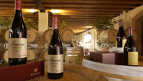
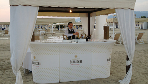
Above: Zenato, cellar tasting.
Below: Berlucchi, wine tasting on the beach.
How and where is wine bought today?
The accessibility of wine has increased a lot over the years with significant growth in the sale of wine in major retail outlets: the main supermarkets and also the discount hypermarkets. The major retail chains are the places where the majority of Italians (around 70% of those interviewed) had bought wine in the last 6 months.
Buying from the cellar, that is, directly from the producer, is nevertheless becoming more and more common: these are often ancient and very beautiful locations, but also innovative and pioneering cellars that offer an all-round experience that also involves the territory. The survey showed that, on average, across the two samples, 32% of those interviewed (28% of the Web Doxa population, rather younger, and 38% of the HQ24 panel, which includes a wider age range) had made a purchase at a cellar in the last 6 months. This is an important phenomenon, an expression of a need and, above all, a desire on the part of the customer. Buying wine means enjoying a pleasurable experience that is enriching at the cultural and interpersonal level.
Another important change in where and how wine is bought was introduced by the internet: e-commerce is displaying strong growth. Looking at both samples, between 11 and 14% had bought wine on the internet in the last 6 months.
Finally, let’s not forget buying from the classic wine shop, which is still common, not least because wine shops have evolved alongside wine bars or restaurants. Often they offer in-depth information, recommendations, tastings and gift-wrapping or packaging for a special occasion.
The survey also showed many other circumstances in which wine is commonly bought: agritourism during holidays, for example, or shops offering wine on draft, where 10% of those interviewed had bought wine in the last six months.
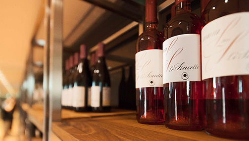
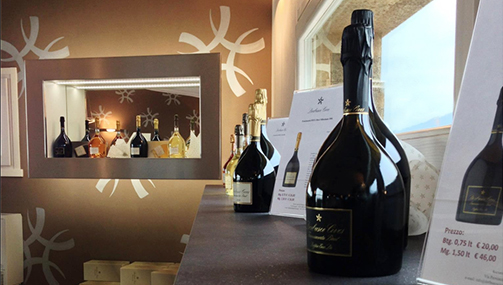
Le Sincette and Derbusco Cives: wine cellar retail store.
What type of purchasing experience are consumers mostly looking for?
Not all consumers are the same: some are more expert, more sophisticated, more willing to spend, and they require a certain level of information. Then we have the routine consumers, simpler, more traditionalist, who buy a brand or a product they already know.
If we are looking for a common denominator, it is that today people want an experience where the wine is at the centre. When a consumer partakes of a glass or a bottle of wine, he wants to absorb the culture that produced it, the environment, the territory and the producer, over and above the simple product.
The survey identifies 7 types of drinkers. Can you summarise them?
By looking at certain variables, from the expertise about wine to the willingness to spend and the quantitative ratio, we identified 7 profiles and then asked our interviewees which one they identified with.
The result is that we can identify the real wine enthusiasts who make up a group of less than 10% of drinkers. Enthusiasts are expert and passionate, regular drinkers who are more than ready to spend.
A substantial number belong to the group of so-called balanced consumers who juggle quality and price and drink in moderation. They rely on the advice of experts, friends, wine retailers and producers, or they look up information on the internet. These make up around 27% of the more youthful Web Doxa sample and 18% in the more statistically extensive HQ24 sample, around a quarter of our consumers.
Another quarter of the consumers can be defined as “aspirational”. They have a thirst for information, knowledge, culture, stimulation and stories about wine, but at the same time they consider the price element very important. Economical products need to be provided for this profile but they also need to have high cultural, symbolic and emotional value.
Then there are around 9% of “simplifiers” with rather plain, basic tastes. They do not like to change, they have a number of wines they tend to stick with, they are very concerned about the price and they look for solid, reliable, transparent, honest and easily recognisable products and brands.
Even more traditional, regular consumers are those who never deviate from the wines of their area, their region, and they tend almost always to drink the same type of wine, maintaining a strong bond with the land of origin and appreciating the authenticity of the product. These are generally rather older consumers, the majority living in the south.
Finally, we found around 7% of “followers”. They are not real wine drinkers but appreciate it on convivial occasions, often away from home, during happy hour and parties. They tend to prefer sparkling wines, usually whites, and consider wine the perfect drink to celebrate among friends.
Above: GIV (Gruppo Italiano Vini): products catalogue.
Below: Guido Folonari: web sites.
To reach these different targets, the advertising of different wines should be different, shouldn’t it?
Yes, it would be wise. Often the same old clichés are trotted out, passing on the same message to the same type of consumer. In reality, especially during this time of crisis, risks have to be taken, moulds broken, new positions invented, and all those ‘marginal’ consumers who drink little and are not knowledgeable about wine must be considered. It is not helpful to look at this segment only in negative terms: it should instead be recaptured by sending out messages that are easier to understand, couching wines in more emotional and entertaining terms, encouraging the imagination to run wild. It is possible to diversify wine advertising yet still retain a common denominator.
What values influence the consumer in making their choice?
The panorama of Italian wine is very varied and complex. Nevertheless, the values that influence consumer choice can be traced to basic elements that remain constant, notwithstanding the changes in fashion, the times, the language. For example, the need for naturalness, which is also a health requirement, is a very important driver of choice. Wine must be a natural, living, honest and authentic product.
Another important element is the territory, the element that gives the wine its identity. More and more Italians have realised that there are many territories that possess quality from the point of view of wine production and no one region is better than the others.
For the consumer, it is more and more important that the producer communicates the values of sustainability, safeguarding the environment, saving energy and taking care of the land. For example, while cork stoppers remain a must and are synonymous with tradition and quality, there is beginning to be an opening for stoppers not made of cork, if they bring advantages in product safety.
Another much discussed question is that of sulphites: this has to be tackled. Generally, most people don’t really know what they are but they are widely associated with something harmful to health. So much so that the awareness of the so-called “zero sulphites” wines measured by the survey was much higher than expected. There’s growing interest among consumers about substances that could cause ailments, such as yeast. There number of vegetarians in Italy is increasing and it is important to let them know that wine is compatible with their diet.
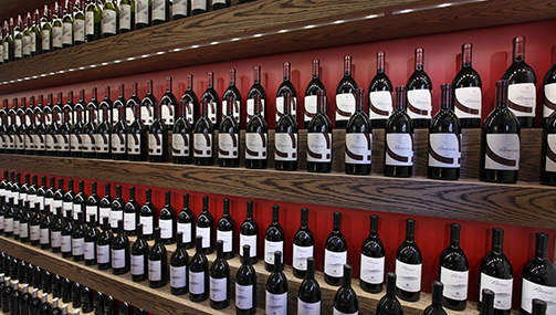
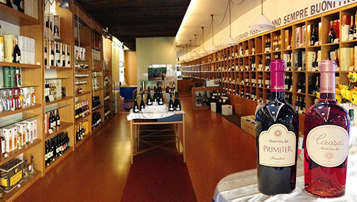
Above: Podere Forte, wine shop Perinquà.
Below: Michele Calò, wine shop.
As regards the strategic actions to be undertaken for the future development, the survey showed that branding and the internet should not be considered priorities for Italian wine. Can you explain this finding?
We proposed 14 strategies and, for each one, we asked for a vote between 1 and 10 on their importance for increasing the success of Italian wine in the future. In itself, the role of the brand, purely from the exterior and packaging aspect, excited a lower level of interest compared to the other strategies because, like the internet, it is seen more as a means than an end. Indeed, the strategy that attracted most votes was that of emphasising a wine’s naturalness and health properties. In second place is the territory: maintaining the link with the territory is considered a value, as is safeguarding the environment from which the wine comes. A third strategy, in second place among the operators of the wine supply chain, concerns exports. At this time, the Italian market has reached a ceiling and is static in quantity terms, while exports seem to offer interesting prospects.
More important are sustainability, as mentioned, and the price. In recent years, the bar of the average price on the Italian market has moved upwards but, especially during the crisis, the consumer has become more sceptical and now demands transparency and consistency, as well as discounts and promotions, especially from the major retail chains and the internet.
Another complementary and synergic strategy that has contributed to renewing the image of wine, opening the door to more aware consumers, concerns organic wines. These are increasing interest and passion, as with other organic food products.
The proposal to diversify wines into a “smart”, easier area has also been considered, bearing in mind young people and occasions when it is important to have limited alcohol content. Innovation and experimentation are important: explaining the new agronomic and wine production techniques is a strategy that met with a certain interest.
How can branding and business on the web be made more effective and incisive?
By always emphasising the personality, the distinctiveness of one wine compared to another. To make the differences clear, the vocabulary has to be constantly renewed, that is to say, the lexicon we use when we describe a wine and its organoleptic components, rather than the production characteristics or the territory of origin. It is important to communicate the elements of the brand image, the wine production house, together with information and terminology that can enrich our knowledge.
What characteristics should the wine of tomorrow possess?
The wine of tomorrow must facilitate and improve the quality of our lives and relationships. It must give pleasure and excitement, maintaining its image as a living, vital product but with a rational, safe, reliable and certified core, so it can be drunk without worries or fears. Not a wine to forget, as once used to be said, or to alter our states of consciousness. On the contrary, the wine of the future will be a wine that enriches, brings emotions, images, culture and all the values connected to the production chain, which is also important for our country from the economic point of view. The wine of the future must be chosen with pride and knowledge about an important industry that needs to be sustained in all its complexity.
Bottle caps: historical fragments, modern icons
Having become, over time, a true symbol of bubbly, together with mushroom caps, the caps enclosing corks began to be seen as collector’s items in the early eighties in the Champagne region of France. Today those pieces of circular tin foil, which could be worth anything from a few euros to several thousands, are precious items to be preserved, listed in appropriate collectors’ catalogues and the subject of events and exhibitions for enthusiasts. Such as the National Bottle Cap Exhibition, held on March 16th in the Guido Berlucchi cellar in Borgonato, Franciacorta, which drew exhibitors from Italy, France and Argentina.
Caps designed by SGA for the club anniversary
Organised in collaboration with the Cap Collectors’ Club, the exhibition showcased priceless collections from all over the world, along with bottles of yesteryear and paraphernalia from the world of wine. In celebration of the Berlucchi Spring Festival, a special cap was created in commemoration of the event, which already has cult status among enthusiasts, and one cap was stamped with the colourful logo of the C.C.C. In recent years, the Club has been making new converts, organising meetings throughout Italy, taking part in themed exhibitions, trade fairs and conventions while maintaining contact with various manufacturers. The Club has around 250 members but it is estimated that there are around 5,000 collectors in Italy.
Arturo Ziliani with the president of the Club, Pino Manieri, who gives the prize to Mr. Gianni Legnani
Devised in the middle of the nineteenth century by Adolphe Jacquesson, the owner of a Champagne firm, the “plaques de muselet” represent the apex of the evolution in the methods previously used to prevent the cork from popping due to the pressure, which basically consisted of handmade binding of jute string and iron wire. By ensuring a better grip of the metal cage patented by Jacquesson, the caps guaranteed a hermetic seal for Champagne bottles, thereby preserving the characteristics of the wine. It was a brilliant invention that was soon adopted by all producers of sparkling wine and would become a symbol of quality.
From the second half of the twentieth century, the caps were lithographed, screen printed or lacquered and embellished with decorative elements, coats of arms and brands: now the stars of advertisements for Champagne and Italian Classic Method sparkling wines, caps are a stylistic element that cannot be ignored in any packaging or global image project of sparkling wine producers.
Italian cellars are also aware of their aesthetic and promotional value: a central feature of the home page of the Berlucchi site, metal caps have become a characteristic element of the lids of producers’ wooden cases, enhanced by a distinctive personality.
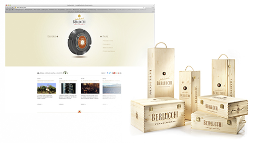
For an in-depth look at the historical evolution of the sparkling wine cap, see the article by Gianni Legnani, formerly director of the Champagne Information Centre in Italy, on behalf of the Comité Interprofessionel du Vin de Champagne.
http://www.winetaste.it/la-capsula-da-spumante-ha-162-anni/
Tag Global design, Packaging
Secondary by name but not by nature
Two crossed goblets, dancing. We are at the table of a typical inn, exposed beams and stone walls. A golden light streams from the window, the sunset takes the working day along with it and gives us a moment to ourselves.
Excellent wines are listed on the blackboard behind the bar. The host is full of recommendations. But what catches our attention are the dozens of bottles placed against the walls. And, above all, the luxurious wooden packages on the shelves, the elegant wrapping of limited editions. A skilful combination of colours and materials catch our eye
and emblazon on our memory the names of great wines, associating them with noble varieties of grapes. Prestigious cases and packing give the whole place an aura, impregnating it with atmosphere, and they become the objects of desire.
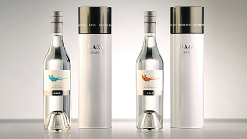
Indeed, for a wine to be seen and remembered as “prestigious”, the territory, the cultivation of grapes and wine making techniques are not enough, nor is the structure and organoleptic profile. Wine producers known this well. They have long understood the importance of a product’s aesthetics in attracting consumers and giving them a message, loud and clear. If the bottle, cork and label are the essence of the image evoked by a brand, special packaging and cases are capable of lifting and elevating their importance.
These packages will be found on the web, in the corner of a wine bar, along the major distribution routes. The combinations of shapes and images with which they attract our attention make us linger out of curiosity before a display, imagining the moment when we present a precious gift box or happily potter about the home cellar, savouring the moment when we will uncork the best bottle.
Secondary packaging is one of the most powerful tools in the hands of producers: it covers an enormous category where there are elements of communication with very different specifications and costs. 6-packs, individual cases, limited editions, special packs, displays, gift wrapping: apart from those referring to the way they are used, all these terms have a single aim, to emphasise the message transmitted by the brand and the wrapping, in line with the strategic corporate direction. In its entirety, secondary packaging echoes the philosophy underlying the brand, starting with the choice of the materials, as the example of Alois Lageder reminds us.
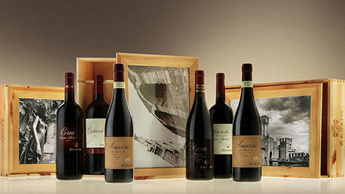
Similarly, the wooden boxes designed for the Zenato wines, when opened, reveal wonderful photographic shots. Those ‘breadsticks’ containing the Barbaresco made by Gaja are unique creations with strong personality. The cartons and boxes with Enrico Serafino Alta Langa lithographs, with gold and silver details, illuminate the bottle like a jewel on the neck of a woman. Gift box and Limited Edition, intended to enhance specific vintages and harvests, greatly increase the perceived value of the brand.
As well as being a megaphone for communicating the brand, secondary packaging contributes to weaving the weft of the ritual the precedes the tasting in an original and memorable way. Sometimes as a real article of furnishing, as in the case of the Berlucchi gift box, capable of creating the atmosphere of the wine or lounge bar, but also of our cuisine and lively hospitality. A real example of versatile, modular design.
In a nutshell, secondary by name but not by nature.
Tag Global design, Packaging
Rosé & Rosato: not just a wine but a way of life
“Apart from people, only wines can really tell us their stories by making great statements that echo down the centuries, so that they come before us today with their identity documents intact”. So says Veronelli (source: “Luigi Veronelli. Life is too short to drink bad wines” by Nichi Stefi and Arturo Rota, p.300).
In this complex identity, the colour of the wine is the visual lure that fascinates and stimulates, attracts and intrigues.
Pink, in its infinite varieties ranging from warm coral to golden, is not the colour of a single wine but of two enchanting universes: Rosé and Rosato.
By Rosato, we mean the wines of central and southern Italy, the most famous being the wines of Salento. Rosé refers the wines of the north that can be still or sparkling. Wines of freshness, immediacy and uniqueness. These are traits that make them not only pleasurable, but a scintillating accompaniment to convivial occasions. They usually accompany lunch and dinner starters, including on important occasions, and emphasise the taste of healthy Mediterranean dishes.
It is the Rosato wines that bring in new consumers every year: palates not schooled in the complexity of wines can gradually discover this universe, starting with the Rosato wines, which offer tangible satisfaction in taste and stimulate the discovery of more complex sensory experiences by training their palates, a development that only occurs if quality Rosé wines are chosen.
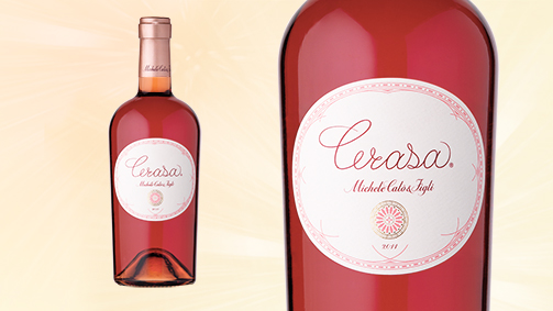
Let us go to a windswept land between two seas, the Ionian and the Adriatic, to access a world where time has the slow rhythm of the estates that produce noble, sweet grapes like Negroamaro, which is used to produce the Riserva Cerasa of the cellars of Michele Calò e figli. Fernando and Giovanni Calò tell us how they decided to take on the challenge: “The Mjere is our classic Rosato, then last year we decided to produce a Reserve, the Cerasa. The procedure is the classic “teardrop” one: about 100 quintals of Negroamaro selected grapes in the temperature-controlled tank, a 12/15 hours break on grape’s skins, this is the right time to obtain pink coral colour and a balanced taste, rich in flavour. The heavy weight of grapes blows up the grapes naturally, the liquid part falls to the bottom of the tank, meanwhile the solid part, the skins, moves on the top ( it was also called vinification “raising the hat”).
During the racking of the 100 quintals of grapes, we obtain only 30/35 quintals of rosato must flower, a spontaneous product without any pressing, with a wonderful colour, bright such as when we put it in the bottle.
Rosato like the colour of Salento”.
“It was a challenge,” continued Fernando, “because we had our established market, we did not know how it would react to a new product. We worked a lot on the product’s image, on the label. We needed to communicate the novelty but also give a foretaste of the sensations the wine produces, so the artwork is very precise, almost classical but very personal and harmonious. The market is ready, it wants novelty, surprise and we wanted to surprise it. There are 10,000 bottles, intended for those who know how to appreciate a good Rosato, those who know our Mjere well. We are very satisfied with the positioning achieved and the response of the market.”
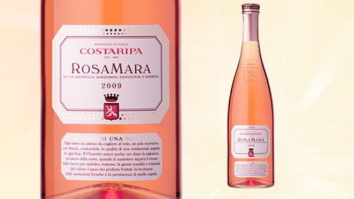
“The Rosés are wines of the Alpine range, they are less alcoholic, more acidic, very fresh, very tasty, and are extremely clear in colour,” says Mattia Vezzola of Costaripa about the wines of this chosen area, Valtenesi, on the shores of Lake Garda.
“The most northerly point where citrus fruit is cultivated, where there are capers, olives, the cedar trees (Tassoni is from Salò) which are cultivated in 3 places in the world: Lebanon, Calabria, here at Lake Garda, a part of the Mediterranean close to the foothills of the Alps.”
The climate makes this land special. “A unique climate,” says Mattia, well versed on the subject, “extremely temperate, a quality/propensity that comes from the size of Garda: 370 square kilometres, a square centimetre of water gives rise to around 1,400,000 hectolitres of water, the minimum winter temperature is 7°.”
This land has always produced wine. “The great step was taken in 1896 when a Venetian senator, a certain Pompeo Gherardi Molmenti, married a very rich lady of Salò, Amelia Brunati, whose dowry was a splendid villa with 15 hectares running down to the lake. He journeyed to Bordeaux and fell in love with that wine, hired two wine experts and took them to Moniga where the terrain is gravelly, yellow clay and the climate is Mediterranean. It may be called Moniga, but it could call itself Saint Tropez, they thought: this is the land of rosé and, in 1896, the first rosé, the first label was produced in 1904.
“Since then we have cultivated only Italian vines: Groppello, Marzemino, Sangiovese and Barbera. Groppello is one of the rarest grapes in the world, there are only 500 hectares there. In the eighteenth century, it was also found in Val di Non a Massacara then, gradually, it retreated and found its ideal environment on the lake. Barbera and Sangiovese are the two most common vines in Italy among the DOC wines, so Rosé is a typical Italian wine.”
“Our Rosé is a wine that can accompany any spicy dish - wherever there are anchovies, capers, rosemary, sage, tomato, basil and peppers. It can also be drunk fresh and, usually, this type of wine, this type of food, this type of climate is only found where there are extremely moderate people and so Rosé is not just a wine but a way of life.”
“A high technology wine, Rosé is a silky delicacy, a very sophisticated cashmere, you have to know how to work it, how to treat it. It requires great respect, contrary to what is thought of Rosé, which are regarded as the “waste product” of wines, of secondary quality. Companies produce them because they are trendy, Rosé is in demand, sales are on the rise.”
“I recommend to all consumers to approach Rosé by tasting only wines of protected origin, above all Valtenesi. We are sliding, because of our own negligence, towards a low profile but we, in Valtenesi, me in particular, are making great efforts to raise the submerged bows of this ship to navigate by riding the waves. The choice of producing Rosé of quality is rewarding, both for the producer and the consumer. A stinking, pink-coloured tsunami is heading our way, and the choice of high quality is the best way to stand out, investing resources and expertise, enabling a positioning that the Italian and better educated foreign markets will amply repay.
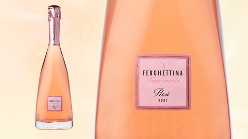
Laura Gatti of the Ferghettina company takes us to Franciacorta, land of prestigious sparkling wines, and surprises us by declaring, without mincing her words, that she loves Pinot Noir and so the unconditional love for their Rosé - 100% Pinot Noir - is its pinnacle.
“Anything but easy, anything but aimed at those who want something light and undemanding,” begins Laura, an introduction that roots us to the spot, listening to her, waiting for her to answer our silent question: why? “To understand this type of wine: our rules lay down a minimum of 25% Pinot Noir, so one could be made with 25% Pinot Noir and 75% Chardonnay. When we decided to produce a rosé we wanted something very different, because otherwise it wouldn’t make any sense to produce it. Over time, we passed from a few bottles to an ever greater number, never too many, today it stands at 30,000, depending on the availability of Pinot Noir, in order to keep the identity pure and because the aim was to unite the structure, the force, the varietal aspect of a red berry with the elegance of a sparkling wine. Pleasing nectar, drinkable but with quite a sharp personality.”
The mind can only conjure up a champagne, the Cuvée Rosé Laurent Perrier, also 100% Pinto Nero, the Rosé par excellence. Laura smiles, pleased at this comparison, and immediately makes clear that the two products have different “callings”.
Why anything but easy? “It was a little difficult at the beginning, there were softer rosés on the market, more appealing, undemanding. To explain, to make our idea of a good product understood, we had to be strategic, precise, in our communication, in the image of the product. Now they ask for it, because it is a different product, the taste is rewarding.”
The future? “It has found its home in a niche slot. It is a wine that not only accompanies but exalts fish dishes, meat like culatello or crudités and seared fillets, with a distinct taste. We wanted our Rosé to be very varietal, displaying notes of berries, raspberries, cherries in alcohol, very typical of the variety, that it be persistent, full-bodied without losing sight of one of the characteristics of sparkling wines, their drinkability. Other producers are trying to follow this course but we have already created and positioned a unique product: it has the acidic freshness of sparkling wines, at the same time it can accompany a meal of several courses without problem… we are always trying to make it more distinct, as is well known. The attention to detail, in defining the image of the product, the label and the communication, enables us to capitalise on the present and future of this Rosé as a tangible value.”
Tag Packaging
Tag Packaging
Tag Packaging
2013 - Rassegna dell'imballaggio: Dalla bottiglia all'esperienza d'acquisto
Tag Global design, Packaging
Identity, evolution of architecture
The point it stands is not fortuitous, it is a legendary place. Legend has it that the founder of the city, on his death, was abducted by an eagle here and carried away into the sky. We are talking about Rome, Romulus and the Patheon.
Hadrian, the emperor who commissioned the building, was not aware of the term “brand identity” but he was profoundly aware of the power of architecture in communicating the features and values of a “name” (what we call brand today).
Every architectural form develops its own code of communication, through grammar it creates individual episodes that take the reader on a journey that, like the memorable journeys of navigation, takes place in unknown waters.
Architecture can mould the future, the future choices, the gaze encountering an architectural reality always involves memory, architecture is memory, which excites us and prompts us to seek out and find these emotions in objects of memory.
The language of architecture is made up of light, materials, proportions, acoustics and history. It comes from a symbolic thought, expressed through symbols and metaphors and cannot exist irrespective of the reality that generated it, which gives the most lyrical perception.
The architectural space always brings something new of itself, thanks to the complexity of the elements that make it up and the life it hosts.
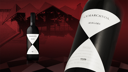
Space is never a question of inside and outside, of what it contains or does not contain, nor is it only a physical perception; space is culture.
It is the space of the imagination, the space of the unknown, the invisible, it isn’t something we perceive physically, it is the celebration of art inspired by time, traditions, therefore dynamic, subject to many influences, open to new vistas and new horizons.
“There is no need to integrate communication with architecture: architecture is communication, if it does not communicate, it serves absolutely no purpose. A very sad neorealist cube can be just as stupid and ugly as an extremely expanded form or without classic or simple geometry. The problem is the ideas and the magic they communicate. Unless architecture manages to communicate and supply that missing magic, it has no sense.“ These are the words of Massimiliano Fuksas, the most visionary contemporary architect, capable of turning dreams into reality in spaces and architecture of a few cubic metres, and in gigantic works, like his “Cloud” in construction in Rome.
This peculiarity makes architecture the source of inspiration for brands that arise from an evolution, an extension of the intrinsic concepts and values of the project.
It isn‘t a spontaneous activity but a study that transfers the visible value of the architectural structure to identity, brand and packaging.
Driving this choice are values not only shared but properly expressed and represented in the graphic forms, the volumes, the sensations that product and place inspire together. These are traits that are acquired both knowingly and unknowingly: anyone can see that in the cellar Ca’ Marcanda of Angelo Gaja in Tuscany designed by the architect Giovanni Bo, the architectural play of the roofs is then reiterated, in a graphic sense, in the labels that create a pleasurable and particular emotional and material connection.
In the same way, even the most distracted eye cannot avoid surprise at the sight of the label of the wines of Alois Legeder from Magrè, the shape forces the eye and the mind to a search for the answer to the simplest question: why this shape? The shape of the label corresponds to the layout of the cellar, designed by the Abram & Scnabi studio, and gives the product a strong sense of origin, a genetic guarantee.
Certainly, this was one of the architectural objects used in a very effective extension to the corporate brand in the Petra of Suvereto cellar, designed by architecture Mario Botta: firmly characterising the architectural structure, it is achieved in the minimal style of the brand, transferring to the eye itself the same warm, energetic sensations.
We do not know whether the designers were aware of the fact that the sphere of influence of their works would be extended to the identity of the product. What we gather from these constructions is the power, the capacity for interpretation and communication of values the product possesses, sending a message to the consumer that encourages sampling as a sublime experience.
Tag Global design
2013 - Wijnalmanak magazine: De Pro
Sara Mutti works for SGA design, an Italian design agency that specializes in wine branding. For thirty years, they have provided the image of well-known wineries: from wine names to logos and from bottles to websites. Italian wineries as Berlucchi, Gaja or Lageder are amont their clients, but also the American Kendall Jackson. For each client SGA develops a specific communication strategy.
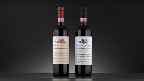
How can you summarize what you do?
“You can consider it the postproduction of a wine. Today, the look of a wine is enormously important: there are so many competitors, how you jump out? Wine is such an emotional product, almost a lifestyle that consumers want to identify with a particular image. Every wine producer tells a story - the packaging is the translation.”
Sounds good, but how does such a ‘translation’ look like in practice?
“We engage in numerious conversations with the winery. What is the history, what are the specific features of the soil? We try to find unique clues. Alois Lageder is a good example. He was one of the first producers who was very concerned with the environment - its logo and bottles had to convey this philosophy. We have done that in collaboration with contemporary artist. We do not go along with trends. The design should be timeless, yet it should stand out in the crowded store shelves. And it should be appealing both in Italy as well as abroad.”
The design is reflected in labels and logos, but there are other ways?
“Striking design goes much further than just the logo. Berlucchi launched a specific type of Franciacorta, the ‘61, with which they not only brought an ode to the origin year of Franciacorta, but also wanted to be a kind of retro brand appealing to younger drinkers. We have translated this into a clear-sixties look, from the bottle to the stands where the wine was served. We were inspired by mood boards with pictures from that time.
Another example: Cascina Castlet in Piedmont, is a very young and modern working winery that forms a contrast with the companies in the region that bend on a long family tradition, with castles and such. Therefore we designed modern graphic shapes for them that are imprinted on the bottle. Sometimes even we design an eye-catching bottle - like that of the brand Bocchino. With everything we do we want to escape conventions.”
When ideas meet and join together
Viviana Varese, teetotaller, Enrico Bartolini, moderate drinker, Matteo Baronetto, pragmatic taster.
This was the combination that led my mind to skirt over some ideas that have little to do with cooking but a great deal to do with aesthetics. Structural aesthetics, the aesthetics of a perfect game, a fantastic equilibrium, like snowflakes: not a single one is the same as another.
“When ideas have sex” is how Matt Ridley explained the value of exchange in the generation of collective intelligence or systemic intelligence as Peter Senge defines it. People retain their own diversity while working together, based on a common thought that emerges from their interactions and this extends their capacity, impacts on their interests, behaviour, without standardising them, giving rise to the emergence of a form of complicity.
Let’s return to the kitchen and, speaking with these chefs about the complicity between food and wine, between them and the sommeliers, between the aesthetics of wine and the aesthetics of food, two common values emerge: sharing and freedom.
Picture: a Viviana Varese creation
Freedom seems to be the manifesto of Viviana Varese and Sandra Ciciriello, her partner and sommelier, a very feminine precept and something of a necessity, given that Viviana doesn’t sample wine. Sandra decides, selects her cellar and, in that choice, both the past and the present are very important. Sandra was a fishmonger and taught the art of discovering, loving and choosing fish to Viviana. She knows every shade of flavour of this central ingredient in the cuisine of “Alice”. This enables her to create “dishes” in her mind, mental storyboards built on taste, intuition and the story of the individual wines. A picture in which the aesthetics are manifest in their most subtle and manifold representation: food.
Viviana invents and creates in complete freedom with the knowledge, the certainty, that the wines suggested by Sandra, with her very personal style, will glorify her creations. We all remember the “panino Bruciato”, Viviana’s ugly duckling, which gave rise to a unique experience of taste, a journey through Alice’s “wonderland”, accompanied by ever more varied flavours of wines selected with great mastery by Sandra. At the table, only at the table, the magic of the encounter occurs.
How does Viviana define this union? Winning.
Enrico Bartolini acknowledges the great communicative power of the aesthetics of the table, the soul of the contents of the dish, accessible through the aesthetic choice. He loves to deliver a degree of surprise to his guests with something not entirely unknown so that it leave traces, it creates a furrow of remembrance in the minds of those who taste it. In this skilful work of sensations, account must be taken of the technical or instinctive consistency, of aromas and tastes, of internal and external sounds, of factors that influence and change the approach to the dish. Enrico is a passionate artist, and his passion extends to wine. “I collaborate with Pino Savoia (manager of the wine lover’s hall) and Giusy Romano sommelier. Being a moderate drinker and keen wine lover, I often throw in hints and tips. I realise I can be very pretentious. The ability to select and suggest wine “for others” really lies in understanding the wishes of others and being convincing with real taste. These are the characteristics I find in the team who help me run my business.”
The aesthetics of food and aesthetics of wine are winning combinations, even though the concept of what is good and fine is subjective. Enrico can’t bear bad or ugly things.
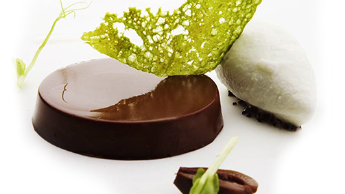
Picture: a Matteo Baronetto creation
From an attentive, creative, imaginative chef of Cracco, this calm, pragmatic dimension that sets his style apart from the crowd is not surprising. Matteo daily consults Alberto Piras, a highly trained sommelier, always ready to study, innovate and be curious. They put their shared approach down to having a “nose” for the work. Their work is similar, sustained by constant research and discovery, they know something will go together by instinct, what will work as a natural combination, and that it isn’t always true that “those who quarrel come closer together”. Cuisine is an “assembly” of products, with the wine to accompany it chosen on the basis of two different philosophies: a wine for each course or just 2 wines to go with several courses. Matteo and Alberto opt for the latter. Selections arise from a very complementary approach, an interchange of ideas and shared objectives. It is a form of collaboration that generates enthusiasm, they work in a ferment of development, fully aware of the change. Wine isn’t drunk just for drinking, but as a function of the food. The food accentuates the wine, the coupling gives a unique character to the dish.
As a matter of culture, here at Cracco, the quality of the raw materials are paramount, even if this is to the detriment of the aesthetics of a dish. Natural products, for example, have more muted colours, but the aesthetics here are the result of a multiplicity of factors and values that are visibly represented by objects and forms, but must be confirmed by content and taste.
All the chefs agree that, at the table, wine has a fundamental role, just like the opening scene of an opera. Everyone is silent, holding their breaths and ready to be excited by the first entrance. The gesture and images in these first moments will decide the reaction of the spectators, one way or another. A wrong note, the wrong bottle, will change the balance and dispel the magic of complicity achieved through mastery.
Tag Interview
The creation of value as the cornerstone of a company
How important is it for a company to establish a distinctive identity and image when it is on the verge of breaking into the market or, if it is already trading on that market, is seeking to improve its reputation?
This issue of a corporate identity in general, and I would say with wine production in particular, is central, decisive and complex. That’s why it has to be approached with real diligence, as with every question that contains the solution in the answer. Each wine company is first and foremost a story - the more effective the story, the more credible it is.
And what gives it its credibility?
A number of factors, above all the central figure, the personality, the charisma of the owner, what we in the marketing world call a company’s testimonial. Obviously, charisma is like character, if you don’t have it, you can’t inject it intravenously.
Nevertheless, your initial question is one that has to be asked at the start of the story of any company and which must continue to be asked throughout its development. I’m referring to that very special feeling that is created between the company testimonial and the company itself. A feeling sometimes so encompassing that the testimonial becomes the company itself. When it’s no longer there, the problem arises as to how to replace it.
From where does this identity spring, then?
Without doubt, from the figure of the entrepreneur, but that’s not the whole story. In truth, it’s the outcome of the combination of various factors. Forgetting that, above all, identity is about territory is extremely dangerous (wine is, first and foremost, about the land from which it comes). I don’t say this lightly - the land of origin is decisive in creating coherence and credibility in the figure who represents it. Not just that: protecting the land is the responsibility of the entrepreneur, a responsibility that goes beyond business, it takes on a social aspect, that’s to say, there’s “cross-fertilisation”. It brings advantages to the company and to the collectivity, and every businessperson must take account of the needs of the collectivity. What we marketing folk refer to as a company’s mission.
What is a mission, exactly?
One of the great objectives of the (wine production) entrepreneur is shaping the land and, at the same time, his own identity. That’s exactly what the history of viniculture, Italian or otherwise, has done. If we think of the hills and the vineyards of so many regions, we can see that the owner of the company has actually been the architect of the landscape. Very often, much of this landscaping has endured, I won’t say integrated within the tradition, but cared for, brought to fruition through the care of companies, and this represents a market success.
I certainly don’t believe the contrary, that a company succeeds irrespective of the land.
This sounds to me like a rather lively debate.
So it is. And how. It encourages producers to ask themselves, for example, whether to adhere to the classifications, or – because they are dissatisfied, suffocated – whether to leave them behind.
This aspect cuts to the heart of the relationship between the company brand and the collective brand and, once again, we are entangled in the problem of identity. I say that the two brands make a perfect marriage because they meet equally essential needs.
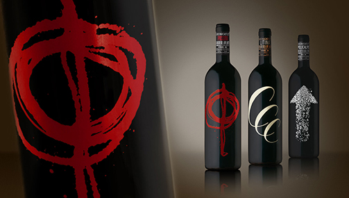
A question about the transfer between generations. In Italy, wine making has a long production history but only recently did it really engage with the business culture. In recent years, we have been witnessing the first real hand-overs of businesses from one generation to another, and this is proving to be a very sensitive issue. You’ve said that the original entrepreneur is a point of reference for a company, but what has to be done to avoid losing the heritage that was created?
I’m a professor and so the “generational passage” is something I deal with all the time – I live it, I experience it. Sometimes I find myself taking an active role in certain family situations.
On this issue, I feel optimistic, almost to the point of naivety, and I’d like to say this from the heart: I am witnessing an extraordinary new generation. While it’s true that the ownership of Italian wine companies is recent, it arose from a paltry business culture. The success is almost miraculous. I say that with great respect, let’s be clear, for the owners and for those who created global success from nothing.
But on what is this success founded?
Obviously not on the “fundamentals” of the economy. On paper, we often see the figures have been really very weak in proportion to the results obtained. Nevertheless, companies have not only grown but become really successful, and this is probably because of a combination of circumstances: the personality of the owners, a propitious period in the market, consumers with limited awareness of the product and so hungry for answers and information.
Now, in some ways, that era had to come to an end and, just as in all markets, dynamism demands innovation and change, and it’s in this that the generational passage becomes a great opportunity.
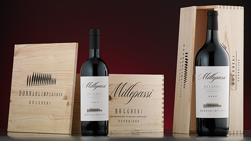
But where do you get this optimism from?
From two facts: 1, I try to help young people graduate who choose this degree course and this profession above all because of their enthusiasm, even when the business runs in the family (but then enthusiasm is the most important quality that a parent can give a child, whatever career they pursue); 2, training in the wine sector has also begun to encompass the business side, even if only in part. Where once there was a very broad technical component (excellent enologists, great viniculture experts and so forth), today, more and more, we’re training entrepreneurs, managers, men and women who put business culture right at the centre of their work.
How has investment by a company in packaging and corporate image been handled in the past, and how should it be handled?
That’s a subject very close to the question of the generational passage and in business culture generally. Allow me first to go back a bit: if we survey the history of Italian wine production businesses, we see that the first pioneers (and there were many) possessed both positive and negative aspects. Positives: enthusiasm, guts, charisma. Often these became, without thinking about it too much, the “corporate marketing” tools (the capacity of an entrepreneur to talk about himself and his story was the basis of advertising). Negatives: the company’s investment was predominately made in vines and cellars; something that was clearly needed at the start, but which required financial, mental and physical resources that stopped them from seeing over the horizon. Let me to say why the training received was mostly technical (agricultural and enological). The best schools were, without doubt, centres of agrarian or enological specialisation, and they certainly did valuable work, but they focused only on the product.
A new market oriented business approach became necessary when markets began to reach saturation point in demand (something common to all sectors), competition and high investment. This is where the discipline comes in that we call marketing, but is more properly called orientation to a market but, above all, to a consumer who makes rational choices. This is not very common, though. Many business still concentrate two thirds of their efforts on the product and only a third on the perception of that product. Research on what the consumer wants and is looking for is not that well established, in fact, it’s a world yet to be fully explored. I’m not a great believer in templates, but some objective elements can be drawn from this research. For example, there is a high degree of awareness on the part of the consumer of the aesthetics and the packaging, which is an advantage for a country like Italy, the home of expertise in design, fashion and art.
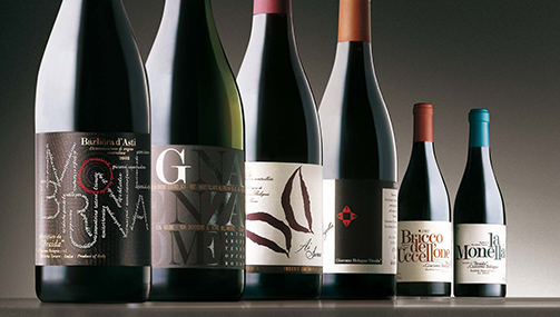
Isn’t there a paradox?
Indeed there is. This should be a real prerogative for Italy and central to the objectives of a company, but instead it has become a brake, because it’s regarded more as a cost than an investment. Nevertheless, and I’ll tell you why I believe this, the reasons for the great success in the world of Italian company brands depends mainly on the utter precision and great attention even to the smallest detail of design and aesthetics. This logic is part of the new business culture and the new generation – and this is why I am so optimistic – is very aware of it. So much so, in fact, that we might risk going too far the other way, though this may be an inevitable counterbalance to what is to come, that is transforming a business that makes a product into a business that achieves excellence, including in the way it advertises itself.
Coming back to my earlier question…
In modern advertising, the packaging and the design are important, but these aren’t limited to the simple requirements of the producer: the label, the bottle, the packaging. Advertising is moving in many different directions and these days we face great challenges (unfortunately, when one speaks of challenges, companies usually think only about the website, but it isn’t enough just to have a website, the point is how to make it tell a story in times and ways that differ from traditional advertising).
What should be done to prepare for these challenges?
The business culture can clearly be studied in universities, but it has to be broadened out to those who do it professionally, so that it becomes a constant theme in corporate life. We have seen the phase of the so-called “flying wine makers” who pinned everything on enologists, who were seen as invaluable, and indeed were much sought-after by companies. I hope they continue to be so successful, but I am convinced that, in future, it will become more and more necessary to collaborate closely with all aspects of business culture, and that includes design. Our heritage is too great to let go to waste.
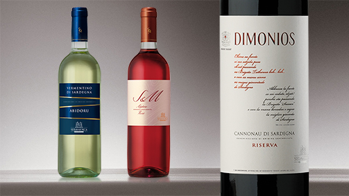
Since the beginnings of entrepreneurial production, the land, the equipment (vital in the development of the product), the people (for the training in knowledge about wine) have been fundamental. Now, though, advertising cannot be ignored, an investment that produces benefits over time. Why, then, do producers see it as almost a forced march and not a resource that is vital for the health, the vibrancy of a company?
I’m glad to be able to contradict you there, because I have had a positive experience. I’ve noted that, especially teaching the master’s degree, when I show the direct evidence of a model (let’s not forget that one of the best ways of learning is to watch others), even the most closed-minded entrepreneur is seized with enthusiasm, ready to accept the new, a renaissance, so much so that at the end of the lessons they come to me and say they can’t wait to go back to their company and put the new ideas into practice.
Another important aspect. You’ve talked about young people anxious to get started and fulfil themselves. That’s why we designers have to be able to see the objectives in advance and bring them into focus, showing the direction that the entrepreneur wants his company to take.
I don’t thing creating a look is an end in itself, something that “grabs” the young and not so young, however good a company is. There has to be a company objective. And that’s what we lecturers try to teach on page two of the company manual. It’s what we call the creation of value, which is just as valid outside the world of wine. Business “is” the creation of value: I’ve created something that before did not exist, and if I created it, it should be protected and nurtured.
In a harsh, fake, enterprise economy, value is seen as simply profit. I don’t denigrate profit, but the identification of an objective with profit is not only dated, it’s utterly inadequate. In other words, the idea that a company only grows if it grows in production, turnover, its slice of the market. Absolutely not! Not least because it may implode if growth isn’t steered, isn’t guided.
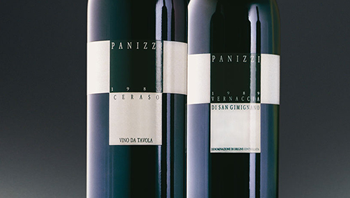
So, the main thing is value. But what is this value?
For example, I very much believe in business as a social institution, business is something that, by the value it creates, can generate benefits, a public good that is bestowed on the collectivity and manifest in many ways: paid employment, protection, the enrichment of the territory, culture that benefits everyone, respect for oneself and what one does.
This, if I might use a rather grand phrase, is the ethical value of the economy. It means the objective cannot be achieved regardless, that there are certain keystones that the consumer also acknowledges. Clarity of the objective is decisive.
What are the difficulties facing the new generation?
The most difficult thing is to identify and achieve an objective that is consistent with the ethos of the company. The new generation will find this difficult to comprehend unless they have guidance. Anything created without due calibration can become an enormous problem, not only for the designers but also for the companies themselves and, therefore, their markets. Continuous changes in direction half-way through are looked on askance by the consumer.
In a nutshell: companies are always in a state of flux. This often prompts them to rush forward and rarely spend time on reflection. But reflection on the fundamental stages on the path of growth is vitally important.
Tag Interview
Markets are conversations
Cluetrain Manifesto 1999.
The great change now underway is in the way buying behaviour is more and more influenced by the logic of reputation among consumers and peer pressure. Often companies remain outside these conversations. Even though they have the same means as the consumers, they don’t know how to use them, how to become part of the conversation.
The way many companies communicate seems inept, inadequate for managing the requirements to react and innovate quickly as demanded by the market. The new abilities required are agility, continuous redefinition, the importance of the service and the customer experience etc.. instead we see continuous efforts by companies to tell their own “story” but empathy is the key to accessing these conversations.
Let’s look back, for a moment, to 1492, the year that marked the passage from the medieval to the modern era. Christopher Columbus is the figure who best represents that historical moment.
An intriguing story, the discovery of America, as long as we don’t make the mistake of looking at it in a linear way: someone deciding to do a certain thing, planning the way to do it and reaching the objective. That’s not how it went!
The discovery of America was the chance outcome of a series of mistakes combined with an iron will to achieve an objective other than the objective actually attained: Christopher Columbus remained convinced until his death that he had shown the way to the East Indies and had not discovered a new continent. It took 20 years to correct this mistake. In order to realise that a new, unknown continent had been discovered, the people of western Europe had to change their beliefs and create new maps.
This occurs at times of great change: things are discovered that were not meant to be discovered. Today, as in 1492, we are experiencing a time of great upheaval. The new discoveries demand new maps in order to understand and communicate.
Chris Anderson says: “We are no longer what we say we are but what Google says we are.”
In this scenario, two great forces lie in opposition to each other, expressed by each one of us but little known: systemic empathy and stupidity.
The first is clearly a positive force, promoting the understanding of people, groups and communities who we don’t know but with whom we identify because they place us in a dia-logical dimension that has nothing to do with any sort of irrationality.
Stupidity is the more ancient, ancestral force, that of complacency, and it has great power. “Never underestimate the power of human stupidity” wrote Robert Heinlein, and he wasn’t the only one: Isaac Asimov wrote an entire, fascinating story “Even the gods are powerless against stupidity”; Flaubert was obsessed by stupidity and wanted to write an encyclopedia on “bêtise”. J.L. Borges also started to write a “Universal History of Ignominy” but stopped when he realised the vastness of the topic.
It’s part of human nature and can never be entirely eradicated.
The internet and the “systematically empathic” media have been transformed into breeding grounds of superficiality par excellence by the lack of models and lack of expertise.
The most common experience that can happen is to open a website and not find tools for interconnection, for sharing, for listening, for information, but “shop windows” that have become covered in dust over time that “scream out” messages like old-fashioned grinders that go unheard because they are of no interest to the user.
The internet is a “non-place”, a metamarket, it isn’t like the simple, physical non-places where people are encountered but ignore each other (typical examples: airports, motorways, railway stations), the internet is heard, instruments for listening are activated in order to converse and be heard. On the internet, the customer is “engaged” because it is efficient in exploiting and circulating information about companies and their products. The borderline concept in this “non-place” is a great green belt that is swarming with opportunities to be seized, and the consumer is readier to seize them than are businesses.
Systemic Empathy is never a casual event but a process to be activated through precise stages:
empathic listening, a careful analysis of the requirements and expectations;
the comparison, an honest assessment of what can be done and given:
the sharing of objectives, a strategic definition of the synergies to be activated.
This process gives rise to websites that are real platforms for global management of digital communication, tools for listening and positioning, real extensions of collaborative businesses that converse with the outside through constant flows of feedback fuelled by established values from strategic choices that include all forms of communication.
Tag Brand, Global design, Web site
Beyond the company, the stand
Reaching out from the company, going beyond, is a must.
Taking brand value into a physical space, with a formal, comprehensible language, pursuing that long-awaited sense of surprise and involvement that typifies the visitors to a trade fair.
This is about finding the correlation between “inside and outside”, that is, the relationship between the company and what is beyond it, in favour of the architecture of performance, without degrading and smothering the product.
This is a form of architecture characterised by impermanence (unlike a building that is designed to last forever), flexibility, use of suitable materials to sustain and amplify the excitement.
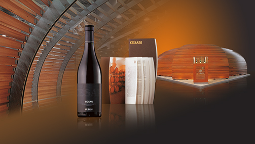
Cesari global identity: packaging, brochure, stand
A place to try out techniques and technologies, the field of application for the most innovative, emotional, virtual and sensorial communication in which the visitor travels along a route where pauses, rhythms, light, movements and the times the space is used are essential elements.
These are the components of an effective exhibition architecture that communicates, the result of a composite of across-the-board and interconnected expertise: exhibition design, interior design, interior decoration, merchandising, food design, experience.
A rather indisciplined discipline but with a precise objective: to display the product in a way that establishes a relationship with the public in a given space-time context.
The design applied to the project demands, in the specific case of the stand, since it is a space outside the company, the attainment of guiding objectives such as the improvement of lifestyle, a concept that becomes an applied strategy to make clear the company is a leader and competitive.
In the case of wine production companies, the values represented are: art, landscape, environment, history and all those symbolic and spiritual values that have forged our culture of appreciating good wines and conviviality, making it famous and symbolic throughout the world.
The historical and cultural reality is exemplary compared to many other realities on the planet, as long as it is conducted by drawing inspiration from the perfection of nature, the environmental balance and morphological configurations of our territory.
In order to achieve this, it is important to produce that leverage effect that makes the practice repeatable since it is properly developed through a logical process:
development of a structured and controlled “communication system” able to interact with the public;
use of instruments able to provide adequate support to the decision-making process;
acknowledgement of the market logic (not only the Customers) of the efficient practices adopted by the Business.
Fedrigoni global identity: coordinated set, box, stand
The fact the company implements processes compatible with the requirements of the market and the environment may be further communicated by adhering to the “Classes of Requirement” laid down by European regulations (UNI 8289), adapted to the specific sector of staging trade fairs.
The “staging” system is divided in two main spheres: environmental and technological. These two spheres contribute to the creation of a harmonious place that is compatible with the user’s needs to the degree in which they meet the Classes of Requirement:
Appearance: the entirety of the conditions regarding the perception of the staging by the users;
Usability: the entirety of the conditions regarding the potential of the space to be properly used by the users;
Management: the entirety of the conditions regarding the running of the space, by virtue of its fundamental feature, its impermanence;
Wellbeing: the entirety of the conditions regarding the state of the constituent parts of the surroundings, which are adequate for living, health and to make carrying out the activities envisaged pleasurable;
Safety: the entirety of the conditions regarding the safety of the users, in addition to protection from and prevention of harm from accidental factors.
It is the designer’s responsibility to apply these principles to the 3 macro stages, the essential parts of the organic whole, that is, the project: design of the staging, design for usage, design for dismantling.
A communication project, perfectly integrated with the values of the business, able to motivate the desire to establish ethical and profitable collaborative agreements.
Tag Global design
The Monsordo project on display at the Milan Triennale
The exhibition TDM5: Italian Graphic Arts is being staged at the Milan Triennale until February 24th, 2013.
The exhibition takes in more than a thousand graphic products collected by the three curators: Mario Piazza, Giorgio Camuffo and Carlo Vinti. In the packaging section, the Monsordo of Ceretto project is being displayed, curated by Giacomo Bersanetti and Italo Lupi.
With this, the fifth edition of TDM5: Italian Graphic Arts, the Triennale Design Museum continues its promotion and showcasing of Italian creativity, widening its research into a story that has always been considered minor and ancillary, in order to restore its proper independence.
Italian Graphic Arts is an opportunity to present the events, figures and phenomena that have accompanied and sustained the cultural, social, economic and political developments of our country, which still remain relatively little known, in all their diversity, outside the specialised community.
Starting from the historical beginnings, the cultural roots and the key moments in Italian graphic design, the exhibition is broken down into types of artefacts: letters, books, periodicals, culture and politics, advertising, visual identity, signs, films, video and packaging. A sort of classification system takes shape, running from the written word to the designs that are brought together through the topic of space and time.
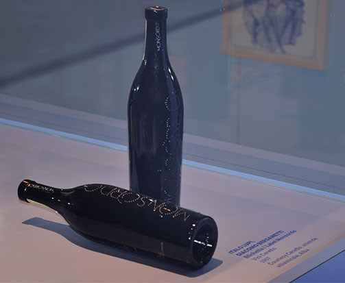
In the food packaging section, the Monsordo wine project of the Ceretto company is displayed.
The visual identity of this product arose from the synthesis between the specific shape of the bottle, designed by Giacomo Bersanetti, and the embossed lettering in the glass, designed by Italo Lupi.
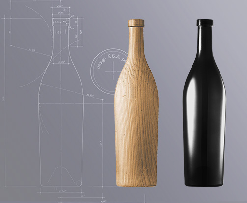
A bottle that is firmly rooted in the territory from which it comes, from the redesign of the ‘Poirinetta’ to be precise, a container that was first produced at the end of the 17th century in the Poirino glassworks near Turin.
The work carried out by Ceretto was a fundamental step that typifies the whole sphere of communication in the wine production sector. With the Ceretto brothers, the transfer of design expertise was achieved regarding the identity of the wine: from the supplier to the designer.
Tag Packaging
The aesthetic side of wine: adorned with excellence
Taken from the Greek word “aisthesis” or feeling, aesthetic value is the spiritual content of an object. A sign that it possesses the qualities of structure, balance, harmony and elegance and, by displaying these qualities, it arouses the feelings that make it so appreciated. This is the web of values that gives an object aesthetic worth.
Wine must be regarded as an object of value, not just a product of nature, and so it is judged within the sphere of aesthetic values, centred on the object itself and not its function: tasting is designed to appreciate the aesthetic value of the wine through the spiritual understanding of the values the object represents.
For whoever tastes wine rather than just consumes it, wine presents a magnificent multiplicity of natural aromas and tastes, and surprises by never being the same since it changes the moment, the state of mind, the food that it accompanies.
The complex signals that wine triggers in our minds excite visions of effort, science and patience, commitment, willpower, synergies, all feelings that must be codified and channelled through its livery since this is what stimulates the eye, the principle and most sensitive tool in arousing desire.
“Le Super Tre Stelle della Guida Oro Vini di Veronelli 2013”
Ferrari - Fratelli Lunelli - Trento Brut Riserva del Fondatore Giulio Ferrari 2002
Touring Club - Vinibuoni d’Italia 2013 - I Vini della Corona
La Viarte - Colli Orientali del Friuli Doc Schioppettino di Prepotto 2009
Manuele Pirovano, sommelier to Davide Oldani, cellar manager of the Ristorante D’O, confirms that one of the first lessons given at catering school was “the Customer, first of all, drinks the label”. The characteristic “pop cuisine” of Oldani dictates choices aimed at appreciating and sustaining the content of the preparations and wine has a fundamental role in this. The wine is the object that activates the sensory receptors, the eye immediately scans the shape of the bottle, reads the aesthetics of the label and, unconsciously, determines the quality of the content. This is a choice that incorporates the thesis, the material object, the bottle, that grades the quality, and the antithesis, the spiritual sensation that suggests the values incorporated in the object.
The female public pays more attention to the ritual and intrinsic fascination of the choice of wine, while men more critically observe the specific product. They read the label and judge its style in a more detached way, displaying a degree of expertise that, perhaps, they often do not possess, and they don’t let the fascination exerted by the aesthetics to come through.
Manuele says the shape of the bottle has value as a “trademark” that determines the worth of the content, a persuasive, inevitable process of communication in which customers take in what corresponds to the expected aesthetic of a sublime content.
I Cinque Grappoli - Duemiavini 2013 - Ais Bibenda
Ca’ Marcanda - Bolgheri Rosso Camarcanda 2009
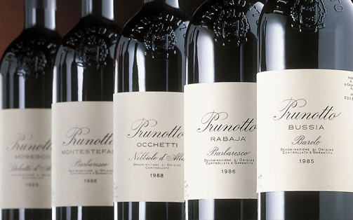
Cinque bottiglie - Guida de l’Espresso
Prunotto - Barolo Bussia 2008
How is this type of finery created? Chiara Boni, a stylist in her adopted city of Milan but Tuscan by birth, talks of creation as a process of cultural and stylistic refinement, sustained by the understanding and sharing of values, which is displayed in a product that, thus adorned, leaves no doubt about the qualities of the content.
“The work of stylistic refinement of a garment arises together with the idea of the woman who wears it”: the emotions triggered by the fabric, the search to identify it, the refinement of collections that follows the thought, the development of expectations and requirements, season after season, is an evolving continuum harmonised in a direct relationship that acquires the most sophisticated nuances. “The intrinsic value of a garment lies in the capacity to appreciate its “content”. A skilful cut emphasises the personality, the “taste” and the “femininity”.
So the substantial values of a lofty wine, the outcome of effort and hard work aimed at attaining excellence, can be lost if the wine is adorned with a generic livery, not a skilful style that enhances its physical properties and character. Dressing up the wine in stylish garb means capitalising and consolidating the value of the work. It is the final step in the process of creation that really completes a wine.
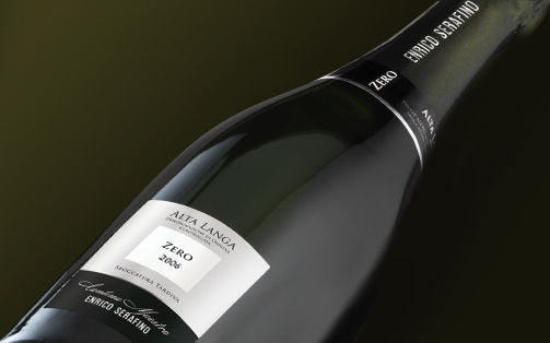
Tre bicchieri - Gambero Rosso
Enrico Serafino - Alta Langa brut Zero Cantina Maestra 2006
Tag Packaging
Bellavista: a vocation for excellence
According to Mattia Vezzola, it was a professional and personal matter that together took him to Bellavista and the attainment of the heights of quality in expressing the absolute uniqueness of identity and style of a company and a product.
A result achieved through the perfect integration between the various elements involved: “… I have always maintained that the people who collaborate with a company must not limit themselves to giving their professional service, but must feel part of the project of growth, really taking part as a privileged person within the project. That means being able to create themselves, together with the owners, the idea of the corporate brand…”
How did Franciacorta present itself at the beginning of your journey?
From the geological and oenological point of view, the territory was extraordinarily suitable for the production of excellent wines intended for fermentation in bottles. This is due to natural causes. But it was also, primarily, a territory that possessed great intellectual and propulsive energy, thanks to the intelligence of the men and entrepreneurs who live there and experience it with great naturalness.
My journey began with the assessment of the potential, at a historic moment, the intuition and desire for perfection of some men who then brought to Franciacorta the light of progress and a future.
All this at an extraordinary period towards the end of the seventies; a time of drive and energy focused exclusively on the production of quality.
And how was the Bellavista project incorporated?
It was established over time (not all at once, but gradual growth) and through the consistency of the direction taken (once taken, always maintained).
What were the stages along the way?
The company grew in the conviction that a vocation for making wine is the foundation. In the second place: the mainly natural management of viticulture, that was begun then, and the emotional/professional involvement of the men, acted as a trampoline for launching the underlying idea of the owner. Third aspect: a careful analysis of the creative direction of the sensory profile, that is, making wines that, nourished by the potential, could express the specific values of the men committed to making them and the characteristics of softness, elegance and gentleness that are inherent in the territory and the raw material. Fourth: applying respectful technologies that were synergies between the principle of tradition and the cutting edge. All this, also thanks to encounters that contributed to opening the mind and setting the key production points.
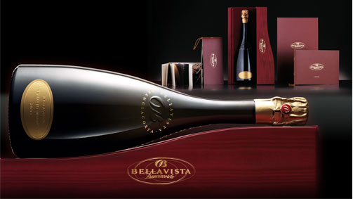
So, in that way, you acquired awareness of the territory’s potential and defined the taste of Casa Bellavista. This stage would have needed time…
Yes, around thirty years, but it hasn’t yet finished.
Ah, it’s not yet finished… but you will have defined the company lines.
There’s a design, of course, with an underlying idea that will be perfected over time. We started with three and a half hectares - today Bellavista numbers 200 hectares with an average age of the vineyards of 20 years, 42 employees of an average age of 39 years
with an average of 10 years experience in the field.
The real corporate assets, I would say.
Exactly! Being a company structured in order to value manual and intellectual work, it’s clear that the professional growth of each individual collaborator is decisive because the details are taken care of, assessed and valued. That takes years, time, generations.
Were there crucial stages during this 35 year long journey?
Yes, of course. Growth has also always taken place thanks to the confrontation, so to speak, between rather opposing positions but which have never regarded as intimidating. For example, following the path of quality usually conflicts with the financial interests of a company. The crucial point, then, is the iron conviction of the owner, firm and courageous, which allowed this path to be followed without hesitation. From the start, we identified the golden road and when a new project is drawn up, the two most important things are the direction and the pace. I don’t say that Bellavista got everything right, but without doubt it made very few mistakes. In that way, a viticultural heritage was discovered with a production philosophy firmly rooted in the family and the collaborators, first and foremost, and, as a result, in the wine that goes into the glass.
Among the various challenges and conquests of Bellavista is the Satèn project. I don’t know how many people realise that Bellavista originated this product. How did this began?
It began with a vision, by chance, an odd situation and the wish to challenge prejudices, especially of those who consider an elegant wine, a little sweet, a little sparkling, more suited to women’s tastes. A wine like this comes to be seen as inferior and downgraded, for a potential consumer, not of quality, or of low quality. In a nutshell, not really a good introduction for a product intended for a female public.
An anecdote clarified my ideas: I was in Venice, at dinner, with a friend. We saw a wonderful girl walking on the opposite side of the canal. A harmonious gait, great femininity and infinite musicality. We stopped eating, as did other people. It was illuminating. Specifically, I understood that the femininity that had paralysed a restaurant, deserved a wine with a different profile of quality and taste, elevated and not humdrum.
It was in ‘83/84. So I thought of a chardonnay grape, high in the hills, exposed to the south that would give rise to must, and so wines, of great grace, freshness, softness and crispness.
These wines, at least 50% coming from must fermented in old casks, gave greater complexity, more volume, more structure, more persistence.
Fermented in bottles with an atmosphere of less pressure, these wines display an extremely subtle cream and extremely sophisticated bubbles.
The term Satèn, which brings to mind, not entomologically but phonetically, the silkiness of chiffon, soft tissue, was the most effective of the names suggested by SGA. The name was then lodged and given to the Consortium and to our great pleasure was adopted by the whole territory of Franciacorta.
And, in this journey, what role does advertising play?
I have very clear ideas on the matter. But I must go back a step: a company can set itself the task of making the best wine in the world but if it is distributed or advertised badly, the company can only emerge from that at a disadvantage. And vice versa.
A company can create the most beautiful label in the world, entrust the marketing to the best distributor, but if the wine is mediocre, it will also emerge from that at a disadvantage.
I mean that a company must seek a balance between quality (not declared, but perceived by the consumer), straightforward and authentic advertising and an image that matches the reality.
What did you set out to communicate, then?
What we are, through the form of the bottle, the label and the colours in harmony with the value of the wine as perceived by the consumer.
I have always maintained that the people who collaborate with a company must not limit themselves to giving their professional service, but must feel part of the project of growth, really taking part as a privileged person within the project. That means being able to create themselves, together with the owners, the idea of the corporate brand by emphasising the objective quality of the product.
Precisely in order for this harmony to be achieved, the agency must above all experience the company in all its complexity and difficulties. Otherwise, the advertising becomes abstract, generic and could relate to any other product of any other company.
What do you need, on the other hand?
That every comma, every line, every colour, every remark bears witness to the commitment of the 42 people who work towards a shared objective down to the tiniest detail. For us, this is an important value.
We don’t choose a graphic, or a supplier, but a fellow traveller with whom we achieve an affinity of thought, behaviour, objectives.
The agronomy, the oenology, the marketing, the advertising and the graphic must be perfectly aligned.
It’s a principle you have always adopted.
Yes. A supplier who has been with you since the beginning knows how you think, what you want, you don’t have to explain a thousand things. The thousand things become prerequisites, so you grow together in the sublimation of the arguments.
Closer relations are built up and everyone’s looking in the same direction.
I often repeat one of my phrases: “You shouldn’t do what you want, but do what there is.” Saying: “I prefer this to that” is pointless, insignificant, superficial, and if after a little while you don’t like it any more, what do you, start from the beginning? No, you must do things that involve constant training and challenge.
For many, it’s trivial, but not for us.
The importance of image in the start-up phase: the Rocca d'Orcia project
Faced with a well-crafted image of an activity or product, we react positively and are attracted by it: we want to find out more about what we like.
Through the image, we get a preview, a story about what we’re being offered; the decision to give it a name and a symbol are therefore crucial in defining the identity of a brand.
The brand is as much a part of the product as what that product does and can be crucial to its success so, for this reason, attention to image becomes a strategic decision in the start-up phase. This decision becomes even more vital when the businesses are related in different ways to each other, with separate missions. Complexity of the relations acting within a group of brands was dealt with by SGA in the recent project for Rocca d’Orcia, the still intact medieval town within the heart of Tuscany.
The project arose from the wish of the entrepreneur Pasquale Forte to revitalise the town that surrounds the Rocca di Tentennano, through the careful restoration of the places that for centuries had housed craft works connected to tradition, and their relaunch.
In a context like this, the work of brand design cannot neglect the search for an expressive language able to capture and emphasise both the typical elements of the entrepreneurial activity and its distinctive selling points with regard to the market and the context in which the brand will exist. For these reasons, the work led to an organic design approach, both in the choice of the name and the consideration of the graphic symbol.
The wine store was baptised Perinquà while the adjoining bar was called: Perillà. A particularly effective two-part name, easy to remember, originating from the local dialect. Two places, with linked activities, with a single stem and a single symbol, but distinguished by phonetic elements that make clear their respective identities.
For the Tuscan store, the name Riamà was chosen, which underlines its greater independence, recalling the traditional Tuscan term rihamà. This term refers to the activity of embroidery and evokes the dexterity required for the creation of the products offered inside the store.
Finally, the exhibition area was named Spazio Se, which will host authors of international renown operating in the field of photographic research and which began the season with an exhibition dedicated to Francesco Radino.
SGA, in addition to designing the four brands and carrying out the research regarding the naming required to define the various ìcompany” entities, also handled the additional communication for the overall project presented recently at the inauguration ceremony.
The overall result of the project can be seen at the following link.
Fan FranciacortAppassioNati: an unconventional approach for the territory of Franciacorta
FAN FranciacortAppassioNati is an association that was formed one evening over a flûte of Franciacorta - it could not have been otherwise - by a group of seven young people, two girls and five boys, with a passion for their territory and lots of get-up-and-go.
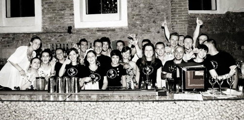
The aim of the association is to increase appreciation of Franciacorta wine among the new generation, presenting it in unconventional ways in order to attract a public of possible enthusiasts beginning right in the area where it is produced.
The association has the concrete objective therefore of promoting Franciacorta by publicising it in an accessible way without, however, diminishing its reputation.
The starting point is a new approach to the wine, offering it as an aperitif during “roadshows” or in trendy premises where the young producers explain Franciacorta to other young people, conducting them through pleasurable and convivial wine tastings.
As part of this, SGA was honoured to contribute to the creation of this young and vibrant association (in particular, naming it FAN Franciacorta Appassionati and the brand), thanks to its long established experience in Franciaforta, gained over many years of collaboration with various cellars in the territory: Barone Pizzini, Bellavista, Berlucchi, Castello di Gussago, Contadi Castaldi, Corte Aura, Derbusco Cives, Ferghettina, Quattro Terre and Vezzoli.
It was precisely this experience that helped achieve the right balance between the “young and innovative” aspects that characterise the association and the necessary communication of the basic values that must accompany such a complex product as Franciacorta.
The name of the association is a play on the English word “FAN” (an enthusiast or supporter, both in the entertainment and sports worlds) which is also an acronym of the merger of the brand name, Franciacorta, with the Italian word for fans, ‘Appassionati’). The name is very short, immediate, easy to pronounce and remember, a name that is easy to identify with.
It conveys a love for the territory of provenance and for the wine it produces.
The branding process was completed with a playful graphic that restates the acronym within the by now famous “bubbles” - of Franciacorta obviously - that is the term most often used to ask for this type of wine as an aperitif.
The objective of the brand is to support, through dedicated events and activities which have been given the title ‘Born to be: FAN’, the drive to disseminate and create a culture around Franciacorta.
All achieved with a light touch, avoiding weighing down the perception of it with frills and formal rigidity which would end up misrepresenting its true function: to represent young people who are creating the culture of the wine by talking about it with other young people.
Tag Naming
Marketing a wine according to Angelo Gaja
Angelo Gaja, the artisan of wine
Barbaresco is a small town in the North of Italy. With a population of just 400 people, it is famous for the production of the wine that shares its name. It was here in this tiny Piedmont that we met Angelo Gaja, the owner of a prestigious vineyard, with family heritage that dates back more than five hundred years. Angelo, who defines himself as an ‘artisan of wine,’ produces wine that is recognised internationally as the gold standard in the sector. One of the reasons for this status is that, alongside the excellent quality of his products, Gaja has always dedicated great care and attention to the company image: from the design of the bottle, to secondary packaging, company logos and communication. We took this opportunity to speak to him about the relationship between wine and packaging and how it can increase the value of a historic brand.
Marco Senaldi
I’d like to begin on the theme of communication: from the producer’s point of view, how do you create a brand for a wine, what are the best communicative strategies?
Firstly, you have to offer the best possible quality of wine in relation to the various price bands; then by intelligent marketing, developing the correct and appropriate positioning of the product on the market and giving the label high visibility is fundamental, as is the quality of company communication. It’s important to increase the value of the individual brands (companies, names of wines) as well as drawing value from the common heritage of the IGT, DOC and DOCG certifications. You have to make the most of the culture, history, tradition, modernity and architecture that the territory offers… infuse the wine’s image with the idiosyncrasies of its territory.
And the unstoppable growth of the wine, both in terms of consumption and value… what’s it all down to?
Above all, it’s down to the fact that people perceive the cultural value of the wine much more nowadays. Up tol the 1960s and 70s, wine was the quintessential beverage in Italy, an everyday consumable. Gradually it became an optional addition to a meal and often even considered a luxury item. Of course, there’s still a price band in which you can find wine at two euros, which caters for that ‘everyday’ sector, but from upwards of ten euros (some bottles are sold on the market or at auction for thousands of Euros) wine appeals to other needs and gratifications in a country where this gastronomic accompaniment now has luxury status.

…in today’s globalised world, do you think it’s possible to escape the homogeneity of taste?
Certainly I do!!! – Actually, in my opinion, small artisan producers are what keep the sector so varied. The artisan gives his own twist to a wine. It isn’t necessarily successful all the time, perhaps it’s not appreciated by the critics – but what they want above all is to make wine in their own ways. It’s a choice that only the artisans can make: Mondavi, Antinori, Frescobaldi: the mass producers just can’t do it, because in order to sustain their volumes of production, they have to appeal to 80% of the occasional consumer market – that means it has to make wines with a ‘popular taste’. The artisan, on the other hand, serves a different purpose. They offer variety and abundance to the European market, and Italy in particular.
Well at this point, I must ask you where Gaja fits in here: are you industrial or artisan producers?
To be an artisan you have to meet certain conditions: first, you can’t buy grapes, you have to use those grown on your land. Second, you can’t buy wine, because the wine must be made entirely at the vineyard. Third, there must be a strong family presence, where family members are passionate about their work and dedicate themselves entirely to the wine sector. Finally, the artisan company must establish what will be its optimal size and decide not to grow beyond that. The artisan must know how to resist the temptation to expand further because they know that beyond a certain limit, the quality will inevitably suffer. Artisans don’t appreciate consultants either – they work with the conviction that their own methods are the best. The main objective of the bigger industries is to satisfy the consumer, but for artisans this is not the case – their main objective is to make wine how they want to make it… and that’s why we are artisans. For years, we have kept just our 100 hectares of vineyard: later we bought some vineyards in Tuscany too, but even there we decided not to expand. And then there’s the issue of price. The ambition of every artisan is to create a wine of high quality, and consequently, a high price tag.
A concept that permeates Italian style and makes it so recognisable around the world is “elegance” – would you agree?
I think we need to distinguish the idea of elegance from that of opulence. I’ll explain better: in the oenological sector, occasional consumers are also those attracted to ‘pleasant’ wines, with no edges, not much acidity, they don’t have tannins, have a ‘rounded’ taste and more or less suit everyone. But the concept of elegance doesn’t have space for this unnatural ‘perfection’. Nature creates dissimilarities: there are terrains, even in the Barbaresco area that, in terms of production, are very different. So what appears perfect, is often not genuine. Elegance on the other hand, doesn’t need perfection. Elegance is something to digest then move on, and this goes for wine too. Our wines are distinguished by their lack of this excess, of exaggerated fullness, of this opulence: they can even seem imperfect, but it is that imperfection that is the ultimate sign of authentic elegance.
This internal elegance has to correspond to an external elegance… for example, where did the inspiration come from for these ‘fluted’ wooden crates with the Gaja brand? They have a distinct visual lightness to them…
This was an idea developed by SGA precisely because the Gaja brand design was too bold and imposing on the classic wooden crates. The idea was to pick up the style of traditional carpentry common in this area [Angelo takes us outside to see an old wooden door with similar carved grooves to the crates]… it’s a technique that in Italian we call ‘grissinatura’, and it’s an effect we wanted to recreate in our crates to reinforce the link with local tradition.
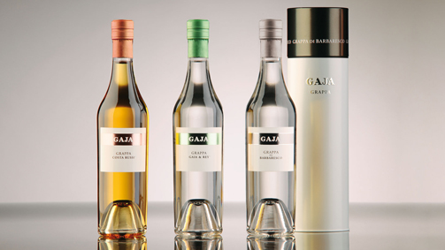
[In the meantime, we moved into the Castle, where Angelo keeps a collection of bottles with historic labels]. Looking at these old labels you can see a certain continuity over time…
Look, this is the first label my great grandfather produced: Gaja Giovanni and sons. Then my grandfather adopted a label in 1900, with the medals that at that time didn’t refer so much to the wine, as to the company that had won a few prizes, gold medals or the merit cross. In 1937, my father reinvented communication for the company: he wrote the name of the producer in enormous letters spelling out “Gaja” grandly above the name of the wine itself. The fact was that he sold Barbaresco at a higher price than Barolo, and this was unacceptable; it was provocative because the gold standard of wine was Barolo. But this price was due to the quality, production methods, and the fact that they never bottled expiring vintages, and so he would say: in this way, in huge capital letters, GAJA had a very precise meaning: “this isn’t just any Barbaresco, it’s a Gaja”. It was an early form of marketing!
The names too are important, a few stand out in particular: Spersss, Conteisa, Darmagi…
We conduct thorough research when naming our wines, selecting them from the traditions of our dialect. Spersss, for example, with 3 s’s, is a word in dialect meaning ‘nostalgia,’ but can be pronounced in different languages.
“Nostalgia” – it was a vineyard my father wanted to purchase, his lifelong dream, which I only managed to fulfil in 1988 when I finally bought the land. Conteisa means ‘contested’ or ‘disputed’, and was a vineyard that lay right on the border between two territories, La Morra and Barolo. It was fought over for almost one hundred years until it was finally divided. Darmagi comes from the French Quel dommage! Meaning ‘what a shame’. This was because in that vineyard cabernet sauvignon was planted, against the advice of my father, to which he replied “what a shame!” (for not having planted them in barbaresco).
In your opinion, what is the relationship between presentation, packaging and the global image that Gaja communicates on an international level?
The label is undoubtedly the primary means of communication between the producer and the consumer. The ticket can help convey the personality of the producer, his philosophies and the ambitions of the company. They contribute to the shape, colour and impact of the bottle… the writing and graphics on boxes and wooden crates, the headed paper and business cards, brochures, flyers, the website, meetings with clients, the organisation of events, presence at fairs, wine tasting events… it’s all communication. The company image depends on the quality of this communication.

Over there I see a brown label…
That was created in the 1970s by a designer who worked for Baratti, a sweet producer based in Piedmont; he used the concept of gold and brown, with the Gaja name in large lettering…
… up to the current black and white label, it’s more sober but striking at the same time…
Yes – from that label there, we gradually arrived at our current black and white design, where the black represents the past, our tradition, and the white signifies the present. It became minimalist, without any decorative images, it’s a ‘tidier’ label – I would define it as “classical modern.”
And the type of paper?
There’s a whole tradition from the 1980s and 90s of using uncoated paper, Fabriano and the like, for wine labels, because they appear softer and warmer. But that kind of paper has two drawbacks: firstly, if a drop of wine runs down the bottle it stains the label, and secondly, if the bottle is stored outside or in direct sunlight, it accumulates dust and loses its colours easily. For these reasons, we eventually opted for a glossier and discrete label.
The classic layout and effective communication seem to be a continual themes for the Gaja brand. How did the image and the product packaging evolve in the last few projectsyou worked on with SGA? I’m talking in particular about Gaja’s Ca’Marcanda, Pieve Santa Restituta and the Fagiani d’oro and grappa lines.
Gaja’s old labels were restyled by SGA. They retained what the labels communicated, but ‘cleaned’ them up, minimising the decorative graphics, and thus adding value to what is essential in the label. For the Ca’Marcanda and Pieve Santa Restituta wines, SGA created a label that prioritised visibility, while staying true to the concept of sobriety and minimalism, playing on two colours and standardising the lettering, protecting what was essential.
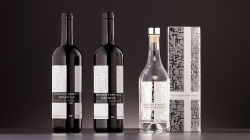
In one word, what is the secret to an effective relationship between the producer and the packaging designer?
I’m convinced that any design proposals must embrace the history of the company and its philosophy. But a relationship like this can’t be improvised on the spot: the secret to efficient collaboration lies in the time you invest in this relationship. With SGA we have developed a mutual trust that has lasted for years. Thanks to this relationship, we’re able to create new ideas together.
Tag Global design, Interview, Packaging, Restyling
2012 - Franco Ziliani's Blog: Franciacorta Extra Brut Sullali
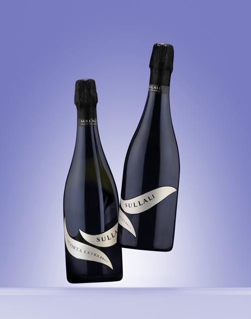
Talking about biodynamic wine: Le Sincette
As Jacques Mell (Bio-Dynamie Conseil founder and Demeter France secretary) said: the French word “agriculture” is extraordinarily revealing, being made up of the prefix “agri” (farm) and “culture” (culture/cultivation).
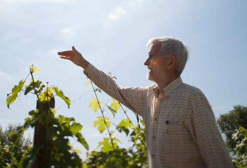
And when talking about culture in the production of wine, one of the most complex subjects to explain is the cultivation of vines using biodynamic methods: knowledge of nature and its cycles, as well as the principles that govern the life of the soil and the vines in relationship to the influence of the stars, a complex culture that allows the wine to fully express the quality of the land.
But what is the proper vocabulary to talk about this level of complexity?
It’s all about combining love and respect for nature and the precision of the steps required to create a biodynamic wine with the need to inform consumers who possesses ever greater awareness and are more and more careful about the choices they make.
The days have gone when the labels on wine bottles evoked a fake agricultural past made up of cottages, little birds and meadows full of flowers. This type of message conflicts with the new production philosophy and with the cultural and ethical values that the biodynamic approach represents.
It seems even more inadequate when addressing consumers who are attracted to these wines because they are searching for something genuine, something in which they can trust.
Let’s take the example of the development of a cellar at Lake Garda in the Valtenesi area: we’re talking about “Cascina la Pertica”, established 30 years ago, which converted to the biodynamic method 12 years ago. The hackneyed link with the imaginary peasant farmer is clear from the brand name itself (literally, ‘Beanpole Farmstead’).
Yet, over time, this baggage of the toiling peasant of long ago has lost its power to be convincing, as is true with foodstuffs in general, because it has been gradually weakened by the false claims of “naturalness” that have flooded the mass market.
To attract today’s consumers, the key word is, therefore, “authenticity”, both in the product and the advertising. For this reason, in defining the new brand, it was decided to change the name, replacing Cascina la Pertica with “Le Sincette”, a new name that is not just simple and memorable, but is also the name of a real place where the company has vineyards.
The new brand is formed of the logo “Le Sincette” and the monogram “LS”, the initials of the name. These elements are represented by appropriately designed calligraphy inspired by the movement of the blades of grass grown between the rows in order to revitalise the soil.
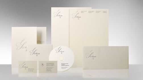
For the packaging of the wines and the website www.lesincette.it, simplicity and clarity are again the keywords in a new vocabulary that seeks to communicate the naturalness of the product and explain how the biodynamic process is carried out.
But the task of conveying this complexity is not only a question of image. A more engaging way of communicating has to be found. Creating social occasions in which the cellar is opened up to the public in order to allow people to share the vision and the knowledge that inspires the work.
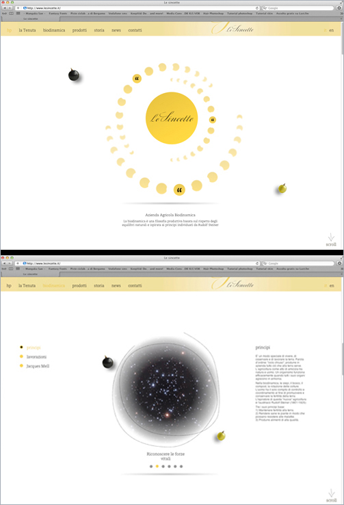
Communication becomes a way of going about things in which, as in the biodynamic method itself, nothing is forced but everything contributes to creating an authentic experience which enriches not only our awareness but also our emotions.
Tag Biodynamic, Brand, Global design, Packaging, Web site
Tag Biodynamic, Global design, Packaging, Press, Restyling, Web site
Brand restyling, the Berlucchi experience
by Marilena Colussi
I eagerly accepted when I was asked to write an article for the new SGA blog about the important and delicate theme of the restyling of particularly renowned food farming and wine producing brands. In this new virtual informative space, I’ll be discussing what these brands represent in terms of our history, tradition and culture and looking at the symbolic and functional value their products have for their consumers and our society in general. So here are a few keys to fully understanding the recent restyling of one of the foremost brand names in the spumante market.
The Berlucchi brand has seen continuous growth over the past twenty years to become the leading seller of Italian spumante wine on large scale distribution networks, a feat achieved by few other brands.
Over the past ten years, many things have changed, not least, the habits of the consumer. Spumante has become so popular that it now features in daily Italian life where before it was exclusive to celebratory events. The competition too has changed, with prosecco leading the way, the wine and sparkling wine market has quickly evolved, as too have the logistics of distribution.
The companies that continue to grow are those that can anticipate these changes and evolve their brands intelligently in synthesis with a system that is becoming more and more complex.
But how can a brand with Berlucchi’s calibre adapt to these changes without betraying its own traditional values, its assets of recognition and appreciation, all while leaving space for other lines of products?
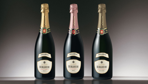
I believe the solution came with the ability to bring together, in a redefinition of the brand, a careful analysis of the market and the consumer and the resolute vision of what Berlucchi has always been and will continue to be. A new direction aimed also at reinforcing Berlucchi’s key role in the history of its territory.
The results of my own market research conducted on a broad range of consumers and buyers of a variety of wines and spumanti have brought to light the profile of a consumer who is ever more attentive and aware of the evolution and the positioning of the spumante wine and its leading brands. The imagery evoked by the ample selection of Italian spumati is rich with emotion and meaning, refining the culture of SAPERE BERE (i.e. the right way to drink). In fact, more notably than other wines, spumante requires the right glass, the right temperature and the perfect sip, and its distinctive bubbles and wire-bound cork further exalt its natural hedonistic and social traits.
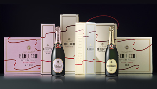
Unlike Champagne, Italian spumante is perceived as a more authentic, natural, dependable and accessible wine. The wine’s ever stronger link to the territories that produce it – with Franciacorta certainly among the most prolific – promoted the recognition of a distinctive value, both in its sentiment and its quality.
The territory and the brand are assets that the producer must hold dear if it is to continually renew the faith of the consumer and reinforce a relationship that endures and evolves over time. The producer must adapt intelligently to the socio-cultural changes, customs and rituals that will be part of our future.
The restyling has acknowledged the current consumer profile, and seen how it assigns sentiment and significance to food and drink, particularly spumante. Pleasure, Italian-ness, Culture and Health come together in the expectance of sociality, sharing and self-gratification. The recognition of the Territorial origins of food and wine greatly enhances the perceived value.
The brand restyling project extended to a reinvention of the packaging for the Cuvèe Imperiale and other product lines, highlighting the complexity of Berlucchi’s case-history in order to improve and bolster the expression of its implicit contents.
An extension and a diversification of the product range allows a producer to reach different target consumers, as well as opening the doors to different distribution channels.
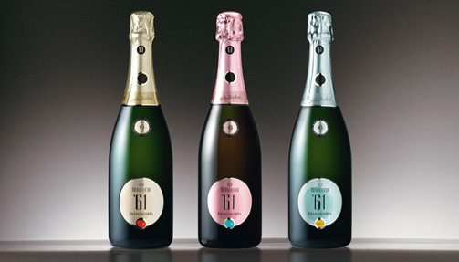
The process of reinventing the image, handled entirely by SGA, also involved the restyling of the Cellarius line, the renovation of the historic Cuvèe line that dates back to ’61, and the creation of the top-line Palazzo Lana. The project also involved the study of secondary packaging, for the ho.re.ca and GDO channels, the development of the entire corporate identity, product catalogues, stands for the Vinitaly exhibition, and in collaboration with the web designer Ocho Durando, the creation of a new website.
It was the realisation of a global project in response to the changes demanded by an increasingly competitive sector.
Dr Marilena Colussi is an expert in Consumer Sociology and Food Trends.
She recently conducted research entitled “Attitudes and behaviours of the wine consumer in relation to large-scale retail channels” commissioned by Veronafiere, Vinitaly 2012.
Tag Brand, Global design, Packaging, Restyling, Web site
2011 - Artribune: Alcolic Design

Vezzoli stand (detail)
Cesari stand (detail)
Tag Press
2010 - Bolzano: Design & Packaging
Museion - Museum of modern and contemporary art Bolzano
Tag Biodynamic
2011 - Wine and Design
Immersed in design
The first contact a consumer usually has with a wine is through the label, which means that design matters. We spoke to three design firms about their very different philosophies. Here, Massimiliano Hangler from SGA in Italy outlines their approach.
SGA is an Italian brand and packaging design agency with a focus on the wine and spirits business. Founded 25 years ago by art directors with backgrounds in both art and corporate design, the agency’s aesthetic links corporate branding to artistic expression. SGA mostly works for Italian companies, but has done some work for companies in the USA. Clients include Bellavista, Campari, GIV, Berlucchi, Gaja, Valdo, Fontanafredda and Ferrari, among many others. The agency’s philosophy is ‘give shape to value’, which is our motto. When we begin working with a winery, we go there and speak to the winemaker and try to understand the winery’s soul. I am not speaking about ‘mission’ and ‘vision’ and all those marketing words, but about understanding how the winemaker lives his wines, how he wants to get on the market and how his customers approach his wines and the category. After doing this, we usually get the concept. From our point of view, there is no difference in approach to Old World and New World. The important thing for us is to express what the wine is. When we visit, we talk with a lot of people. Afterwards we try and extract elements from that experience. In one case, Ceretto’s Grappa, we found a church in the vineyards that had an artistic work that was very colourful. We used the same colours for the label. We give the customers a piece of the winery experience. The communication is true, so the customer finds on the label what he finds on the ground of the winery. The important thing is to be true to the customer and to express something that is clearly different from competitors. When we start to work on the project, we get all the bottles and design labels of the main competitors. The main advantage is to avoid copying, but also to understand how much you can stand out from the rest of the labels.
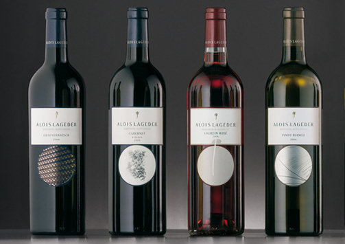
The importance of story
We have a lot of experience in the wine market and understand the vineyard language. Piedmont has a label language, Tuscany has another label language. You have to be part of this, but if you only use that language, you will not stand out from the crowd. For example, we rebranded a Piedmont winery, Enrico Serafino, for Campari. It had a typical Piedmont look, but it was old fashioned, so the market got bored. Campari began to rebuild the quality of the product and we rebuilt the imagery. We searched in their cellar and found a letter from the first owner. We used that to rebuild the wine’s image. We designed a font based on the handwriting in the letter and also focused on some elements of the region, Roero; it’s like Barolo but it’s a new one. From old pictures we saw that the main characteristic of that firm was that a train could stop in front of it. There were oak barriques all over the front of the company, so we linked the handwriting with the two first letters ‘E’ and ‘S’ in the brand. We wanted the design to give some fresh energy to the sales force, as well, because they are so important. They took the new brand all over Europe. We do not have precise sales figures, because the company is listing on the stock exchange and can’t give numbers, but they said there was an improvement in sales and orders around six months after the new image was presented. It also won a prize at Vinitaly last year. Because we want to create value, we also did a document that explained how the image was built. This was to we give the core team the idea of the project, because in wine, narrating a story is very important. Everybody needs a story, that’s clear. If you have got an interesting story founded on the winery’s history and you can show what the winery did to improve its quality, it lets people get in touch with something authentic. There are many quality wines out there, so it is important that they each bring something different. Our clients are very happy when we give their wine some additional value, to help express the quality of the wine. When the bottle goes into the sales channel, there is no one supporting it, but they know that the product can speak for itself.
Archetypes
To create a long-term relationship between the customer, the bottle and the winery, we try to introduce some unconscious elements into the label that can speak to the customer. We use archetypes; we did some cultural research and found out that there are shapes that people all over the world associate with the same things. So when people see a square label or a square shape, they associate it with the earth. If you are talking about vineyards, you can use a square shape to tell them there is a deep link with the earth. We worked on a bottle of Tosti, which is a sparkling wine. We shaped the bottle so it had a belly on it. The reason we chose that shape is the bottle was going to be sold all over the world and the belly can be found everywhere. You can see it in ancient objects that have been found in Africa. Everyone is familiar with the archetype. We shaped the label around the bottle so when these bottles go on the shelf, there is always unconscious communication between the customer and the product. Another project we did was with Alois Lageder from Trentino, which had an oldfashioned product line with old-fashioned labels. In this case, we organised a contest with modern artists; we brought them around the winery, we made them speak with the winemaker and we told them to create a team to express the winery. This main thing with this winery is that they try to have as little impact on the environment as possible. They are biodynamic. At the end, we collected all of the art papers and chose teams to express what the winemaker is doing with his wines. When you see the pictures, you will see there are two archetypal elements: the circle and the square. The circle is an archetype of the sky and it can also express the continuity of nature. This means if you are biodynamic you respect the environment and have a circular life – if you use a lot of chemicals, on the other hand, you cannot have circular growth, because you will have to keep on using chemicals or have no fruit. So you see, these labels have three levels. The first is that they are nice to see, because they have art work on them; the second is that they express nature. In nature there are four themes: the ground, the wine plant, the wine maker and the wine itself. For the ground the artist’s work was about putting a stone on a paper and to brush it, so we got a label with an image of the ground that gave birth to the wine. The second label has a stylized vine leaf on it. The third step is that you can find the handprints of the winemaker on the label. This is a very modern design and it replaced a very old design.
The export manager was afraid to put this wine on the US market and also on the Italian one, because it was a break from the past. But in this case the label had a very interesting story to tell, because when you talk about how the artists worked, you are proving that we are really authentic. In the end they went with the label and the result was that they sold out.
What not to do
The most common mistake is copying. If you go to a territory like Piedmont and visit maybe two or three of the wineries which have no conception of branding, marketing or design, you see they look the same. Maybe they have looked at each other, or looked at the leader, to get their design elements, but in doing this they are only working for the leader. They are reinforcing the leader’s ideas. Another very common mistake is to try and design something so new and unusual that is has no substance behind it. The third mistake is making a very nice design when the wine itself is not so good. Sometimes for the international market we are asked to design different labels for secondary lines. In this case, you can choose to design a label to be seen as typically ‘Italian’ and many do this. But nobody will remember your label or your brand, because you have made yourself into just another Italian wine. So even on the international market, we still prefer to design in such a way that it expresses the winery.
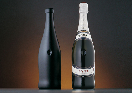
2008 - Oenographies: designing narrative itineraries
by Giovanni Baule
Polytechnic School of Milan
Midway between the process of design and the production process in the wine sector lie forms of this itinerary that show a certain degree of similarity. These itineraries are also ‘stories’: itineraries that encapsulate acts of narration. On closer examination, they confirm the existence of consonances, clearly visible contiguities between design - the creation of a graphic sign or the genesis of a form - and the cycles and phases of winemaking. When a combination like this, of cultures and sensitivities, of methods and approaches, develops in the same locality, when a ‘theme’ coincides at the deepest level, superficial analogies are superseded opening up complex, unpredictable paths. This proximity of itineraries allows design to create signs and shapes capable of communicating the “wine product” by evoking its essence and avoiding the need to superimpose pre-established identity masks. This is what we mean by oenographies.
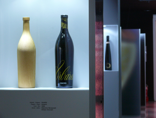
Oenographies place the emphasis on communication as a distillate, a synthesis of a complete, hidden process, an underlying form responsible for producing the final meaning. These oenographies, where the method of design adjoins the communicated content, generate real communication prototypes: it is worthwhile taking a closer look at them because they encapsulate a very interesting formula. If we try to retrace these itineraries, we get a glimpse of a new approach to the image 15 of a product and its design: an approach that, while retaining and enhancing the communicative efficacy of the final product, uses the tools of communication design which are far removed from conventional product communication schemes, and far removed from those identity projects for consumer goods that remain exclusively tied to the tired but still widely used methods of marketing-oriented communication. The latter is an approach that is unequivocally focused on the target, relegating the aim of discovering and illustrating the essence of a product to second place.
Furthermore, it is an approach whose sole aim is to reiterate the power of the brand, to highlight the expectations induced in users of the communication, and to focus on need to make the product attractive to users by exercising every kind of appeal. The spin-off in design terms of this marketing-oriented logic, which seeks in the graphic layout and formal dressing of the container all the guarantees of a consolidated grammar, made up of approved and stereotyped ingredients from a collection of conventional formulas, ends up by reversing any change in the horizon of expectation (what consumers want from us): it lowers the level of that ‘communications pact’ that links messages and users, triggering a sort of communications short circuit. But narrowing the range of experimentation in communications languages and innovation in the development of grammars means perpetuating that reticent design that depresses the relationship with the recipients of the communication and results in the paradox of a ‘dumb’ communication, incapable of conveying anything. On the other hand, the application of proven rules and also the treatment and overturning of coded typologies, the use of expedients to ensure product recognition and also the shift in accepted practice open up a design space for any designer who wants to operate in unexplored territory, beyond the line of ‘I’ve already seen it’.
There have always been numerous references linking the act of writing, typesetting (therefore, graphic design) and reading to the world of wine-growing and winemaking. Drawing on the monastic tradition, characterised by its ability to blend the flavours and smells of nature and writing, handwritten graphics and the art of winemaking, Ivan Illich in his work “In the Vineyard of the Text”, which is dedicated entirely to this dual itinerary, describes the moment of reading as follows: “When he reads, Ugo of San Vittore harvests the words: he gathers the grains from the lines. He knows that the word ‘page’ can refer to the rows of vines all joined together. The lines of the page are the wickerwork of a frame that supports the vines… The Latin word ‘legere’ is derived from a physical activity: legere means to ‘collect’, to ‘create a bundle’, to ‘assemble’… The devices used to order the page, the pagination that underlies the graphic layout of information, forms part of a visual whole that helps to determine the intelligence of the reader…”. It is the graphic-scribe who cultivates the vineyard of the text and it is the reader who in turn collects and binds together the materials of writing. The relationship between the wine-growing and graphics is again confirmed, both nominally and visually, by the small illustrations that even in the copies belonging to scribes embellish the incipits, either at the start of the book or at the beginning of each chapter, with friezes shaped like leaves or vine tendrils: this interwoven pattern 17 of shoots and tendrils alluded to the text as textura, and as ornamental designs formed figures that are still today known as ‘vignettes’. These deep roots cultivated by graphic design form the logic that embodies every editorial project, the graphic layout of texts where words, lines, columns and images are constantly interwoven to create a communications whole (the page). This original character of graphic design can be found in our oenographies: design is a way of working that focuses on the contents, it selects and picks the most significant parts and re-elaborates them into an essence before being proposed as a brand, or a cover, an illustration or layout, or a packaging that all represent the visual concentration of a ‘text’ or a ‘content’. The outcome of this ‘paratextual’ process - working around the text - is an evocative synthesis, a series of signs steeped in history, the memory of a reduction process that preserves elements of its origins. From the start, this type of graphic design works through a strongly modelling impulse: it suggests a stereoscopic model to the designer, a method that works simultaneously on different reference communication layers and on the various levels of complexity.
The project must keep all the various elements together (techniques, languages, expressive styles, semantic links…) and in this way design the character of a modern rhetoric of communication. Oenography is the choice of a narrative morphology and its possible experimentations, opting in favour of stories that start from traces of the territory and the evocative ideas surrounding these places. These traces take the form of marks and, once transposed as signs, can be transcribed as alphabetical letters. They become repeatable alphabets. A visual language, one that is articulated and developed by the design project, is generated from a narrative fulcrum. The narrative assembly, complete with its own complexity, is translated into a final stage setting where the container and its “dressing” form a single whole. There are some territories and landscapes that prompt the use of signs more than others, perhaps because of the climate and their particular exposure. As in a map with endless connections, the signs in turn refer back to the territories they came from, where the intertwining of visual, olfactory and tactile paths are laid out in rows of narrative itineraries. The profile of a landscape, the view glimpsed between rows of vines, the surface of a stone, the moonlight, an archeological find, an ancient seal, the testimonial of memories are all microcosms that, using the magical qualities of light and colour, the filter of our gaze, and the treatment of languages generate earth signs; by means of careful working, they become narrative ‘material’. At this point in the communications project, we are at the opposite extreme to those bucolic myths that, having multiplied out of all proportion and been cloned from the first ‘white windmills’, now crowd a virtual countryside that has been ruthlessly built over, polluted in terms of communicative credibility and subjugated more to the logic of declamation rather than narration. These myths use the countryside inappropriately as a location and build fictional scenes, not dissimilar to Disneyland’s plastic castles or the artificial villages of retail outlets, on the two dimensions of product labels. Instead, these oenographies constitute a special narrative system, a double tale that retains a successful link, a memory of the associations evoked by the localities, which moves parallel to the story of the product, using some of its characteristics and sharing its itinerary and physiognomy: even in its own production process wine elaborates a synthesis of the light of its rains, the colour of its soils, the harshness of its slopes, the shade of its cellars; and it, too, becomes the essence, the concentrate of a narrative process…
The ‘material’ link between languages and territory creates a sequence of concatenations that forms the basis for the narrative structure of these oenographies: stories based on signs and infinite clues refer to the experience of these places and truly anchor the product to the territory. In terms of the graphic languages used, a wide range of typesetting forms have been created, giving prime importance to the earth signs and to the material quality of the letters; enigmatic signs also form part of these, real discoveries of an archeology of signs. This produces an open iconographical system, in which the evocative aura expands through writings in verse, calligraphy, rhythms of movement, and creative typesetting. Even the naming process, namely defining the product name, is interwoven with the method used for the visual design: there are names that stem from traces of sounds captured in the area, from historical echoes, from verbal findings and dialectal sayings (dialect being the language of the place); ‘ancient’ words that have developed from ‘topophonemes’ (sounds linked to a place), which through various rhetorical experiments, all converge on a narrative target, the ‘evocative flavour’ of the story.
Lastly, the shape of the containers themselves is elaborated from historic types of glass used for wine, developed by generations of craftsmen and their innate intelligence of the material: having been rediscovered, they are elaborated and redesigned, transformed and reinvented. Unlike the pure use on the label of an ‘artistic’ image conceived elsewhere for other expressive purposes and flanked by chance assonances, here the ‘image’ and ‘content’ develop together; they follow a common itinerary and merge, sharing traces and itineraries. These crossed itineraries in the construction of the product and the construction of the product identity suggest a method used in project to communicate the wine’s identity. It cannot be purely descriptive because the language of evocation is not conveyed by writing captions. Nor can it be developed elsewhere and then be imported and used as required. Instead, it must have common roots and know how to evolve analogies using its own language and alphabet, with deep-rooted consonances and consistency. It cannot separate form and content, ‘container’ and ‘dressing’, but instead operates using the logic of the paratext, the bond that envelops content and communicative apparatus in a narrative continuum. The oenographies project therefore becomes a lesson in method, a communicative paradigm for the whole of communications design, and a useful tool to guarantee a new quality of communications pact. By finding the traces of its own alphabets in the localities and in their evoked memories and products, alphabets that it reworks through skilful and mindful elaboration, this design truly deserves the epithet controlled designation of origin.
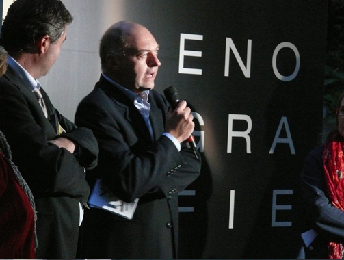
Giovanni Baule is full professor of Industrial Design at the Faculty of Design at the Polytechnic School of Milan, where he also chairs the undergraduate course on Communications and Design and is deputy coordinator of postgraduate course on Industrial Design and Multimedia Communication.
Since 1985 he has edited Linea Grafica, a bimonthly magazine on graphics, visual and multimedia communication (XVII Premio Compasso d’Oro).
His main focus of interest is methodology of visual communication, design and research into multimedia systems of electronic publishing.
Tag Global design, Video
