2013 - Artlab: Labels and colour
Although a particularly intense use of colour on spirit bottle labels is a recent phenomenon, its roots go deep: Johnnie Walker has been using red as an element in its whisky’s identity since the beginning of the last century.
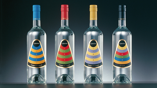
Wineries also have a long and well-established tradition of using colour to improve their brands’ recognisability: Veuve Clicquot’s deep yellow and Mumm’s red sash are integral parts of their brands’ recognisability. But the colours chosen also have to be in tune with the wine’s personality, ensuring that the colours relate to and express the taste experiences they suggest.
One example of this is the silver-platinum tone paired with satin in the case of a Franciacorta wine. In the approach adopted by Francesco Voltolina of the Bergamo-based studio SGA, colour has become a focal element for brand identities and product positioning.
One example is the Cà Marcanda line by Gaja, which has gone for a minimalist graphic design, where colour is the signage value that distinguishes one product type from another. A contribution to the spreading use of colour in wine labels comes from the evolution in papers, in print systems and in inks. Pearly colours, the matt finish of screen-printed tones and the range of metallic colours help refine the message being conveyed, giving even the most traditional of labels a touch of personality.
All the same, it is indicative that, unlike what happens in Italy, which is still faithful to a certain type of classical tradition that influences the language of graphic design and communications, the labels of foreign wines, especially from Australia, South Africa and California, privilege full colours applied to ample surfaces, stylised images, elaborate illustrations and hyper-decorative patterns. On these bottles, the culture of graphic design plays a stronger role than that of winemaking. As for the result, the jury is still out…
