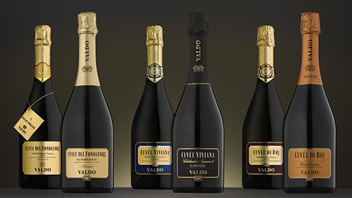
Sartorial restyling for the Valdo Prestigio line.
The restyling project of the Prestigio line, produced by Valdo for the Ho.re.ca channel, is now complete. It involved:
- Cuvée di Boj
- Cuvée Viviana
- Cuvée del Fondatore
- Cuvée 1926
The development of the project was carefully configured and inspired by a well-defined company strategy, based on the absolute awareness of their own characteristic values, identity and potential, and organised into clear and common objectives.
We look back at how the project unfolded with the global marketing manager of Valdo Spumanti, Mauro Bonetti. With a career in marketing in the wine and spirits sector that began in 2008 with Pernod Ricard Italia, Bonetti graduated from Milan’s Bocconi University and matured experience at companies like La Rinascente SpA, before moving to Valdo Spumanti in March 2014.
“The restyling project of the Prestigio line all began with the Cuvée di Boj, its genesis being the input from the market itself that began to reach us in 2013: it came from the consumers and a portfolio of around 4500 ho.re.ca clients that, in Italy, interact with us through a strong distribution network consisting of more than 100 agents”, Bonetti explains. “They asked us to ‘give it a bit of a dust off’, to make it younger to appeal to the contemporary consumer. Today the Prosecco embodies the spirit of the time: drinkability and lightness combined with a sophisticated taste. The old packaging didn’t communicate these concepts to the new target consumers to full effect. And so we set ourselves the goal of evolving our look, without revolutionising it”.
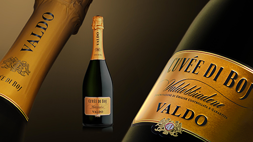
With the aim of elevating the perceived value, the old packaging of the Cuvée di Boj was brought up to date with minimalism and geometric precision. An accentuation of the modern line accompanies the preservation of the family feeling and identity. The old bordeaux was abandoned in favour of a deep and dense golden tone, an expression of a persuasive product with a complex personality. The colour gives the product character and makes it distinctive: the metallic tone, warm, almost like copper, expresses richness and prestige.
For the label, an aluminium support was used, reflecting the light to confer vitality and brightness. The material used for the label allows all the most important information to be printed with a pronounced relief. The shape of the rectangular label with its softened corners and condensed characters was maintained, a solution that helps improve the legibility. “The new packaging of the Cuvée di Boj is a perfect example of the elegance of days gone by reinterpreted in a modern key: a classic of today”, sums up Bonetti.
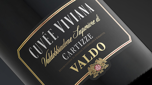
Last year, the restyled Cuvée del Fondatore and Cuvée Viviana entered distribution: the latter is produced from the grapes of the hill of Cartizze, the most famous in the Prosecco region. The prestigiousness of this product is emphasised by the total black - both for the label and the cap - as well of the use of embossing, reminiscent of the softness of fabric. “The restyling of the bottle offers a multisensory approach, which conveys the modernity of this product without distorting its identity and classic shell”, Bonetti comments.
The updating of the previous version of the Cuvée del Fondatore was more limited: like the other projects, more prominence was given to the name, the Cuvée and the legibility of the key information - a result achieved thanks to a brighter support -, but the alternating shiny and matt lines on the golden surface was maintained as it remains a distinctive and highly recognisable aspect of this particular packaging.
“For us it’s essential that the area of origin is instantly visible and clear. With this, emphasis is drawn to all our core values: the bond with the territory, the passion and obsessive attention to detail and quality, the history and the sense of tradition”, adds Mauro Bonetti. He is echoed by Giuseppe Sala, manager of the traditional distribution channel: “coherently, for the whole range, the name ‘Prosecco’ has been moved to the back of the label, giving greater importance to the name, Valdobbiadene: this is what distinguishes us and this is our extra value. Not all Prosecco is the same.”
For all products of the Valdo Prestigio line, with the aim of giving the bottle a sleeker look, the cap has been elongated and has lost the band around the neck, making the overall look more contemporary. “A sustainable choice, from both environmental and financial perspectives: despite the greater investment in terms of paper quality, we have in fact optimised the economic balance of the products”, Bonetti explains.
It is a choice confirmed also in the restyling of the Cuvée 1926, the Valdo product that proudly asserts the year in which the producer was established. Here the intervention focused on reinforcing the family feeling. For this reason, the Valdo brand is completed by the symbol of the griffins, which evokes tradition and prestige, and the format recalls the characteristic polygonal profile with softened corners. The legibility of the name, and above all the brand, has been greatly improved, the elements being particularly evocative and recognisable.
Since its establishment, Valdo has always pursued the objective of creating a strong identity, sustained by the elegance and high quality of its products.
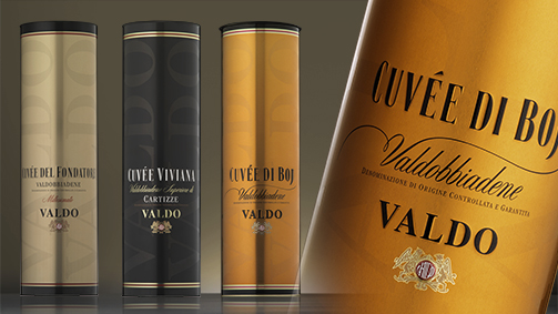
To achieve such an important objective, no aspect can be overlooked; with this in mind, the project needed to communicate the real value of the sparkling wines through a series of elements that, in addition to the primary packaging, extend to the secondary packaging and utility and service tools, such as the new ice bucket and bowl.
In creating the secondary packaging, metal containers were chosen that are very sophisticated in terms of production that are of high visual impact and value. “The secondary packaging is essential if one is to distinguish oneself from the masses on the shelves, particularly during the festive period”, explains Sala. “Customers look for something new, even in the tiny details: always having something new to present, something to talk about… that’s the real trump card.”
The outline of the new Valdo ice bucket is inspired by the sleek lines of a classic flute glass; thanks to this choice, the bucket is strongly evocative and communicative. The base is characterised by a pronounced re-entrance (picure) that allows the bottle to remain raised, and therefore emerge and stand out from the objects that crowd a table.
The proportions of the ice bucket are well-calibrated in width to ensure it is practical to use and contains the weight, and is developed vertically for better recognisability, making the object both distinctive and functional.
The extension of the project to the ice bowl came naturally and coherently. The final shape, obtained by merging the volume of five ice buckets on a pentagonal base, constitutes an indication of the law of the golden portion.
This allowed us to create a container with a strong visual impact, that can hold and chill six Valdo bottles.
The metal cylinder, ice bucket and ice bowl are made of completely recyclable materials.
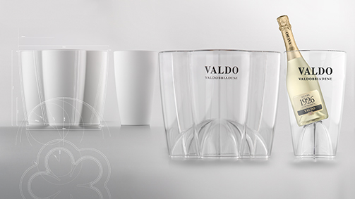
The ice bucket and bowl are like suits made to measure for the bottles. These objects are greatly appreciated by our customers, both for the visibility allowed by the transparency and the sinuosity, as well as the effectiveness at maintaining the right temperature for the wines. The picure creates a dynamic and solid base for the bottles, providing adequate exposition”.
“In this market, of which we hold an important share, you have to be innovative and ingenious. Over the course of 2016, when we mark our 90th year, we will produce a celebrative logo and special editions, supported by ad hoc activities,” concludes Bonetti.
