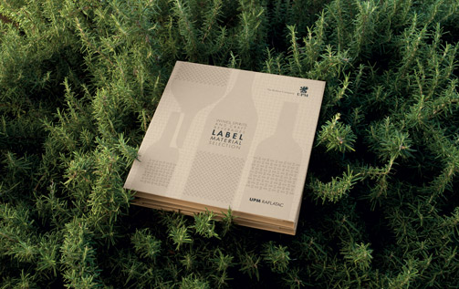
Design of new catalogue for UPM Raflatac’s self-adhesive labels
UPM Raflatac is one of the world leaders among self-adhesive label manufacturers. It supplies high-quality paper and film both for consumer and industrial products through a global organisation made up of factories, distribution terminals and a widespread network of sales offices employing around 3,000 people.
The production of a new catalogue for self-adhesive labels used for beverages - considered a crucial segment for the company’s growth targets - led UPM Raflatac to strictly focus on certain objectives:
- to raise and consolidate the perception of the company’s reputation to bring it into line with the objective quality in terms of aesthetics and technology represented by the materials in the portfolio;
- to demonstrate, especially in the target format of drinks’ producers, designers and printers, that UPM Raflatac is completely aware of and able to respond to all their needs and expectations;
- to convey its identity and its values, based on the utmost concern for the environment, production sustainability and a high level of technical expertise.
These are well-defined, complex objectives that needed to be conveyed through authentic, innovative content; creative solutions were required both to excite and stimulate the curiosity and imagination of the interlocutors and to demonstrate the potential of each label selected, for the purpose of reinforcing the perception of reliability and versatility through high-profile performance.
All the decisions connected to the design of the new catalogue, both the part dedicated to the assortment and the visual book, had to be in line with the corporate philosophy, its values and production methods and so our responses were drawn from observations of the extraordinary, boundless beauty of Nature.
The new UPM Raflatac catalogue was designed to be very practical and easy to consult; when looking for a label, the whole range must be available at the same time and “on first sight”. Just this simple aspect can enable the catalogue of one label stock manufacturer to stand out compared to another.
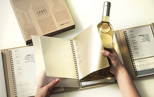
The samples as ‘listed’ in two directions: horizontal (for instant identification) and vertical (to enable selection by touch and sight).
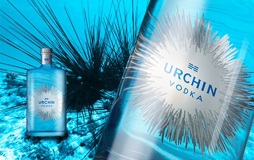
The labels were carefully selected to meet current and future trends in the beverage sector in the various forms, ranging from artisan drinks to spirits (cognac, vodka, whisky) through to soft drinks, beers, wines (whites and reds) and, of course, sparkling wines. Alongside the assortment, only the essential information was included to enable the features of each label to be recognised instantly.
The catalogue’s structure was devised to optimise the use of material and display the company’s great concern for the environment; unlike most catalogues of the sector – and others – plastic was not used but, instead, a material that conveys a sense of naturalness and warmth right from the first contact and, at the same time, possesses resistance, in view of the frequent use by the operators.
The self-adhesive labels offered in the catalogue’s four sections are the real protagonists of this new work instrument and that’s why we avoided needless enhancements.
The real ‘meeting’ between a group of 18 different labels – selected depending on the corresponding beverage type – and design creativity comes in the visual book, the catalogue’s fifth section.
The design of this section started with an examination of the performance of each label, arising from the close dialogue with UPM’s technicians and experts. In the second phase, 18 samples were chosen, for which an intervention was needed to enable the intrinsic features of each material to be highlighted.
This had to be done in a way consistent with the codes and languages of each market segment and in an especially distinctive way: specific concepts were identified for each project – all inspired by Nature – that were pertinent and innovative, creative and incisive, surprising and memorable at the same time.
Content and a harmonious and linear direction of reading were required, which could be defined as holistic: from the type of drink to the label identified as most suitable, from the name assigned to the product to the creative visual which, for each label, is never generic but always significant.
In all phases, from design to actual production, the dialogue with UPM’s managers (Italian and international) was constant, as it was with the company (MCC Lucca and Prato) that printed and produced the catalogue; only the close, continuous exchange and discussion of every detail enabled its optimal production.
