2013 - Wijnalmanak magazine: De Pro
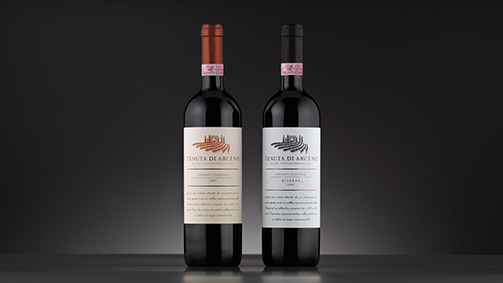
Sara Mutti works for SGA design, an Italian design agency that specializes in wine branding. For thirty years, they have provided the image of well-known wineries: from wine names to logos and from bottles to websites. Italian wineries as Berlucchi, Gaja or Lageder are amont their clients, but also the American Kendall Jackson. For each client SGA develops a specific communication strategy.
How can you summarize what you do?
“You can consider it the postproduction of a wine. Today, the look of a wine is enormously important: there are so many competitors, how you jump out? Wine is such an emotional product, almost a lifestyle that consumers want to identify with a particular image. Every wine producer tells a story - the packaging is the translation.”
Sounds good, but how does such a ‘translation’ look like in practice?
“We engage in numerious conversations with the winery. What is the history, what are the specific features of the soil? We try to find unique clues. Alois Lageder is a good example. He was one of the first producers who was very concerned with the environment - its logo and bottles had to convey this philosophy. We have done that in collaboration with contemporary artist. We do not go along with trends. The design should be timeless, yet it should stand out in the crowded store shelves. And it should be appealing both in Italy as well as abroad.”
The design is reflected in labels and logos, but there are other ways?
“Striking design goes much further than just the logo. Berlucchi launched a specific type of Franciacorta, the ‘61, with which they not only brought an ode to the origin year of Franciacorta, but also wanted to be a kind of retro brand appealing to younger drinkers. We have translated this into a clear-sixties look, from the bottle to the stands where the wine was served. We were inspired by mood boards with pictures from that time.
Another example: Cascina Castlet in Piedmont, is a very young and modern working winery that forms a contrast with the companies in the region that bend on a long family tradition, with castles and such. Therefore we designed modern graphic shapes for them that are imprinted on the bottle. Sometimes even we design an eye-catching bottle - like that of the brand Bocchino. With everything we do we want to escape conventions.”
