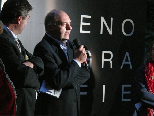
2008 - Oenographies: designing narrative itineraries
by Giovanni Baule
Polytechnic School of Milan
Midway between the process of design and the production process in the wine sector lie forms of this itinerary that show a certain degree of similarity. These itineraries are also ‘stories’: itineraries that encapsulate acts of narration. On closer examination, they confirm the existence of consonances, clearly visible contiguities between design - the creation of a graphic sign or the genesis of a form - and the cycles and phases of winemaking. When a combination like this, of cultures and sensitivities, of methods and approaches, develops in the same locality, when a ‘theme’ coincides at the deepest level, superficial analogies are superseded opening up complex, unpredictable paths. This proximity of itineraries allows design to create signs and shapes capable of communicating the “wine product” by evoking its essence and avoiding the need to superimpose pre-established identity masks. This is what we mean by oenographies.
Oenographies place the emphasis on communication as a distillate, a synthesis of a complete, hidden process, an underlying form responsible for producing the final meaning. These oenographies, where the method of design adjoins the communicated content, generate real communication prototypes: it is worthwhile taking a closer look at them because they encapsulate a very interesting formula. If we try to retrace these itineraries, we get a glimpse of a new approach to the image 15 of a product and its design: an approach that, while retaining and enhancing the communicative efficacy of the final product, uses the tools of communication design which are far removed from conventional product communication schemes, and far removed from those identity projects for consumer goods that remain exclusively tied to the tired but still widely used methods of marketing-oriented communication. The latter is an approach that is unequivocally focused on the target, relegating the aim of discovering and illustrating the essence of a product to second place.
Furthermore, it is an approach whose sole aim is to reiterate the power of the brand, to highlight the expectations induced in users of the communication, and to focus on need to make the product attractive to users by exercising every kind of appeal. The spin-off in design terms of this marketing-oriented logic, which seeks in the graphic layout and formal dressing of the container all the guarantees of a consolidated grammar, made up of approved and stereotyped ingredients from a collection of conventional formulas, ends up by reversing any change in the horizon of expectation (what consumers want from us): it lowers the level of that ‘communications pact’ that links messages and users, triggering a sort of communications short circuit. But narrowing the range of experimentation in communications languages and innovation in the development of grammars means perpetuating that reticent design that depresses the relationship with the recipients of the communication and results in the paradox of a ‘dumb’ communication, incapable of conveying anything. On the other hand, the application of proven rules and also the treatment and overturning of coded typologies, the use of expedients to ensure product recognition and also the shift in accepted practice open up a design space for any designer who wants to operate in unexplored territory, beyond the line of ‘I’ve already seen it’.
There have always been numerous references linking the act of writing, typesetting (therefore, graphic design) and reading to the world of wine-growing and winemaking. Drawing on the monastic tradition, characterised by its ability to blend the flavours and smells of nature and writing, handwritten graphics and the art of winemaking, Ivan Illich in his work “In the Vineyard of the Text”, which is dedicated entirely to this dual itinerary, describes the moment of reading as follows: “When he reads, Ugo of San Vittore harvests the words: he gathers the grains from the lines. He knows that the word ‘page’ can refer to the rows of vines all joined together. The lines of the page are the wickerwork of a frame that supports the vines… The Latin word ‘legere’ is derived from a physical activity: legere means to ‘collect’, to ‘create a bundle’, to ‘assemble’… The devices used to order the page, the pagination that underlies the graphic layout of information, forms part of a visual whole that helps to determine the intelligence of the reader…”. It is the graphic-scribe who cultivates the vineyard of the text and it is the reader who in turn collects and binds together the materials of writing. The relationship between the wine-growing and graphics is again confirmed, both nominally and visually, by the small illustrations that even in the copies belonging to scribes embellish the incipits, either at the start of the book or at the beginning of each chapter, with friezes shaped like leaves or vine tendrils: this interwoven pattern 17 of shoots and tendrils alluded to the text as textura, and as ornamental designs formed figures that are still today known as ‘vignettes’. These deep roots cultivated by graphic design form the logic that embodies every editorial project, the graphic layout of texts where words, lines, columns and images are constantly interwoven to create a communications whole (the page). This original character of graphic design can be found in our oenographies: design is a way of working that focuses on the contents, it selects and picks the most significant parts and re-elaborates them into an essence before being proposed as a brand, or a cover, an illustration or layout, or a packaging that all represent the visual concentration of a ‘text’ or a ‘content’. The outcome of this ‘paratextual’ process - working around the text - is an evocative synthesis, a series of signs steeped in history, the memory of a reduction process that preserves elements of its origins. From the start, this type of graphic design works through a strongly modelling impulse: it suggests a stereoscopic model to the designer, a method that works simultaneously on different reference communication layers and on the various levels of complexity.
The project must keep all the various elements together (techniques, languages, expressive styles, semantic links…) and in this way design the character of a modern rhetoric of communication. Oenography is the choice of a narrative morphology and its possible experimentations, opting in favour of stories that start from traces of the territory and the evocative ideas surrounding these places. These traces take the form of marks and, once transposed as signs, can be transcribed as alphabetical letters. They become repeatable alphabets. A visual language, one that is articulated and developed by the design project, is generated from a narrative fulcrum. The narrative assembly, complete with its own complexity, is translated into a final stage setting where the container and its “dressing” form a single whole. There are some territories and landscapes that prompt the use of signs more than others, perhaps because of the climate and their particular exposure. As in a map with endless connections, the signs in turn refer back to the territories they came from, where the intertwining of visual, olfactory and tactile paths are laid out in rows of narrative itineraries. The profile of a landscape, the view glimpsed between rows of vines, the surface of a stone, the moonlight, an archeological find, an ancient seal, the testimonial of memories are all microcosms that, using the magical qualities of light and colour, the filter of our gaze, and the treatment of languages generate earth signs; by means of careful working, they become narrative ‘material’. At this point in the communications project, we are at the opposite extreme to those bucolic myths that, having multiplied out of all proportion and been cloned from the first ‘white windmills’, now crowd a virtual countryside that has been ruthlessly built over, polluted in terms of communicative credibility and subjugated more to the logic of declamation rather than narration. These myths use the countryside inappropriately as a location and build fictional scenes, not dissimilar to Disneyland’s plastic castles or the artificial villages of retail outlets, on the two dimensions of product labels. Instead, these oenographies constitute a special narrative system, a double tale that retains a successful link, a memory of the associations evoked by the localities, which moves parallel to the story of the product, using some of its characteristics and sharing its itinerary and physiognomy: even in its own production process wine elaborates a synthesis of the light of its rains, the colour of its soils, the harshness of its slopes, the shade of its cellars; and it, too, becomes the essence, the concentrate of a narrative process…
The ‘material’ link between languages and territory creates a sequence of concatenations that forms the basis for the narrative structure of these oenographies: stories based on signs and infinite clues refer to the experience of these places and truly anchor the product to the territory. In terms of the graphic languages used, a wide range of typesetting forms have been created, giving prime importance to the earth signs and to the material quality of the letters; enigmatic signs also form part of these, real discoveries of an archeology of signs. This produces an open iconographical system, in which the evocative aura expands through writings in verse, calligraphy, rhythms of movement, and creative typesetting. Even the naming process, namely defining the product name, is interwoven with the method used for the visual design: there are names that stem from traces of sounds captured in the area, from historical echoes, from verbal findings and dialectal sayings (dialect being the language of the place); ‘ancient’ words that have developed from ‘topophonemes’ (sounds linked to a place), which through various rhetorical experiments, all converge on a narrative target, the ‘evocative flavour’ of the story.
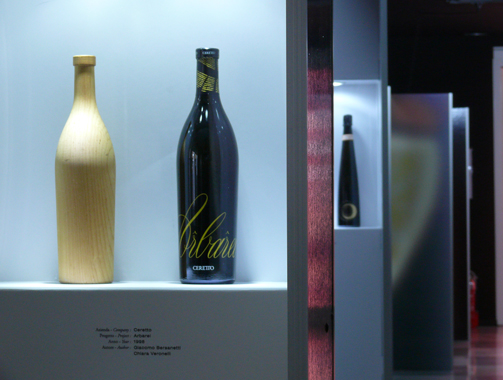
Lastly, the shape of the containers themselves is elaborated from historic types of glass used for wine, developed by generations of craftsmen and their innate intelligence of the material: having been rediscovered, they are elaborated and redesigned, transformed and reinvented. Unlike the pure use on the label of an ‘artistic’ image conceived elsewhere for other expressive purposes and flanked by chance assonances, here the ‘image’ and ‘content’ develop together; they follow a common itinerary and merge, sharing traces and itineraries. These crossed itineraries in the construction of the product and the construction of the product identity suggest a method used in project to communicate the wine’s identity. It cannot be purely descriptive because the language of evocation is not conveyed by writing captions. Nor can it be developed elsewhere and then be imported and used as required. Instead, it must have common roots and know how to evolve analogies using its own language and alphabet, with deep-rooted consonances and consistency. It cannot separate form and content, ‘container’ and ‘dressing’, but instead operates using the logic of the paratext, the bond that envelops content and communicative apparatus in a narrative continuum. The oenographies project therefore becomes a lesson in method, a communicative paradigm for the whole of communications design, and a useful tool to guarantee a new quality of communications pact. By finding the traces of its own alphabets in the localities and in their evoked memories and products, alphabets that it reworks through skilful and mindful elaboration, this design truly deserves the epithet controlled designation of origin.
Giovanni Baule is full professor of Industrial Design at the Faculty of Design at the Polytechnic School of Milan, where he also chairs the undergraduate course on Communications and Design and is deputy coordinator of postgraduate course on Industrial Design and Multimedia Communication.
Since 1985 he has edited Linea Grafica, a bimonthly magazine on graphics, visual and multimedia communication (XVII Premio Compasso d’Oro).
His main focus of interest is methodology of visual communication, design and research into multimedia systems of electronic publishing.
Tag Global design, Video
