The importance of image in the start-up phase: the Rocca d'Orcia project
Faced with a well-crafted image of an activity or product, we react positively and are attracted by it: we want to find out more about what we like.
Through the image, we get a preview, a story about what we’re being offered; the decision to give it a name and a symbol are therefore crucial in defining the identity of a brand.
The brand is as much a part of the product as what that product does and can be crucial to its success so, for this reason, attention to image becomes a strategic decision in the start-up phase. This decision becomes even more vital when the businesses are related in different ways to each other, with separate missions. Complexity of the relations acting within a group of brands was dealt with by SGA in the recent project for Rocca d’Orcia, the still intact medieval town within the heart of Tuscany.
The project arose from the wish of the entrepreneur Pasquale Forte to revitalise the town that surrounds the Rocca di Tentennano, through the careful restoration of the places that for centuries had housed craft works connected to tradition, and their relaunch.
In a context like this, the work of brand design cannot neglect the search for an expressive language able to capture and emphasise both the typical elements of the entrepreneurial activity and its distinctive selling points with regard to the market and the context in which the brand will exist. For these reasons, the work led to an organic design approach, both in the choice of the name and the consideration of the graphic symbol.
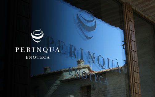
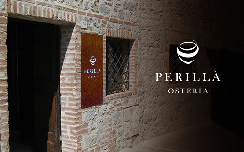
The wine store was baptised Perinquà while the adjoining bar was called: Perillà. A particularly effective two-part name, easy to remember, originating from the local dialect. Two places, with linked activities, with a single stem and a single symbol, but distinguished by phonetic elements that make clear their respective identities.
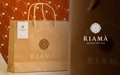
For the Tuscan store, the name Riamà was chosen, which underlines its greater independence, recalling the traditional Tuscan term rihamà. This term refers to the activity of embroidery and evokes the dexterity required for the creation of the products offered inside the store.
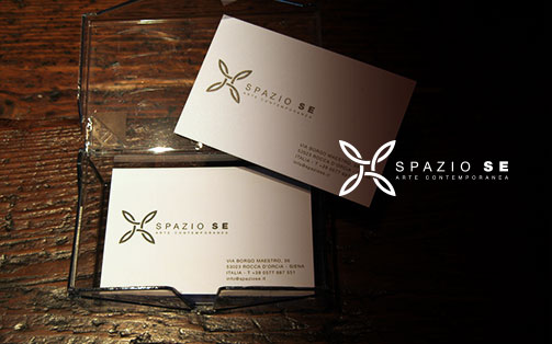
Finally, the exhibition area was named Spazio Se, which will host authors of international renown operating in the field of photographic research and which began the season with an exhibition dedicated to Francesco Radino.
SGA, in addition to designing the four brands and carrying out the research regarding the naming required to define the various ìcompany” entities, also handled the additional communication for the overall project presented recently at the inauguration ceremony.
The overall result of the project can be seen at the following link.
