For the buisness unit Campari Wines we developed projects for: Riccadonna, Sella&Mosca, Enrico Serafino, Cinzano, Teruzzi&Puthod.
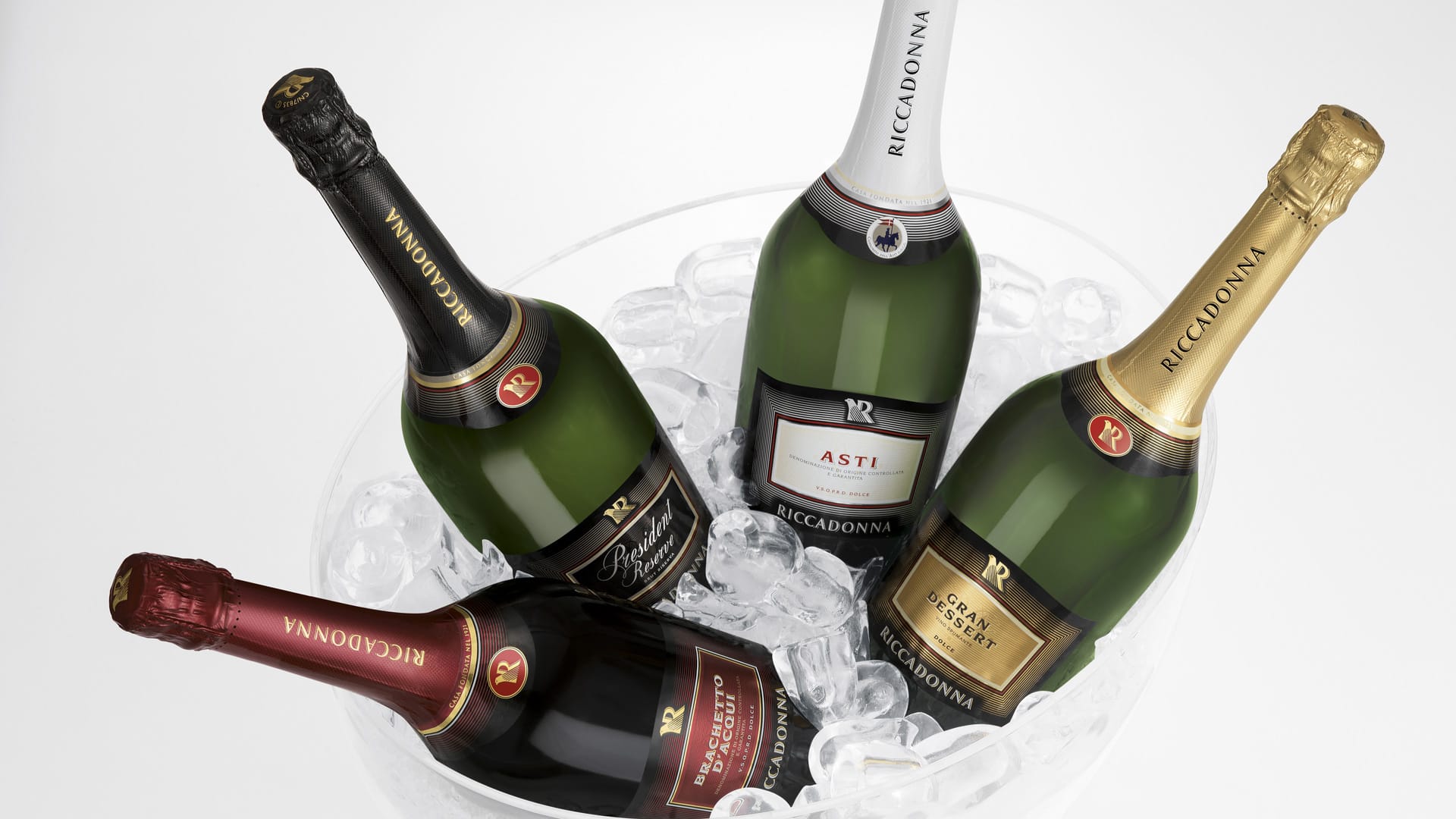
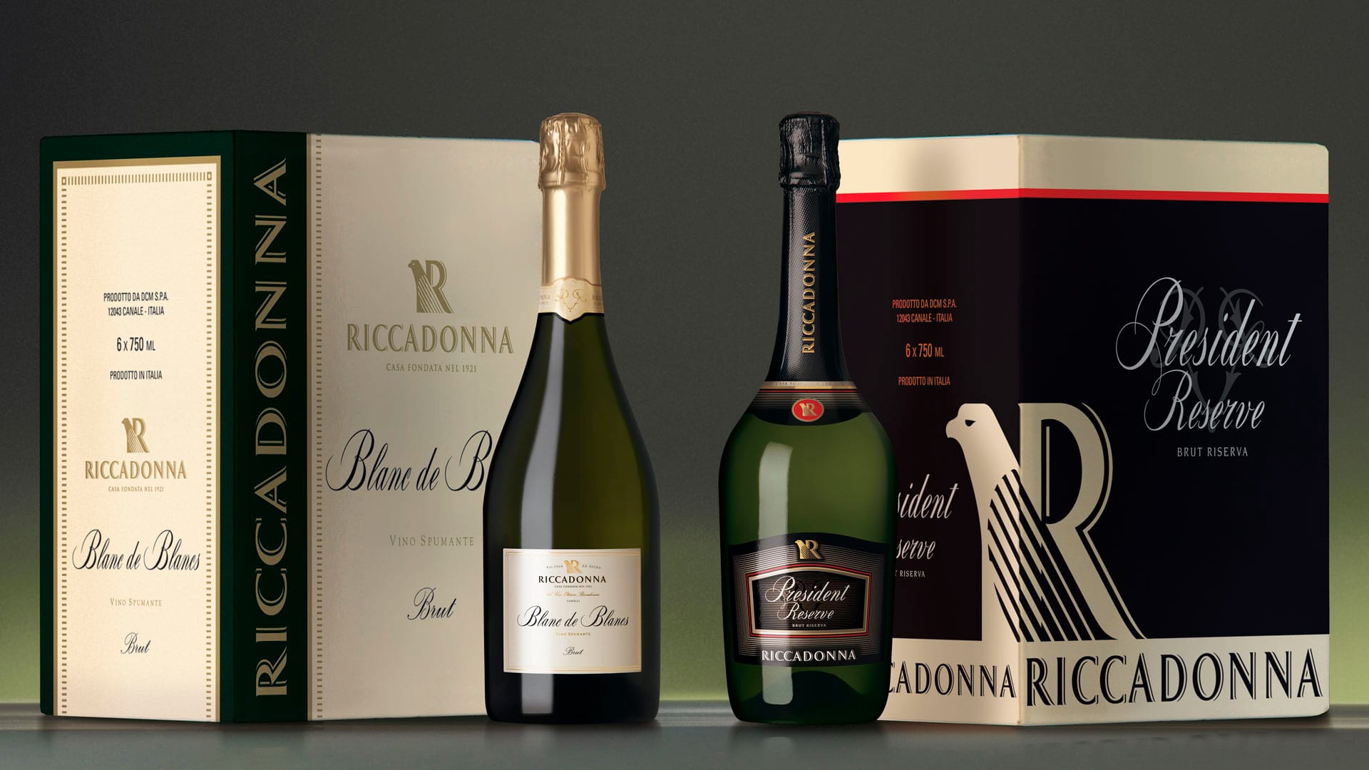
The restyling of the line of Riccadonna wines for Large Retail Organisations was the subsequent step to the restyling of the brand. To stylistically harmonise the new labels with the new brand, the theme of lines in the wing of the symbol was applied to the concentric frames and determines a gradual passage between the entire field and profile of the label, as with the upper part of the packaging between the neck and body of the bottle. the base of the capsule was embellished with the gold or silver laminate ring according to the type of product. The red oval shape on the shoulder that accommodates the brand, replaced in the Asti by the brand of the group, is highly appealing and recognisable.
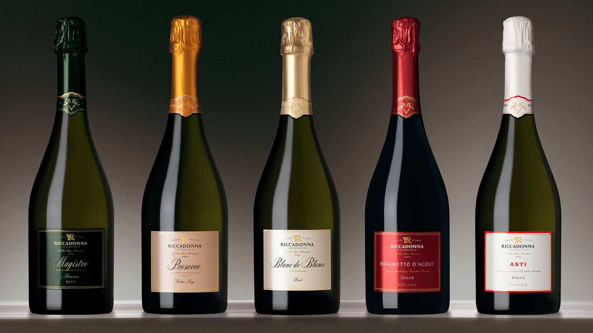
The Riccadonna line destined for consumption in hotels, restaurants, and bars, plays on the minimalist aesthetic codes: the square shape, the centrality of the name of the product, the naked upper part of the bottle. The overall effect is a classic style brought into the present. When compared, we see how the packaging of the two lines responds with aesthetic codes specific to the requirements of the distribution channels.
Attività: Branding, Packaging, Secondary Packaging, Restyling, Global Design e Naming