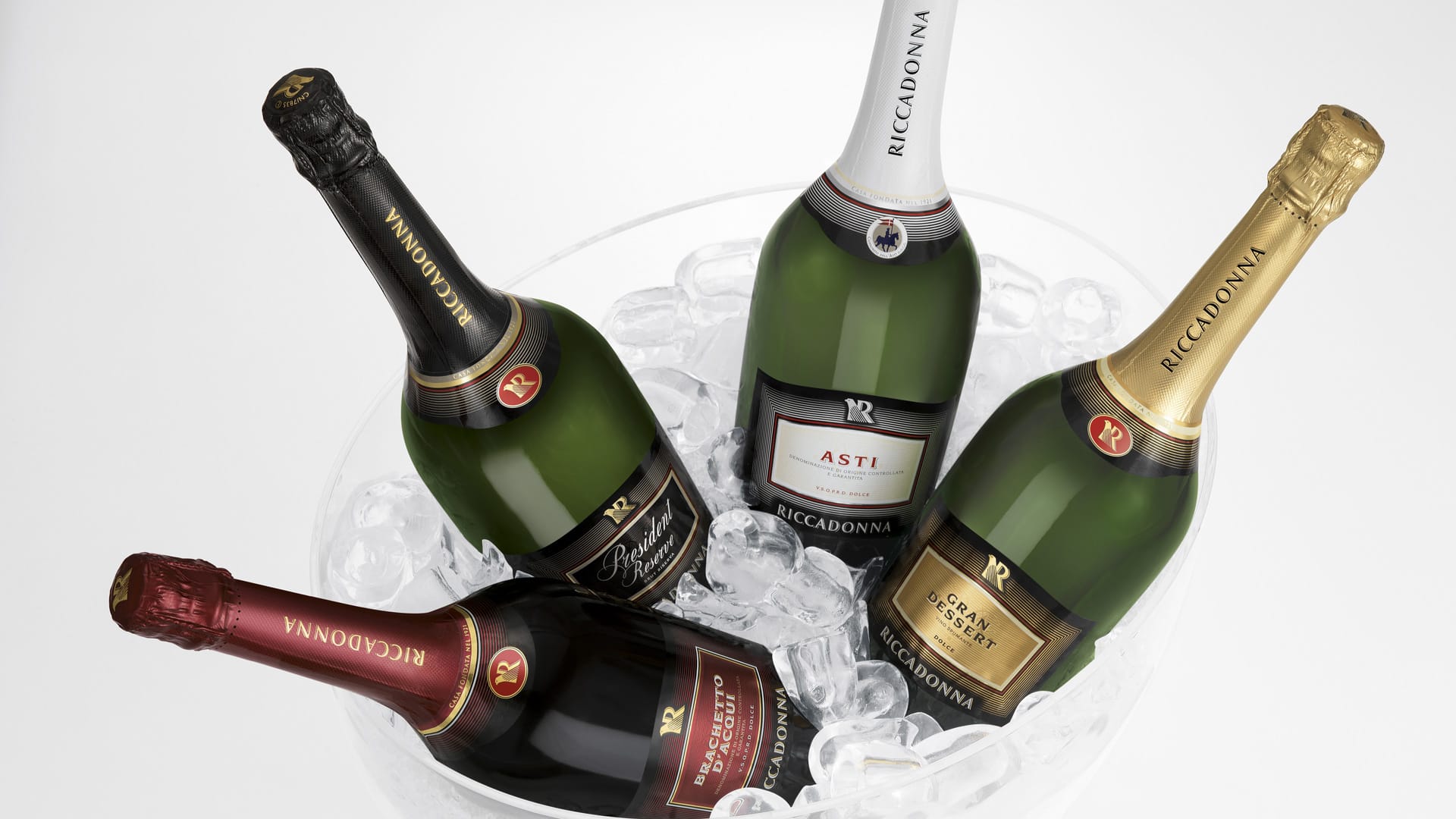
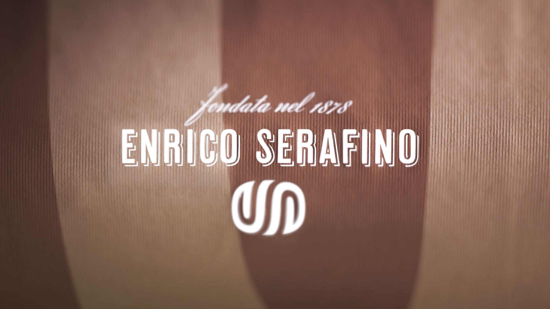
For the buisness unit Campari Wines we developed projects for: Riccadonna, Sella&Mosca, Enrico Serafino, Cinzano, Teruzzi&Puthod.
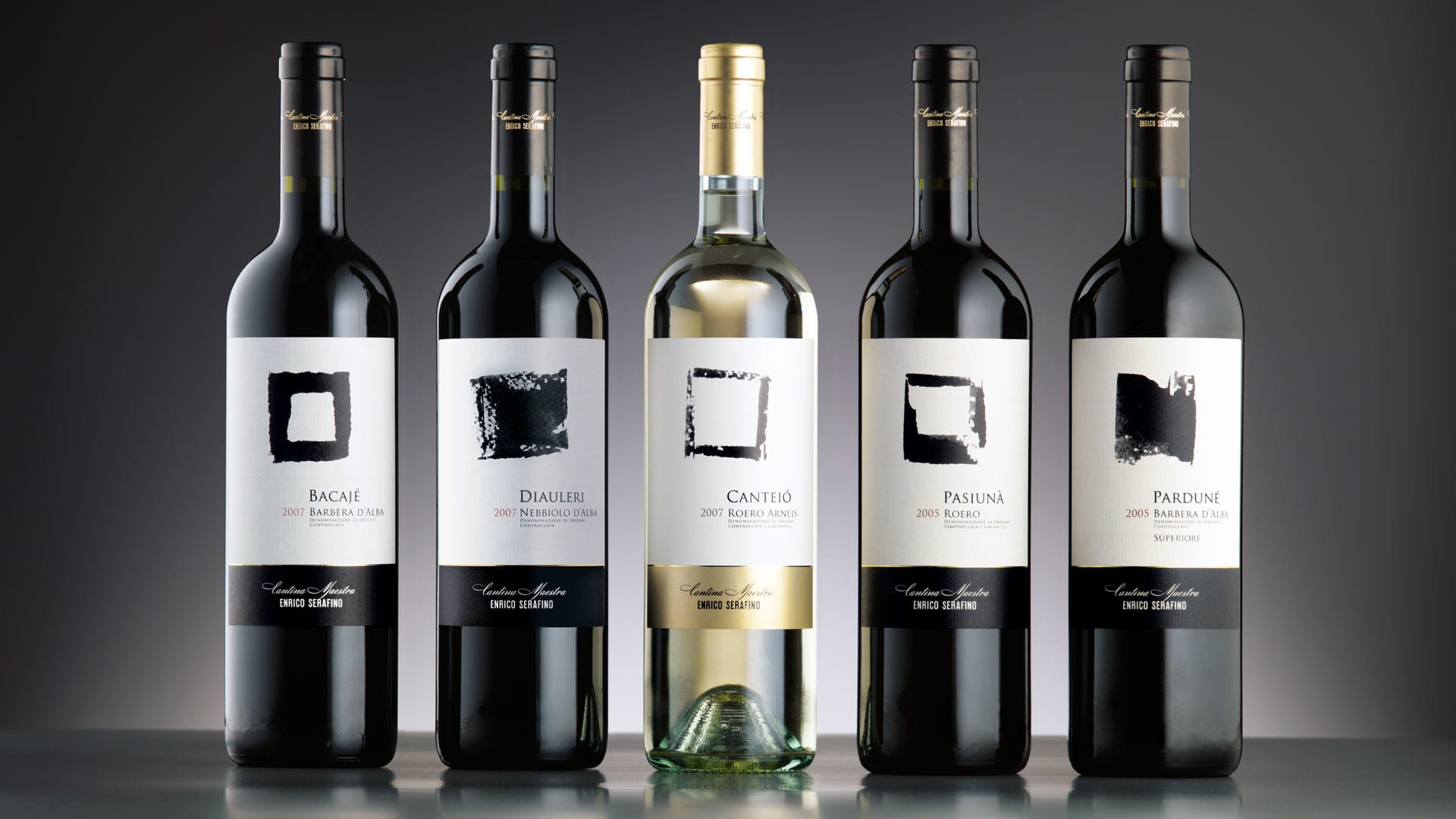
For Enrico Serafino, SGA worked on the sign. The square, universally used in semiology to represent the earth, was researched with the aim of probing its expressive potential. The result of this research was a family of signs in which the thickness of the stroke and the gesture of the stroke generate formal variations that, when applied to different references, underline the uniqueness of each wine. The graphic structure of the label expresses sobriety; the central sign is the protagonist, the flag on the left determined by the denomination of the products underlines the vertical axis, the strip at the bottom accommodates the brand and the value of the signature. (Winner of the Etichetta d’Oro International Packaging Competition Vinitaly 2008).
Attività: Branding, Packaging, Secondary Packaging, Restyling, Global Design e Naming
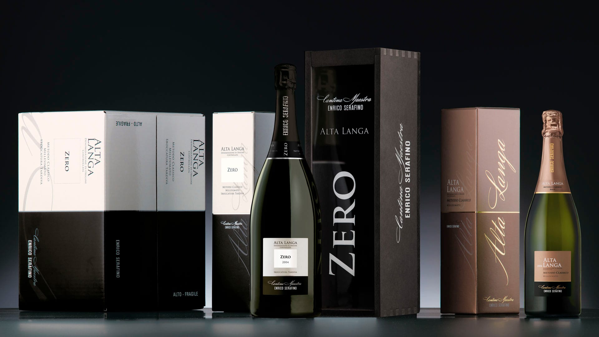
Anche nel caso del prodotto Alta Langa Zero il minimalismo adottato è assoluto. Un quadrato bianco su fondo bianco a rappresentare la tipologia di prodotto caratterizza l’etichetta restituendo forte personalità.
All'interno della gamma dei progetti sviluppati per Campari Wines è stato sviluppato, in particolare, il progetto “Arcidiavolo” Teruzzi & Puthod, vincitore del premio Etichetta d’Oro International Packaging Competition Vinitaly 2010 e “Dimonios” Cannonau Riserva Sella & Mosca.
- Vinitaly Etichetta di Bronzo 2011 Alta Langa Zero
- Vinitaly Etichetta d'Oro 2010 Arcidiavolo
- Vinitaly Etichetta di Bronzo 2010 Blanc des Blancs
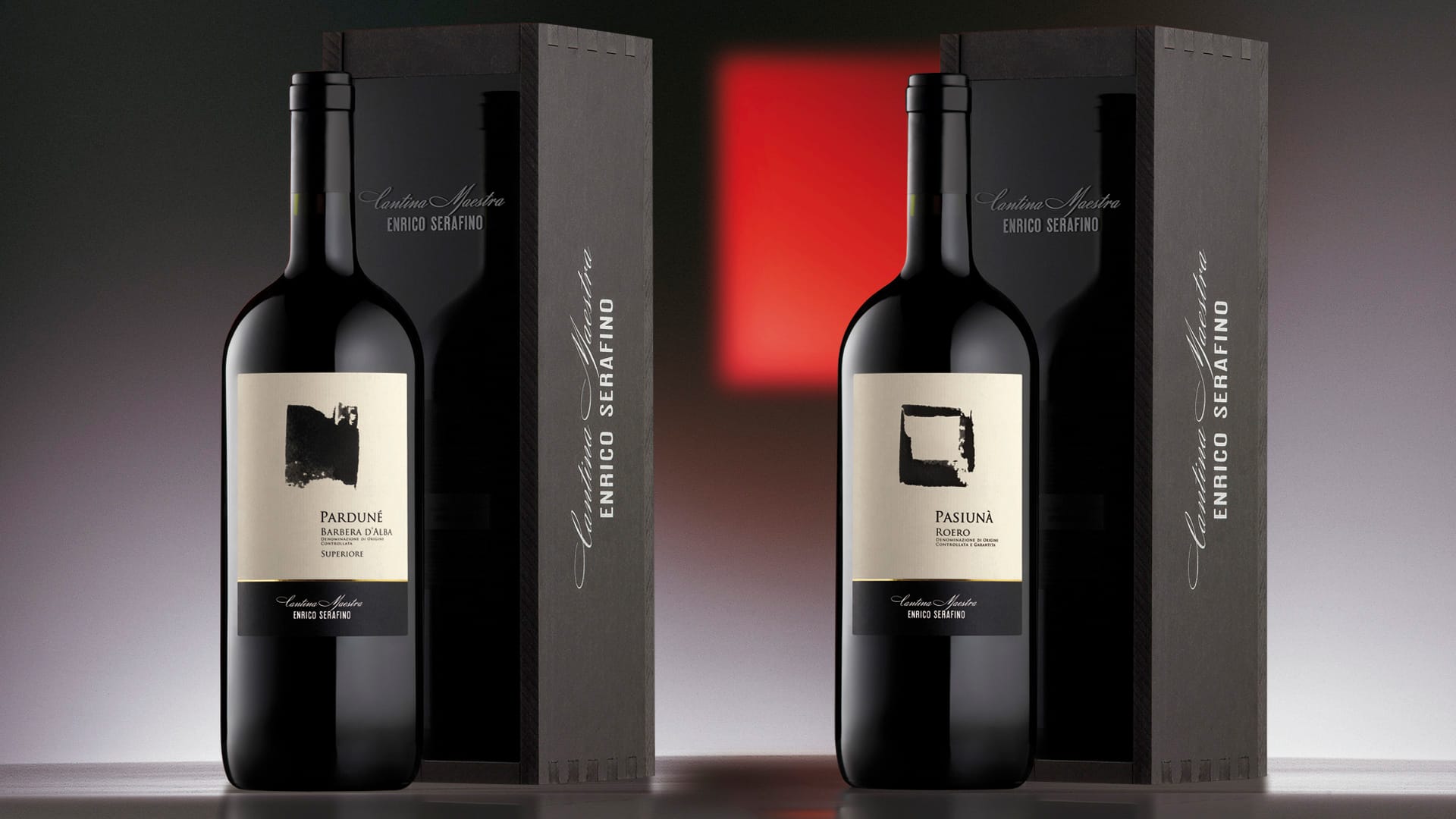
- Vinitaly Etichetta d'Oro 2008 Pardunè