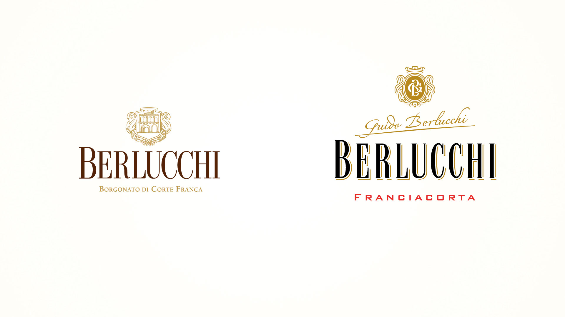
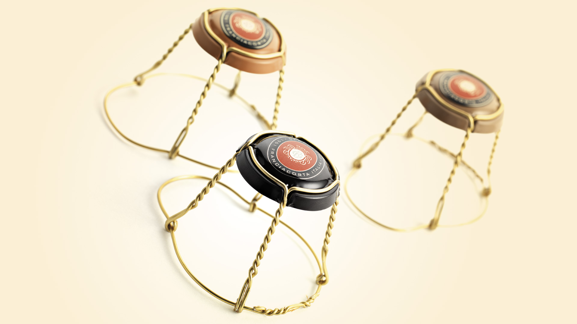
The restyling of the Berlucchi master-brand was a response to various crucial requirements: to raise the perceived value of the brand and restore its identity as belonging to a territory renowned for excellence, a phenomenon first instated by Berlucchi itself in the late 50s. Our work on the logo improved legibility and elegance; the complete redesign of the heraldic symbol introduced more personality and authenticity, thanks in part to the insertion of the monogram with the initials of Guido Berlucchi.
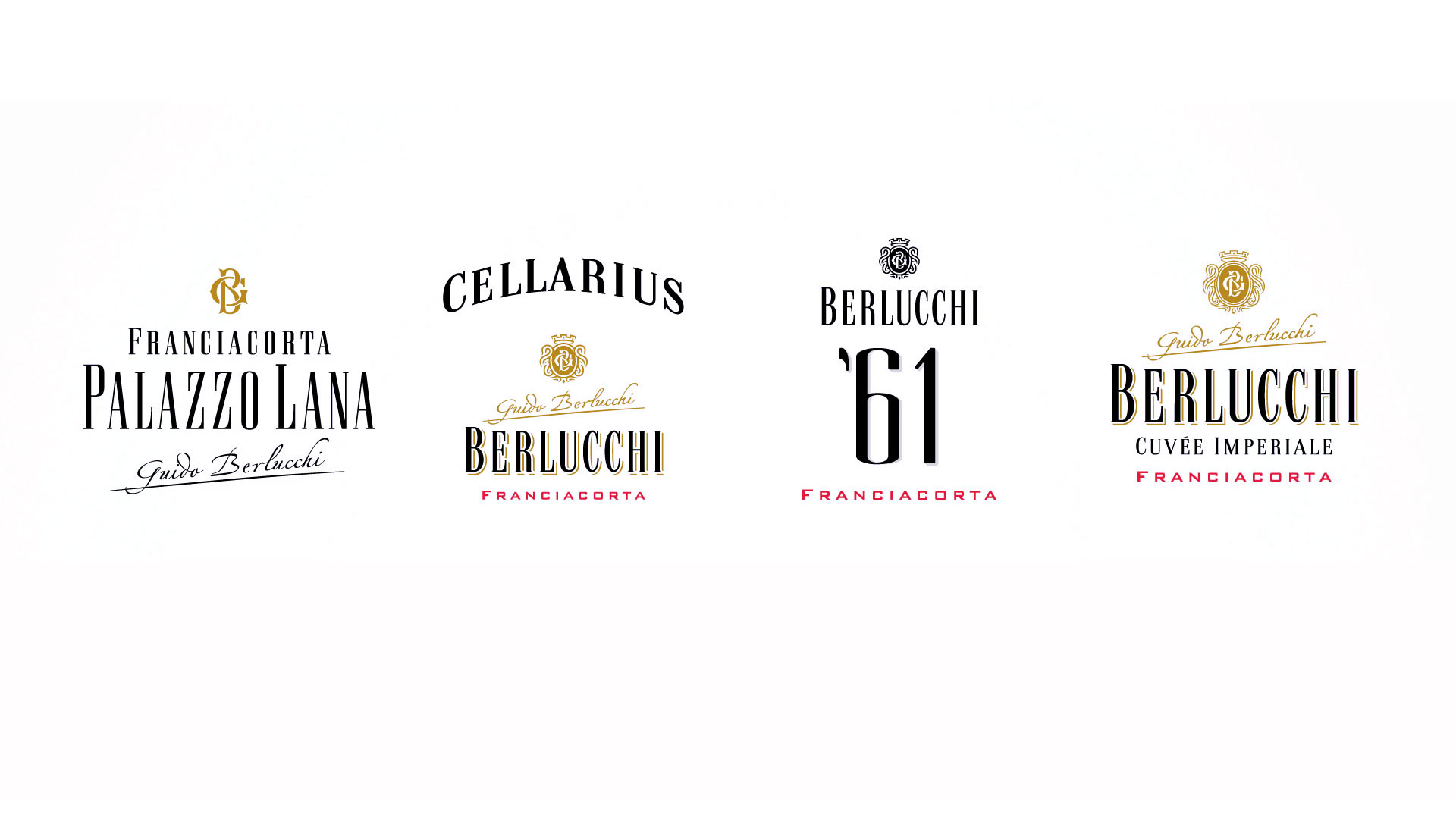
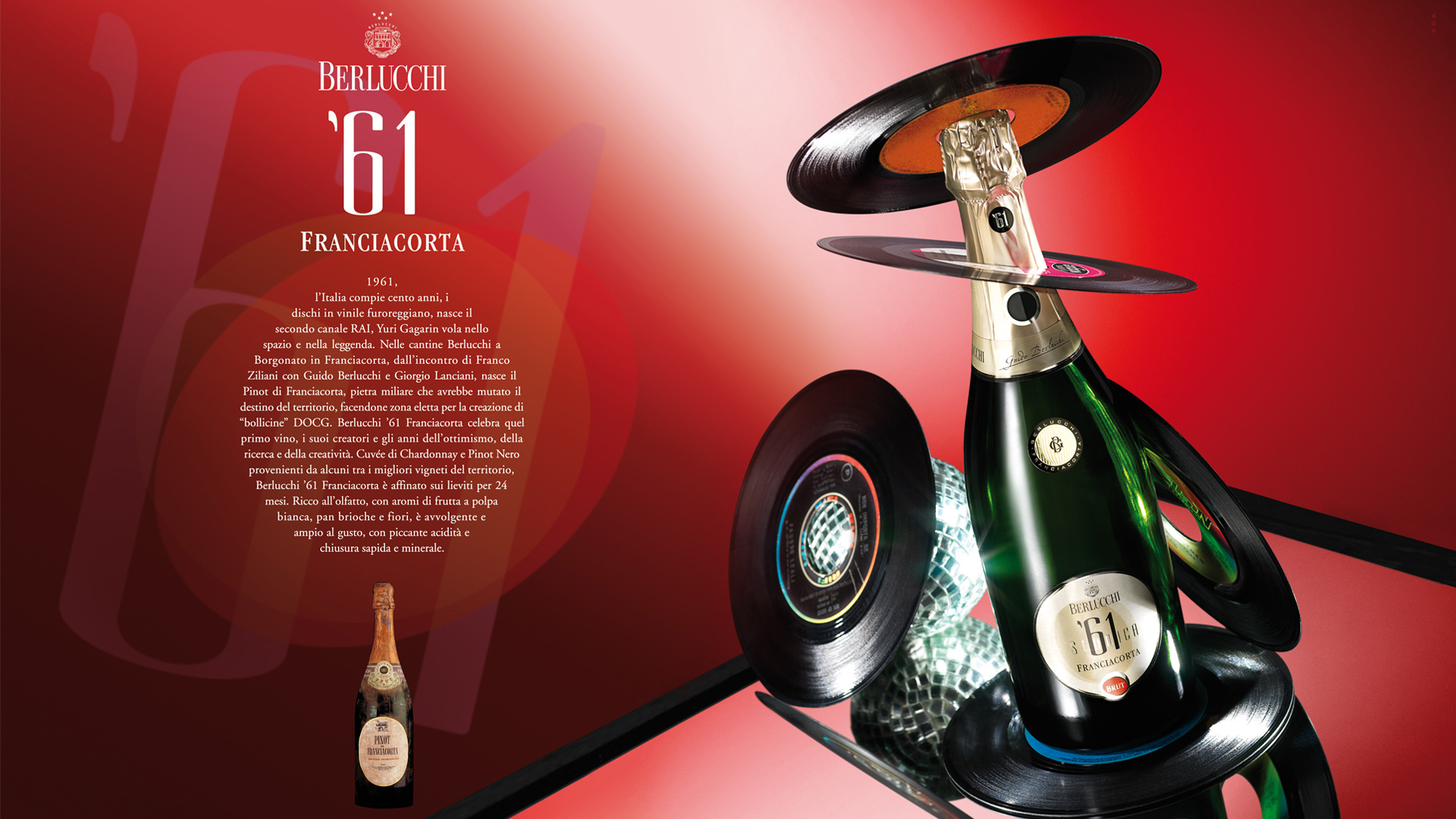
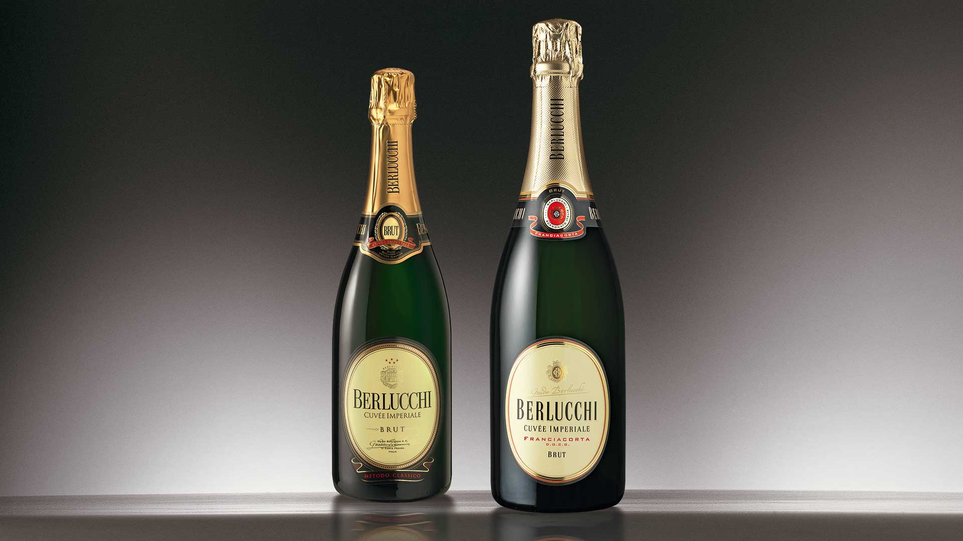
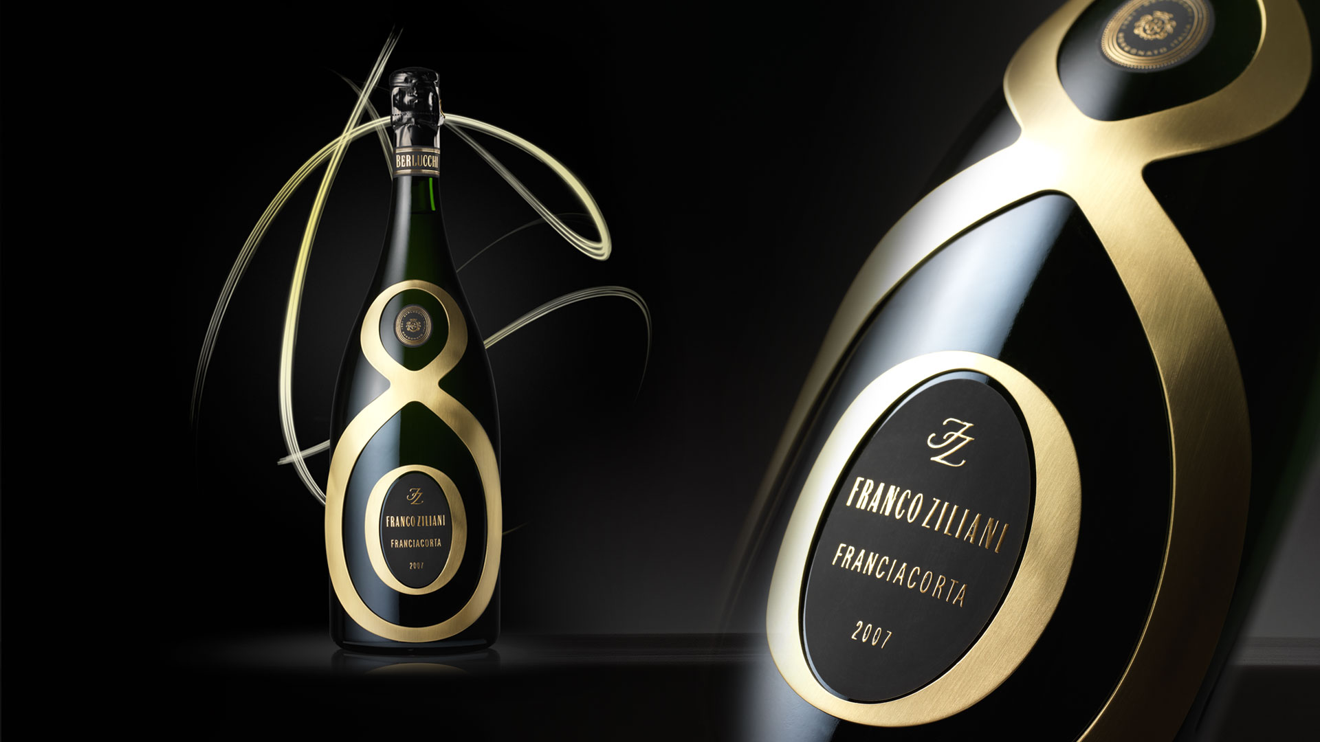
Restyling the Berlucchi master-brand, we found we needed to consider the characteristics of each line of products (identity, target, market), which have many aspects in common, and consequently redefine the brand architecture of the four lines that constitute the product portfolio: Cuvée Imperiale, Berlucchi ‘61, Cellarius, and Palazzo Lana.
Attività: Branding, Packaging, Secondary Packaging, Restyling, Global Design
- Intervista a Marilena Colussi L'esperienza della Brand Guido Berlucchi