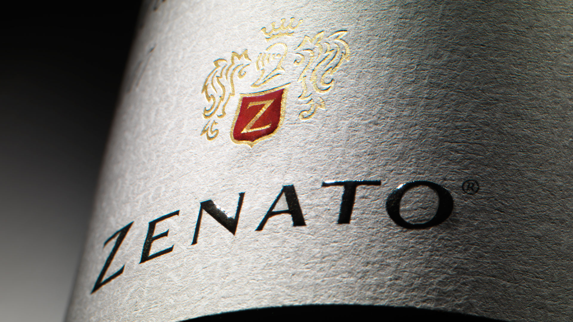
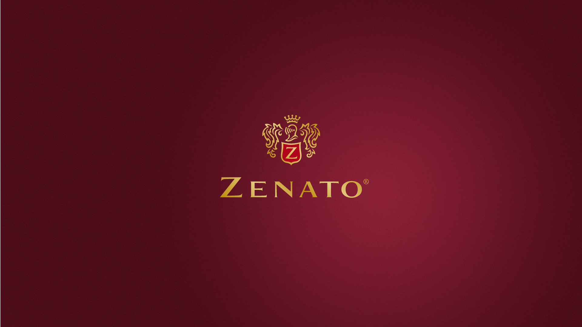
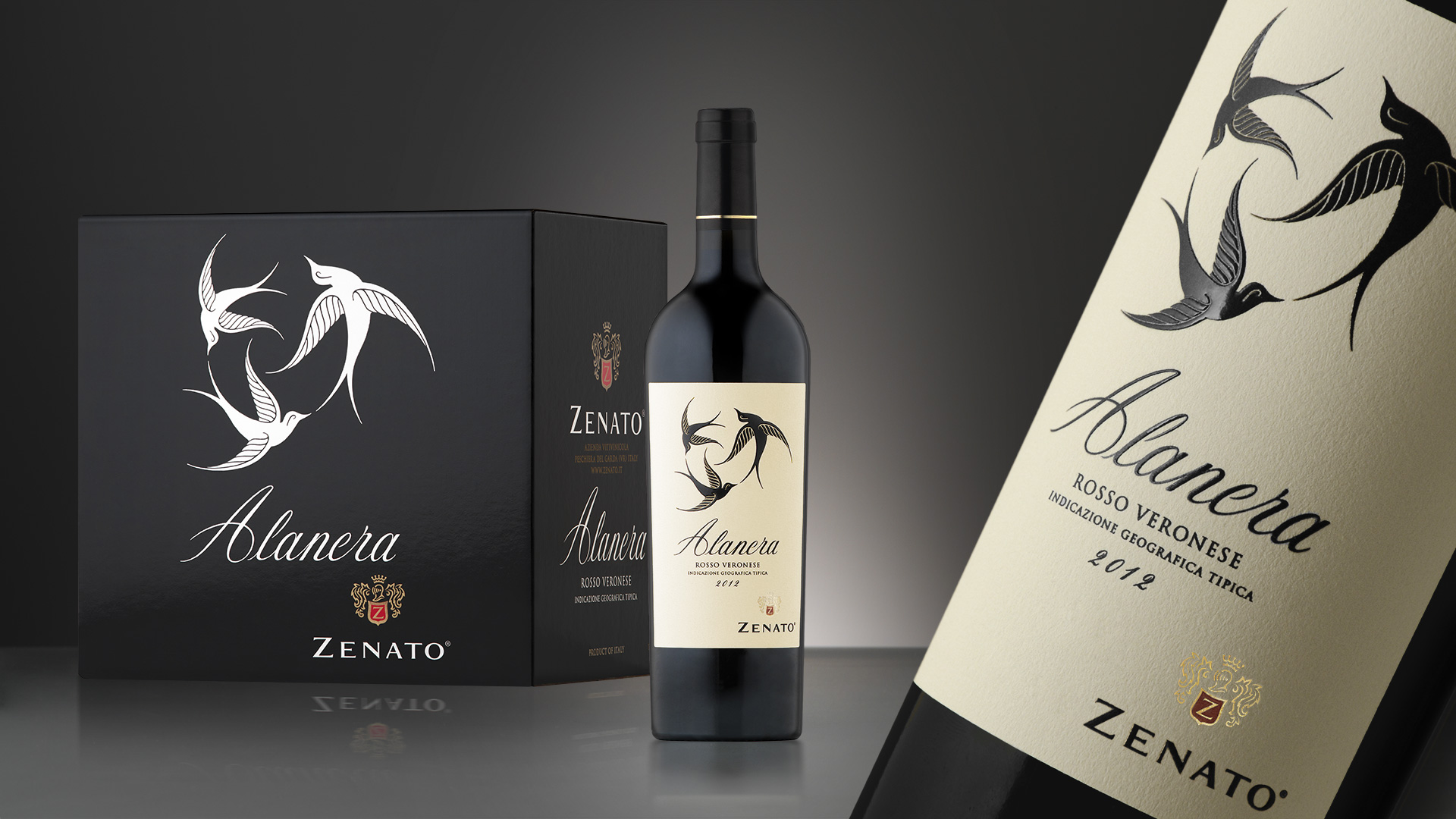
The project for the Zenato brand required us to attribute greater incisiveness and personality to the brand. The definite lines of the heraldic symbol and of the logotype, guarantee a perception, corresponding to a complete awareness of its own potential.
The decision to aggrandize and evolve the old brand and express the respect for the founding values, ensures the continuity and consistency of quality one expects from a leading winemaker. The gold reflects richness and opulence in the flavours; the red corresponds to the passion and commitment of the entire team; the black denotes self-confidence; together they convey maturity and experience, elegance and prestige.
The most visual ‘weight’ was given to the logotype to underline the maturity of the company.
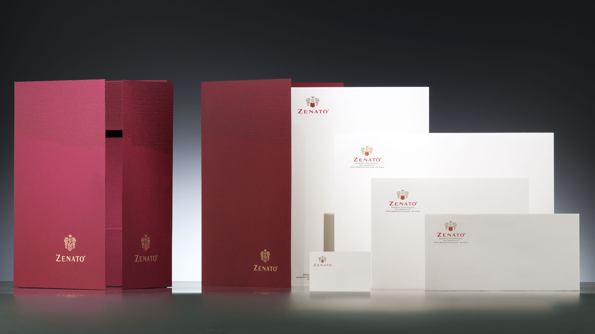
Attività: Branding, Packaging, Secondary packaging, Restyling, Global Design e Naming
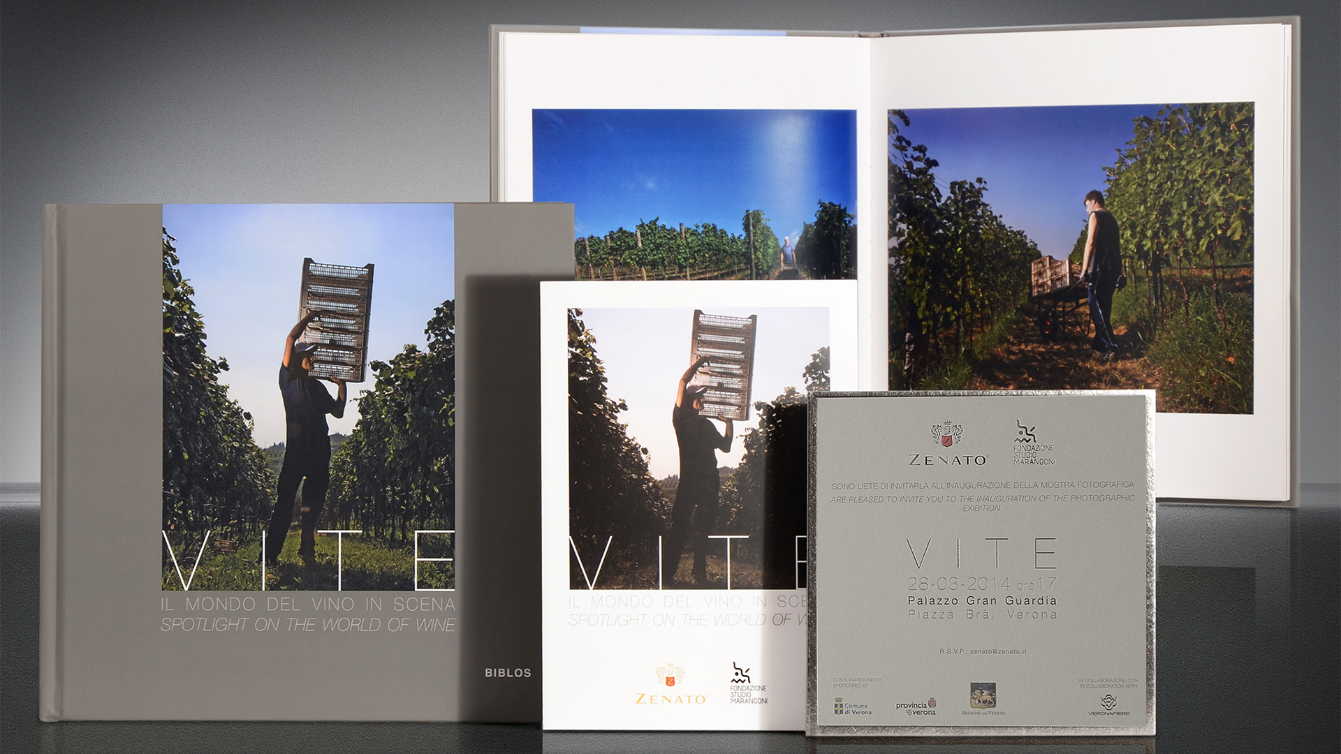
- Intervista a Nadia e Alberto Zenato Mostra fotografica VITE: il mondo del vino va in scena