The new positioning of Mirabella through a global design strategy project
Strategy /Brand value building
In an increasingly competitive context like the world of wine production, the strategic management of the brand is seen by some producers as a primary requirement. The identification of the positioning, therefore the value-bearing system, the mission, the key target and the content of the storytelling are fundamental and determinant steps in defining a consistent and effective strategy for obtaining positive, long-lasting results. For the Mirabella project, the analysis phase was crucial: with Claudio Castellaro (Creative Business), it was possible to explore, based on a methodological approach perfected through numerous shared projects, the various aspects that contribute to determining the personality of this specific corporate organisation; in particular, its potential in terms of brand value building through marketing guidelines aimed at the consistent development of all the communication instruments required for its relaunch.
Currently, priority actions have been carried out but the strategic guidelines prefigure a more extended and complex course that will be carried out in the medium period.
Branding
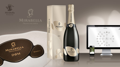
The project phase firstly led to the restyling of the Mirabella corporate symbol. The face of the goddess Demeter was redesigned, giving a more contemporary character to its reinterpretation. A new, more personal symbol whose three-dimensionality was determined by the positive-negative contrast of the two sides of the face, the graphical synthesis of which enabled the problems of reproducibility evident with the previous brand to be eliminated. The action on the brand also led to the redesign of the corporate name, stylistically harmonised with the figurative symbol with improved legibility.
The new brand ensures attribution and continuity with the previous one and required the introduction of a radical change in the appearance of the products.
The development of the brand was further broadened with the creation of an image handbook in which the codifying of the rules of application and the chromatic codes ensure its correct use over time. The creation of the corporate coordinates completed the definition phase of the primary instruments of corporate identity.
Naming
An important element that determines the identity of a product, especially a wine, is its name. But creating a new name, consistent with the image of a cellar that is not already in use is today truly one of the hardest tasks. “Edea” was created with the intention of affirming, in a simple and easily memorised way, the character of this Franciacorta, the wine that constitutes the core business of the cellar and that distinguishes it, since the fining on the lees lasts for more than 30 months, while 18 would be sufficient under the regulations for making a Franciacorta.
Packaging
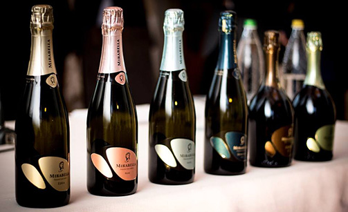
In relating to the new positioning of Mirabella, oriented towards innovation and to the main key target identified, the Millennials, the appearance of the products was designed with the precise aim of conveying the values associated with the brand, such as naturalness and innovative capacity.
The three forms that make up the label are a precise reference to the stones in the territory of Franciacorta, the natural forms of rocks smoothed by water, an element of particular importance for this company, since the underground cellar is surrounded by groundwater that maintains its temperature and humidity always constant.
The three ‘stones’ which, by varying in composition and colour, characterise the various wines, can also refer to Teresio, Mirabella’s founder, and his two children, Alessandro and Alberto, respectively the company’s cellar master and marketing director. Three wine experts whose different skills and attitudes contribute to the creation of these Franciacorta with a unique personality. The simple graphical language and the strict minimalism convey the particular attention that the company pays to aspects regarding the naturalness of their wines, a firm commitment that led this cellar to produce the first Franciacorta free of sulphites.
Secondary packaging
The enhancement of a sparkling product cannot neglect the development of a distinctive secondary packaging, consistent with the strategic direction and the image of the wines, as well as their respective positioning, while also carefully considering aspects such as functionality and costs.
Catalogo
The renewal of the image of a cellar must pay particular attention to the images that document its life, the place and the people at the times that mark the different activities and production phases. We therefore planned the involvement of photographers and video operators who put together – under our artistic direction – an accurate record that, as it is enriched over time, will make up a complete archive of the life of the cellar. The images and video shots communicate authenticity and naturalness, without force or artifice. The material gathered was selected with this same objective, avoiding any retouches or alterations to the result obtained. From this material, we were able to create the Mirabella catalogue project which, in relation to the new orientation, portrays the character of the cellar with freshness and dynamism.
Web Site
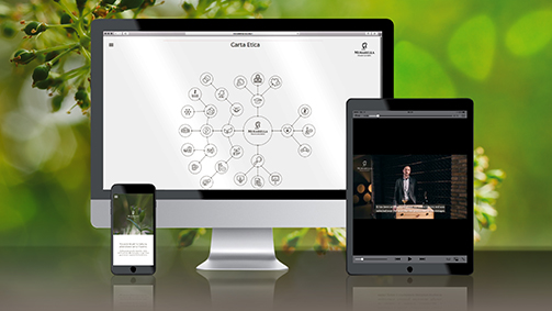
Special attention was given to the new Mirabella website, created in collaboration with NokNok, which was conceived as the primary vehicle for the contents of value that characterise this cellar. Video tutorials and a detailed information system seek to express the particular attention paid by the cellar to the passionate and expert consumer but also to all those who seek to broaden their level of knowledge. Thanks to the experiential communication and the dialogue with its interlocutor, aspects that characterise the company, such as protecting the environment and nutritional health, are thereby made transparent and accessible. Indeed, it is Teresio and his two children, Alessandro and Alberto, who tell us, in a personal and direct way, about the cellar, their experiences, their expectations and their wines. The Charter of Ethics completes this information, represented through a dynamic infographic – inspired by the process of growth of the plants – that encapsulates in a single image the constant effort poured into the various areas through the actions undertaken by the company. Special attention was also paid to the choice of the content, the terminology and the technical choices in order to achieve the best optimisation for the research engines.
Tag Brand, Global design, Packaging, Website
