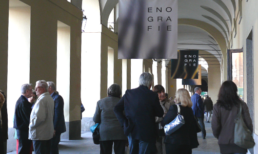
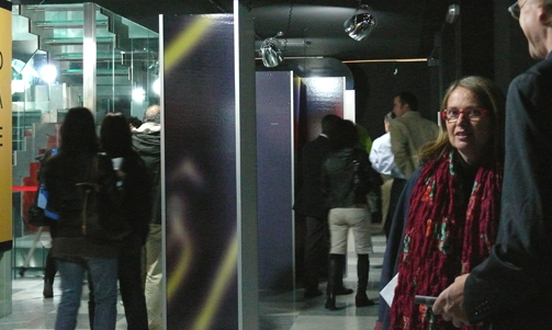
2008 - Oenographies: Interaction between graphics and structures
“Wine is a real value that transcends reality” - Luigi Veronelli
The link between wine and aesthetic research has become increasingly clear and important over the past few decades. In the case of Piemonte’ wines, this evolution has been driven by companies or enlightened wine-producers whose prime aim has been to re-launch the production of high-quality wines, generating a phase of renewal that has laid the foundations for the development of its products, also in aesthetic terms. From this point of view, producers like Giacomo Bologna, Maria Borio, Angelo Gaja, Bruno and Marcello Ceretto, to mention just a few names, should be seen as pioneers of this phenomenon which has seen intense commitment to achieving excellence in every sense in Piedmontese wines. A variety of means, both analytical and aesthetic, are used to interpret wine, describing it through images or shapes. This exhibition aims to tell the story of how a label is designed and how much new and significant progress has been achieved by the wine-producing companies in our region.
Mercedes Bresso
President Piedmont Region
Interaction between graphics and structures
Valeria Bucchetti
Polytechnic School of Milan
Wine does not need, and has never needed, a figurative type of communication, in which the content is depicted realistically; on the contrary, it belongs to a multisensory commodity universe that involves multiple perceptive modes (in fact, all of our senses are affected, take the example of effervescence which occasionally touches us when we taste a wine). It is a product that emerges from a process imbued with its own history; in other words, an object that triggers off a narrative process, and stories that materialise through allusions, cross-references and metaphors. And it is in this field of extended expressive devices, which have evolved a language genre over the years, that we can read a wine’s image, analyse its identity, and consider the communicative elements that make it a product.
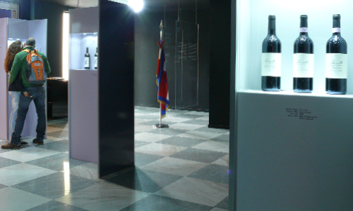
There is certainly an area of the project, described below, that enables us to grasp the skills that are brought into play quite well, and which clearly express the obsolescence of a project concept in which the role played by communications was limited to the layout of the label. And the design of the communication was seen only as the graphics of elements which contrasted with the structure of the container, in which the so-called “dressing-up” was brought into play, in which one perceived the figure of the graphic designer-illustrator rather than that of the technical designer-engineer, who had the skill necessary to “design objects”. This process has learned to combine these aspects, well aware that designing all the devices necessary to activate the process to give significance to an object, determines both the identity of the object and the programme of actions related to it. The various works collected allows a broad analysis in which attention can be focused on the relationship between the graphical components and the structural elements, in order to divide the works into categories that develop around a different degree of centrality of each individual component. The examples express a fluid balance in which the influence of the structural matrices and of the word-icon intermingle, with varying degrees of importance. In other words, the object of our analysis can be summed up in the question: what is the element that determines the mental image of the object? What is it that produces its identity? The search for a reply has revealed a number of “concentrations”, areas of recurrent behaviour within which we can recognise different models. The first is the level of contact graphics, in which the graphical elements adhere to the body of the object; a second in which the identity of the label is the protagonist, with an extensive search for non-standard formats; symmetrically, there is a level in which the form of the container determines the visual structure, and another in which the shape of the bottle and the structure of the label are completely integrated, even creating a category formed of cases in which the integration between the bottle and the label is a question of perception. Contact graphics include the signs that emerge on a visual plane like tattoos on the body of the object: they are frequently obtained by silk-screening and generate a direct perceptive contrast with the glass, with its transparence, but also with the chromatic density of the wine it contains.
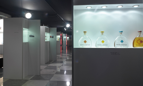
One example is Arbarei, with calligraphic characters that depict the skin of the bottle, recalling the experience of Silvio Coppola, while another is the “Phi” sign of Passum, which was born as the graphical result of a writing exercise undertaken to find the most eloquent gesture, full of force and formal quality, which finds the communicative effectiveness that makes it look as if it has just been drawn on the bottle, in the treatment and the perceptive relationship between the surfaces involved (the sign and its background). The silk-screened reproduction and the chromatic relationship with the object are full of contrasts and play with the volumes, round shapes and forms, opposing the two-dimensional sign to the volume of the bottle. The same is true of Aviè, where the graphical element is an imprint, an archaic marking that creates a thread to embrace the bottle. They are signs that originate from different references, but which emerge from the graphical treatment on the body of the container, and the use of the latter as a background for the graphical effect, as open, free signs that reflect their particular visual form on the material surface of the object. Signs that frequently have a strong gestural character, that refer to the action of the subtended hand that composes them, and are revealed as permanent, indelible, even to the point of suggesting that one should keep the object; signs that offer aesthetic qualities, to ennoble the container that makes them a protagonist, regardless of any other information. The label-sign on the other hand represents an area of expressive research in which our attention is focused on overcoming the traditional format; here the design strives to find solutions that can link container and label, with new relationships that are able to determine the identity of the object through its own personality. The overturning of the label’s traditional structure (usually of a rectangular shape with text set out in epigraphic form) in favour of possible new design solutions, opens up a world of experimentation. The picture is complex, ranging from measures that are structurally limited, as in the case of Ceretto grappas, for which the label has been re-designed with a triangular shape and rounded corners that break with standard formats, with a structure that influences the topological layout of the graphic elements to produce a device with a strong impact, right down to the complete reinterpretation of the label shape, as in the case of Forteto della Luja. Here the objective status of the label changes, and is transformed into a long, thin strip, that allows the text to wind around the bottle in a spiral. A ribbon that winds meticulously around the object, underlining the care and attention that went into its preparation, outlining the wine’s identity with its movement. It is inside a structured code, like the one defined by the different bottle families, designed exclusively to contain specific types of wine, that the structural dimension of the container can act as a differentiating factor. If the articulation of the form varies and evolves to point of the sophisticated attribution of a form to each category, made all the more modular by the chromatic variable that we have in France, for example, where all Rieslings from the Moselle must be bottled in elongated green bottles, and those from the Rhine in brown or amber bottles, the structure of the container with its own rules becomes a very interesting design space to introduce new expressive registers and to launch resemanticisation processes. This is what happens, for example, with the Tosti spumante, which re-interprets the codes for spumante. The study for the bottle, which has identified the archetype of the “great mother” as the symbolic element on which to develop the project, introduces a small concavity, which transforms the body of the bottle. The hollow becomes a strong distinctive element, which captures the attention, and attracts the viewer who is thus involved in a direct contact and a tactile relationship with the object. All the elements that combine to “dress” the bottle rotate around this point: the label and capsule are incorporated into the structure, adapting their character to it. Similarly, we can refer to the central role of the bottle with I Solchi from Bocchino.
The bottle surface is etched with signs that design it, shape it and define its identity; they are signs that recall the farmed land and reiterate its values through touch. The bottle surface triggers a sensory experience that addresses sight and touch, and reproposes on a small scale the perceptive qualities of a sculpture in granite to which it refers explicitly. As in the previous case, the graphic elements come into play later: the label adapts to the folds of the bottle, so that it is incorporated, almost achieving the perfection of a formal camouflage. Bocchino’s Grappa di Langa achieves a different balance. This is an example of an approach that evolves from the dialectics between structural and graphical elements. The “squashed flask” shape has an identity of its own and is the communications support that allows the graphic elements to play a strong supporting role. Condensed into two labels, the graphical elements create a perceptive game in which the flask is a partner. The first, small, square label, is positioned at a 45° angle on the front, and acts as a fulcrum at the centre of the object. The second is a little larger, and has an internally punched shape, with a gap that corresponds exactly to the surface area of the first label; it is positioned on the rear of the bottle so that the eye can put the message together again and recompose the overall image generated by the interaction between graphics and structure. The last category comprises solutions based on interaction between the bottle and the label achieved thanks to a perceptive device.
One example is Bricco della Bigotta from Braida, in which the extremely essential, linear graphic construction envisages a layout that aims to highlight the relationship between full and empty volumes. The label is built around a game of contrasts which employs chromatic assonance so that the area seems to blend perceptively with the glass and the body of the bottle, achieving a close relationship between the visual structure of the label and the container. Selezioni Comunali is another example of the same perceptive mechanisms, but with a contrasting visual configuration. If the principle of the Bricco was balance and complementarity, here the integration is generated and takes shape by questioning the balance through the graphical structure. The trapezoid shape of the label, first of all, combined with the clear, highly legible signs, that seem to become smaller, creates a perspective effect. The resulting dynamics contrast with the symmetrical, stable structure of the bottle. The effect is to distort the object, sparking off a sort of intriguing perceptive discomfort, which triggers a contrast between the lines of the bottle and the structure of the label; between the two-dimensional and the three-dimensional, between “real” perspectives which interpret the volumes of the bottle and perspectives induced by the compositive structure of the graphic elements that contrast with the former. Different areas of reference which make it possible to reveal the modular relationship between graphics and structure as aspects of a single communications system. Two linked levers on which to act to generate an identity, but also two spaces in which to activate exercises in design quality; in which the quality of the detail of the graphic dimension dialogues with the structural quality, growing stronger in order to achieve a uniform result that strives to tell a story from different viewpoints.
Tag Global design, Packaging
