2002 - Impackt
Bottling
I had never seen a bottle with a navel, a label which wound round the bottle like a spiral of tape, a cork you could read through the glass…
…And I didn’t have to go far to touch them with my own hands, only as far as Bergamo, in the quietly industrious environment of Bergamo Alta. There, in a beautiful old house with frescoed walls, in a totally Italian atmosphere where technology and tradition blend harmoniously, a group of artist/designers work with a passion at the most sophisticated projects for the packaging of bottles of wine, oil and spirits, such as I have never seen. The place I am speaking about is called Studio Grafico Artigiano, set up in 1983 by Chiara and Giacomo Bersanetti as a studio of graphic design and company image. It is now a unique workshop of professionals with the same tastes and ideals, who also share a system of artistic training which has allowed them to create carefully devised projects which have great impact both in terms of concept and form. Given the high professional standards of the members of the group, which since 1996 has enjoyed the full-time co-operation of the artist Francesco Voltolina, it comes as no surprise that they are true aesthetes and that all the bottles, the products of their imagination and their hands, are true table sculptures. They are in fact beautiful studio models, turned in wood before going into production.
But Studio Grafico Artigiano does not limit itself to devising wrappings and labels, no matter how sophisticated. The challenge is to put the packaging into a context, with the aim of combining packaging and architecture, as in the case of the co-ordinated image project for the Petra agricultural company. The architecture of the wineries, designed by Mario Botta, has recently been developed to include a whole range of symbolism taken from both sacred and popular traditions from both the West and the East. The Petra wineries, which are located near Suvereto, an ancient town in the Tuscan Maremma, are characterised by a cylindrical central building surmounted by an imposing flight of steps which leads to an observation point placed between earth and sky. On the label for the Riserva Petra, this triple element — earth-man-sky — is portrayed through three intersecting rings made up of words to represent the relationship of man and the tree (and thus the vine) with the sky and the land. The label of the Val di Cornia wine, on the other hand, represents the vault of heaven portrayed in classic temporal symbolic elements (12 circles representing the months and the constellations, 8 spheres representing the phases of the moon, 7 central concentric rings representing the days of the week) all placed in relationship to the cultivation cycle of the vine and the production of wine.
A bottle without a label is the solution for Cascina Castlet‘s Passum wine. The starting point for the idea was to emphasise the unique quality of the wine by going, both conceptually and physically, beyond the normal paper label stuck on to the bottle. An unmistakable red “P”, printed on the glass by serigraphy, is the outcome. This immediately enables one to recognise the make of wine through the powerful graphic image, while all other information is carried in a scroll audaciously placed along the neck of the bottle. These two features, the screenprinted glass and the label on the neck, make this one of the most innovative packaging projects in this field.
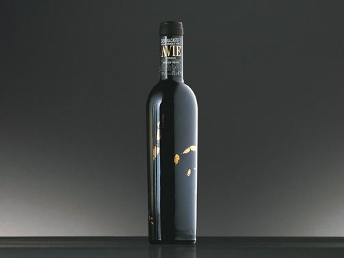
The same kind of careful thinking has gone into another project for the same company. The bottle for the Avie wine, ephemeral and mysterious, bears on its body, literally, the owner’s hand print. To underline Maria Bone’s decision to devote herself more decisively and directly to the management and care of her vineyards, as well as to indicate the vast amount of dedication required for the production of this wine, the Bersanettis and their associates had the idea of transferring Signora Borio’s fingerprints to the glass, then coloring them by screenprinting in pure gold. In this way, a bottle has been created whose packaging, though using only light touches and concepts, manages to convey great richness, quality and taste.
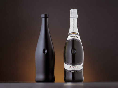
The navel of the world isn’t a place, it’s a bottle of sparkling wine, at least it is since Studio Grafico Artigiano decided to approach the subject of packaging for Tosti Spumante through research into collective archetypes. They had to be innovative and to identify an image for the bottles and, as always, wanted to come up with a powerful and meaningful concept. So the Studio decided to create a relationship between the wine/Spumante and its container, the bottle, the archetype of the Great Mother, she who contains, protects, nurtures and gives life, often symbolised in antiquity by the vase, amphora or goatskin flask. They designed a bottle which is an evolution of the symbolic vase, with a softly rounded shape like the female form, with a small depression representing the navel. This hollow, set in the centre of the “belly” of the bottle, becomes a powerful distinguishing feature, catching the attention and attracting the consumer who instinctively picks up the bottle so as to get to know it by touching it. Surrounding the navel are all the other features which contribute to the character of this new bottle, such as the label and the collar, which are combined in a single circular shape, emphasising the central point. It was technically quite difficult to create such a bottle, especially because Spumante wine exerts considerable pressure on the walls of the container. However, these difficulties were eventually overcome and the result is a packaging which is unique of its type.
Another story: the starting point for the development of the trade mark for Sparina wine was the letter “S” of its name transformed into a double spiral, with all the symbolic, artistic and traditional allusions attached to it. The double spiral, much enlarged, also becomes a decorative and easily-recognisable motif on the gift packs in which the traditional wood, with all its color, warmth and solidity, is combined innovatively with a sheet of light, transparent plexiglass. This play with transparency is taken up again in the neck of the bottle, through which it is possible to read the trade mark on the cork.
A multitude of bottles and labels, a series of vestments that have been especially cut out and sewn like clothes that have been tailored to measure. There is, for example, a slim and elegant black bottle, embellished only with a long tape, which winds sinuously round it. Then there is another, a special edition for 2000, in which a shell of natural beeswax seals the cork and covers the neck and shoulders. There are labels hand-written by expert calligraphers, others which are asymmetrical or made into different irregular shapes. Big bottles with small labels and labels transformed into poetry on bottles with wings. And so on and on… Words, letters, signs and designs; surfaces and volumes; colors, materials and finishes.., every bottle becomes a different story which adds a special “flavour” to its contents.
Sonia Pedrazzini is a designer and teaches at the Accademy of Design of Bolzano; she writes about packaging culture for the packaging monthly Italialmballaggio.
